We challenged Midjourney to turn Figma, Sketch, and Adobe XD into human characters for our animation about UI/UX design apps.
Developing the concept
What makes a top-notch promo video? Unconventional product presentation? Striking high-quality visuals? Something else? As we were preparing for the launch of the new Lunacy, we kept thinking of a billion ways to make our promo video creative without overdoing it.
We’d already made an official product presentation and a promo video demonstrating all the hot new features.
At first, we were planning to use this same video for our launch on Product Hunt, but we realized it wouldn’t be enough. As much as we liked the original promo video, for a vanity fair this massive, it was a bit too clean and modest. On Product Hunt, you need something extra special to stand out.
We agreed that the video needed to be a bit more in-your-face, borderline provocative. That’s when we decided to reimagine graphics editors for UI/UX design as human cartoon characters. Every graphic design tool has its own personality in a way: some are hard to communicate with, while others are friendly and easygoing. Some are easy to read, while others constantly make you feel like you don’t know them at all.

The idea was to make a story about a new guy (Lunacy) joining a friend group (apps for UI/UX design). We decided that the cool guy club had to include Figma, Sketch, and Adobe XD as the three most popular tools for UI/UX designers.
Because the animation needed to be engaging for a rather diverse audience, we decided to go for a style most users would recognize. We agreed on a South Park-inspired animation almost right away — could there be a better fit for a story about UI/UX design apps?
Our first step was generating the main characters of the animation in Midjourney.
Experimenting with AI image generation
Ideally, we expected to get solid production-ready characters to optimize our workflow. But because our query sounded a bit too niche, we knew we’d probably need to rework Midjourney’s designs.
At first, we wanted to replicate South Park’s style as is, with just a bit of extra texturing and volume. Our initial prompt was as straightforward as it can get: “south park characters”.

We ended up with a bunch of different design styles to choose from. To see how these would look with a little extra volume, we changed the prompt to “south park characters in 3d”. What we had in this run were claymation-inspired designs, characters with flat 2D faces and three-dimensional clothing, and more.

Overall, Midjourney did not disappoint, though we ended up with a few odd character designs. Blue sticky note mustache, anyone?

Once we were done milking Midjourney for ideas, we realized that
1. We couldn’t leave any of the designs AI generated unedited and would have to either rework them or start from scratch. Because we had a very clear vision for each of our characters personality-wise, we realized that none of Midjourney’s designs was a good match in terms of looks.
2. We needed a different style that wouldn’t be as similar to South Park’s signature character design. Our goal was to reinterpret the iconic style and create something new instead of cloning Cartman, Kenny, Stan, and Kyle and recoloring them.
Deciding on the style
Once we decided to step away from South Park’s style, we revisited the designs from our first prompt. One of them became our main inspo for further work.

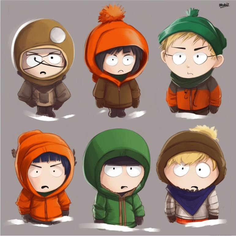
We loved that it felt unique while maintaining South Park’s signature character features. The characters’ faces and clothing had more definition which was perfect. To get the most out of Midjourney’s algorithms, we generated some more characters to help us with the animation. Thanks to AI, we had hundreds of South Park-inspired designs to choose from.
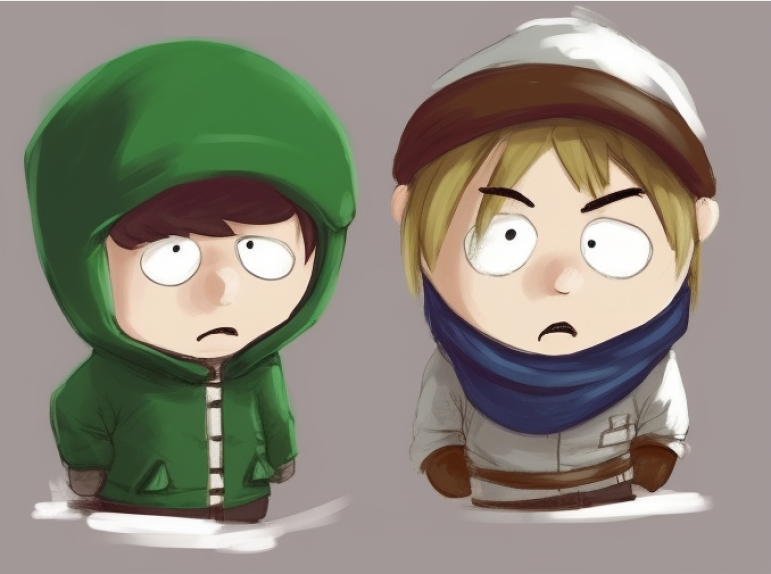
Here is a small fraction of what we had after several runs:

With these many options, we began developing our characters by mixing and matching different features from Midjourney’s designs. We decided to adjust the style a little to make it easier to animate the characters. As much as we adored Midjourney’s designs, they required some more definition.
The characters AI generated for us imitated hand-drawn humans. There were soft color blends, brush-like strokes, lots of fine details, and no defined outlines. All these might look good on a static object but can be tricky to animate.

We needed something like this, but less South Parkish.

Ultimately, we decided to keep the simplicity and cleanliness of the original characters topped with some shading and more realistic facial features. That would give us just the right balance between animation-friendly 2D stylization and humanlike character design.
Final designs
Once we knew exactly what wanted, it didn’t take us too long to design the characters everyone on the team was happy with.
The first character we made was Adobe XD. One of Midjourney’s designs was almost a perfect fit, though we envisioned Adobe XD as a slightly weirder artsy boy.

For Sketch, we combined two different designs from Midjourney. We liked the slightly confused facial expression of the first guy and the outfit and messy hairdo of the second guy. After merging these two together, we got a perfect character to represent Sketch.

For Figma, the initial plan was to create a badass guy who stormed into the world of graphic design and took over the entire market. Later, we changed our minds and decided that right now, Figma is more of a chill bro who minds his own enormous business. Because Figma currently occupies 88% of the market, we modified the first design to make Figmate a bigger person who is living his best life.

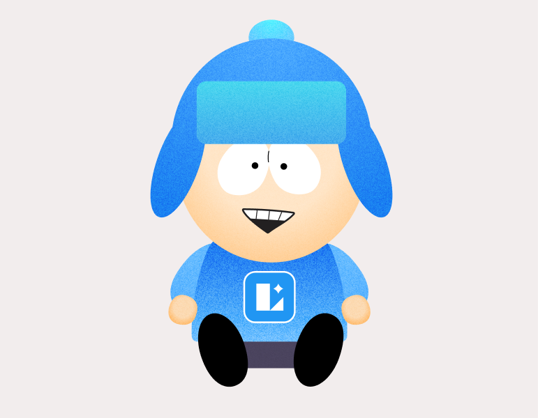
Lunacy to us is a new guy who gets along with everyone. We only used one reference to create this character and aside from the facial expression, we did not change much. We also swapped the color of his clothes for Lunacy’s signature light blue.

After all four were ready, we needed to draw them from the back.

The next step was drawing the background. We knew we wanted something similar to South Park’s landscapes, so we asked Midjourney for help once again. We typed in “flat illustration of forest road, south park style, side view”, expecting to get a similar scenery.

The results looked beautiful, but we wanted something slightly different. Most of the designs from Midjourney either had too much going on or were too flat and minimal. There were also a few sceneries that had a completely different vibe that would not fit our story at all.


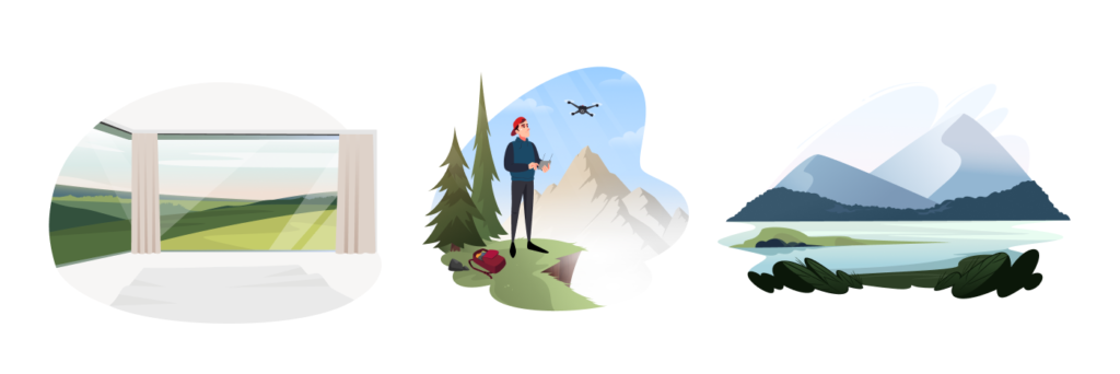
The solution was simple: we picked a few illustrations from the Vivid pack you can find in the Ouch! library and took several elements from each one.

Then we added outlines and noise to match the style of our main characters.

Lastly, we drew a bench and placed our design bros on it.


And ta-da! We were ready to send these guys to our animators. You can watch the final video here: