Here’s a case study from our friends at Red Collar on how they reimagined CSSDA certificates—turning typography, color, and motion into artful design pieces.
Hi, it’s Den from Red Collar. Let’s talk about our recent collaboration with CSSDA and how we turned a simple concept into something truly exceptional.
At Red Collar, a digital agency known for bold creative solutions and attention to detail, we’ve spent years crafting award-winning work for global brands and platforms. Recently, we teamed up with CSS Design Awards (CSSDA)—a platform celebrating the best in UI/UX design—to create their new certificates. Here’s how we approached the project and what went into making these pieces, not just awards but art.
Form: a fresh perspective on simplicity
The idea behind the certificate design was simple: look at ordinary things from a new angle. Even straightforward typography can transform into a stunning design object when viewed differently.
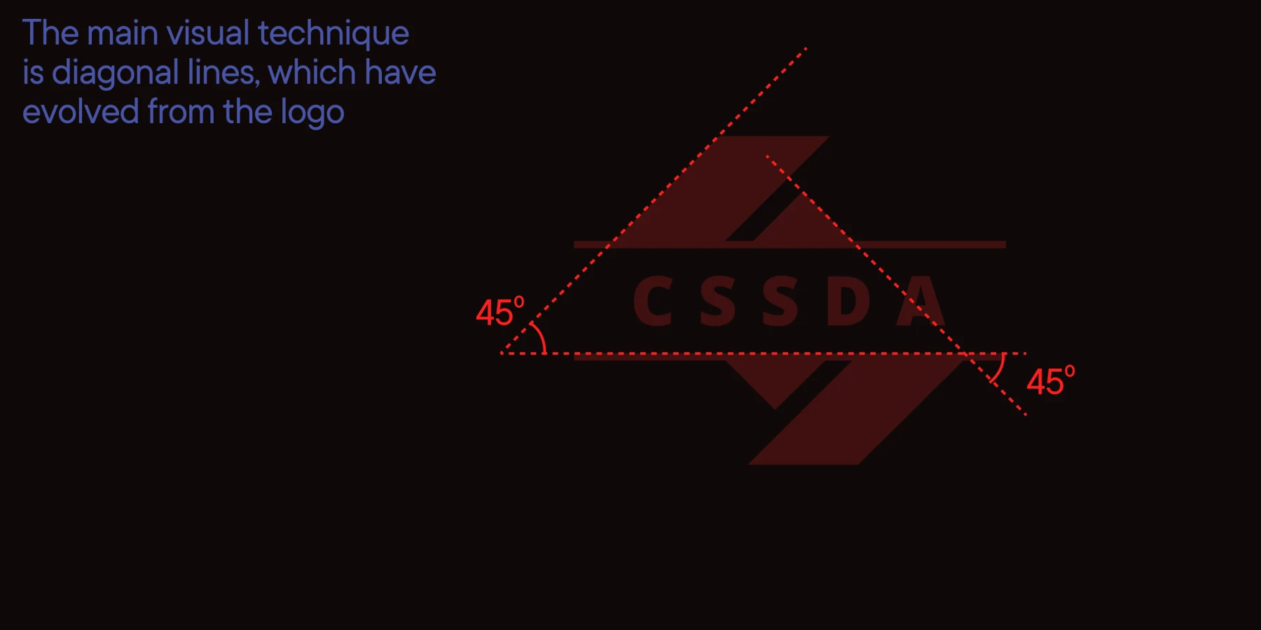
We created a unique, isometric typographic composition where the award text isn’t just static—it’s part of the design itself. Inspired by the CSSDA logo’s 45-degree tilt, we applied this angle to achieve a sense of depth and balance. The result? Certificates that feel like they’ve stepped straight out of a modern art gallery.
The goal was clear: we wanted each certificate to double as an art print—something worthy of being framed and displayed alongside posters or interior decor.
Color: subtle vs. special
We divided the certificates into two types—standard awards and special nominations—and let color set the tone for each.
- For the standard awards, we kept it clean and elegant with a minimalist palette: colored typography on a dark gray background. The contrast makes the awards feel modern and sharp, giving the colors center stage.
- For the special nominations, we pushed things further with bold, bright backgrounds. This choice highlights their uniqueness, making these awards feel rare and celebratory.

Animation: typography in motion
The same design principles guided the animation process—distortion, transformation, and new perspectives. We wanted the animation to reflect the feeling of entering an alternate universe, where space and typography behave in unexpected ways.
By playing with angles, depth, and movement, we created animations that immerse the viewer and reinforce a core design truth: sometimes, you need to change your perspective to see something new.
The general video: bringing the concept together
To showcase the certificates, we put together a video featuring short animations. Each animation reflects how typography moves and behaves in the “alternative universe” we created. The key idea? Changing the angle changes the perception.
Animated certificates: sharing beyond the frame
Beyond the physical certificates, we offered something extra: animated certificates. Each winner gets a customized animation they can share on social media—an engaging alternative to posting a static photo. This way, winners can showcase their achievements in a dynamic, attention-grabbing format.
Creating these certificates wasn’t just about handing out awards; it was about reimagining how awards are presented and perceived. By combining thoughtful design, animation, and color, we crafted certificates that honor winners while turning everyday typography into something extraordinary.
At Red Collar, we believe great design comes from looking at things differently. So what do you think—how much does the right use of form and color shape the way we celebrate success?