Every ecommerce website relies upon a workable billing form to move customers through the billing process. At this stage the job is almost done – the customer has committed – but as a business, you are not yet over the line. Until the transaction has been made, the deal has not yet been sealed, and the customer can still walk away. In fact, if your billing form has usability issues in the shape of its design, slippage here is still a distinct possibility. It’s therefore of paramount importance to design your billing form as convenient as possible. Here are some tips and examples.
Keep It Simple
Don’t overcomplicate matters. The customers must be able to follow the logical flow of the billing form easily and without questions. Doubts raise hesitancy, and hesitancy is exactly what you want to avoid. Don’t include any unnecessary information and keep everything on the same page in easy scrollable reach. If the form does need to be longer for any particular reason, break it into bite-size chunks that are easily navigable and use breadcrumbs – an indication of how far the customer has traveled in the process and how far they need to go to get the job done. This can be easily displayed at the top of each new step in the form of a timeline and is best practice for a number of high-profile websites such as Wiggle. It’s really not rocket science, but its fundamental to the cause.
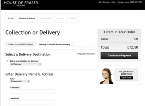
Take a look at this example. Everything is simple: users can pick methods through the dropdown menu which makes it all faster. The page itself is clean and simple and best of all, there is a live chat option for anyone who has any doubts. This makes it easy for you to eliminate unnecessary content and replace it with a single button where they could get all of that information if they need it. There is a tracker on the top as well, which makes it a lot easier for customers to know where they are on the journey.
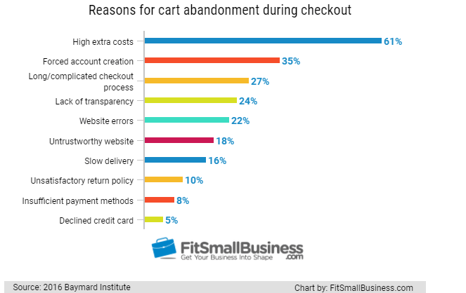
And here is a research study that shows exactly how vital simplicity is in the process. So many people give up their purchases because of the long checkout process or forced account creation. This is just another reason to make your process simple and to make sure that you have a guest checkout available.
Make It Clear
Use clear formatting, keep text boxes separate, and make it obvious what is expected from each textbox. It’s just common sense.
“I would expect to see a large font which is easy to read and relevant field titles. Anything less is just lazy,” warns Frank Tomlinson, a website admin at Britstudent.
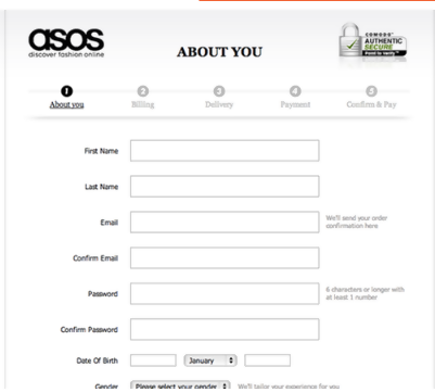
Here is an example from Asos. They take great care to make the page as plain and simple as it can be and they also match their branding on the page. The form fields are as clear as day. They are right next to each field and you can easily see what you need to type in. On a side note, they have also created a tracker so that the user knows exactly how many steps they have left before they are done. The form is quite long if we are speaking honestly, but it does its best in trying to be as simple and as polished as it can be. There could have been fewer points but keeping it clear helps the customer have a better journey.
Help Users with Prompts
Make it clear to the customer what information is necessary and what isn’t. As regards the necessary information, use custom input spacing techniques which can be automatically generated using JavaScript, which customizes fields such as phone numbers or zip codes so the inputting is automatically edited to the correct layout and tabs the customer onto the next input box when all the digits have been inputted. Ebay is a great example of how custom input spacing can work. It also acts to inform of errors in the case of an incorrect number of digits for a zip code say, or where the information that you have input is invalid. It’s vital that any errors are flagged obviously and immediately: the frustration of hitting ‘go’ and the form not responding is palpable, and will often lead to a customer quitting the process entirely.
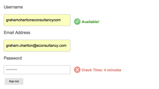
Here is an example of a strange yet interesting and useful prompt from Geeklist. They encourage their users to try harder at creating a password that’s hard to crack. As you can see, they inform you how long it will take for someone determined to crack your password and enter your account. They even have the red letters which then inform you even further that this is not a good thing. So, they make you create a more secure account because they care about your well-being – an excellent thing to show right on the signup – and they do it in an interesting and fun way. Where else can you get this prompt? It’s usually more generic than this. They also do a great job at using the mentioned custom input which makes it easy for someone to sign up without typing too much.
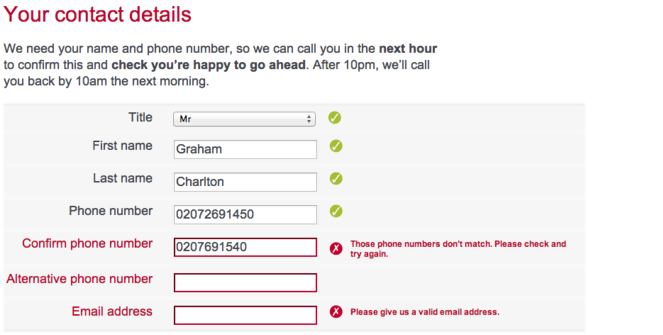
This is another great example of custom input and prompt usage. This makes it easier for the customer because they don’t have to repeat the same form several times but rather simply know when they have made a mistake. The form also fills itself using the existing information. It’s clear, simple, and really easy to fill out.
Recap
Before the ultimate step of hitting ‘pay now’, or whatever the buttons state, it’s vital to offer the customer a recap of what they are purchasing, and what the final cost will be. This is the moment when a customer can get anxious about their purchase, and second thoughts need to be avoided at all costs if you are the business in question. The recap should be concise and clearly displayed to avoid any confusion whatsoever. Ensure that all taxes are included at this stage so the customer understands exactly what the total is, and also include details on delivery times and any other pertinent information. Amazon is a great example of how this can be done clearly and concisely.
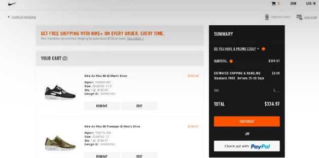
This is an example of the recap page from Nike. It’s simple, it shows the product clearly which does two jobs – one is to reignite that desire for the product which gets lost in the forms and typing different things and another job is to show the user what they are buying so that they can see if they made a mistake.
“It still amazes me there are ecommerce websites that don’t employ a recapping step as the penultimate stage. As well as anything else, it is unprofessional, and immediately raises doubts in the mind of the customer that this is a professional service that will deliver on its promises. Unfortunately, we are still operating in a zone that is not entirely trusted at times, so adding validity is crucial,” points out Jane Travers, a design blogger at Writemyx.
To Sum Up
None of these recommended steps are out of the realms of what is typical or what is eminently achievable. It’s really all about being thorough, and giving the customer the reassurance that they need to go through with the purchase. Don’t make the mistake thinking you’ve got the job done too early: complacency is the enemy.
About the author: this is the guest post by Martha Jameson, an educator, content editor, and proofreader. She shares her insights and experiences at PhDKingdom and Academicbrits and also on blogging sites such as Originwritings.
Title image from Bermuda free vectors on Ouch
Check the top trends in UX design for ecommerce, review the effective design practices for product pages, and learn how to integrate identity design into digital interfaces.