If you run a website and it’s not optimized for mobile devices, you are losing most of current traffic. How can you avoid this?
According to a report, more than 61% of total web traffic comes from mobile devices, leaving only 39% for desktops.
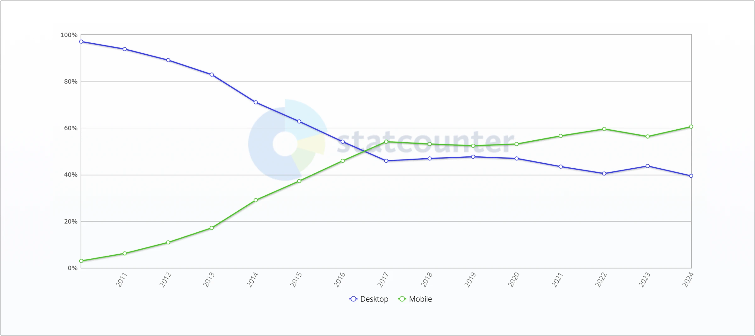
According to this graph, the number of users browsing the web on mobile devices is continuously rising. That said, a desktop is not the first device of choice for users anymore.
That means, if you run a website and it’s not optimized for mobile devices, you are behind the curve and risk losing most of your current traffic. Furthermore, you can’t rank your web pages higher on Google. Learn more about website ranking and ways to improve it in this article. In November 2016, Google added the Mobile-First Indexing article to their documentation. In essence, this article means that Google now looks at mobile versions of the pages to evaluate them for indexing and ranking.
If you want to learn more about ways to attract relevant traffic first, check out our guide on how to use content marketing to drive more traffic to your website.
However, how can you make your website mobile-friendly?
This post has the top 10 tips that will help you create a mobile-friendly website. But first, let’s see what mobile-friendly web design even is.
What is a mobile-friendly website?
As the name implies, mobile-friendly websites are designed, developed, and optimized for mobile devices and tablets along with desktops.
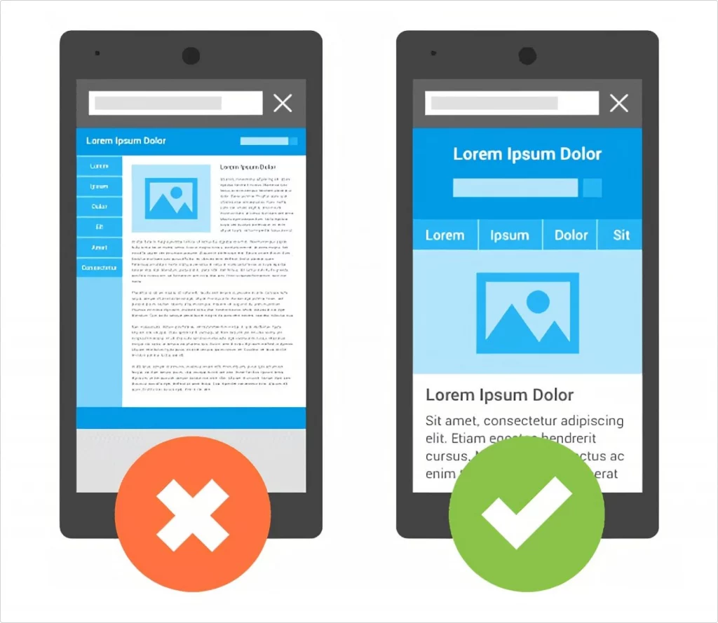
That means they perform just as well on mobile devices as they do on desktops. Texts, images, buttons, or other elements on mobile devices are easy to read and navigate. Every button you can press in a desktop version works on a mobile device, every core feature is accessible via a mobile device, etc. In other words, mobile content is easy to consume.
Here’s what a mobile-friendly website looks like.
How to check if your website is mobile-friendly?
Before optimizing your website for mobile devices, let’s check whether it’s mobile-friendly and, if not, see what the issue is.
This may seem like a complex task. Fortunately, Google has PageSpeed Insights — a mobile-friendly testing tool that allows web admins to check whether their web page is mobile-friendly.
Enter your URL, and it will start analyzing your page.
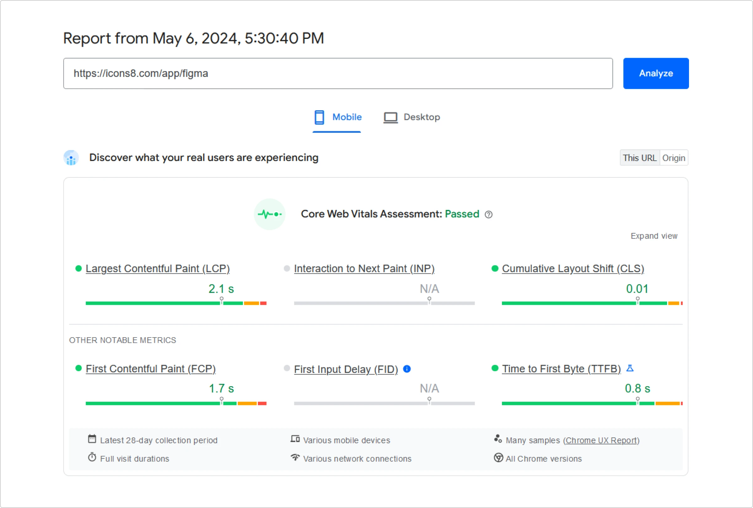
As you can see, overall, the webpage is mobile-friendly, and there are no issues.
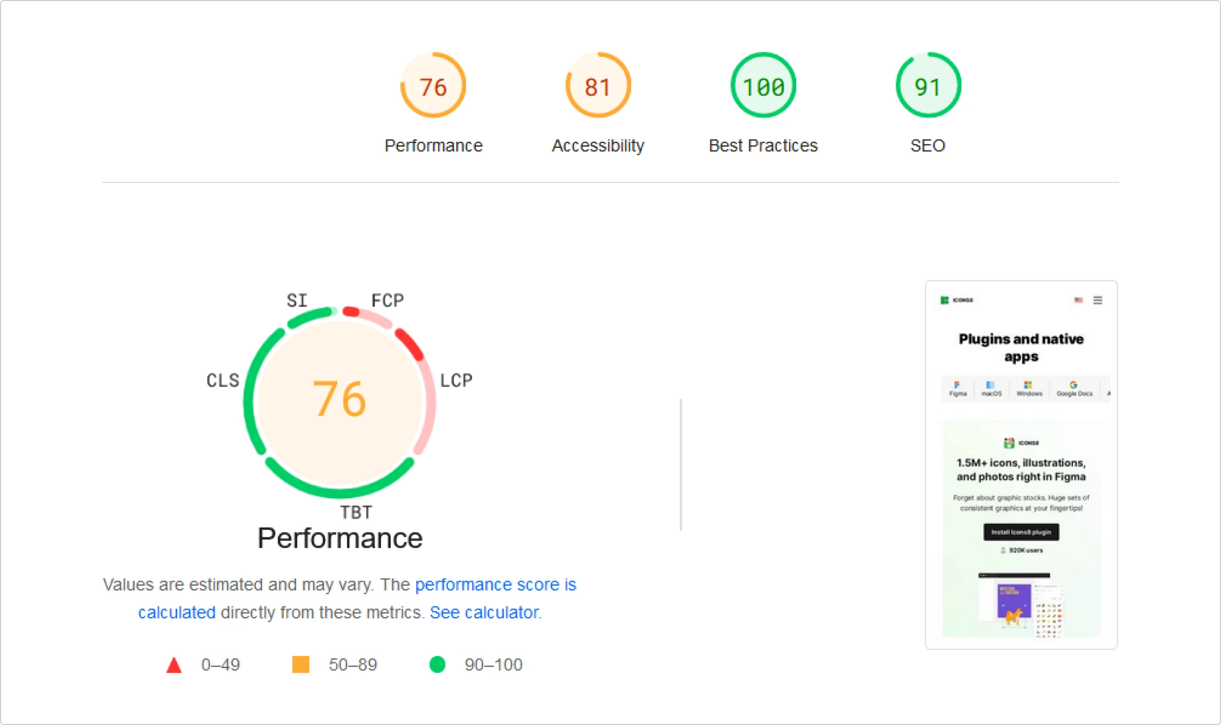
Diving further into the webpage analysis, here are some of the criteria the tool uses to assess a website.
Performance
This metric refers to the loading speed of your webpage when viewed via mobile devices. Here, PageSpeed Insights highlights anything that can slow down the loading. The 5 key performance markers here are First Contentful Paint (FCP), Total Blocking Time (TBT), Speed Index (SI), Largest Contentful Paint (LCP), and Cumulative Layout Shift (CLS).
FCP measures perceived load speed. It’s the time a user spends waiting for something to appear on the screen when opening a page. Whether it’s text, images, or other elements that start filling in the white screen, it all counts when calculating the FCP.
TBT is a bit more complex parameter that is often confused with TTI. TTI is Time To Interactive a.k.a. the point where the page becomes fully interactive and responds to button taps, scrolls, etc. TTI lets a page pass this interactivity milestone once it is free of all long tasks for at least five seconds. Long tasks are JavaScript codes that make parts of your UI freeze. The gold standard of loading delay for a long task is 50 ms. Anything over those 50 ms is a blocking portion. TBT is a sum of all these blocking portions of each long task that take place before TTI. Say, you have 10 long tasks that take 85 ms each — your TBT will be (85-50)*10=350 ms.
Speed Index measures how quickly visual content appears on a page as it loads. The tool tracks visual progression over time and calculates the SI using the Speedline Node.js module.
Like FCP, LCP assesses perceived loading speed. Except this parameter measures the time it takes to load the main chunk of content on a page. It calculates the render time of the largest image or text block that appears on the screen.
CLS is a metric that helps estimate the visual stability of a webpage. It evaluates how often users experience unexpected changes in the page layout while browsing. These layout shifts often happen when various elements within a page load asynchronously. Whenever an element changes its look or positioning or the UI keeps jiggling as the page renders, the tool registers these events as layout shifts.
Accessibility
The accessibility test is mostly aimed at checking whether the elements in a web page have accessible names, alt texts, and labels.
Be careful when assigning the ARIA roles, states, and attributes. If you use incorrect ones, assistive technology products might mark the contents of a page as nonsensical UI information. Also, avoid using an autorefresh with a refresh time of less than 20 hours. This can be disorienting for users with disabilities and cause issues for screen readers. Finally, if you use video files, make sure they have a track element that includes captions.
Best practices
This section reflects how safe and trustworthy your website is. To pass this test, make sure to do the following:
- use a strong Content Security Policy (CSP) that can block cross-site scripting (XSS) attacks
- protect the website with HTTPS and avoid all types of content that require loading over an unreliable HTTP connection
- avoid third-party cookies
- avoid requesting a user’s location and notification permission as soon as the page loads
- check whether all images load with correct aspect ratios and resolution
- specify the HTML doctype — a declaration stating the version of HTML the page is written in, that the browser needs to figure out how to render it
- specify the character encoding format your website uses
- check the console in developer tools for error messages
- check whether your source map is valid
SEO
Anything that helps search engines analyze and rank the content of your website falls into this category. To make your web page easy for the search engines to crawl and help it rank higher, do the following:
- add alt texts for your images: concise, yet precise descriptions providing additional information on what an image shows is crucial for both high SEO scores and accessibility
- size interactive elements appropriately: each tappable element should be big enough or have enough free space around it to make it easy for the user to interact with it
- make sure the page has a
titleelement: keep it short, relevant, clear, and unique - use meta descriptions to summarize page content
- make sure each link has a descriptive text and an
hrefattribute: thehrefattribute is what makes the links crawlable - avoid the use of plugins on a web page
- check whether your page allows search engines to crawl it: otherwise, it will be blocked from indexing
However, if your website or web page isn’t mobile-friendly, follow the optimization steps below.
10 steps to make your website mobile-friendly
Here are the top 10 tips you can implement today to make your website mobile-friendly.
- Use a mobile-responsive theme
- Prioritize speed
- Include a search function
- Simplify your menus
- Eliminate pop-ups
- Use a large and readable font
- Change your button size
- Use media queries
- Keep your forms as short as possible
- Test your site regularly
Use a mobile-responsive theme
The first step to make your website mobile-optimized is to choose a mobile-responsive theme or template.
A mobile-responsive theme is important because it improves the overall user experience and has a significant SEO advantage. Fortunately, most desktops and popular website builders, such as Wix, Squarespace, Webflow, etc., are highly customizable. If you use a CMS like WordPress, ensure your install theme is responsive. And if you are working on Webflow, there are great directories for Webflow agencies, such as Vezafy, where you can find your perfect partner to help you optimize your website.
Go to Appearance > Themes > Add New to install a mobile responsive theme.
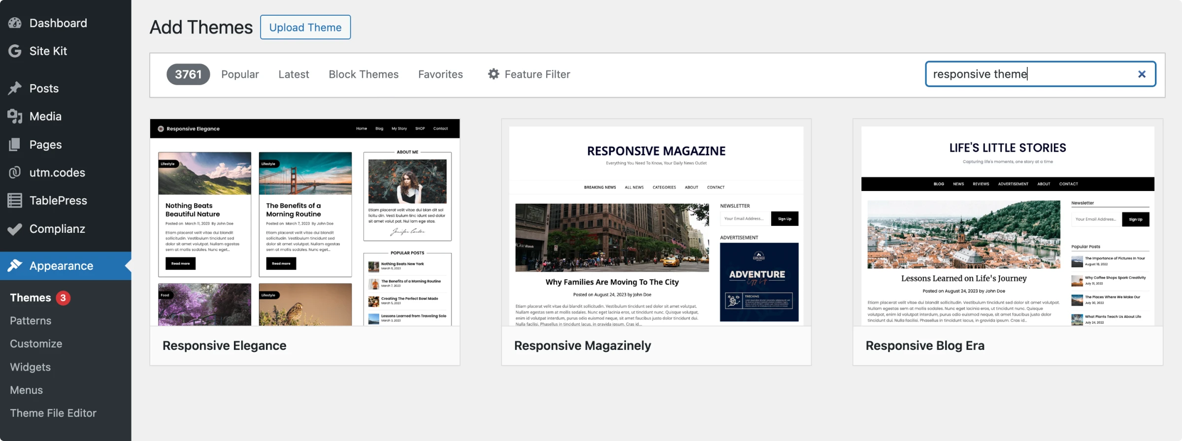
Search for “responsive theme” in the search bar. This will bring up all the responsive themes in the WordPress theme gallery.
Also, don’t forget to check reviews before installing.
Prioritize speed
No matter how responsive your website is, you will lose customers and leads if it takes ages to load.
Google’s study shows that 32% of users leave a mobile website if it fails to load in 3 seconds. Here’s a report by Google that shows how website speed impacts bounce rates.
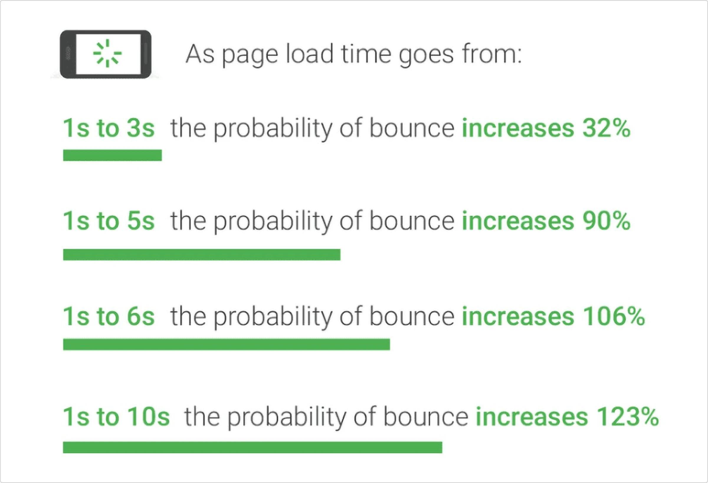
A solution is to implement speed optimization tactics to accelerate your website’s speed. We’ve got quite a few useful tips on how to optimize a WordPress website in this article. Here are some more optimization steps to consider:
Switch to premium hosting: Website hosting should be the top priority when optimizing your website for speed.
If your website is large and gets lots of traffic, you should invest in premium hosting, such as VPS dedicated. Here’s an article about WP Engine alternatives that offer premium hostings.
Start using a CDN: A Content Delivery Network (CDN) is a highly distributed server platform that works together to provide faster web content delivery. In short, it helps to speed up your website. Cloudflare is a free CDN service you can use.
Optimize images: Before adding images to your website, you should resize and optimize them because unoptimized images are large and slow down the website.
TinyPNG is a great image compression tool. It compresses images without losing their actual quality, so you can see the difference between an unoptimized and optimized image.
Include a search function
Navigating a website is complex, and navigating on mobile devices can be even more complicated. Luckily, there are some ways you can make your site’s navigation easier. One way is to add a search function.
You may not want people to wander around your website to find an article they are looking for, which often frustrates them.
People can discover more content in seconds if your site has a search function. Take Amazon, for example.
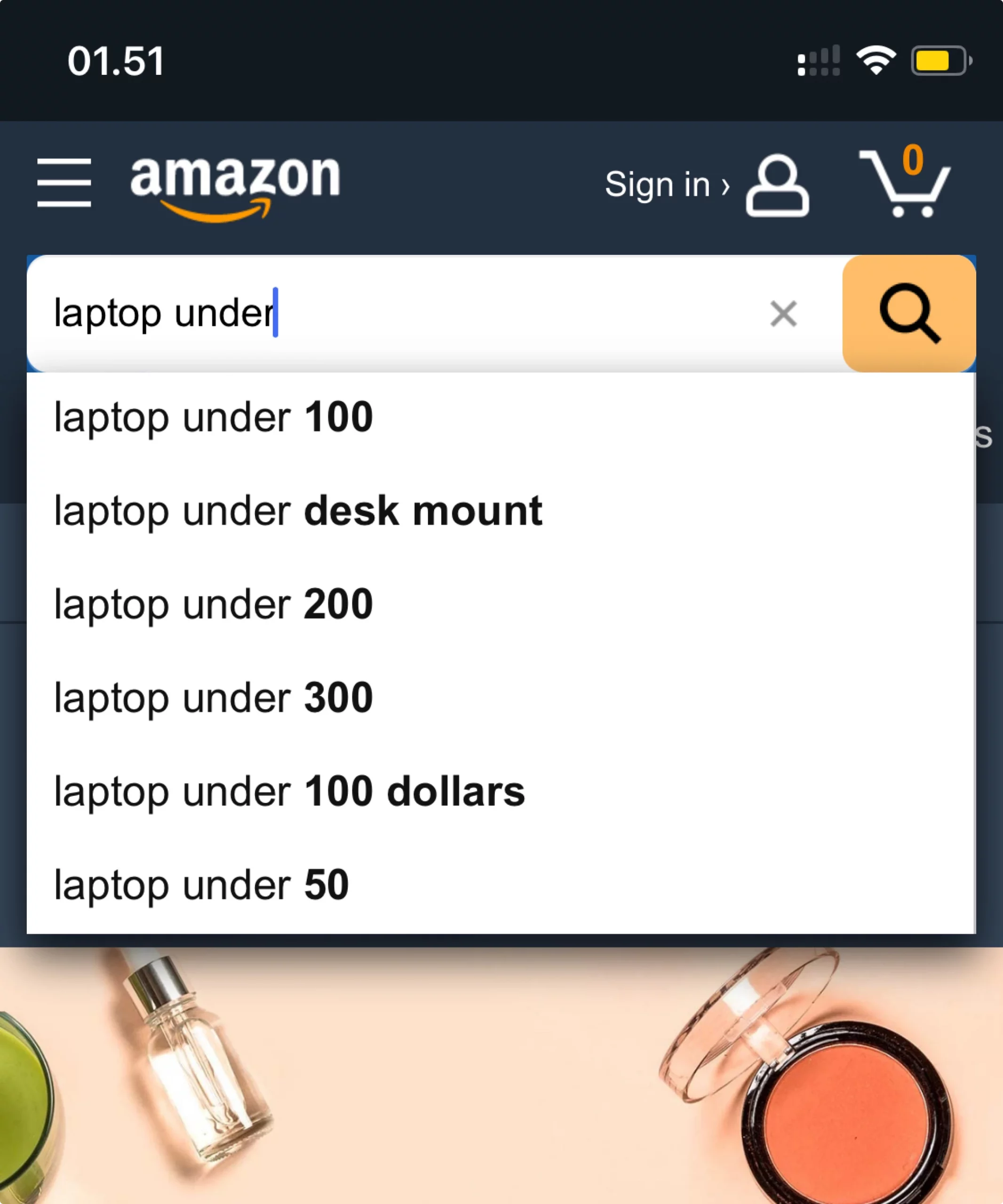
Let’s say someone visits Amazon’s website to buy a working laptop under $400. And, if he wants to see more expensive laptops, he can use the search function to view all the models quickly.
Similarly, you can add a search bar to your website’s top, bottom, or sidebar.
Simplify your menus
Mobile screens are much smaller than computer and laptop screens, so the content on both screens looks different.
On bigger devices, each element, such as menus, sidebars, etc., is easily visible to users. However, this isn’t the case with smartphones and tablets.
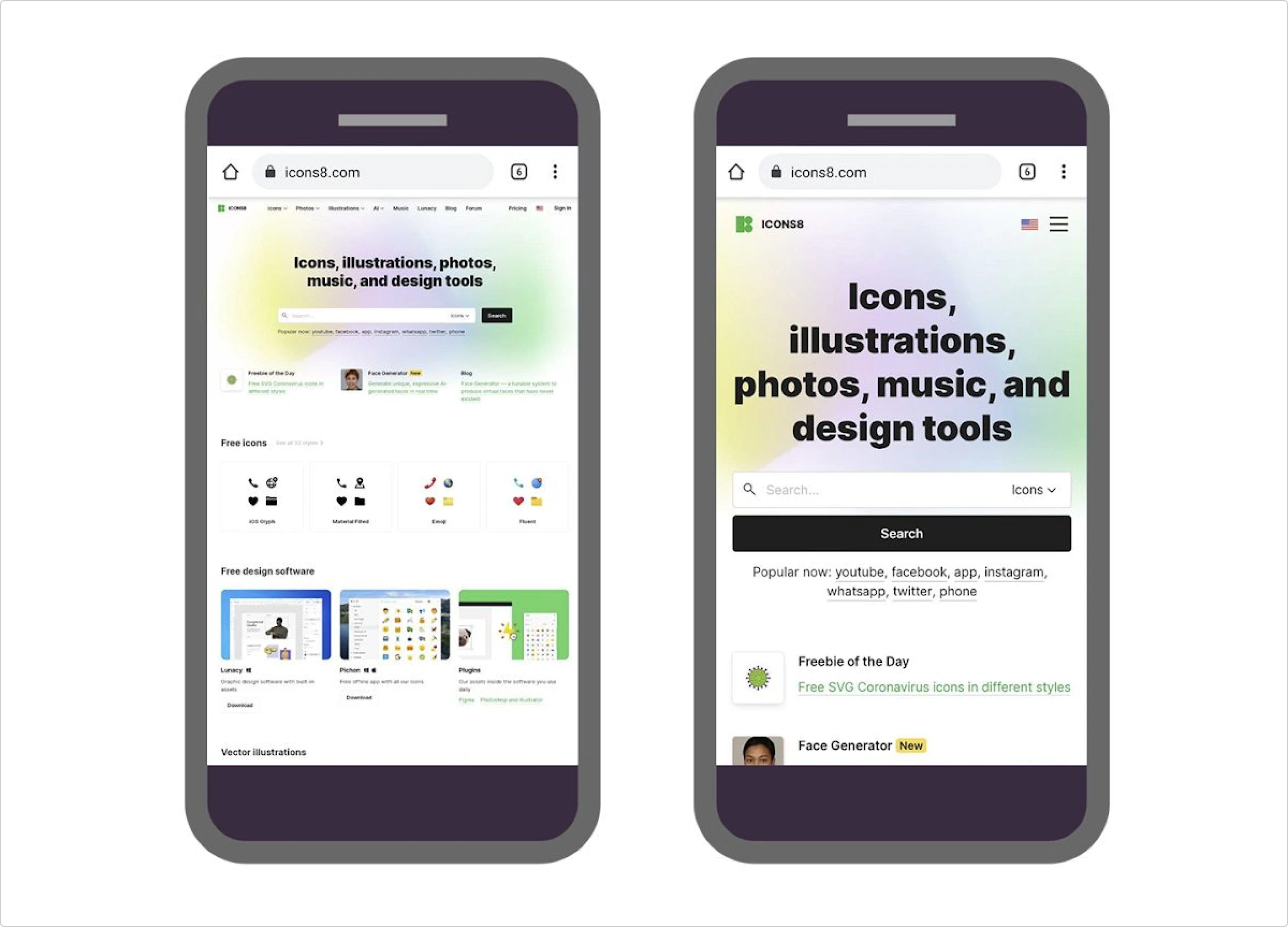
As you can see from the image, the menus on the standard website are not visible unless you tap the zoom-in button. This will hurt your conversion goals badly.
The next image shows the website is well-optimized for mobile devices and looks pretty good. All of the information, including menus, is easily visible.
Eliminate pop-ups
People visit a website to get information or a quick solution. If your content is helpful and engaging, they will stick to it and revisit your website.
But, having unnecessary pop-ups, especially on mobile devices, drives your visitors away. Nobody has time to find the “x” button to close the pop-up; most of the time, they just click away and find another website.
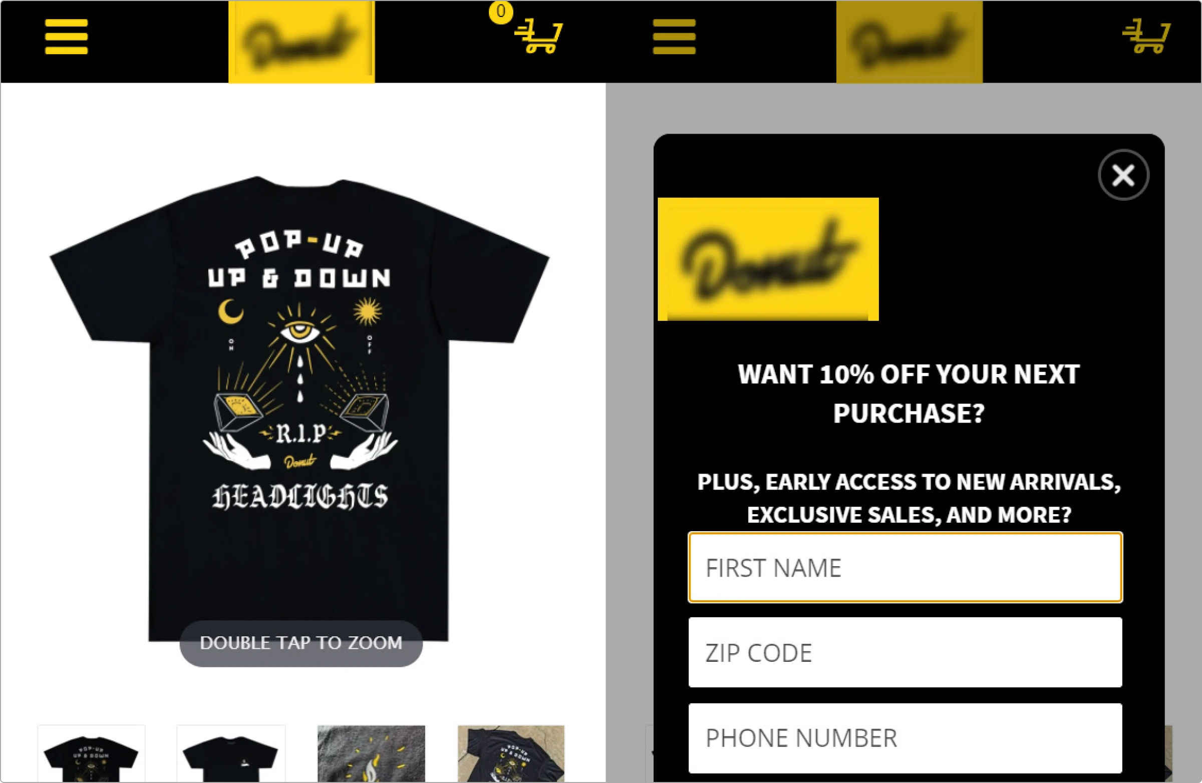
So, if you want to improve users’ experience on your website, avoid adding pop-ups.
If you think pop-ups are too crucial for generating leads or building an email subscriber list, disable them on mobile devices and limit them to 2-3 on desktops.
Use a large and readable font
Reading on a small screen is much harder if the font is tiny. Of course, it’s the same for bigger screens, too.
So, using at least a 14px font size for all devices is better.
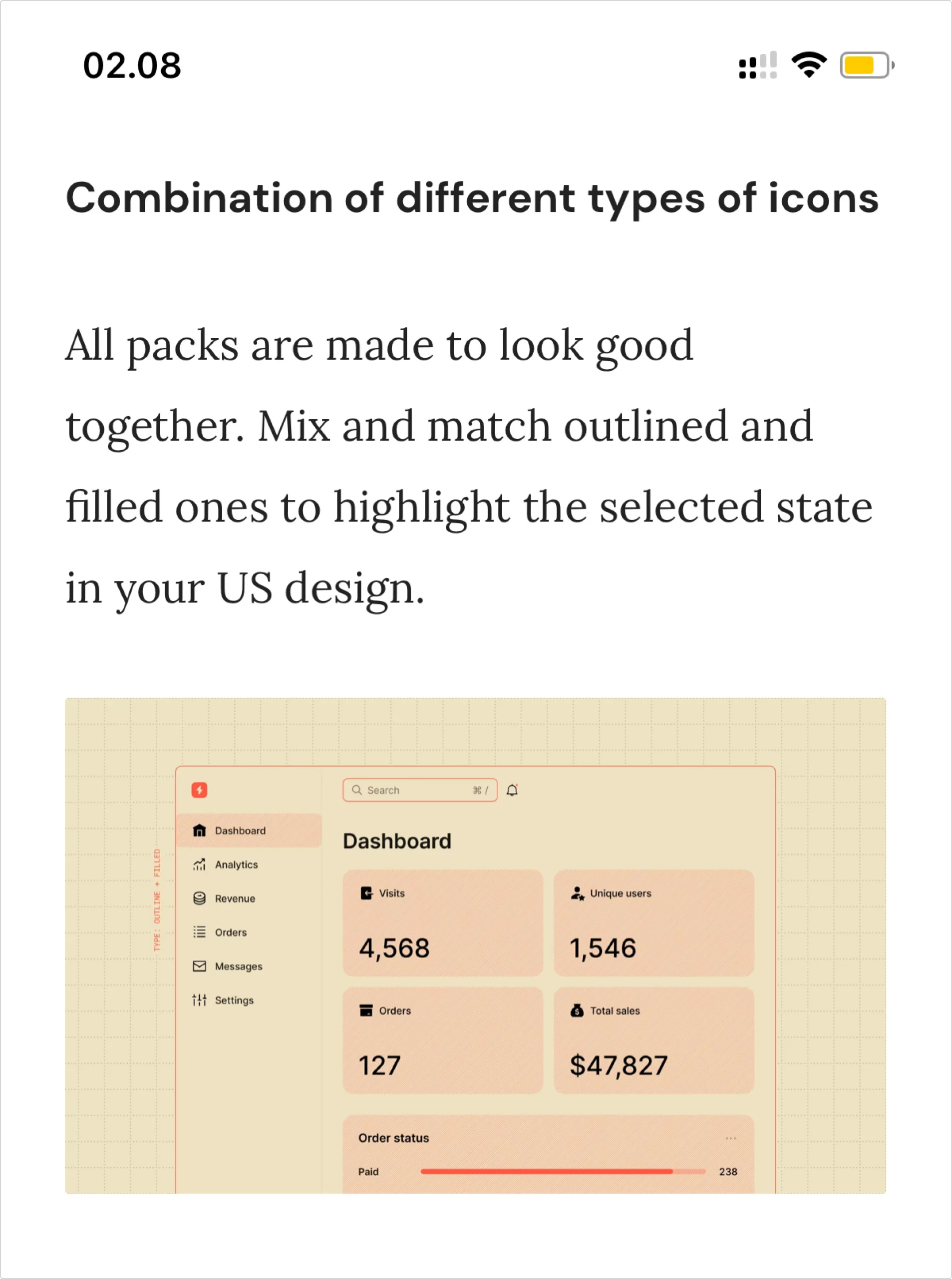
To test this, write a 50-100 words paragraph and preview it on desktop and mobile devices. This will show you if the font shows up a little small and increase it a bit.
To maximize readability for all devices, you can space out text with line breaks and bold the important words. You can also use capital letters and bold font for the section’s headline.
It’s also a good practice to stick with one font and use it everywhere on your site. Because using multiple fonts requires a web browser to download them to highlight them to the users. This process might affect your website’s loading speed. Also, read how to choose the right size and format for icons.
Change your button size
Buttons are primarily used to do something on a website. You can add it on forms, download or checkout pages, dialog boxes, etc.
While adding a button, make sure it looks great on all devices, especially on mobile, since we deal with small screens.
Moreover, the text on a button should be visible immediately. If your visitors don’t understand what’s written on the button, why would they bother clicking on it?
Poorly designed buttons could hurt your conversion rates.
Here is an example of it.
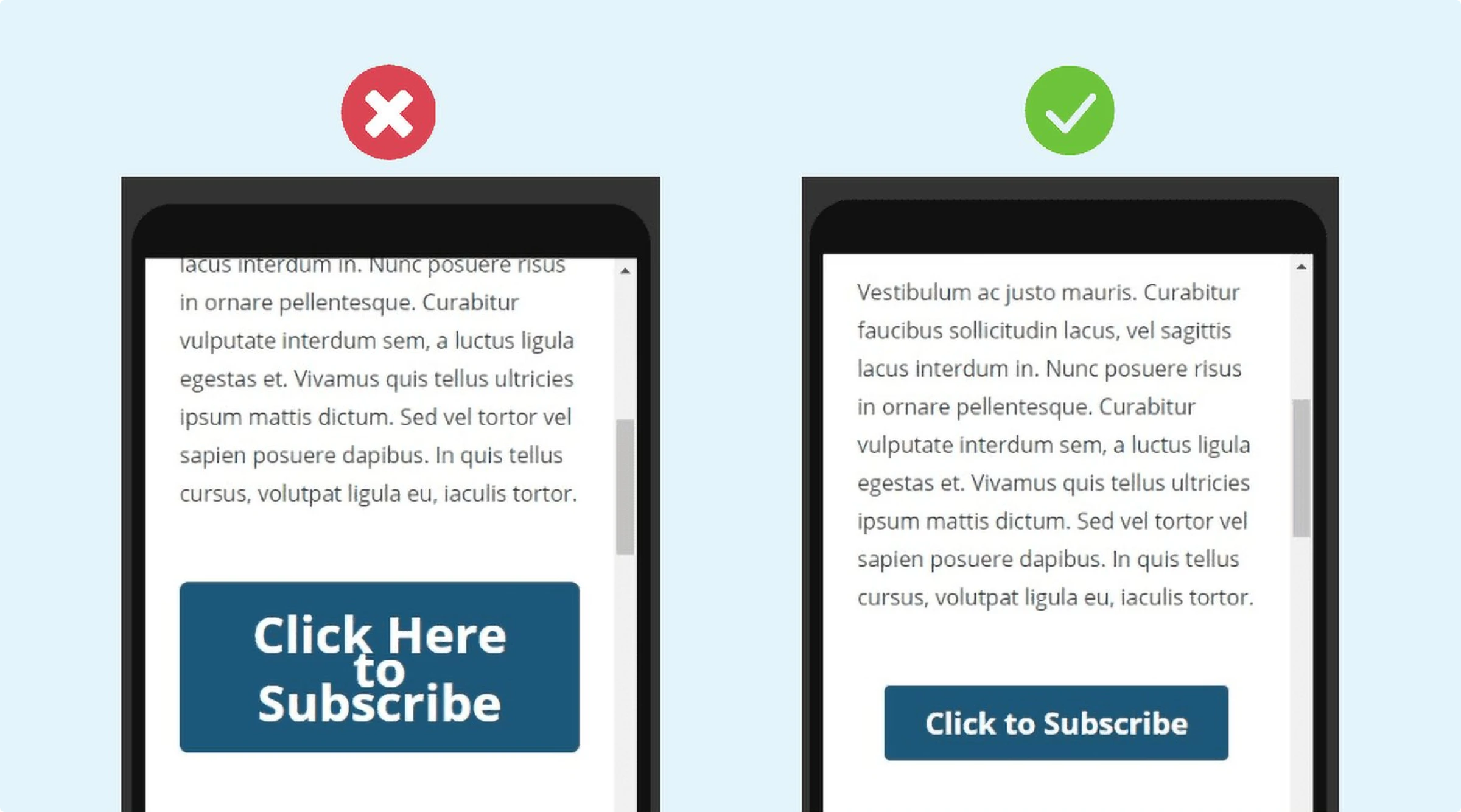
The way you test your font size on mobile, you should do the same with buttons.
Use media queries
Another great way to make your website mobile-friendly is by using media queries.
You don’t need to use media queries if your website is mobile responsive. However, you may need to use media queries if it’s a custom website or page.
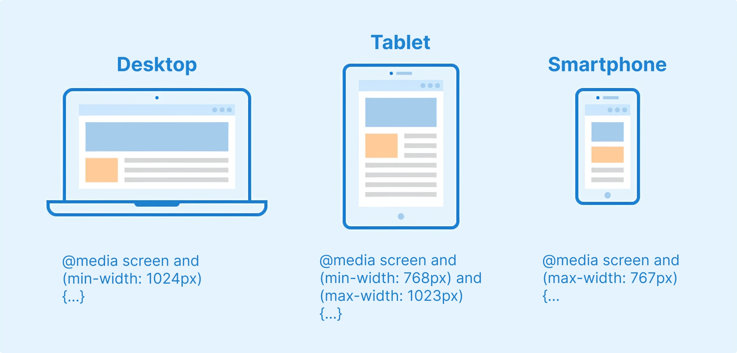
Media queries deliver tailored stylesheets to desktops, laptops, tablets, and mobile phones. In simple words, media queries automatically detect the screen size and display a set of CSS that you have set.
Here’s an example.
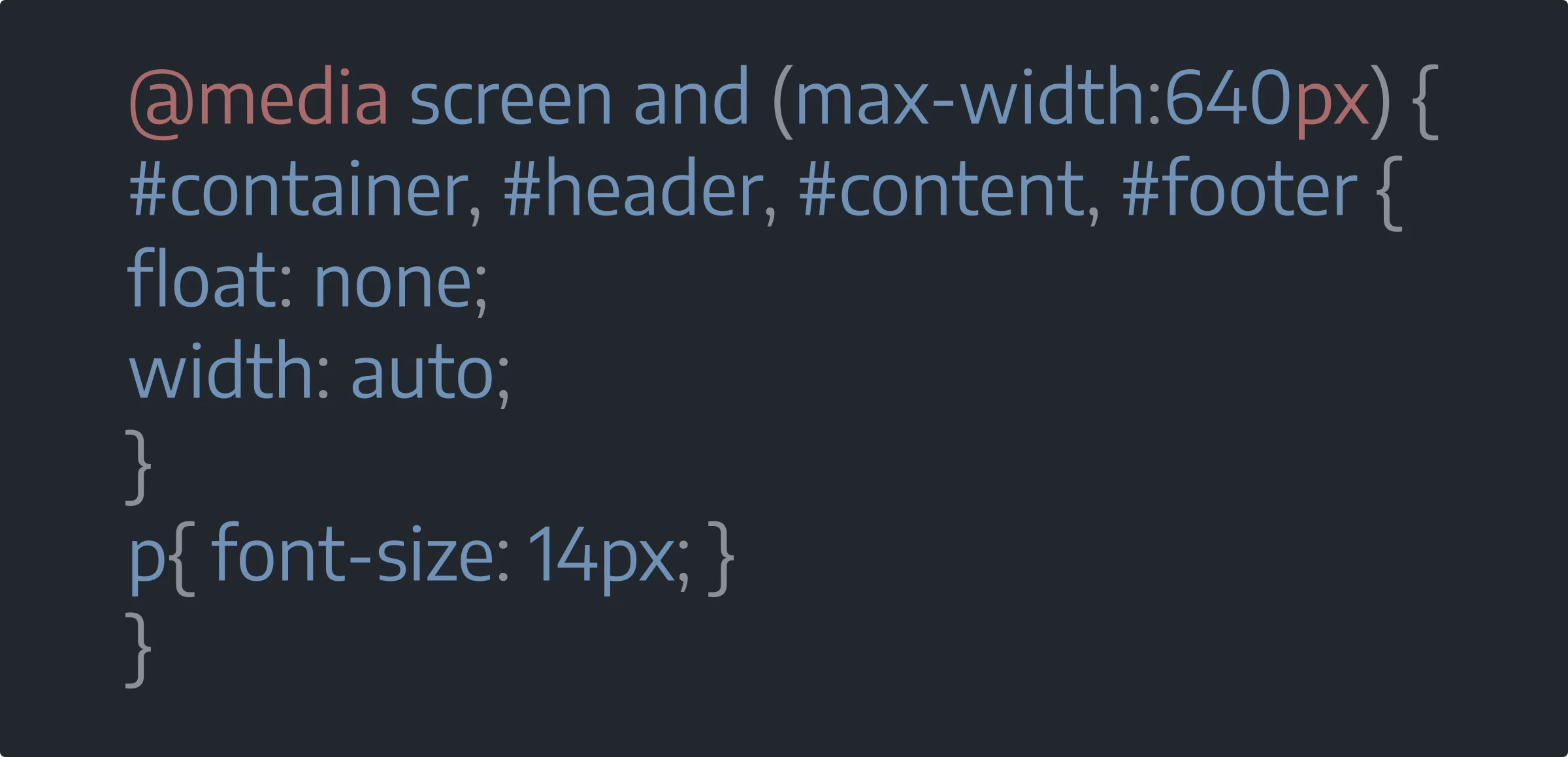
This code tells us that if the screen is less than 640px, all the CSS code inside the media query will apply.
Keep your forms as short as possible
A webform is a great medium for visitors to contact you. We generally use different forms like contact, subscription, and registration forms.
But if you ask your visitors to provide a lot of information, they will probably leave it blank and click away.
It’s easier to navigate and fill out a form on bigger screens. But it’s different on mobile devices. So, you should be well-planned about what you ask on your forms.
For example, you shouldn’t ask for billing details on the registration form.
Test your site regularly
One of the best ways to ensure your website provides a good user experience is to regularly perform tests.
You must test your website on different devices whenever you update or modify your content. So, spend some time on your website and see if there’s anything that needs fixing. Also, you can use Google’s mobile-friendly testing tool, which I mentioned before.
This works well if you are testing one or two pages. But if your website is large, this process may take a long time.
Fortunately, there’s a great way to automate this process and determine which pages are not mobile-optimized.
First, add your website to Google Search Console. Once added, navigate to the Mobile Usability section under “Enhancements.”
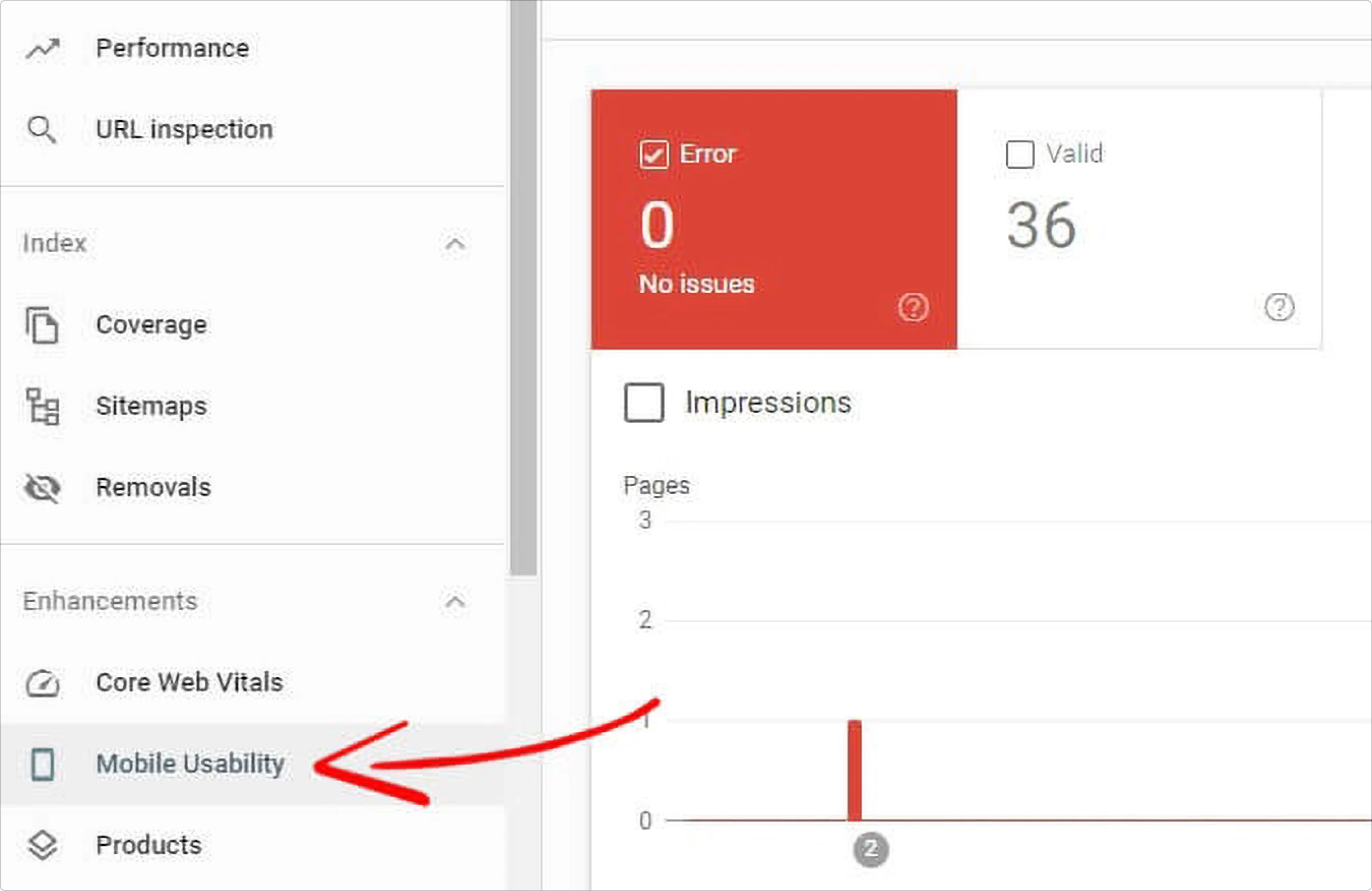
It will show you when Google detects mobile usability issues on your website.
Click on the error types to view which pages have been affected.

Now, all you have to do is fix the issue and click submit for validation.
Conclusion
If you don’t optimize your website for mobile devices, you are losing most of your current traffic. Even search engines like Google don’t prioritize sites not optimized for mobile.
Generally, a desktop screen is generally bigger, so it doesn’t require much optimization.
However, showing all the content properly on smaller screens is difficult and requires additional effort.
In this article, we have shared the top 10 tips for creating a mobile-friendly website. After reading them, all you have to do is implement them. And don’t forget to test your site regularly.
Once you have completed all of these steps, if you still wish to optimize further, you might consider implementing Progressive Web App (PWA), an advanced web technology, to your site. With PWA, your mobile website can have the look and feel of a native mobile application. Also, for Magento merchants, especially those who often have to deal with performance issues, Magento PWA can help improve your mobile page speed dramatically.
About the author: Jyoti Ray is the founder of WPMyWeb.com, which specializes in affiliate marketing, content marketing, and SEO. He writes for or has been featured on JeffBullas, SurveyAnyplace, SearchEngineWatch, and more.