Posters. They follow us pretty much everywhere we go. In our modern society, they’ve become an ordinary part of our surroundings, seamlessly blending in with the environment. And although we may not notice them – if they were to suddenly disappear, the world would certainly become a more empty and unfamiliar place.
Posters definitely liven up our surroundings, but they’re not just there for decoration – and they have a far greater impact on our daily lives and on our thought processes than it may seem at first glance. In this article, we’ll dive into the purpose and history of posters, and the different types of posters that we usually come across, focusing primarily on printed posters. You’ll also find some useful insights on successful poster design, as well as guidelines for making your poster a complete success.
A Brief History of Posters
Although posters seem to be a relatively modern means of advertisement and communication, the earliest forms of the poster date back a few centuries. During the Elizabethan period, text-only posters were used by the monarchy to inform citizens of important developments and laws.
However, it was not until the early 1800’s that the first inklings of the modern poster as we know it emerged. The development of new printing techniques such as lithography in 1796 by Alois Senefelder, which was soon followed by chromolithography, paved the way to faster and easier methods of mass production. Early posters were used mainly for informative purposes, to update the general public on news events, as well advertising items and cultural events such as theater performances and dances, such as the posters below, designed by Henri de Toulouse-Lautrec to publicize the French dancer Jane Avril.
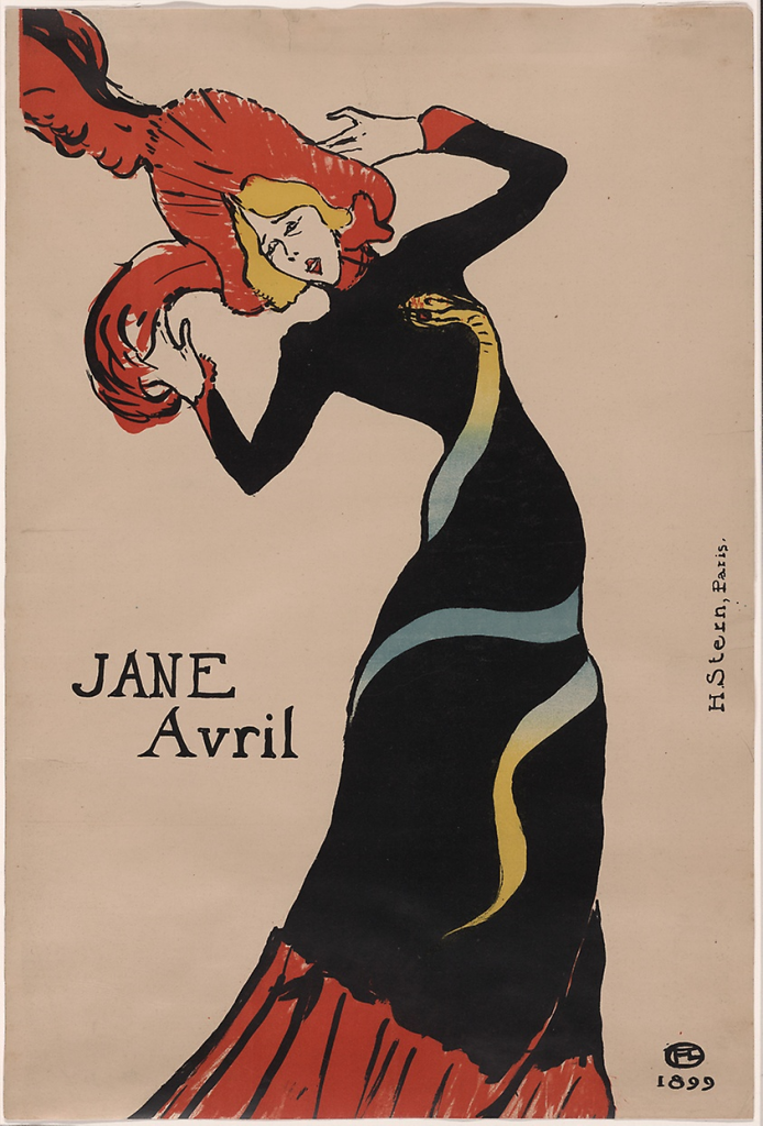
Picture from Art Institute Chicago
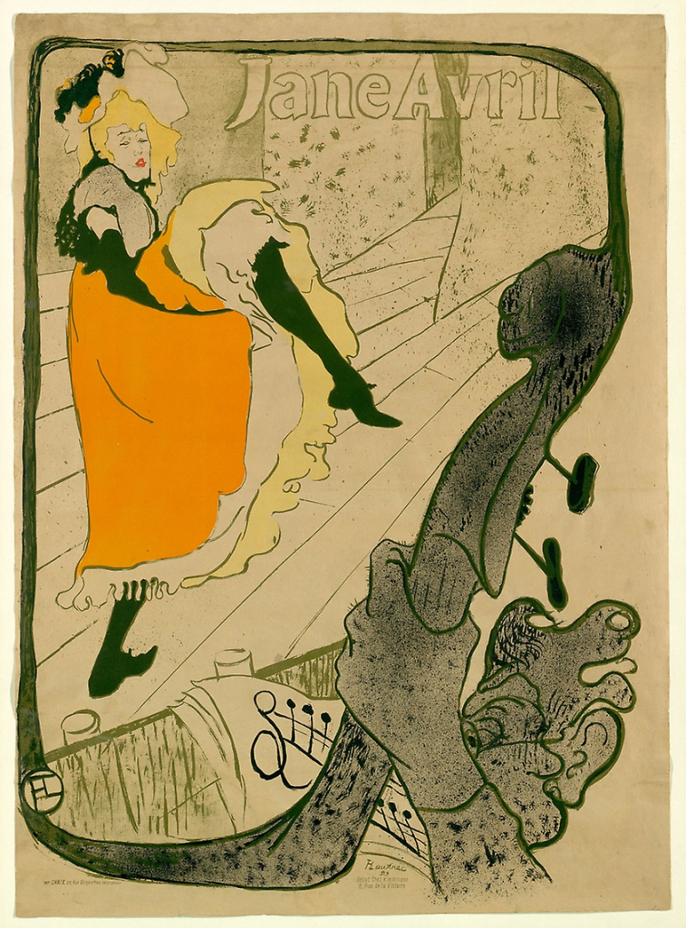
Picture from Art Institute Chicago
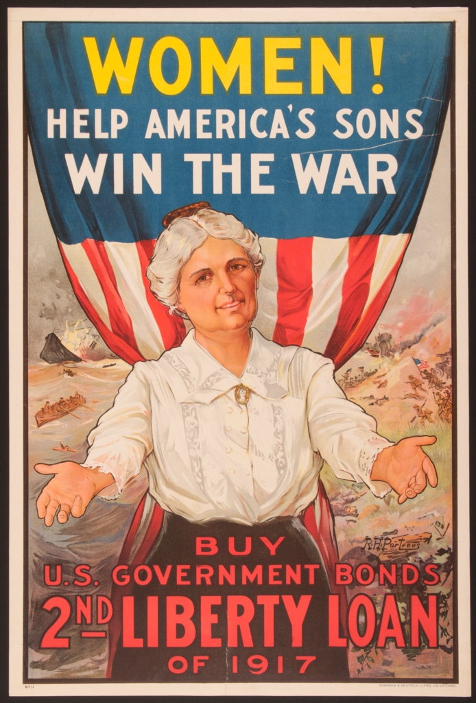
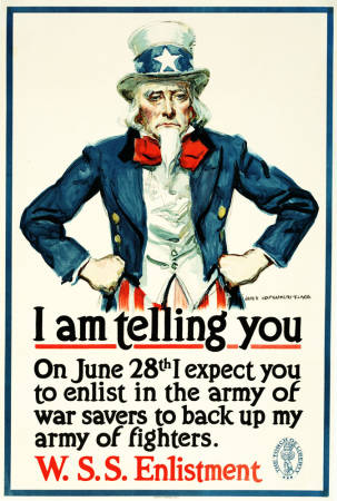
During World War I and II, the poster became a very effective method of political influence and propaganda. Take a look at some of the most famous posters from this period:
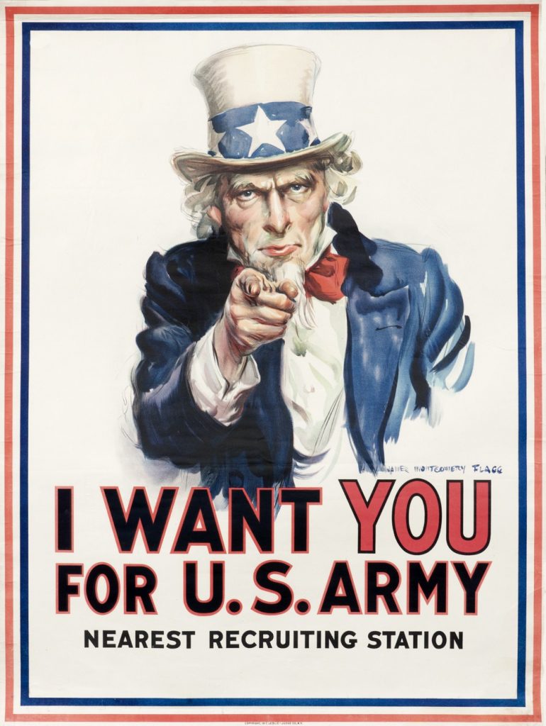
Picture from International Poster Gallery
The posters were designed to inspire a sense of collective patriotism and a call to action.
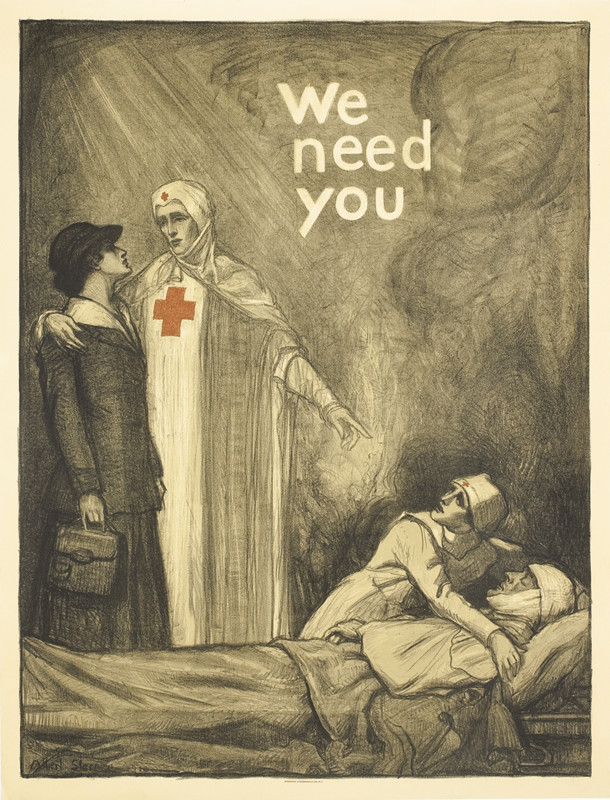
Picture from International Poster Gallery
Picture from Museum of Fine Arts Boston
The language used tended to have a forceful tone and the posters seemed to speak directly to each individual within the masses.
Picture from Pritzker Military Museum & Library
The general trend seems to be that the way posters are used reflects the economical, political and cultural states of the society in which they’re created and utilized. In times of turmoil, such as during the World Wars, posters reflected the overall atmosphere of uncertainty and unease.
Nowadays, with the West being more or less stable and focused on consumerism and enjoyment, posters are mainly used for advertising, selling, and informational and decorative purposes.

Design by Namrata Katiyar
Why Posters Matter
The fact that posters are so ubiquitous suggests that they have a lot of influence and value in our society. Most of the time, we can barely set foot outside of our homes (and even there, we often have decorative posters) before being faced with yet another poster ad. The fact that this is such a widespread means of advertisement suggests that it must be a highly effective one.

Poster design for Bose Frames
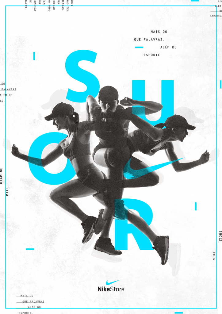
With such an abundance of posters, it may seem as though we have become desensitized to them – most of the time, we do not pay attention to them, accepting them as a natural part of the environment. From simple wispy paper flyers that can often seem like litter on public walls, to huge billboard advertisements – whether we consciously notice them or not, posters have a deep effect on our thinking and behavior. Our subconscious mind picks up far more than we are aware of. So even though you may not feel as though you’ve noticed or remembered the poster ads that you saw yesterday, more likely than not, a sudden “random” urge to get yourself a new pair of Nike shoes is not all that random – and it’s very likely you consciously or subconsciously noticed an awesome Nike poster (or posters) during your daily commute.
Design by Paulo Assunção
Posters are also a very powerful way for brands to establish a presence, allowing them to get maximum exposure and establish a connection with consumers. The more ad campaign posters a brand has, the more familiar it seems, which has a direct effect on our shopping behavior – the brand we’ve been exposed to the most will be the one we try to opt for.
The design of the poster is especially important. You can have the most unusual product and concept, the best wording and slogans, but as the poster is such a visual form of communication, getting the design right is crucial. You have to make sure it’s appealing to your audience, as well as inspiring interest in potential new customers.
So, what exactly makes a good poster, and what do designers need to know?
Poster Design: Key Components of a Successful Poster
Design by Michael Sallit
Keep the focus on key info
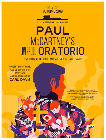
If the poster is an advertisement for an event, highlight the event name, location and date in a way that will help the viewer immediately process the details – for example, by using a large, bold font, and placing the most important info in the center of the poster, as demonstrated by the poster for Paul McCartney’s concert above. You can also use a quirky font to draw in the viewer’s focus, but make sure that it’s easy to read and understand, even from a distance: Krispy Kreme, for example, have used large balloons instead of ordinary text:

Design by MORPHINE Motion Graphics
Notice that the rest of the typography has been kept simple: this eliminates any visual confusion and keeps things well put together, allowing the viewer to process the poster with ease.
Use space wisely
Except for unique one-off cases, don’t place huge chunks of text all over the poster – a passer-by usually does not have the time (or desire) to stop and read paragraphs upon paragraphs worth of text. Generally, don’t aim to use up all of the available space – this will give your poster a neater, less cluttered look.
Furthermore, as mentioned previously, keep the key information, and any images of your product, if you have one, in the center or at the top, where the viewers’ vision will naturally rest when they look at the poster. Draw attention to what’s important with the use of contrasting, bold colors.
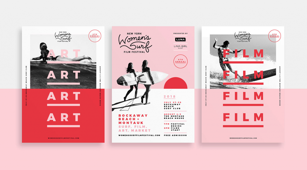
Design by Shanti Sparrow Design
Make the colors pop
Stick to eye-catching colors and images when designing your poster. Use contrast wisely, and test out different color effects. Of course, always prioritize the overall message and mission behind the poster you’re designing, as a bight and fun color scheme won’t work everywhere. For example, it’s not likely to be used in something such as an anti-smoking campaign, where the main idea would be to create a certain negative association to parallel the negative health effects of the habit, thereby creating a serious and sullen mood:
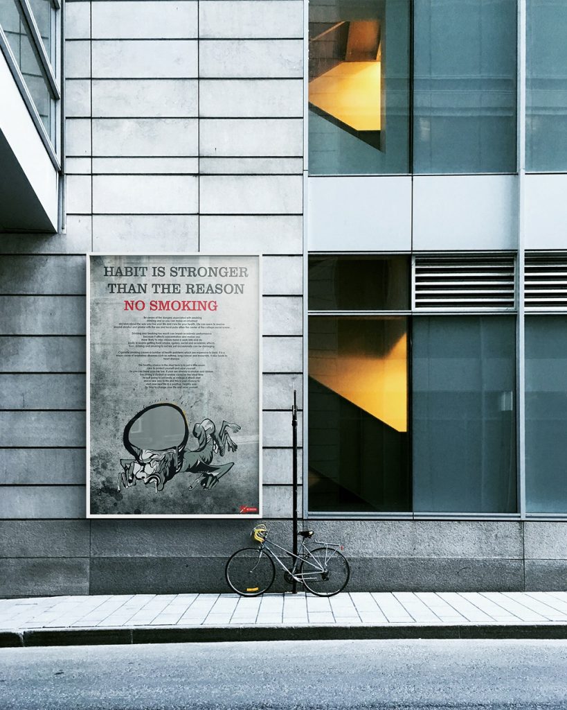
Design by Vinay Gowtham
However, where possible, use colors that will grab visual attention. We are bombarded with so much information from our environment, making it impossible to notice everything in our surroundings. If your poster stands out, you increase the likelihood of it being seen and people interacting with it.

Design by Tarek Abdelkawi
Adapt to your audience
Choose suitable images, colors, and wording for the target audience. Not only should all of these combined reflect the poster’s purpose, but should also speak directly to the target demographic. This is an important point to consider if you are designing marketing or ‘call to action’ poster, as it will essentially be competing against multiple other posters within the same niche – if yours can appeal to the intended audience, it will be the one your customer will actively engage with.
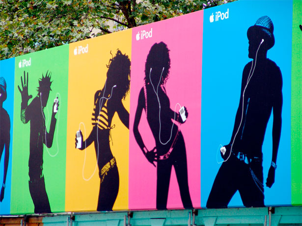
The iconic Apple iPod silhouette ads targeted the younger generation – without any clear, defined features of the models, we can tell that the target market is in their teens to mid-thirties. The ads place a focus on being bold, bright and expressing yourself whilst using the product, which appeals to an audience with this philosophy.
Final Thoughts
Posters have been around for a while – and they’re definitely here to stay. Despite the rapid advancements in technology, with the digital age providing us with new methods of getting information across, posters remain one of the most simple, accessible (and effective!) ways to communicate ideas – whether you’re looking to advertise, inform or inspire a call to action. As long as you design your poster to stand out and target your audience – your poster is destined for success!
About the author: Diana Raz, content writer on technology and design issues
Title image by Andrea Carveni
Dive into history and modern state of stock photography, learn more about branding and brand books and read about laws of visual storytelling