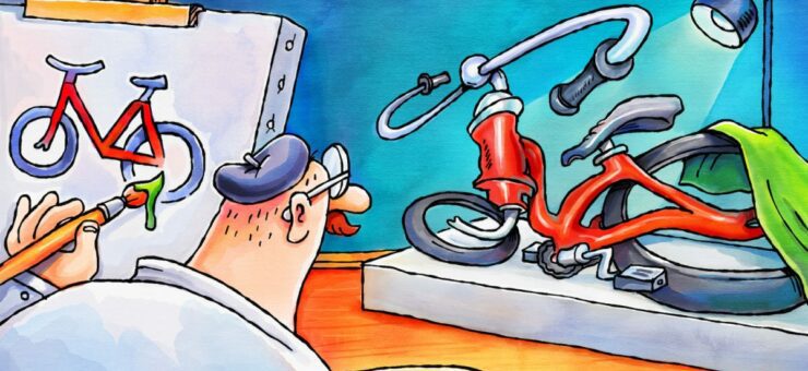
Exploring the impact of photo references on icon design: A $5 challenge with freelancers reveals insightful results.
I found five freelancers on Fiverr, gave each $5, and asked them to draw a bicycle icon. My instructions were vague, but the experiment was to see if I could compensate for them with a thorough photo reference.
Most people can discern a BMX from a racing bike, not only by looking for bruises on their owners’ bodies.
If I give a freelancer only a photo reference and ask him to draw me an icon, will that be enough?
Rules:
- No excessive instructions (color, size, etc.). Only a photo.
- No revisions, except in one very special case.
Note. You can’t ask much for $5, so I’m not going to criticize these works in terms of their design. However, these examples may benefit both designers and employers. Designers will recognize some thought patterns that accompany good design and potential employers may learn the benefit of precise requirements.
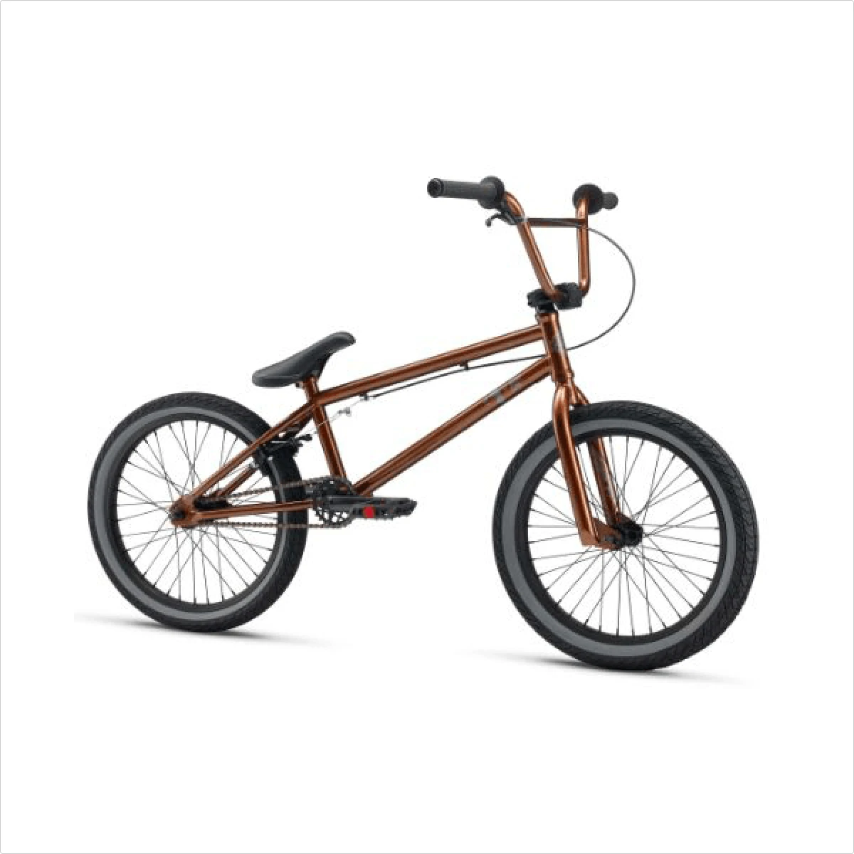
BMX

The designer didn’t use the reference but gave me a common portrayal of a bike—two wheels and an odd frame. Then he played with the handlebars a bit. Instead of one BMX, I got three city bikes. Good deal?
A plus is that the designer tried to make an icon recognizable in small sizes, though I never specified such a requirement.
A BMX bike is all about proportions and its low saddle. Here is an example:
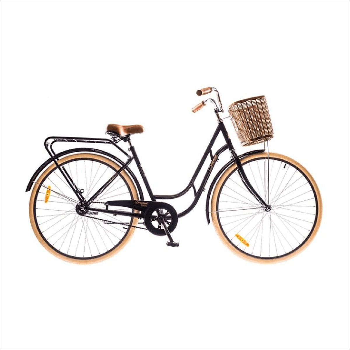
City bike
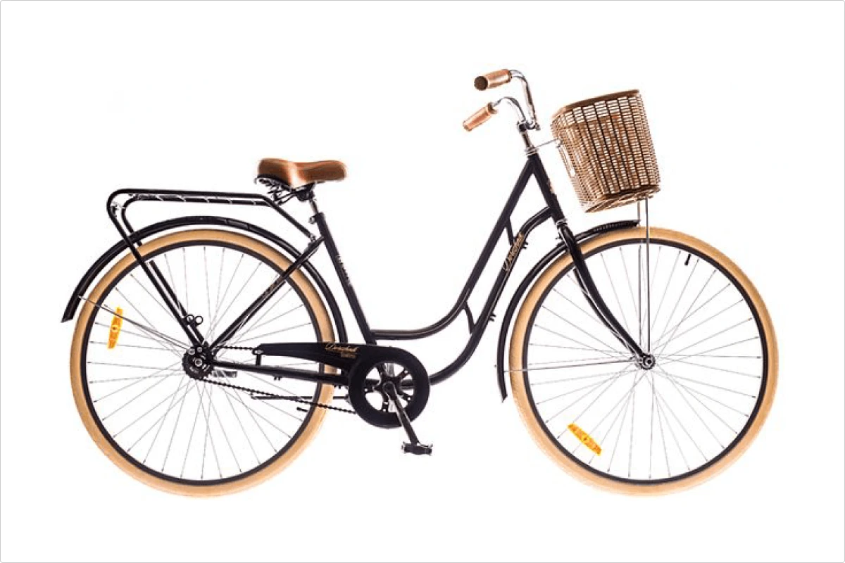
To be honest, the city bike is a lucky ticket for any designer. Tracing the contours gives you a decent result—no traps. Yet, I must mention a few interesting points about this design. The designer left off the carrier and added a lamp… childhood memories, perhaps?
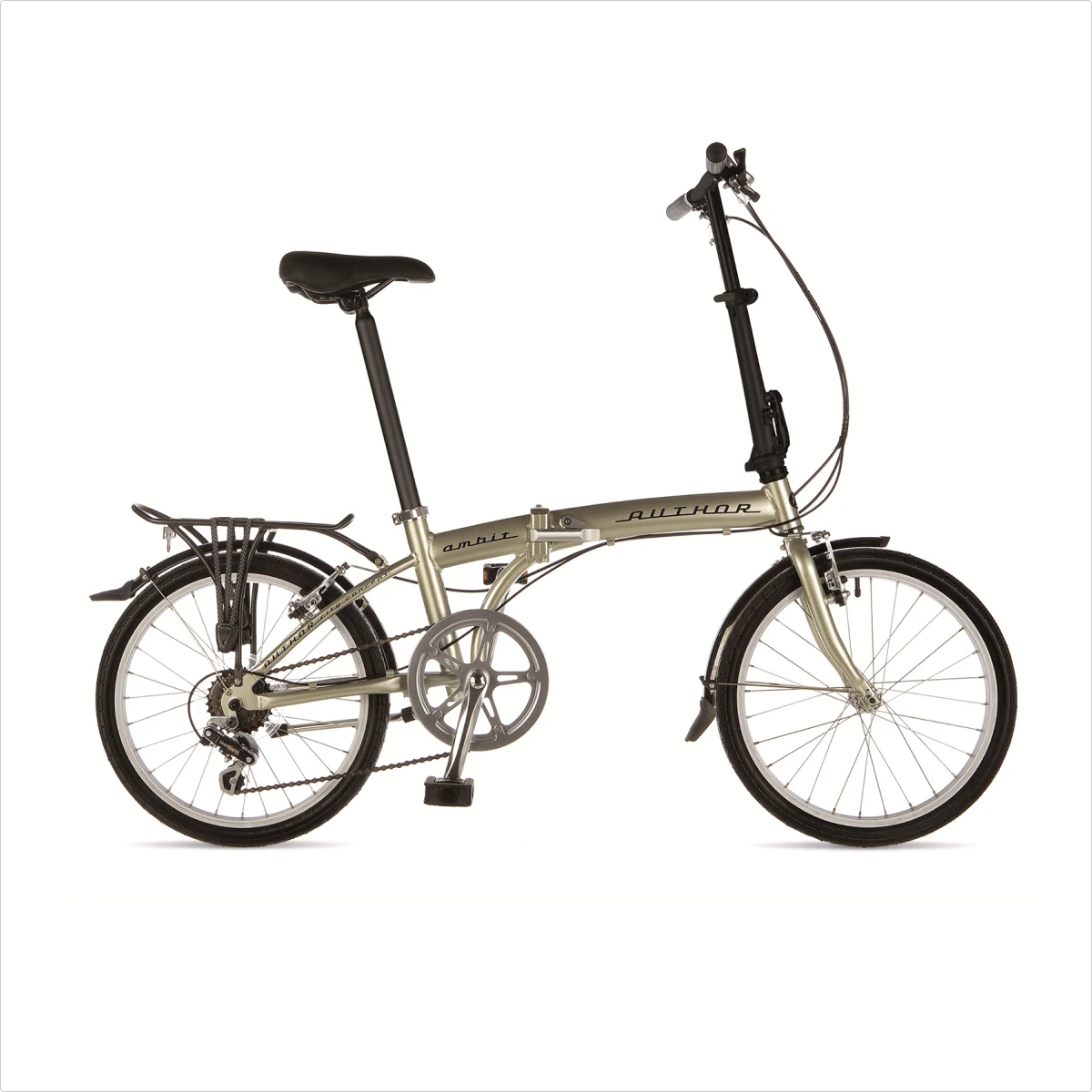
Folding bike
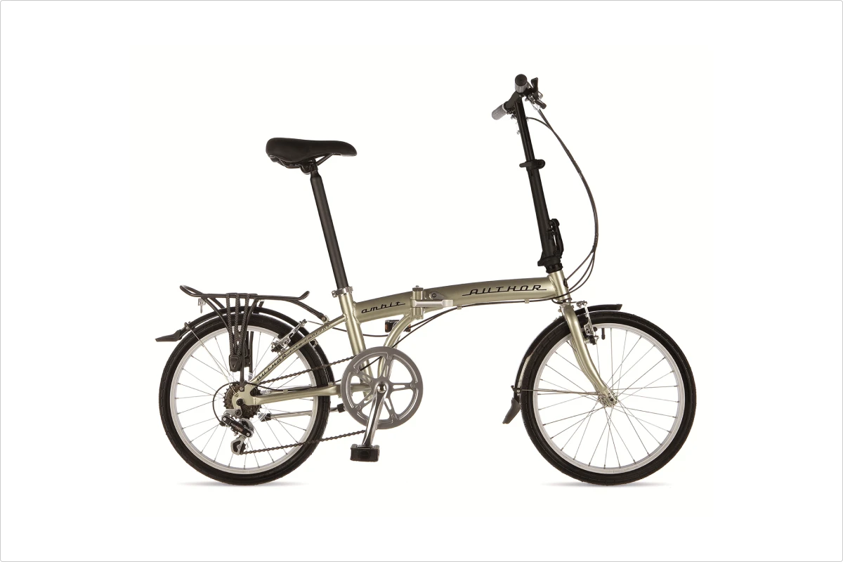
If the city bike is the lucky one, this one is the trickiest. I guess that’s why the guy tried to trick me back by giving me a filtered version of my own photo. So, I asked for a revision and got this:
It’s not just about following a contour or even pure simplification. The most critical detail here is the joint, which we need to exaggerate:
Racing bike
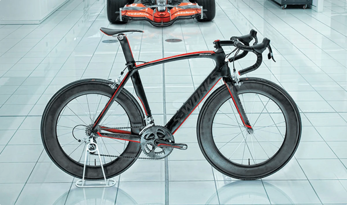
Two critical details are wrong in this design:
The handlebar. A racer has many miles to cover, so attaching a hot spa stone instead of a curved handlebar to his bicycle would be a very sophisticated torture. A curved (or drop) handlebar has many variations, but they all look more or less the same in a simplified version – curved.
The seat of a racing bike is usually higher than the handlebars, allowing a racer to take a more horizontal position while riding. Given that the racer is steering with a hot spa stone and sitting on another one, the whole thing suddenly becomes cruel and possibly even illegal in a few states.
Jokes aside, this is a decent city bike design, but not a racing one. I had to check 3 times if I sent the right reference. Perhaps the guy just sent me one of his old designs and got an easy $5.
Here’s an example:
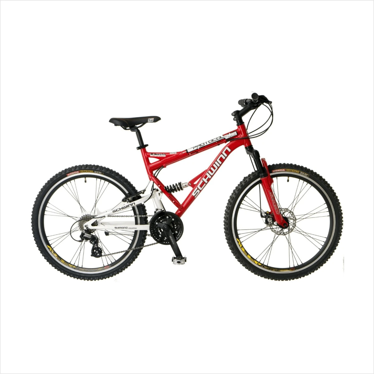
Mountain bike
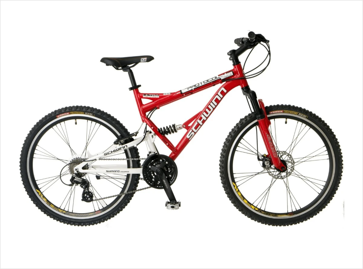
This is a heartwarming design. The designer copied the reference, but look at how he left out unnecessary details, such as cables and spokes, but nailed the most important one for a mountain bike—the suspension.
Yes, not all mountain bikes have such suspension, yet imagine yourself browsing categories on an internet bike shop. This one really conveys the meaning.
The only thing we could do here is to exaggerate the tire tread and the frame width:
It’s not a better version because I like the one I got – it is a colorless version that looks better in very small sizes.
Summary
Some designers were luckier with their references than others. Some designers blindly copied their references, while others tried to create something of their own. I have a feeling a pair of these bicycles came right from an image stock, but that’s what you get for $5.
Final thoughts
The conclusion is quite simple—one photo reference, even a good one, is not enough. If you want a more specific design, ask for it explicitly, ask many questions, and provide many answers. Or be ready to pay more than $5 and let experienced designers do this part of the job for you.
Hope you found this article useful.
You can download a collection of bikes created for this article here.
If you are a traveler, you may like this ironic story: While I Was Redesigning a Boarding Pass, Paper Got Old
Or we can stay on the topic of icons and learn Tips for Using Icons in Your App
About the Author
Andrew is a usability specialist at Icons8. He started his career as a phone support specialist, telling jokes while customers rebooted their computers. Then, he moved to usability testing and occasional writing.