Search Engine Optimization (SEO) is among the essential digital marketing strategies today. Since it depends on constantly changing search engine algorithms, it remains a challenge for many designers. Meanwhile, user experience (UX) designs can substantially assist SEO efforts. This article will explore what SEO metrics a UX designer should focus on and how the two overlap.
First and foremost, let us briefly define what UX design and SEO is. If you are a UX designer or SEO specialist, you can skip this information.
What is UX design?
In essence, it’s the philosophy of designing – websites, in our context – to improve the viewer’s experience. That frequently includes but isn’t limited to ease-of-use, optimal visual stimulation, and plain quality. UX concepts then branch out, from loading speeds and mobile-friendliness to calls to action (CTAs) and URLs.
In more strict terms, Wikipedia defines UX as the “process of supporting user behavior through usability, usefulness, and desirability provided in the interaction with a product.” With this in mind, we may outline the basic principles of UX design as the following:
- Usability: being responsive and easy to navigate
- Usefulness: providing immediate, clear value
- Desirability: inciting engagement and delivering desirable outcomes
What is SEO, and how do the two overlap?
SEO is a digital marketing practice that does what the name suggests. Namely, it optimizes content for search engines, increasing its ranking in search engine results pages (SERPs). In turn, its principles extend to improving user engagement, including content formatting, page responsiveness, and other factors. Enhanced engagement sends search engines the social signals it needs to evaluate content better; hence the mantra “quality is king.”
Then, the two overlap somewhat. Both UX and SEO seek to increase user engagement by offering content value, ease of navigation, and other desirable qualities. Thus, the basics of UX design affect SEO, and vice versa, since they overlap in purpose.
How the basics of UX design affect SEO
To begin exploring this overlap, this SemRush study on ranking factors is an excellent starting point.
Direct website visits aside, which don’t directly hinge on UX principles, the study identifies these three metrics as the most substantive:
- Time on site
- Pages per session
- Bounce rate
These are then followed by referring domains and backlinks, which are more SEO-centric. However, these three metrics can be enhanced or hampered by UX design. And given how significant they all are, they should deserve your attention.
Time on site
After securing visitors to your website, the time they spend on it is a crucial metric. Among the basics of UX design that affect SEO, consider the following 3 to enhance it.
Its influence
In terms of SEO, the time a visitor spends on your website directly correlates to the value your content offers. In terms of UX design, increased time on site attests to your design’s desirability and usefulness.
How to use it
To allow UX to yield better time on page, you may consider three main practices, namely:
- Focus above the fold: ensure usefulness by delivering immediate value
- Reduce clutter: eliminate distractions to enhance usability and desirability
- Match the header title to the SEO title: enhance usefulness by providing viewers they get what they came for
Focus above the fold. While the term is a remnant from when people folded newspapers when reading it, the concept still applies today. Users decide extremely quickly whether your site offers value to them based on your above-the-fold content.
Thus, you should ensure the content you keep above the fold is relevant, valuable, and straightforward.
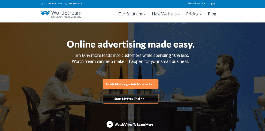
WordStream does this very well. Their NAP information (name, address, and phone) and business type are immediately visible, and you don’t need to scroll down to find them. Their CTAs are clear as day, and there is no clutter to discourage visitors.
Zapier excels at focusing above the fold as well.
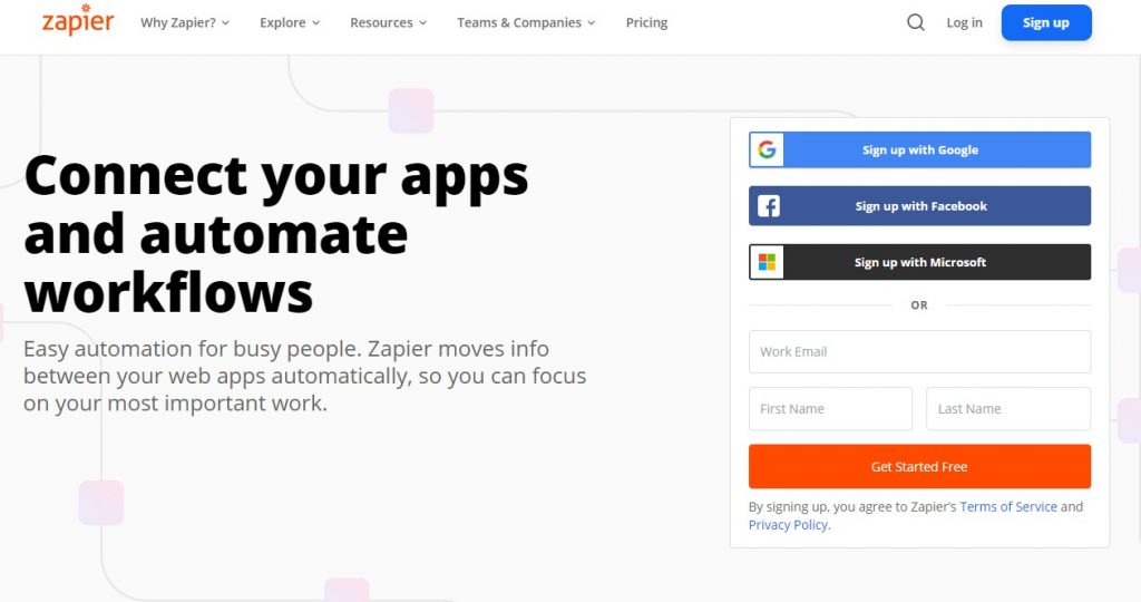
The site immediately gives a brief explanation, visible CTAs, and personal business propositions. It provides multiple sign-up options, from Google to work email, concluding another visible “get started free” CTA.
Reduce clutter. On the subject of clutter, a core principle of UX is to de-clutter your page as much as possible. In this context, “clutter” typically refers to:
- An overabundance of pages not organized under a header
- Busy design elements that don’t add value
- Secondary or irrelevant images, framed text, and other elements
These are undesirable and simple, and it directly follows the concept of above-the-fold content; visitors need immediate value. Sites like the above offer usability and usefulness through a clean design that is easy on the eyes. There, visitors can swiftly focus on their propositions and find what they seek, as there are no distractions from CTAs and main elements.
By contrast, multiple on-page elements like images and framed text are distracting and can dismay visitors. In the case of the main pages, they exhume a lack of professionalism that undermines confidence. In landing pages, they can hamper navigation to CTAs through visual overload, reducing conversion rates. For a rather extreme example, consider the infamous Bellads:

Here, it should be self-evident that this chaotic layout doesn’t inspire confidence or allow easy navigation. For a similar example of visual overload producing a janky UX, consider LingsCars:
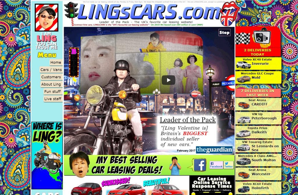
Of course, most websites won’t usually be this cluttered. But still, such layouts will certainly not encourage visitors to stay around and navigate to CTAs.
Match the header title to the SEO title. Another UX factor lies in visible, accurate header titles. Visitors need to know what value they’re getting, and they usually deduce it from titles alone. SEO also benefits from such accuracy, ensuring your header titles match your SEO titles to the letter.
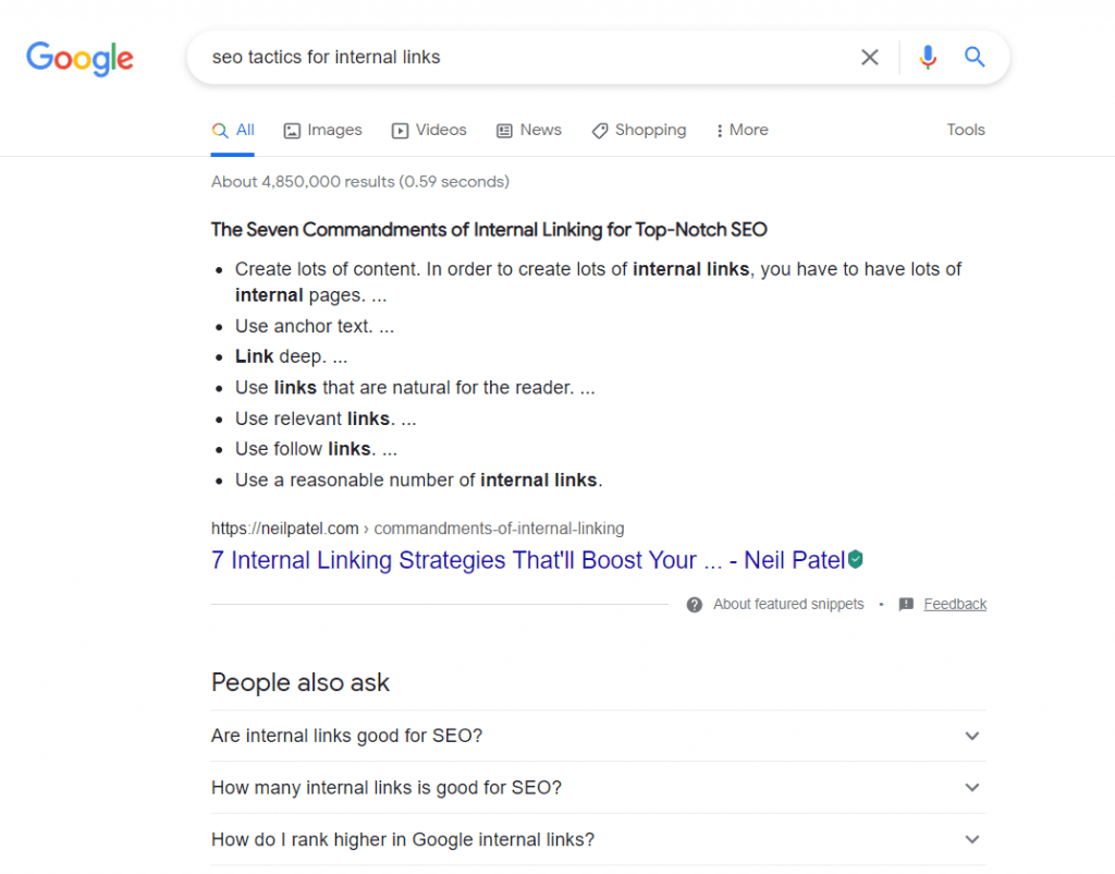
For example, this query considered my search intent and returned Yoast’s page as the second organic result.
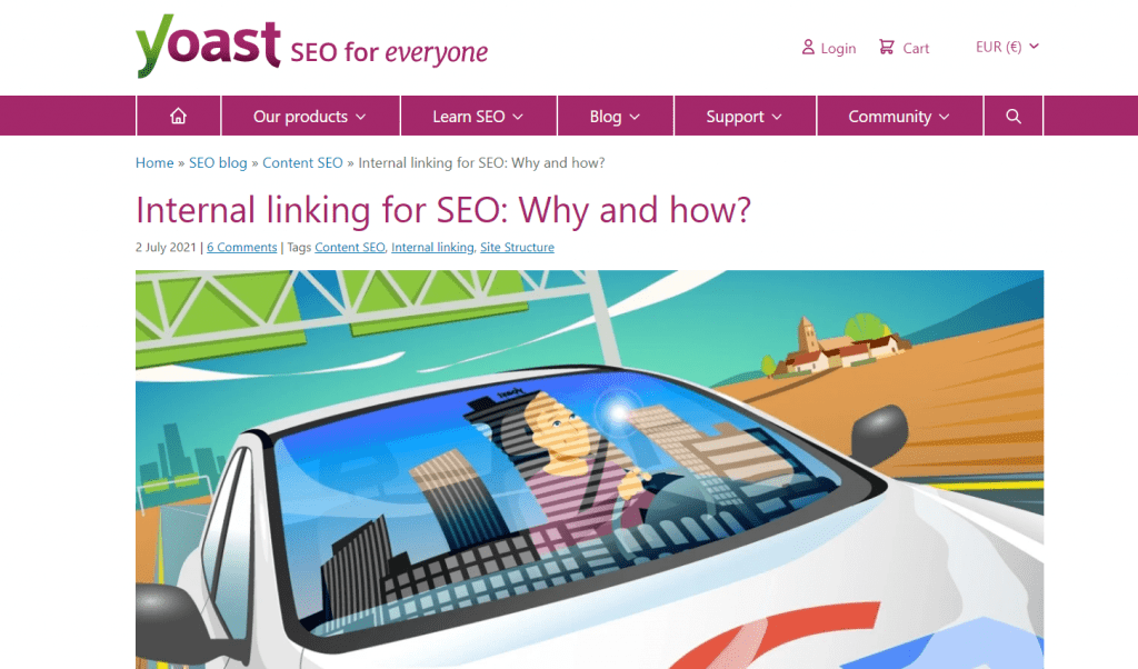
Visiting the page, I find the same title within it. This assures visitors that they’re getting exactly what they clicked for.
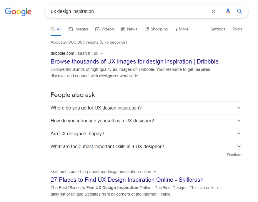
Similarly, this search for UX design inspiration returned multiple valuable organic results. Clicking on Skillcrush’s page, I am greeted by a near-identical title and an inviting visual:

Granted, this example page did replace “27 places” with “the best place,” but it still fully satisfies my search intent. Thus, this is a page I will stay on, despite the slight discrepancy.
Pages per session
Once visitors have found your website, you likely want them to visit multiple pages. This increases the likelihood that they convert and boosts SEO through engagement signals. Thus, this is a crucial SEO metrics a UX designer should focus on.
Its influence
In terms of SEO, pages per session directly increase your visitors’ overall time on site, enhancing your domain authority (DA). Moreover, visiting more pages ensures they see more CTAs, thus increasing the chances they convert. In terms of UX design, pages per session attest to your design’s usability and enhance your visitors’ UX.
How to use it
To invite visitors to navigate more pages per session, you may consider the following:
- Create a user-friendly URL structure and improve navigation: increase your website’s user-friendliness to facilitate easier navigation
- Streamline your header menu: further, enhance your website’s ease of navigation to ensure more desirability
- Use clear CTAs liberally: employ the core tenet of visual appeal to enhance your CTAs, and use them liberally to increase visibility and conversions
Create a user-friendly URL structure and improve navigation. UX hinges on straightforward navigation, and clean interfaces and menus aside, URL structure is essential. Visitors need to identify page content through URLs alone, which is relatively easy to ensure.
For example, this Statista study’s title matches its URL almost to the letter.

The structure is clear as well, without indecipherable symbols in-between words.
Similarly, the title of this statistic by StatCounter also matches its URL.
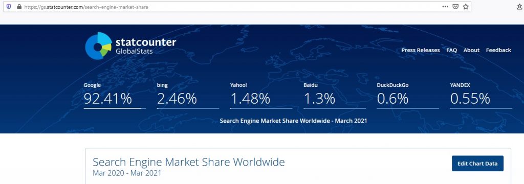
“Worldwide” is the only word that’s missing, and the URL still makes the page content abundantly clear.
Streamline your header menu. Speaking of interfaces and menus, then, your header menu is equally crucial. Visitors won’t navigate to additional pages if they need to dig them out of your website.
Clutch addresses this by using drop-down header menus.

This approach allows visitors to navigate with accuracy without getting lost or relying on search alone.
In much the same way, albeit in a different style, so does WordPress. The header offers many more options, but they’re all clearly labeled and appropriately distanced.

Thus, they convey their purpose immediately and enable visitors to find what they’re looking for quickly.
Use clear CTAs liberally. Finally, convenient navigation improves the odds that your visitors reach your CTAs. Thus, you can use CTAs liberally across your content, ideally starting with your home page.
Ahrefs does this incredibly efficiently; their CTA is prominent, clear, and readable.

It has an approachable tone, uses emojis, includes affiliates, and even discloses pricing. This CTA ticks many UX boxes and can help fuel SEO signals as well.
Neil Patel does so just as efficiently, albeit in a different style.
First, the layout draws attention to the cluster of CTAs. Then, CTAs are clearly defined and distinct in their purpose. Most importantly, they look clickable – an element many unclear CTAs lack.
Bounce rate
Finally, neither time on page nor pages per session will benefit from high bounce rates. Both UX and SEO actively seek to reduce bounce rates as much as possible. Here, among other steps, consider three crucial ones.
Its influence
In SEO, bounce rates directly impact your page authority (PA), as they create negative engagement signals. Moreover, they reduce the chance that a visitor converts and may underline core content shortcomings. In terms of UX design, bounce rates may indicate a failure to project desirability.
How to use it
To address bounce rates, you may consider three crucial practices:
- Increase your website’s loading speed: directly enhance your website’s usability through increased responsiveness
- Ensure mobile-friendliness: further, improve your website’s usability and desirability by catering to mobile users and their UX
- Refine your tone: increase your pages’ desirability by refining your style to better resonate with your audiences
Increase your website’s loading speed. Page loading speed may well be the single deciding factor for many visitors. Most visitors expect loading speeds of 3 seconds or less, and each additional second increases bounce rates massively. Luckily, Google’s PageSpeed Insights can evaluate your site for you.
After using it, you can use standard on-page SEO practices, such as image compression, to address those insights.
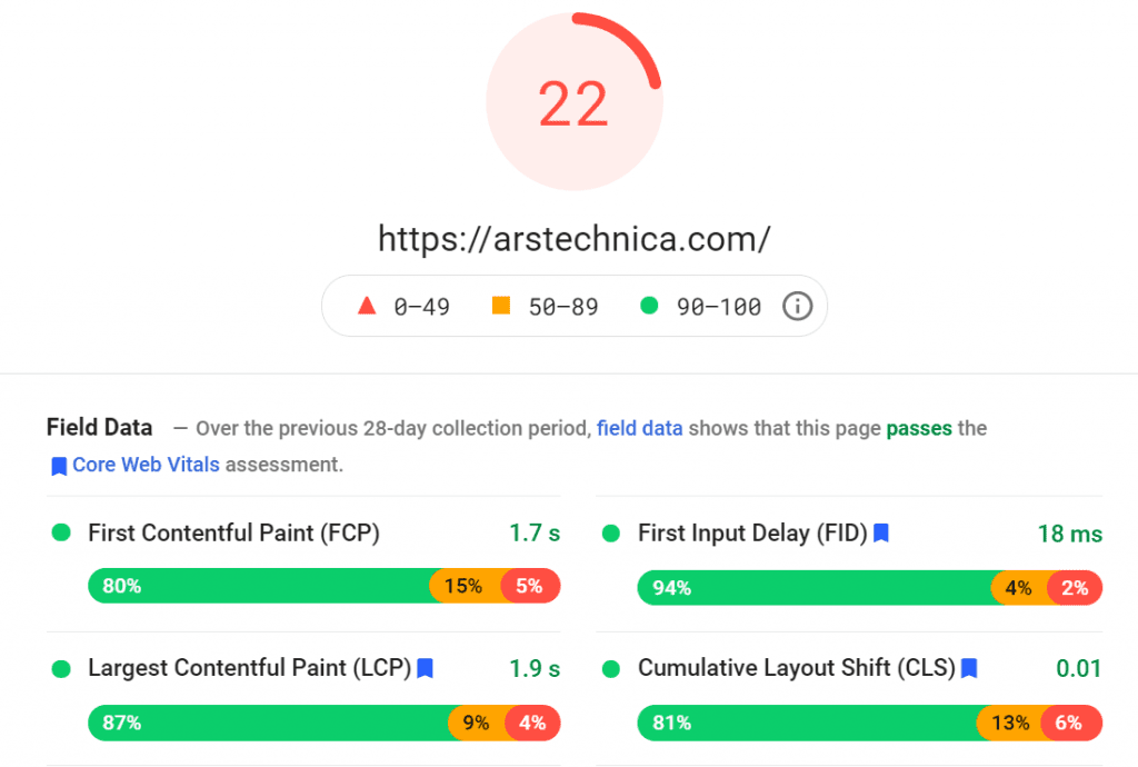
Consider, however, how deeper insights are essential to making changes by comparing that score of ArsTechnica to this of Steam’s store:
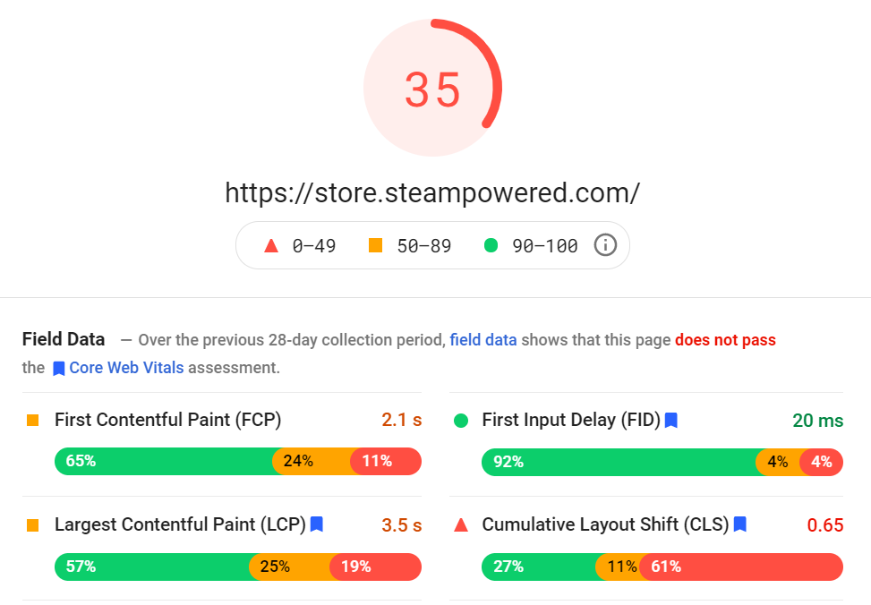
At a glance, the former may seem to be better across the board. Indeed, between the two, only it passes the Core Web Vitals assessment. However, the latter has the better score – by a factor of nearly x2, no less. Thus, before making sweeping design changes, it is highly advisable that you look deeper than the basic metrics presented.
Ensure mobile-friendliness
Similarly, UX hinges on mobile-friendliness. SEO does so, too; over 50% of all incoming traffic is from mobile devices.
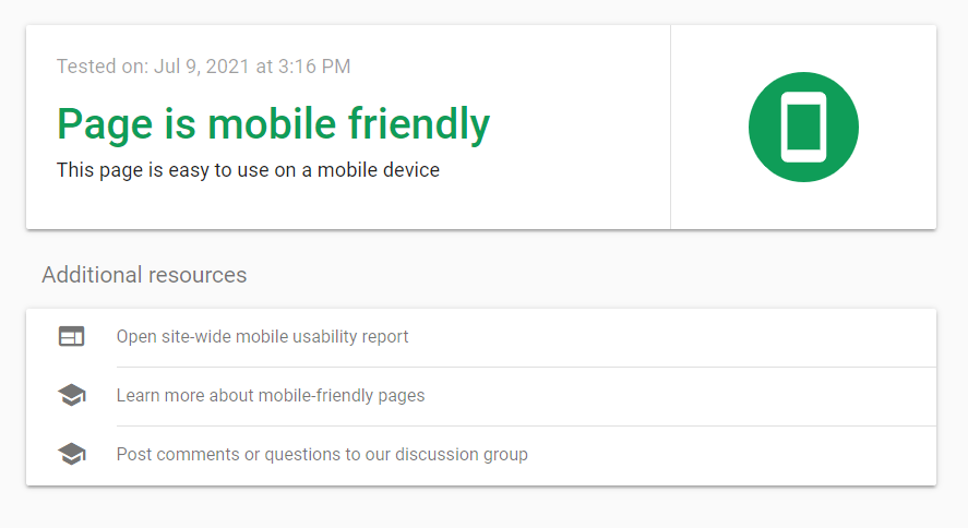
Fortunately, Google offers a mobile-friendliness test.
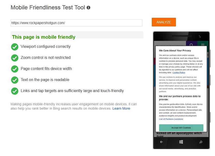
For more insights, Bing also offers a mobile-friendliness test you may consider.
Among other practices, a user-friendly UI, a clean structure, and fast loading speeds will all ensure your UX design visibly affects your SEO.
Refine your tone. Finally, your tone across content can directly affect your bounce rates. While your tone is more of an SEO concern for content creation, it too overlaps with UX.
For example, OptinMonster adopts a humorous, endearing tone for its exit-intent popup – accompanied by a cute visual.
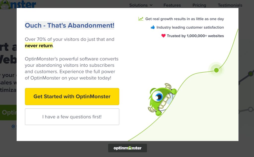
At the same time, it presents a stat on bounces and a final CTA to entice leaving visitors.
Backlinko employs similarly friendly and human yet rather assertive language to preamble some articles.

This augments engagement while also blending copywriting techniques with eye-catching yet simple visuals.
While either of these tones may not fit all industries, a robotic tone is demonstrably ineffective for engagement. As such, you may refine your industry-fitting tone across content, popups, and CTAs for maximum benefit.
About the author: Alexander Elsis is a NY-based freelance web designer and copywriter. He frequently contributes blog content to Digital Dot New York and similar agencies, where he discusses the intricacies of modern SEO and digital marketing.