We’ve been doing some experimenting and usability testing to try and find the best Sign Up UI. Here are some insights that cost us several hundreds of dollars and a couple of weeks of our time.
The simpler the better? Only up to a certain point
We probably made our sign up too simple, so users thought it was a login form:
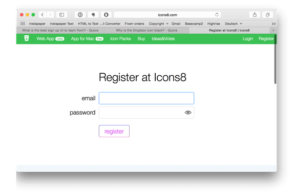
We had to add an optional name field. We don’t use it much on our website, but it solved the problem. The form doesn’t look like a login anymore.
Don’t display password by default
It’s not what Luke Wroblewski and Jakob Nielsen suggest. We followed their advice and discovered that some users flinch when they start typing the password in plain text.
There are two ways to explain it:
- Users think they are filling in the wrong field
- Users are surprised to see something as intimate as their password in the open, similar to their reaction when porn suddenly pops up on a public screen.
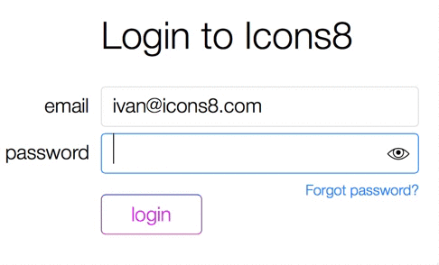
Solution: a button to show the password worked just fine.
Not using OAuth authorization as a primary method
When we started, we decided that Facebook would be the most convenient way to signup. Although we were planning to add other methods later, we had a series of usability studies run on a prototype that only had Facebook authorization.
It appeared to be the dumbest UI decision ever and we ran into all kinds of problems:
- A lot of people don’t have Facebook
- Some people don’t want to disclose their private Facebook account
- Facebook may be blocked at work
- Some people want to share their Icons8 account with team members, but obviously don’t share Facebook accounts
- Some people accessing the service get logged in for the first time on Facebook from a work computer and must go through an extensive security check (“What’s the name of your first pet?”)
- We’ve seen a lot of unexplainable bugs like redirects leading to nowhere and internal server errors — I believe some of them are our fault, some of them are due to Facebook, and some of them from infrastructure such as filtering proxies
We saw a user struggle to login with Facebook for 8 minutes; after failing to do so, she got so upset that she refused to continue the usability test.
Don’t force users to confirm their email
Although some security experts and anti-spam activists wouldn’t agree, I believe we should view these as the developer’s problems, not the users’ — we shouldn’t make our problems their problems.
- Checking email breaks the flow: users have to switch from browsing to email and back. They could get distracted during that time by checking their email and abandon the task completely. Although that has never happened during our usability tests, you can see how users focus on their new messages for a moment, resisting the urge to read while being observed
- Users provide valid emails anyway because it’s such a common practice to ask for confirmation. Plus, a disposable email can still be valid. It’s a rare case when you can break the pattern and benefit rather than confuse the user
If you absolutely need to confirm email, make sure users can continue to use the website and confirm their email later, for example within 48 hours. This way they aren’t distracted from browsing and can confirm their account when they read their email. To avoid disposables or spammy leads from signing up, you can integrate your form with a real-time email validation tool instead of forcing users to confirming their emails first.
Don’t generate a password for the user
Our purchase process doesn’t require registration; after the purchase, we do the following:
- We generate a password
- Show it in the interface
- Email it to the customer
It’s a source of problems that appear both in our usability testing and from the experience of our support.
- Users tend to ignore the generated password after the purchase. People don’t focus on the confirmation screen after the purchase at all; they figure that if the credit card was processed successfully, that’s it
- It breaks the password generating routine that users have. Some users have the same password on many websites, so next time they come they try their usual passwords. Some users use 1Password to generate and store passwords. Either way, pre-generated passwords break the flow
- While we provide our password in email, it’s a bad solution. As said before, checking the password in email breaks the flow: users have to switch from browsing to email and back. They could get distracted during that time checking other email and abandon the task completely
The solution is to ask the user to enter a password after signup. It could be a page with a single field.
Conclusion
So these were the hidden rocks we found while playing with our sign up forms. I hope you’ll be able to apply some of our practical conclusions to your projects.
Countless Sign-Up forms are not the only asset we created during our 5 years journey. What Can You Learn From People Who Drew 30,000 Icons?
If you’d rather focus on one thing at a time, take a look at this Button That Fooled Them All
About the Author: Ivan Boyko is a founder of Icons8. He got his first job after drawing a banner with CTR of 43%. After years of creating icons, he specializes in rapid prototyping and backlog grooming.