


If you have spent some time working in the web designing field, you might have heard that it is important to keep everything above the fold at one point or another. Although many will argue that the concept of keeping everything above the fold is outdated, it still remains an integral part of website design. It might not be as consequential as it was once, but it still requires consideration for all the websites that aim at looking presentable to provide an engaging experience to its visitors.
So, what exactly does “the fold” mean? How important is it and should you be worried about it web designing?
The History Behind the FOLD
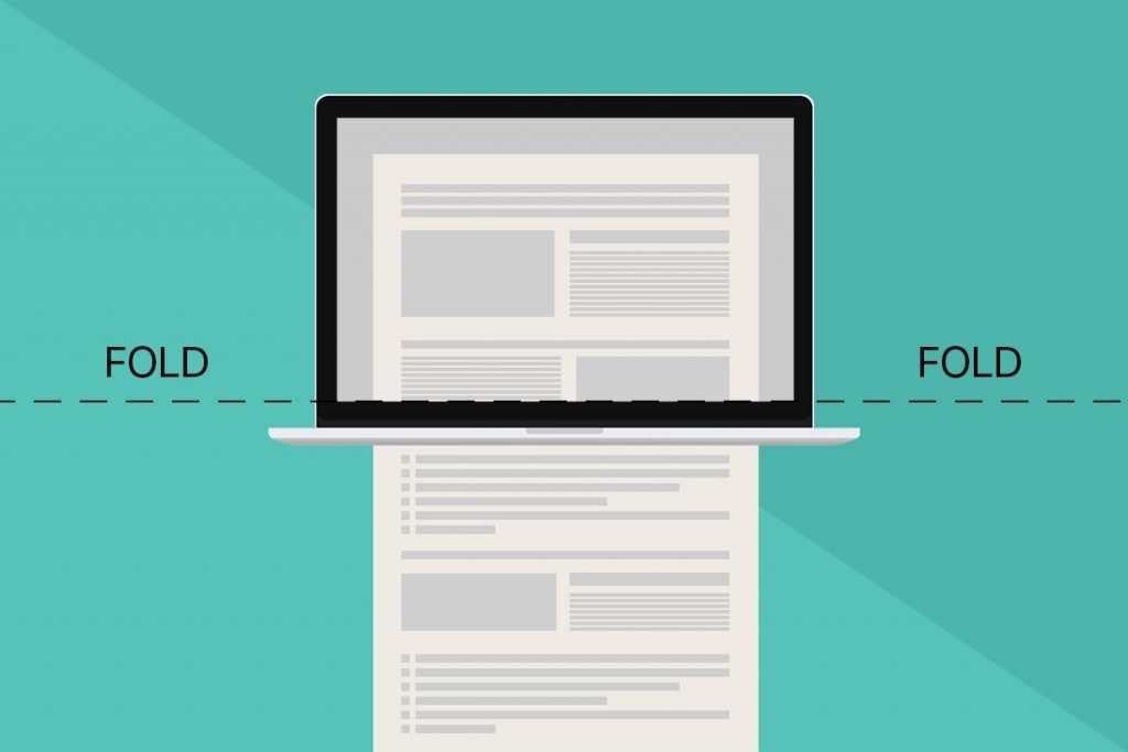
The concept of the fold originated from the newspaper era. The newspapers are printed on large sheets of paper and are folded once they hit the stands. This leads to only the top half of the paper visible to the onlookers.
This notion made the newspaper industry believe that to attract the audience, they must add catchy headlines and attention-grabbing content and images on the top half of the page. The same principle is applicable to digital content. However, the only difference is that unlike newspapers, the websites do not have any physical fold. The fold, in this case, means the scrollbar.
Anything above the scroll is referred to as above the fold.
The things that are visible immediately without scrolling the website are considered as the above the fold. Anything that requires scrolling is considered to be below the fold.
Why Is Above the Fold Important?
The content placed above the fold is what is first visible to the visitors when they will load the page. And since the visibility of above the fold content is high, it is a good practice to keep the content that is crucial for achieving the business goals there. Apart from this, it is also considered an important factor in SEO.
What to Keep in Mind on Above the Fold Content
Although above the fold is the real estate of a website, there are certain things a web designer needs to consider while designing its content and looks.
Focus on usability
The fold is an important guiding design principle. So, make sure that creating a website you design for above the fold such that it focuses on the usability of the website. The content needs to be attention-grabbing, convincing and encouraging the users to continue exploring the website further by scrolling or clicking on what you provide them. It needs to be relevant and appeal to the users that they are in the right place.

This above the fold concept by SnackNation clearly states that the website is about getting delicious snacks for your office. Besides that, there is also a call-to-action button of ‘Try it Free’ where the user can enter the work email to get a free sample box from SnackNation. Both the content and the call-to-action button are quite attention-grabbing making the visitors curious to browse through the rest of the website.
Don’t cram content above the fold
As said above, all the important images, messages, and content should be above the fold. But while doing this, ensure that you balance this concept with the principles of usability and don’t just jam every piece of content above the fold. This will do more harm to your website than good.
For example, your website has a message showing “Want to know more?” and below that, there is a large button saying “Learn more”. This makes it clear to the user that if he/she wants to have more information they need to click on the “Learn more” button. Now, consider a case where you have around 4-5 such messages in the same space. Your visitors will be confused as on which button they should click. So, don’t cram all of your content above the fold. Group it into manageable chunks and spread them out with proper hierarchy and white space.
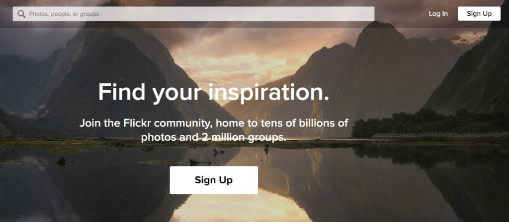
A very simple yet classy design concept by Flickr. It conveys all what it delivers to the visitors without cramming too much content above the fold maintaining an equal balance of content and space.
Go storytelling way
The content kept above the fold should be a preview of the information provided in the rest of the page. It should be such that the visitors will be encouraged to scroll down for more information and explore the life below the fold.
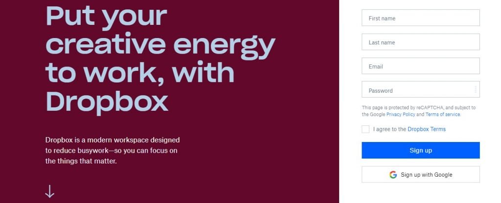
This design by Dropbox is the perfect example of the storytelling concept. In the above the fold design, with eye-catching font and colors, it tells the users what the website is about along with an arrow pointing downwards to indicate the users that they can get more information by scrolling down. Moreover, a sign-up form is also provided for the users that are ready to sing-up at once.
Quality above quantity
Always focus on the quality of the content you have above the fold. Ensure that your content is precise and inviting to the users. For example, take a look at the landing page of Trello. It has a minimal design using decent colors, a precise message conveying what it does and an inviting call-to-action button of sign-up.

How to Find the Fold?
With the advancements in responsive web designing, the folds for different sizes of devices is almost the same. As per Optimizely, an average fold line that all the web designers have agreed upon is at approximately 1000 pixels wide and 600 pixels tall. This is the best scenario where the screen resolution is 1024*786 pixels, with browser window maximized and no installed toolbars.
There are many online tools to determine this fold, one of them is a heatmap. Heatmap collects data from real-time users about how they interact with the website and display the results using different colors like dark red showcasing the frequently used part of the page, yellow for the medium used parts and light green for the least used sections.
There are many types of heatmaps available for websites. Scroll heatmap is the one that lets you determine the fold of your website. It tracks how far the visitor scrolls down your page. You can get an idea of where your visitors are spending most of their time and from where they start scrolling. This will tell you where is the fold of your page.
Conclusion
The concept of the fold can never disappear, however, it can be certainly bent. By striking a proper balance between the concept of fold and usability and placing only the most important things above the fold, you can provide an attractive yet engaging and inviting web design.
About the Author: Bhavin Tanti is the CEO at Brevity Software Solutions, a leading mobile app development company in India. Apart from this, he also loves to write on mobile app development, SEO, web design and development.
Title image from Pablo set of vector illustrations on Ouch
Read how to use icons on landing pages, how UX builds trust and loyalty for your website and how to cope with banner blindness