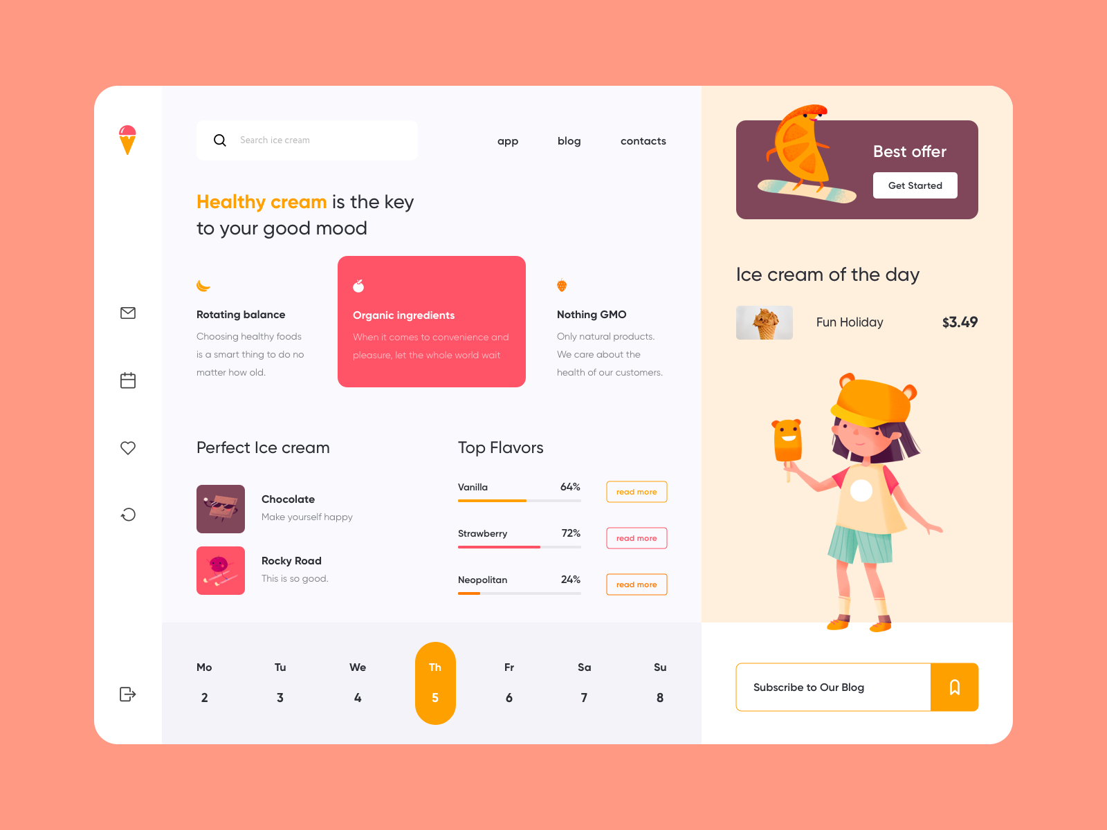
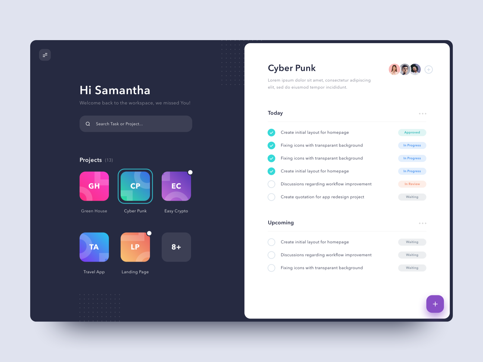
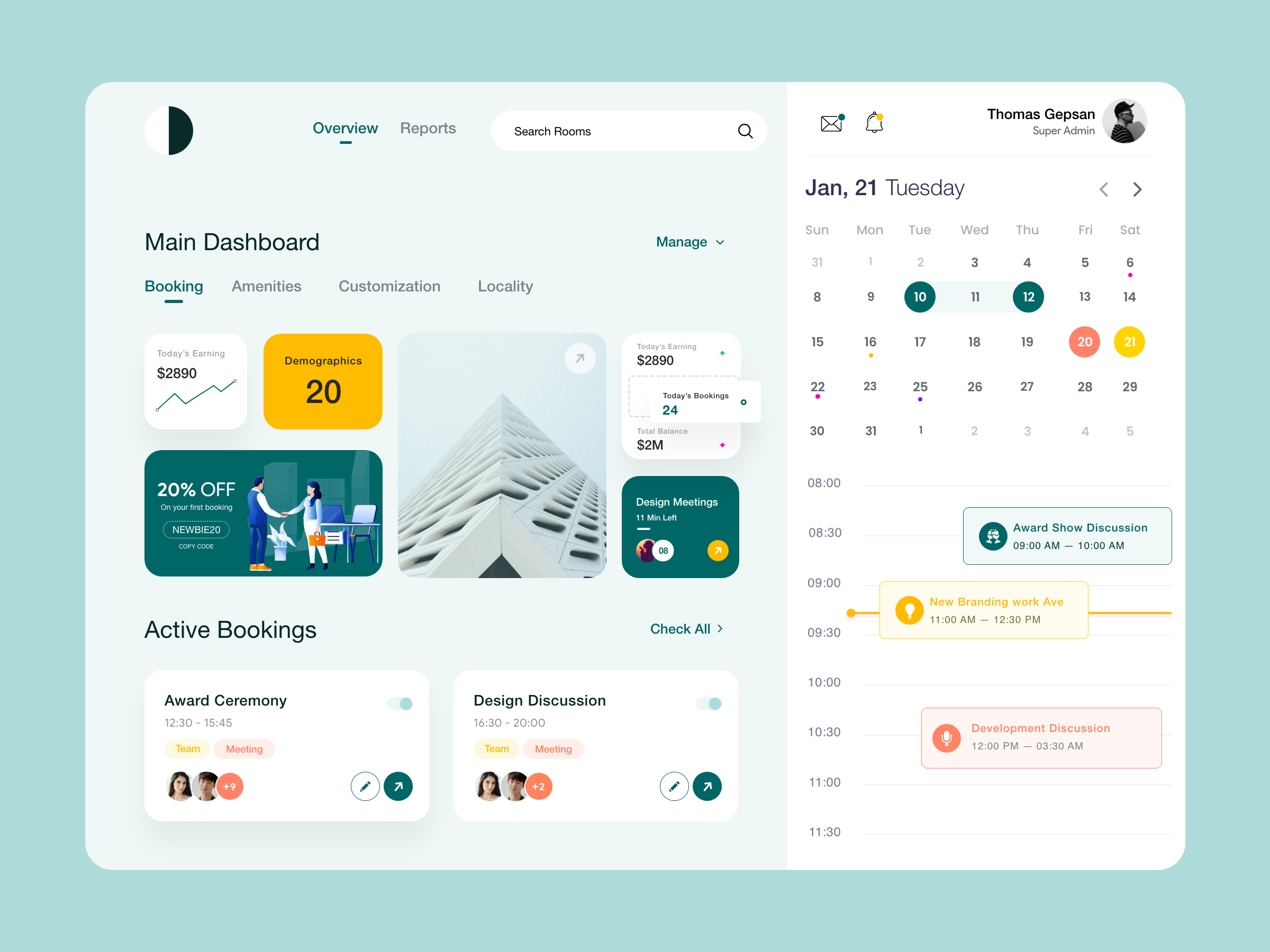
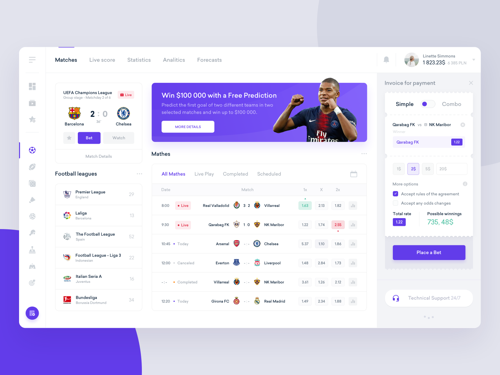
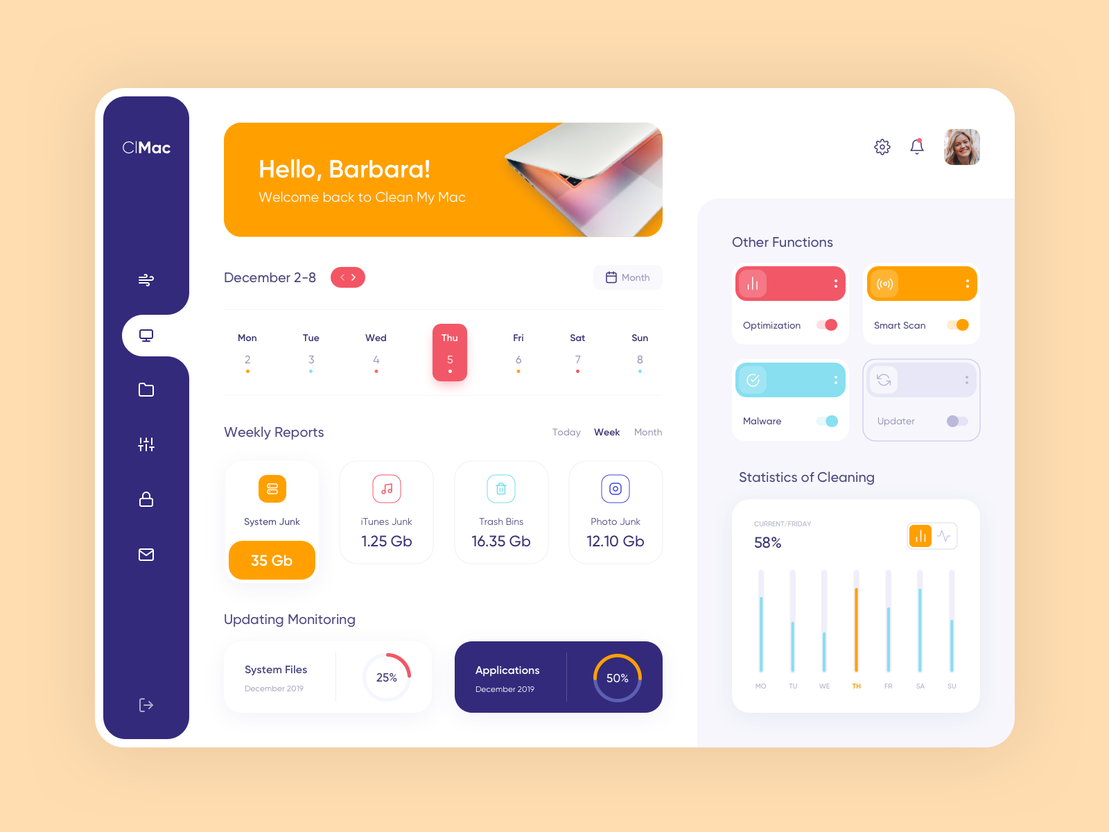
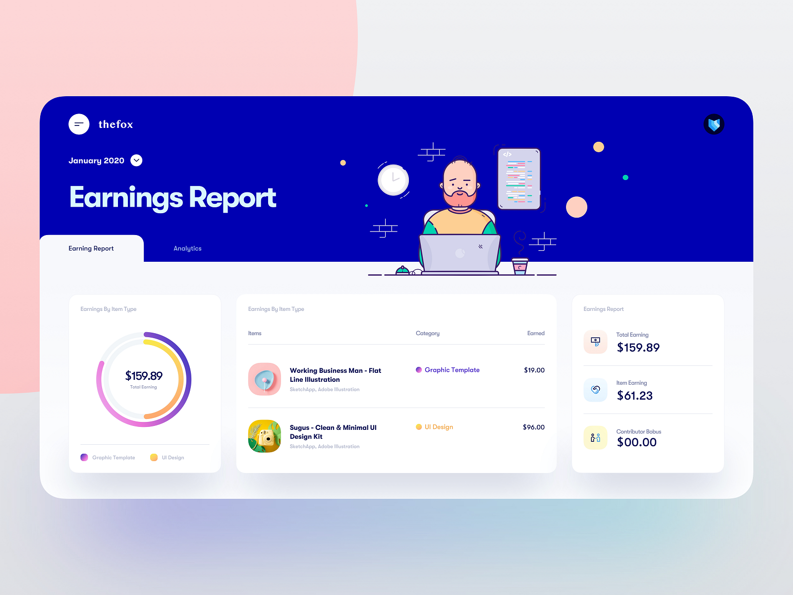
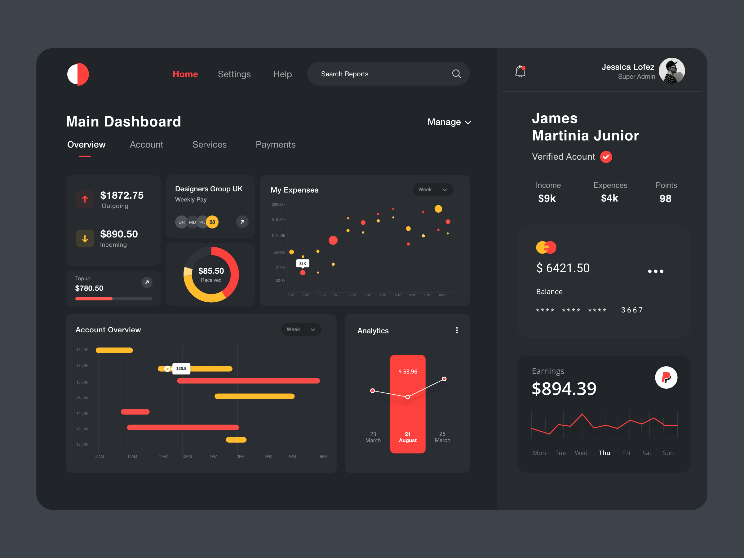
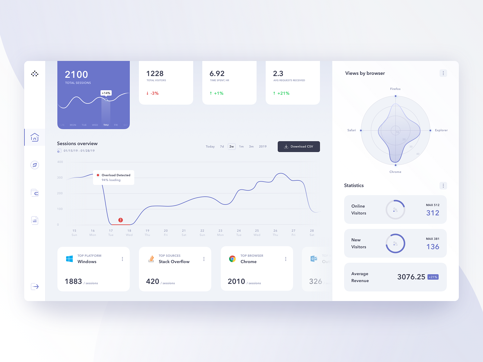
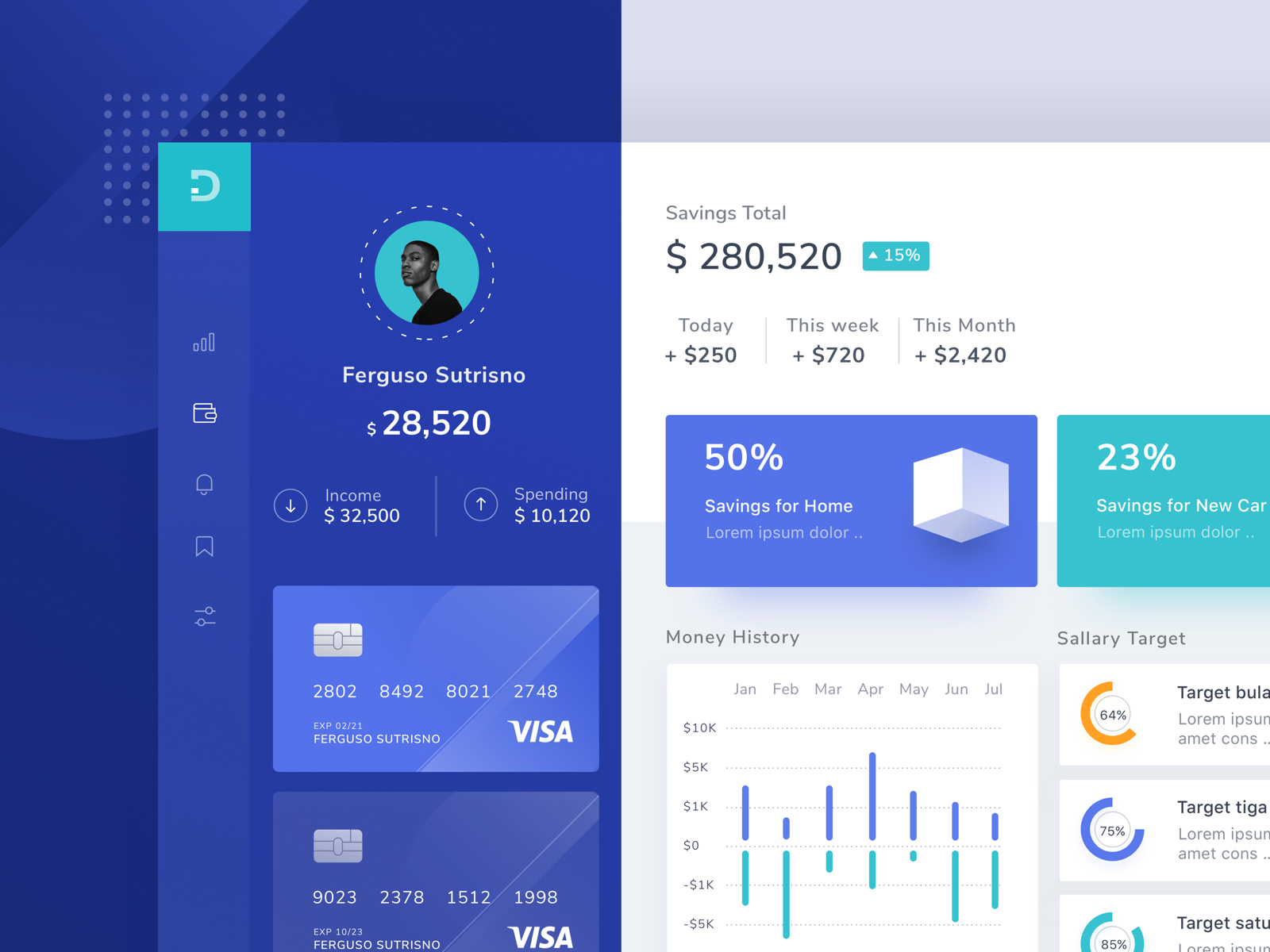
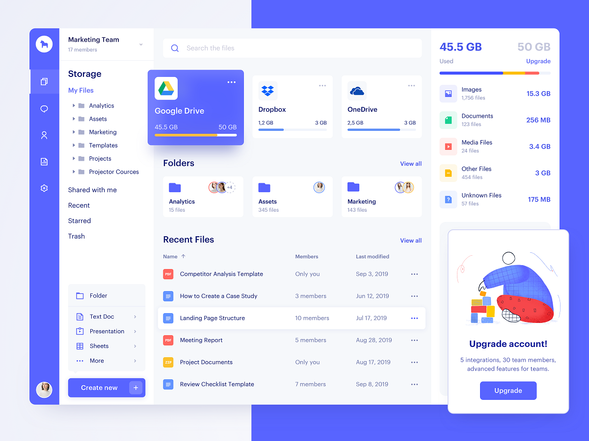
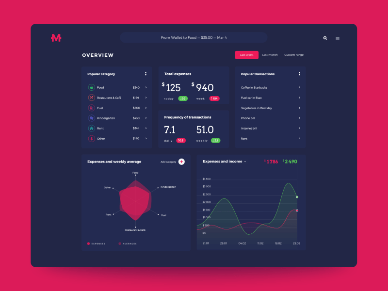
For UI/UX designers, dashboard design is always a challenge of arranging lots of data in an effective and aesthetically pleasant way.
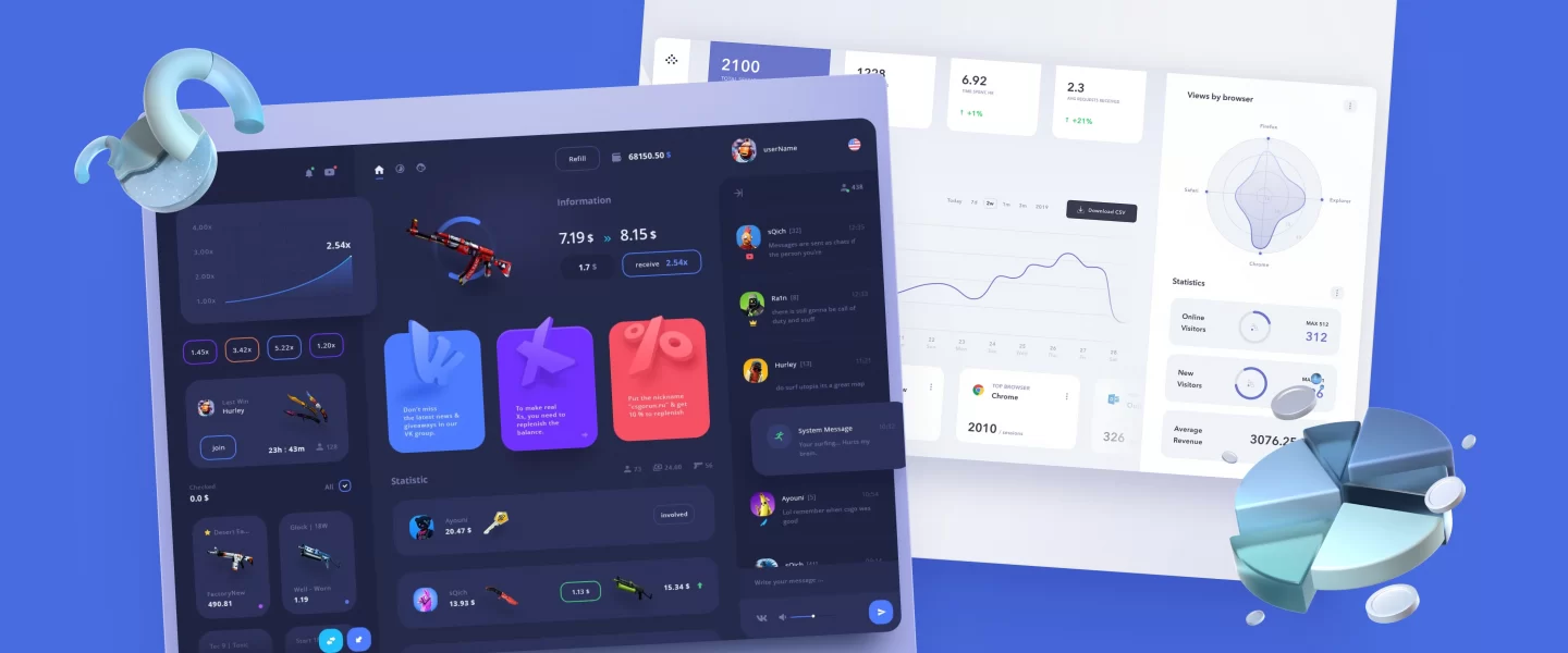
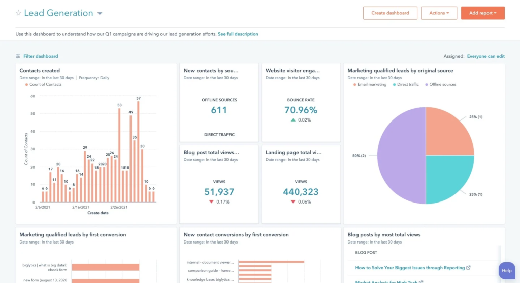
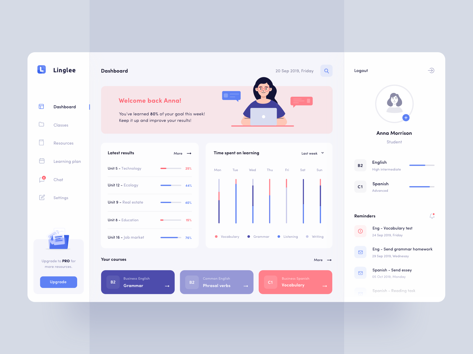
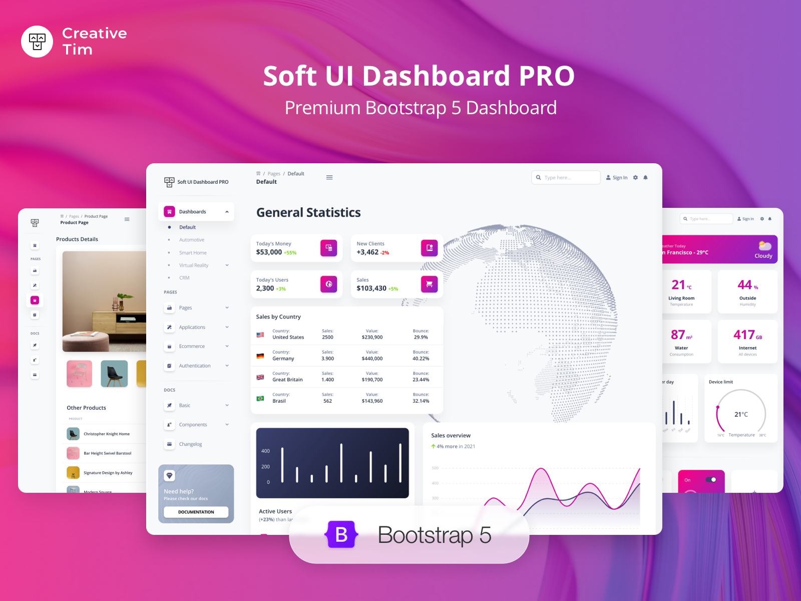
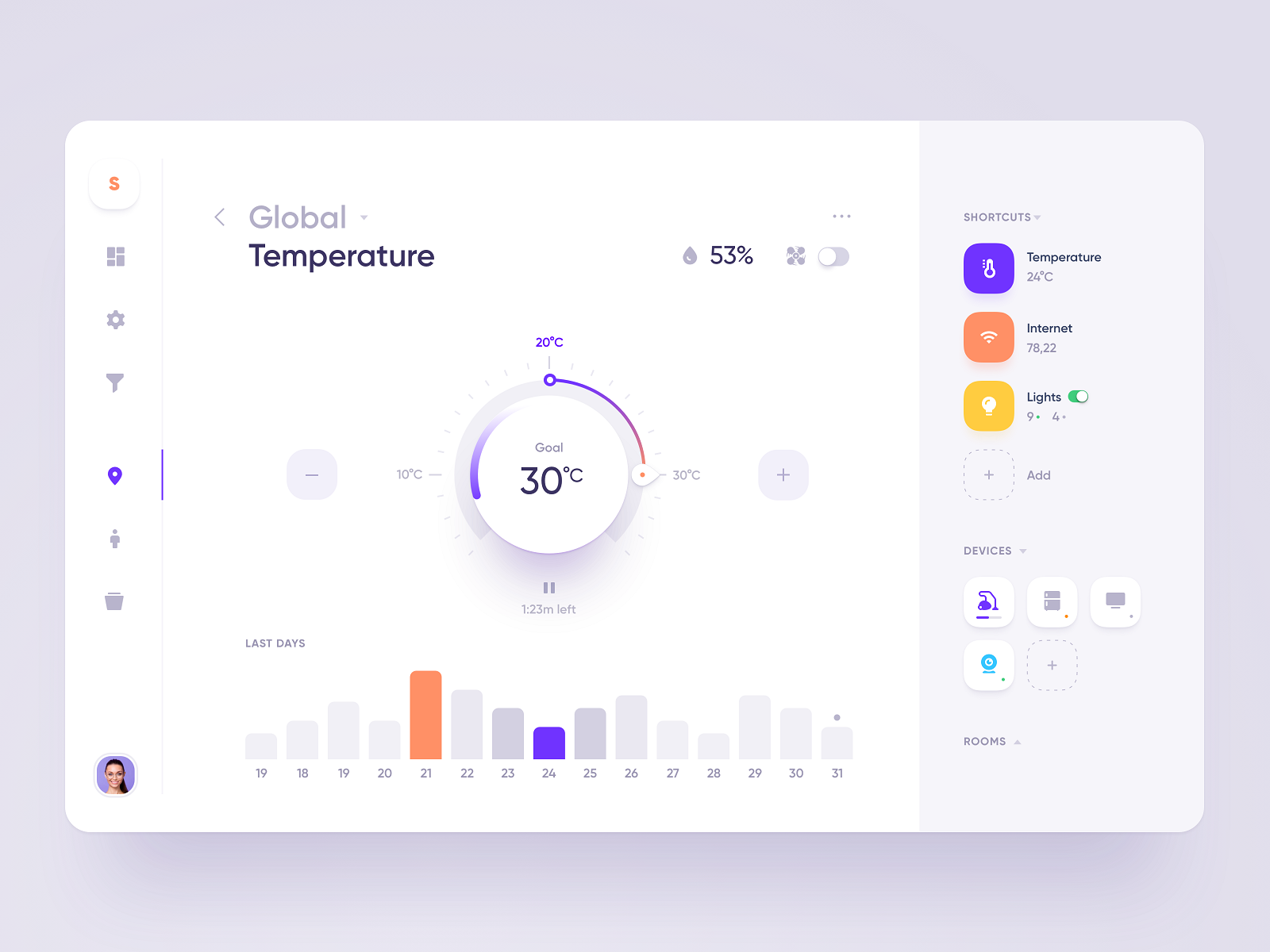
A dashboard is a type of user interface that visualizes particular KPIs (key performance indicators) for a specific goal or process. Dashboards are about data visualization and infographics. They help users quickly overview performance metrics, notice positive or negative trends, and measure efficiencies. Charts, diagrams, status bars, progress bars, and all sorts of filters — sometimes it can be hard to fit them all onto one screen. We have gathered some ideas to get you inspired, including examples of how other designers in custom web design solve this task.
Also, check the review of popular UI design trends and inspiring sets of tab bar animations, loading animations, web designs with hero illustrations, and free UI design resources.
About the author: Marina Yalanska, content writer and design researcher, Managing Editor for Icons8 Blog.