Detailed guide to help you with travel-related projects and lots of use cases to catch your muse.
Here, we go through the most common cases and find the perfect graphics for each of them. Read below or click the topic you are interested the most in:
Content
- Minimalistic travel icons
- UI travel icons
- Travel icons for dark mode interfaces
- Travel icons for marketing design
- Flag icons in design
- Bonus: travel illustrations
Minimalistic travel icons
For clean and minimalistic designs, you can have two different approaches:
- Use minimalistic icons to keep the whole design neat and calm down.
- Use bright and contrasting icons to make an accent in your design.
Minimal travel icons with minimal layout
Here is one example of the icons complementing the minimalistic design. The white background and clean typography work well with these hieroglyphic travel icons, which are low in detail but still interesting.
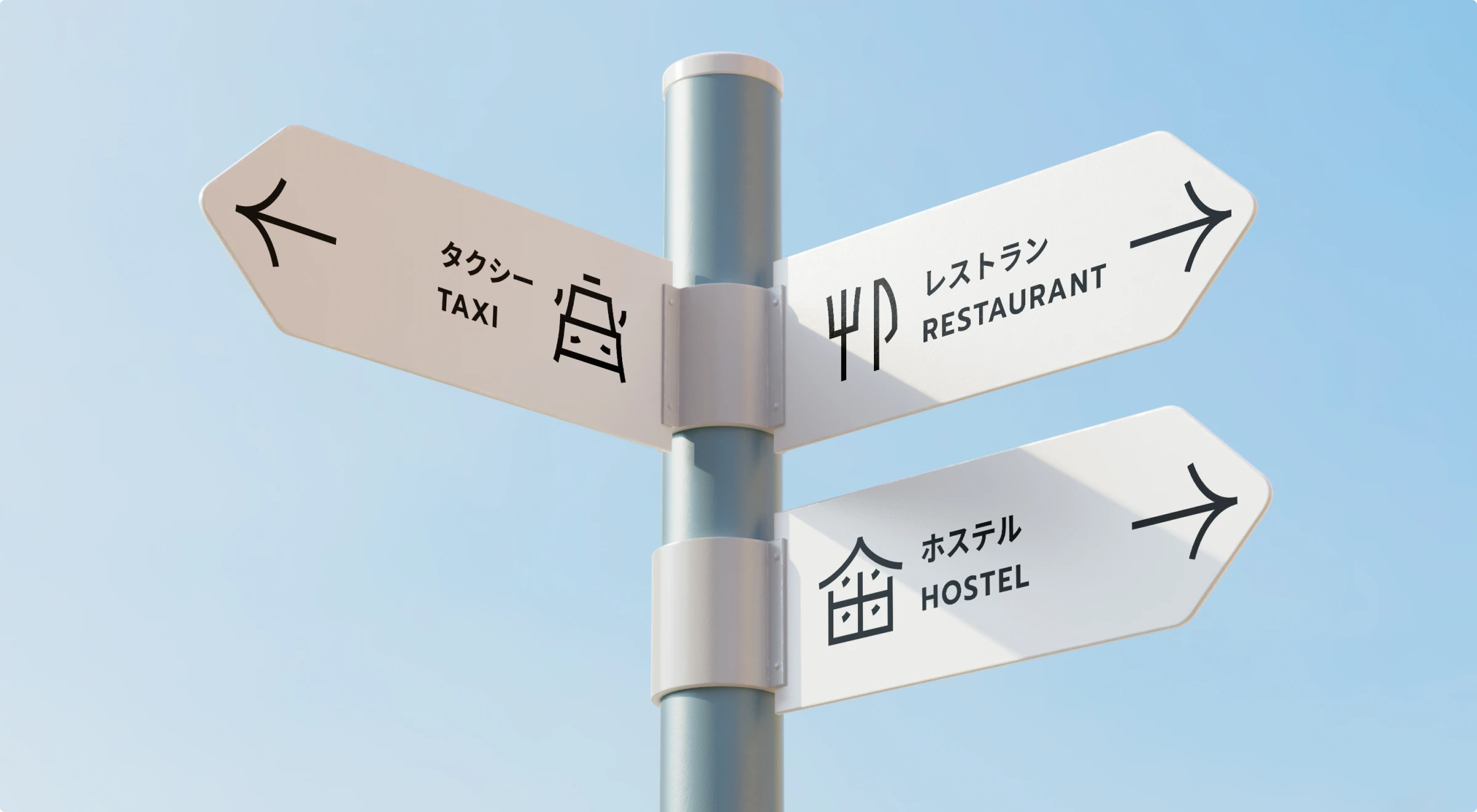
Here are several choices for minimalistic travel-related icon styles to use:
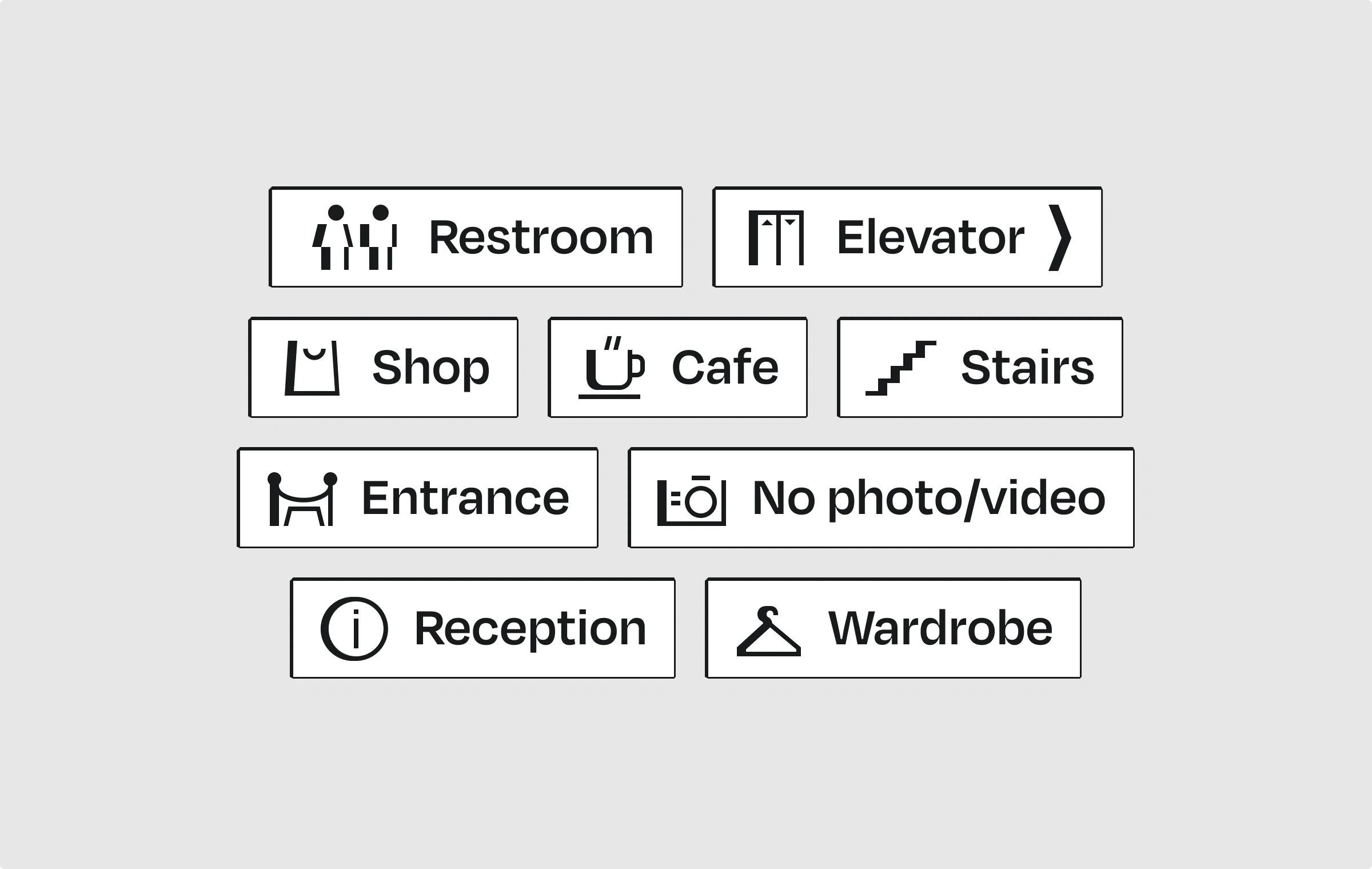
Outlined icons, in general, are perfect for minimalistic designs, and having them with a little bit of detail, be it serifs, pulsar lines, or shadow imitation, adds a sophisticated feeling to the whole concept. For example, this is what icons in the minimalistic Hatch style look like pairing with the text on this navigation design:
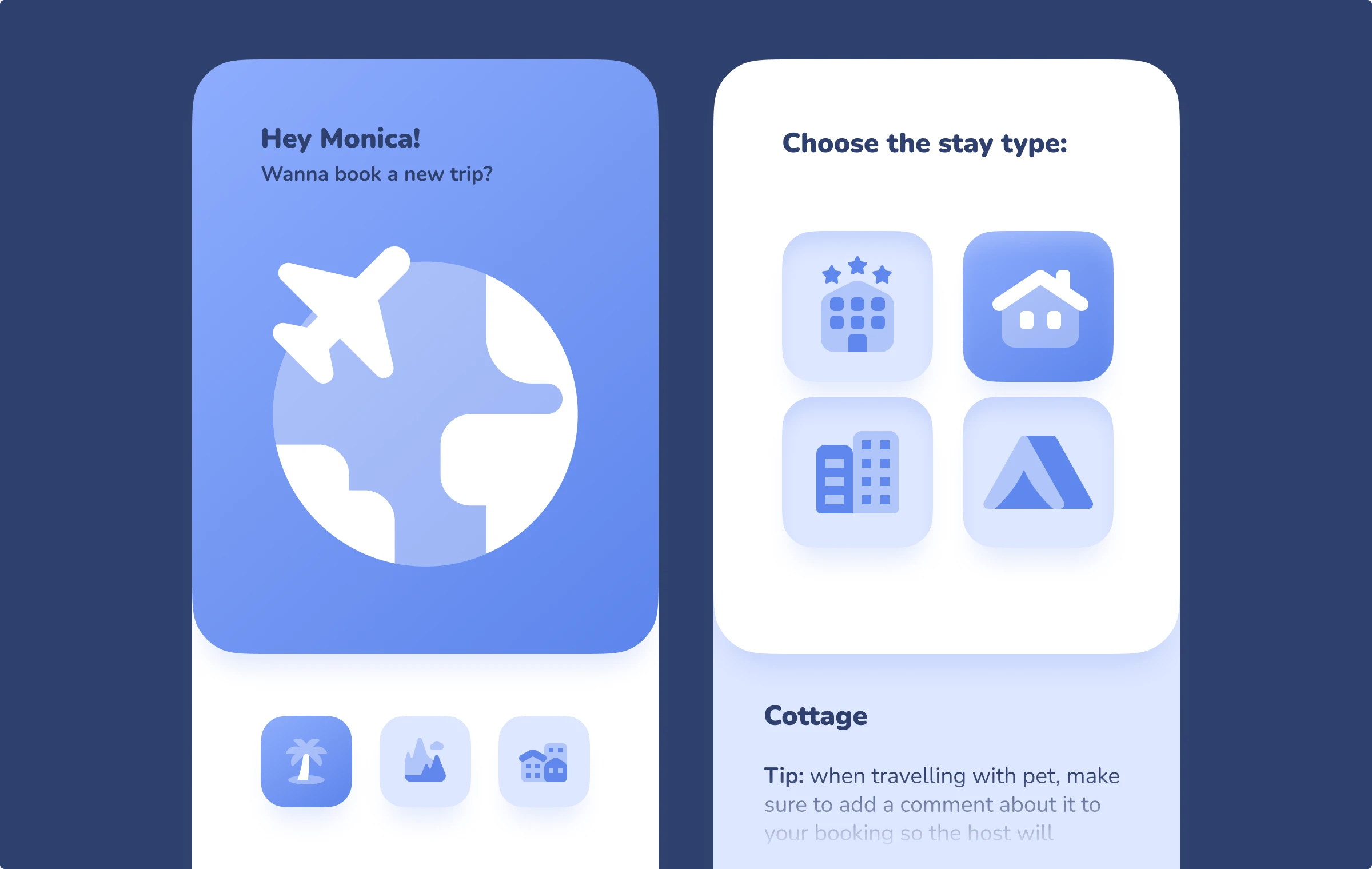
Filled icons can also be handy: by playing with the opacity, these travel icons in the Plumpy style create an interesting effect of layering. This effect made Plumpy icons a nice option for a minimalistic travel mobile app concept:
Contrast travel icons in minimalistic designs
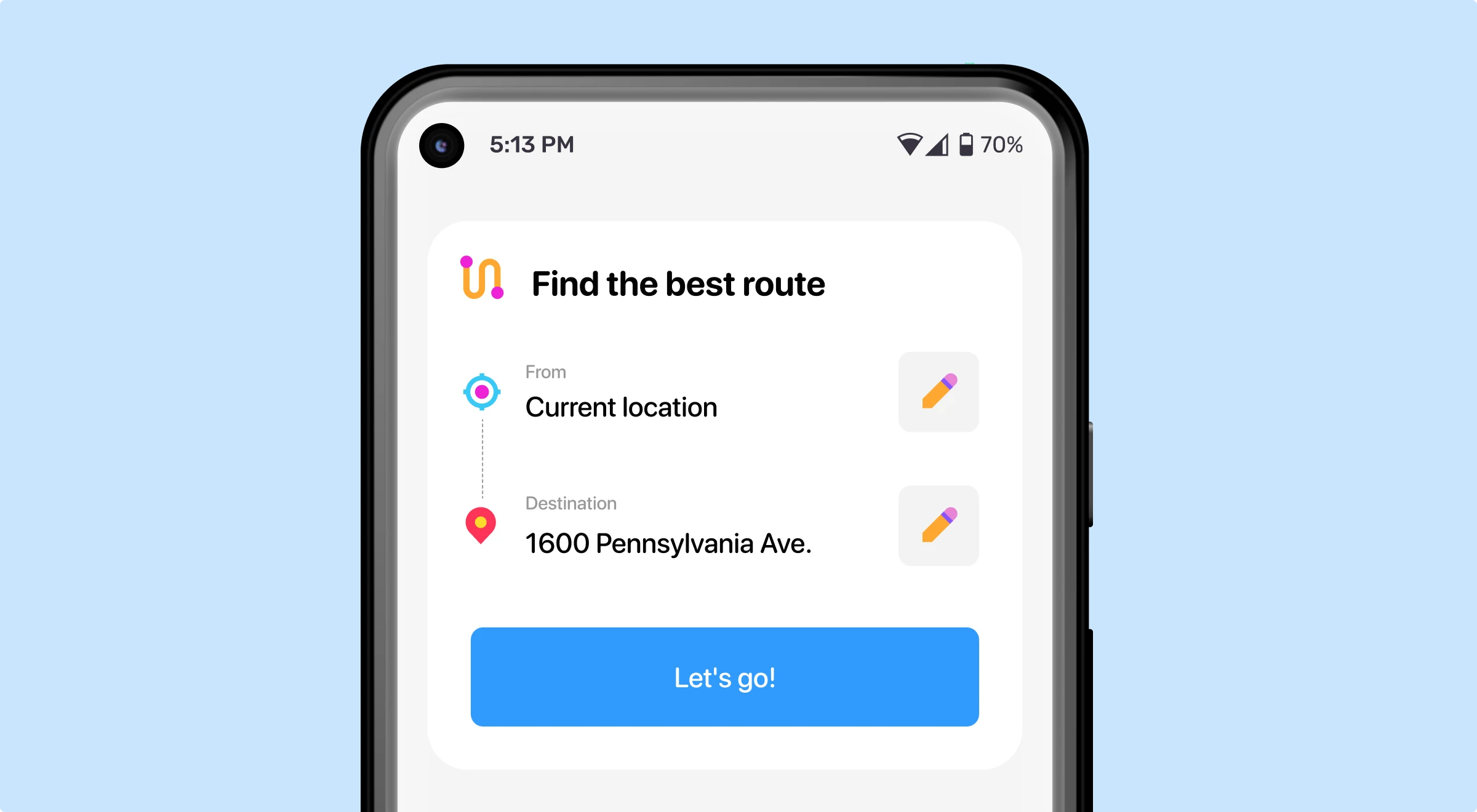
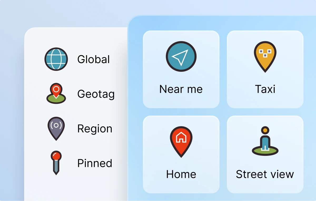
Using contrasting icons, you can bring some color to your minimalistic travel-related design. You can manage the level of boldness, but the best way is to choose minimalistic but bright icons. As an example of inspiration, use this UI concept of a navigation mobile app, where we use location icons from the Tiny Color pack.
Some of the other great choices for low-detailed but colorful travel icons:
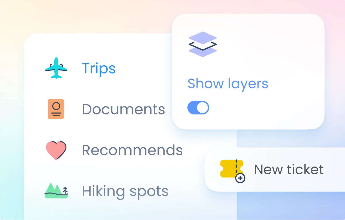
Colored simple icons are perfect to brighten up clean interface designs. Use them in your travel-related menu bars like in the examples below:
UI travel icons
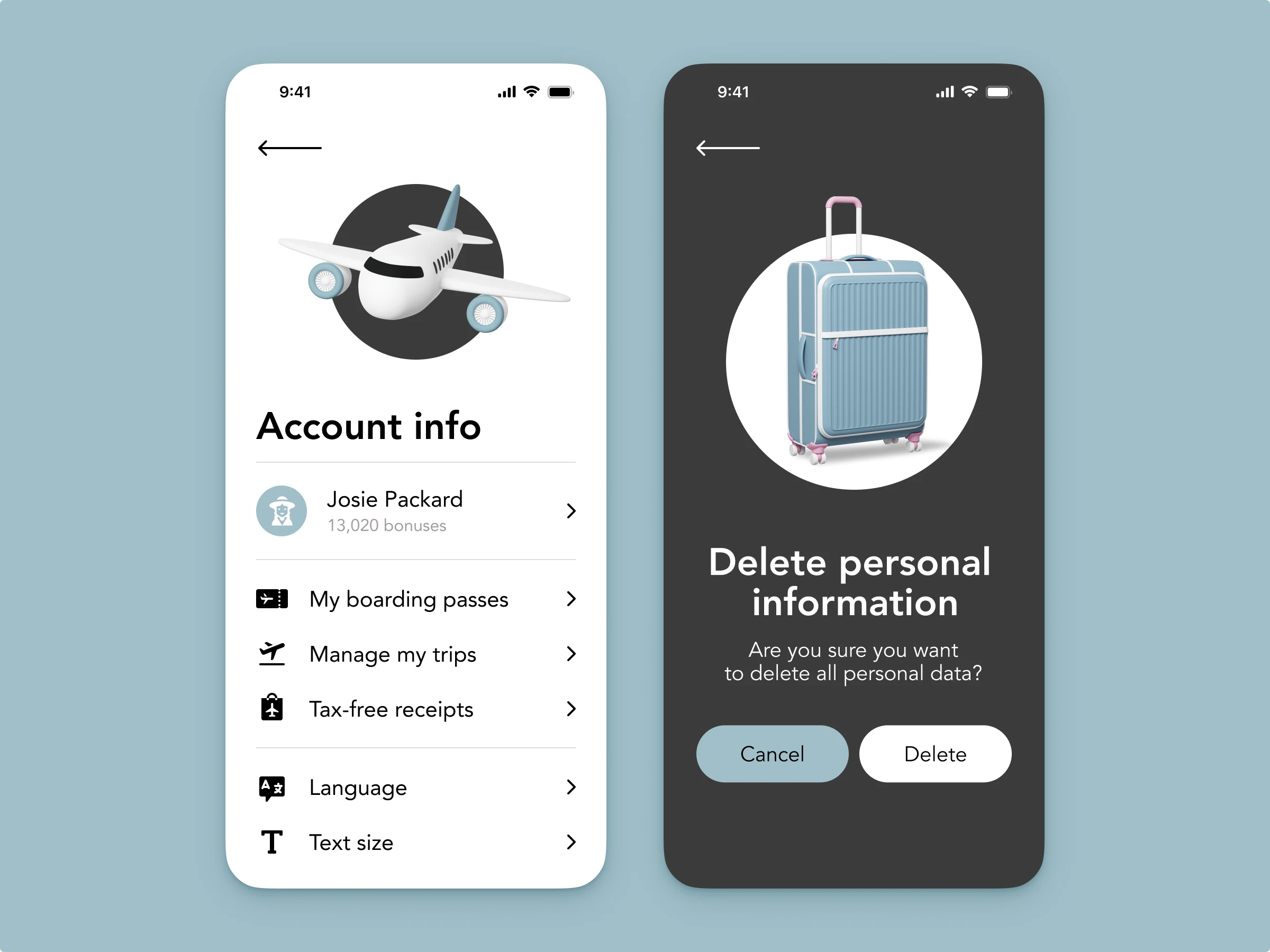
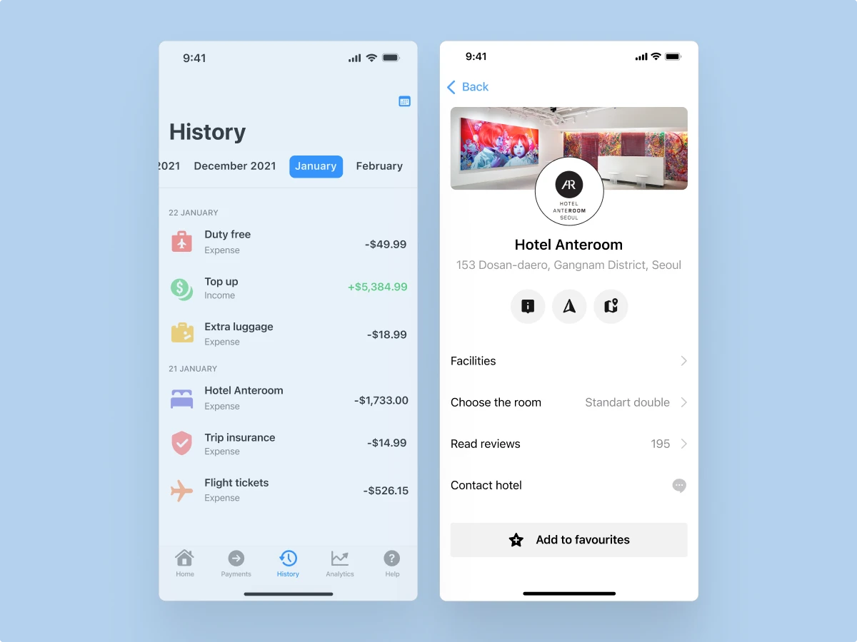
The safest way to deal with interfaces is to put UI icons in them, and travel-related interfaces are no exception. Just follow the guidelines of the platforms your interface belongs to and easily match the whole UI with your travel icons. For example, below, we have an iOS app for the airlines, so we use the iOS Glyph travel icons for the account menu. We also decided to add 3D travel illustrations to the design.
Here are travel-related icons packs, sorted by the platforms:
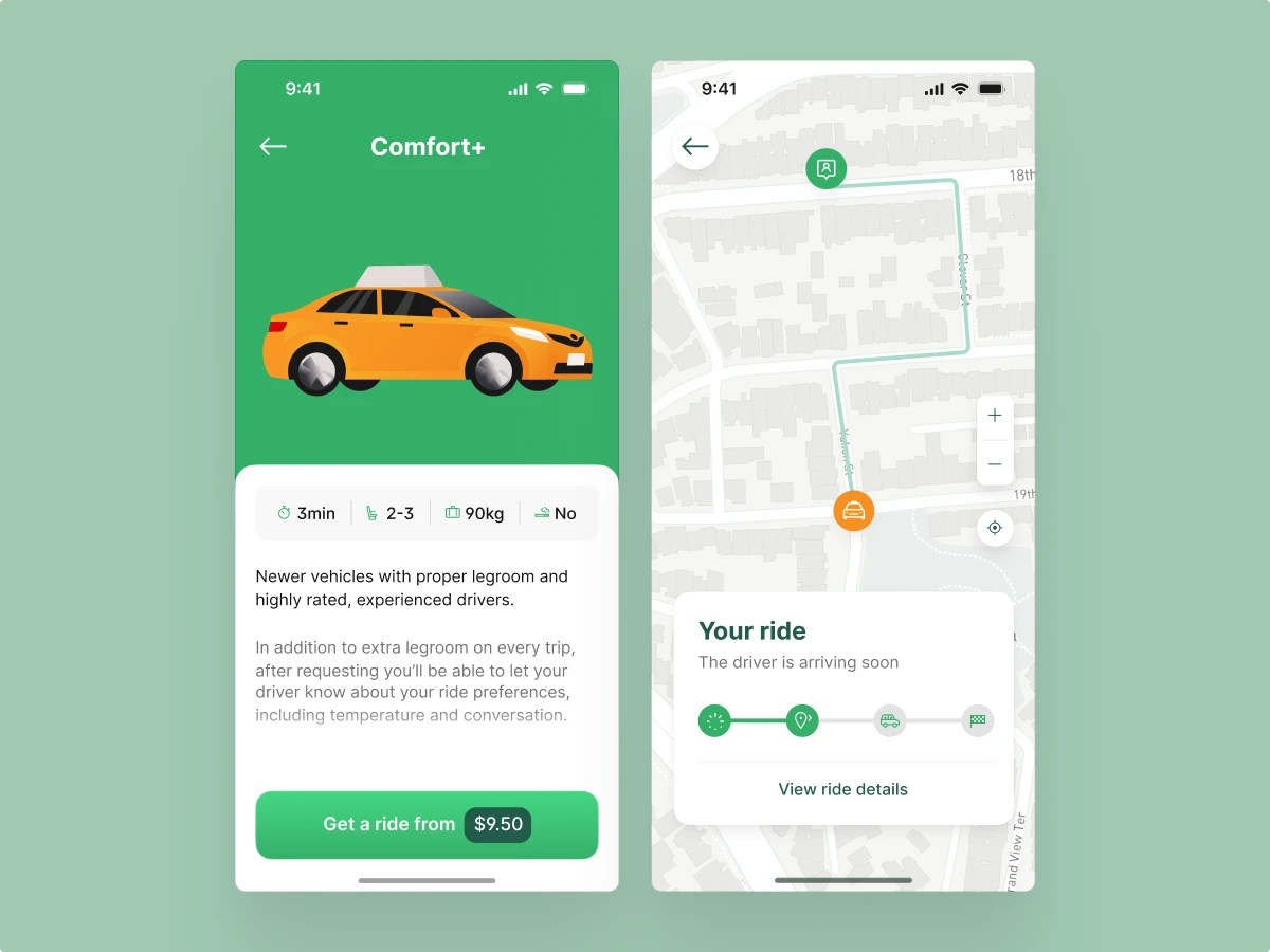
Also, check out some more UI concepts with travel icons below for inspiration. By the way, you can get the taxi car from the first screen here.
Travel icons for dark mode interfaces
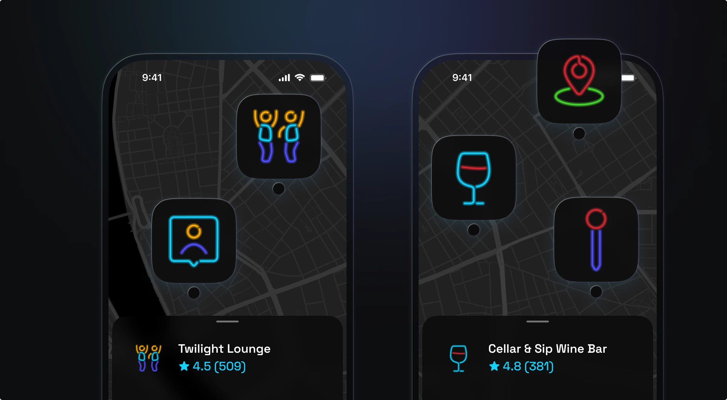
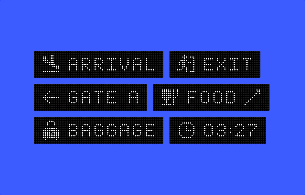
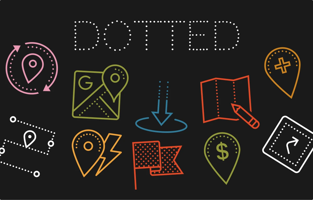
Dark mode is a tricky case. For most icon styles, you can just invert the color to make them look more contrastive with dark-colored backgrounds. But to make dark designs really stand out, consider icons made specifically for dark mode. For example, we used location icons in neon style for this concept.
Here are some travel icons in the styles that look the best in the dark mode:
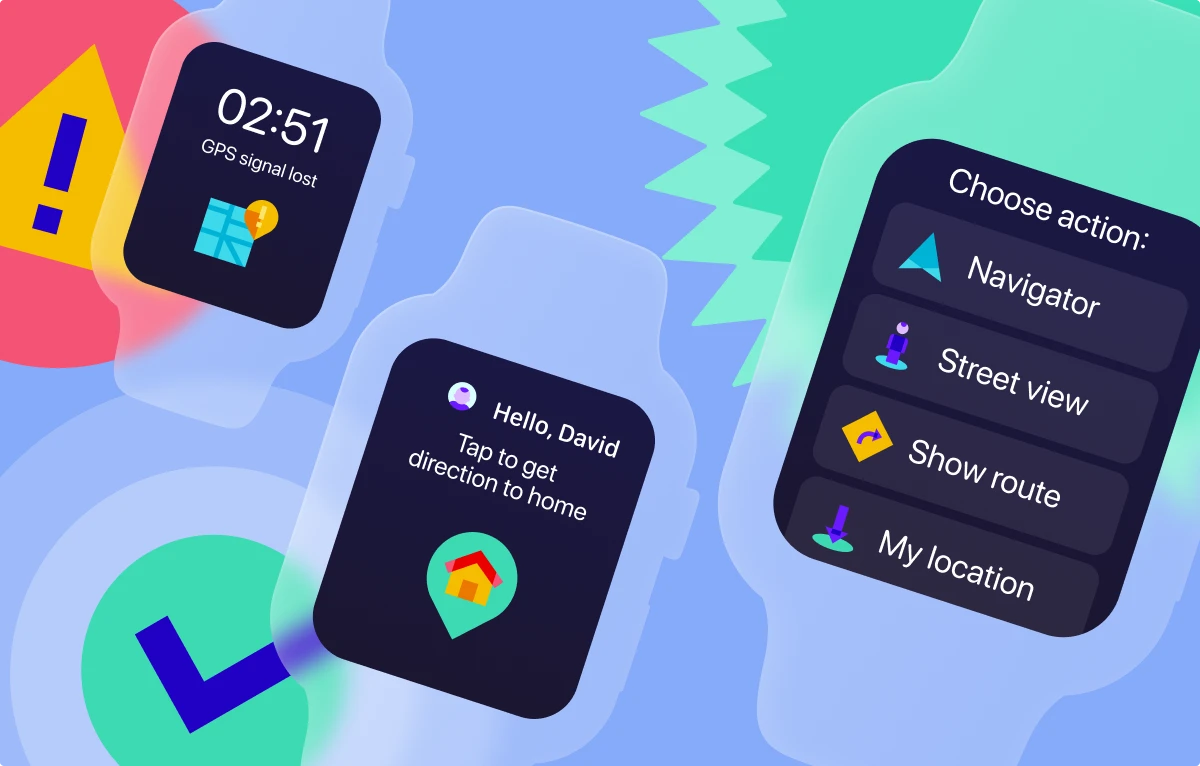
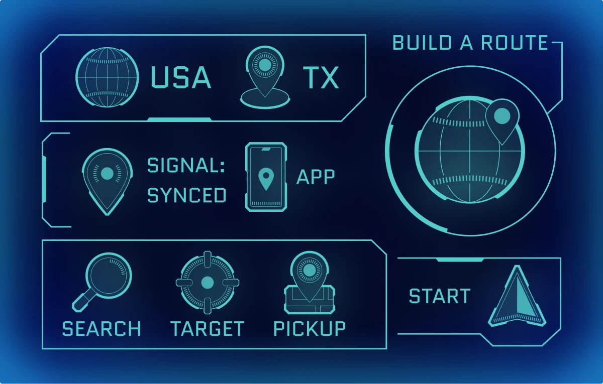
Here are some more use cases with travel icons on the dark mode designs:
Travel icons for marketing design
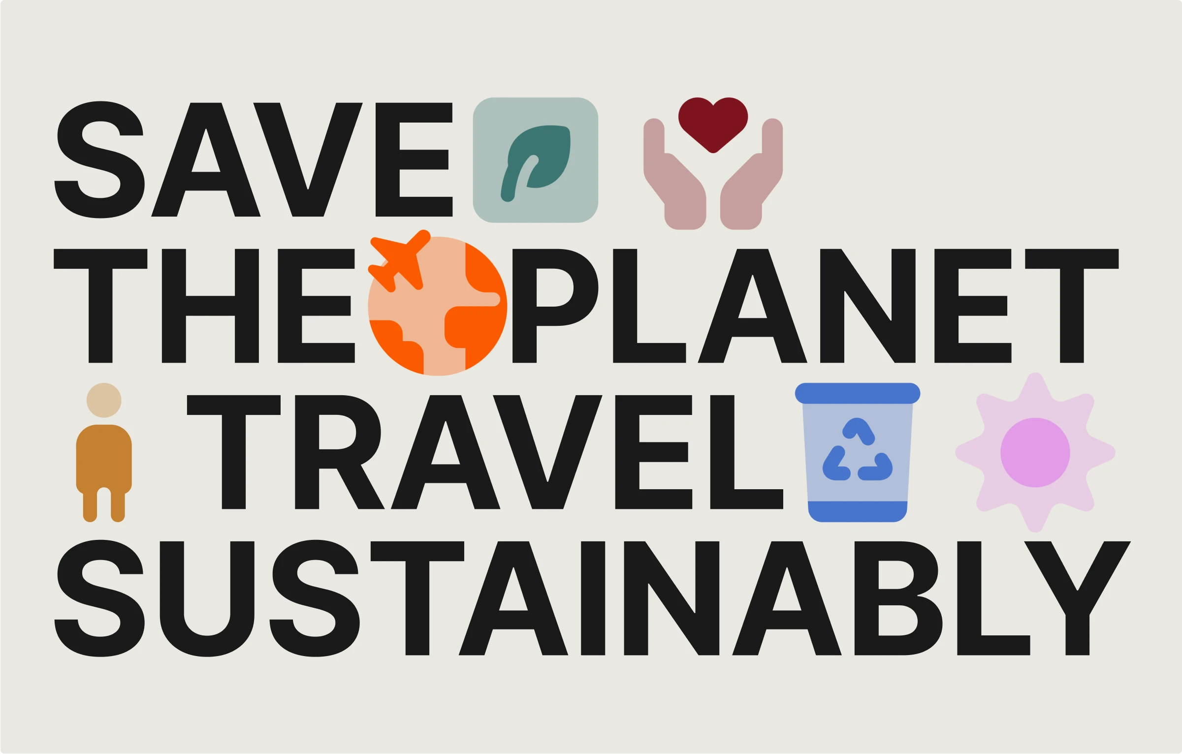
Icons are not only for interfaces and bullet lists. Playing with their size and with the layouts makes them also a valuable part of the marketing visuals. For example, here we put ecological-related icons to this banner design:
Travel icons for social media content
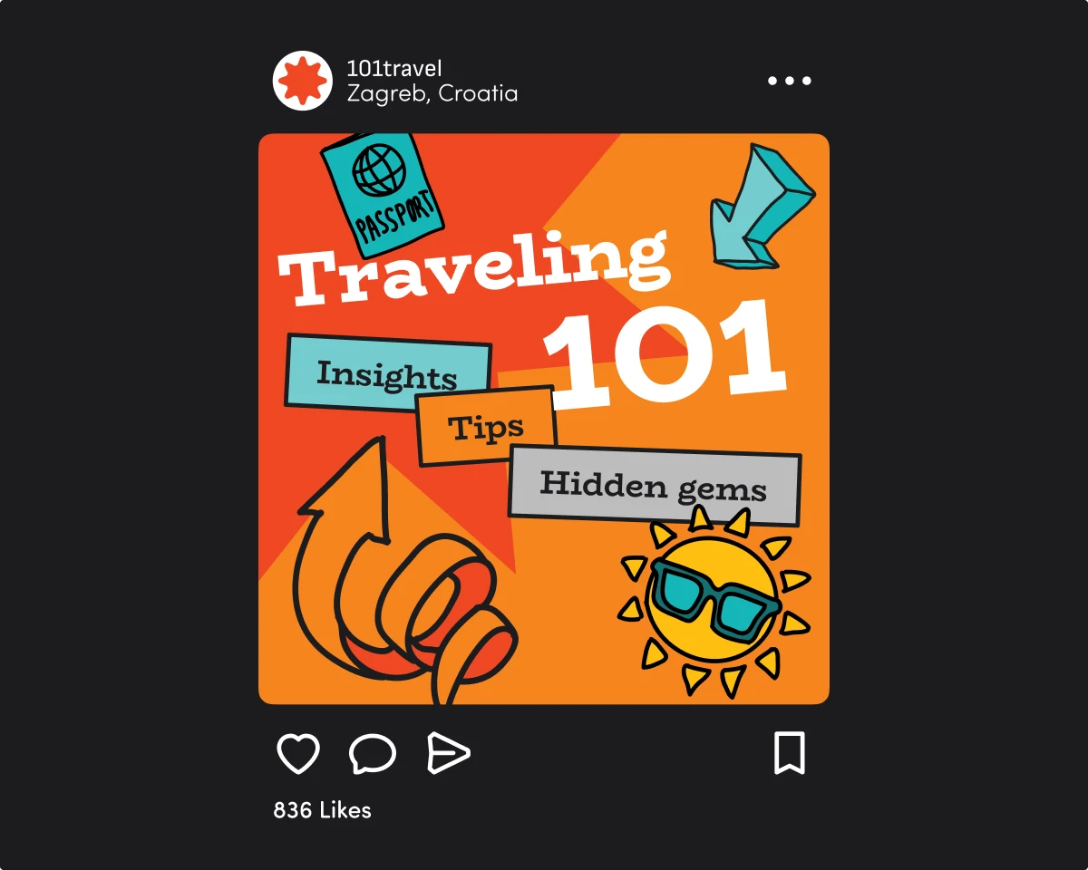
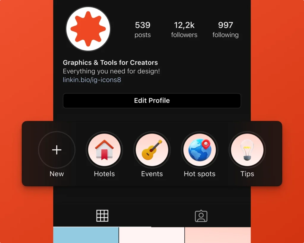
Here are some icon styles that would look good on your social media:
Consider implementing icons in posts and account design:
Travel icons for prints
Icons can also be handy in designing prints, such as travel brochures, business cards, flyers and event posters, as in the example below. Here, we matched the typography with variable icons Forma, which can adjust any line thickness.
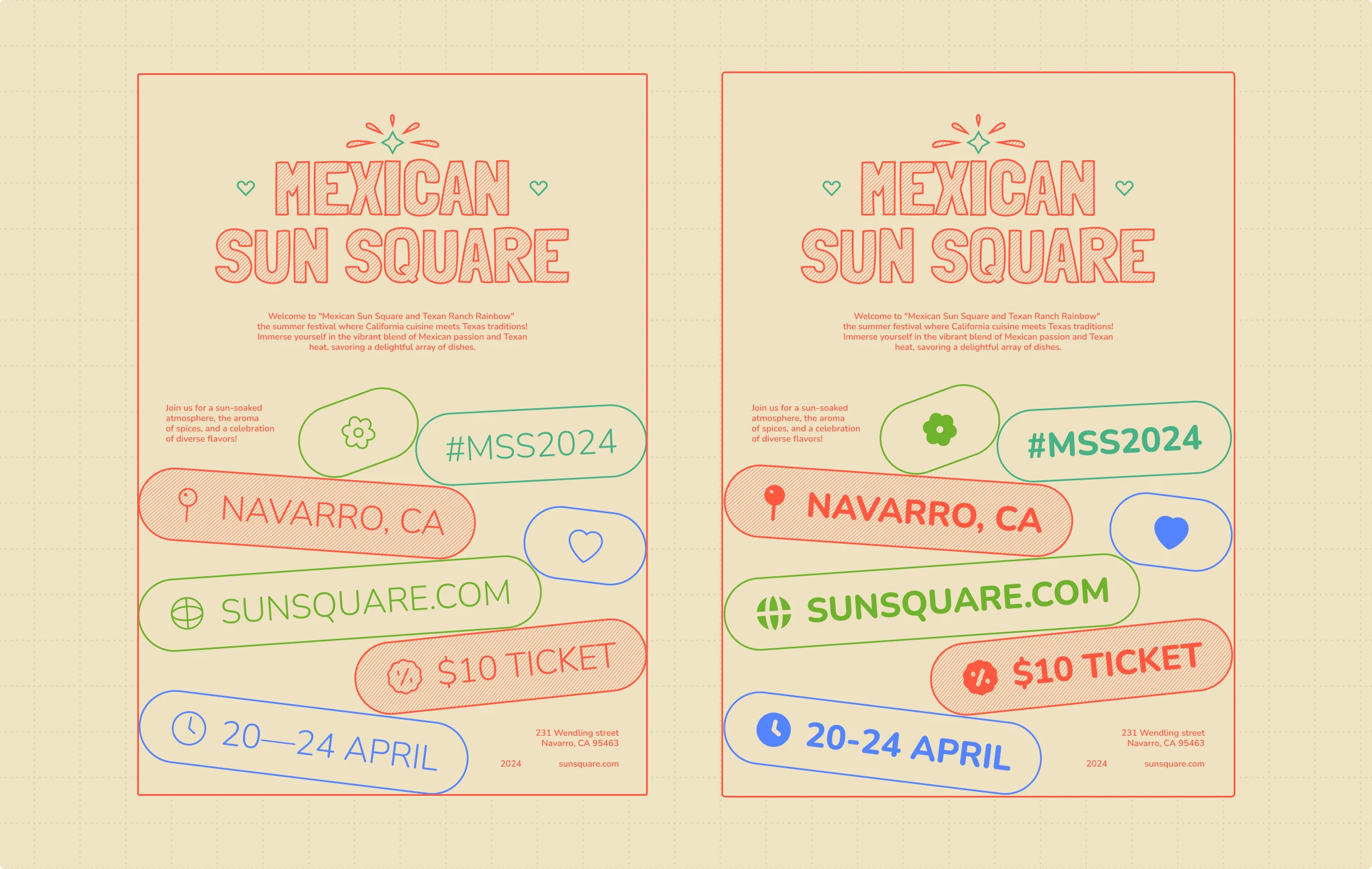
You can use a wide range of icon styles in your travel-related prints; it only depends on the initial aesthetic of the project. Don’t limit yourself and try one of these travel icon packs:
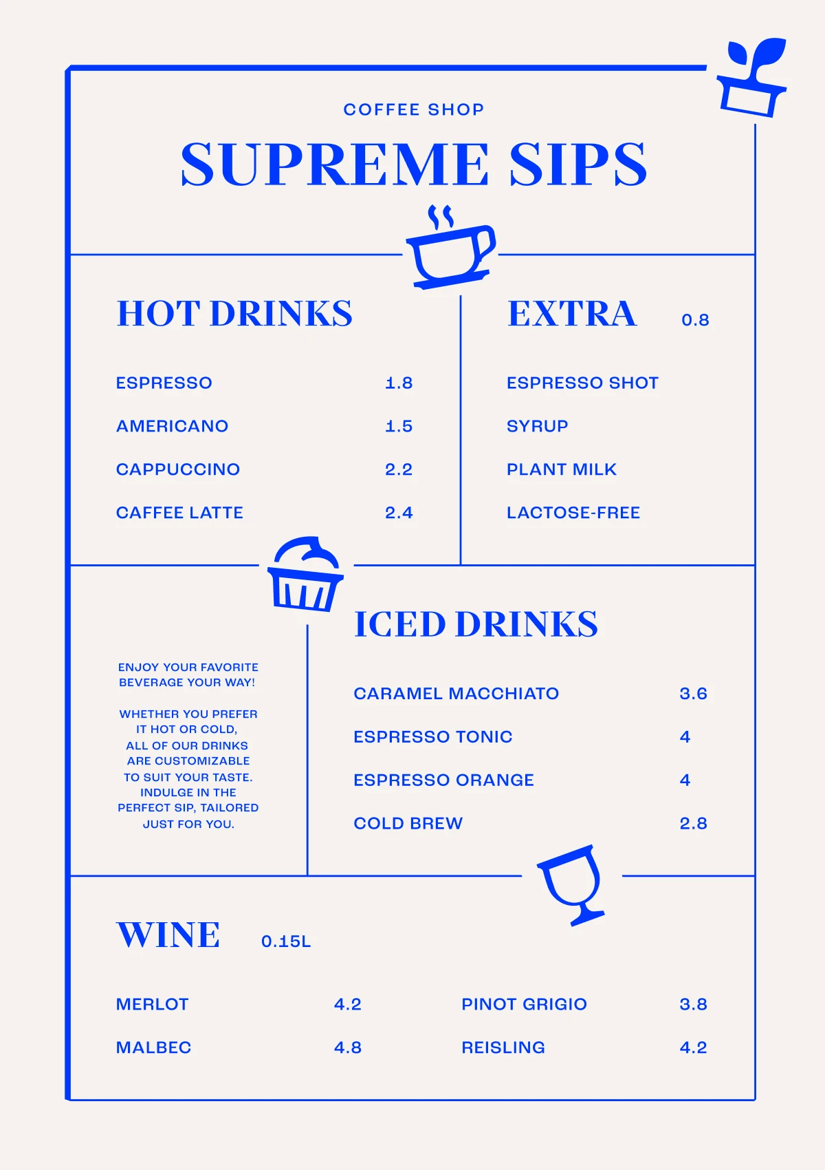
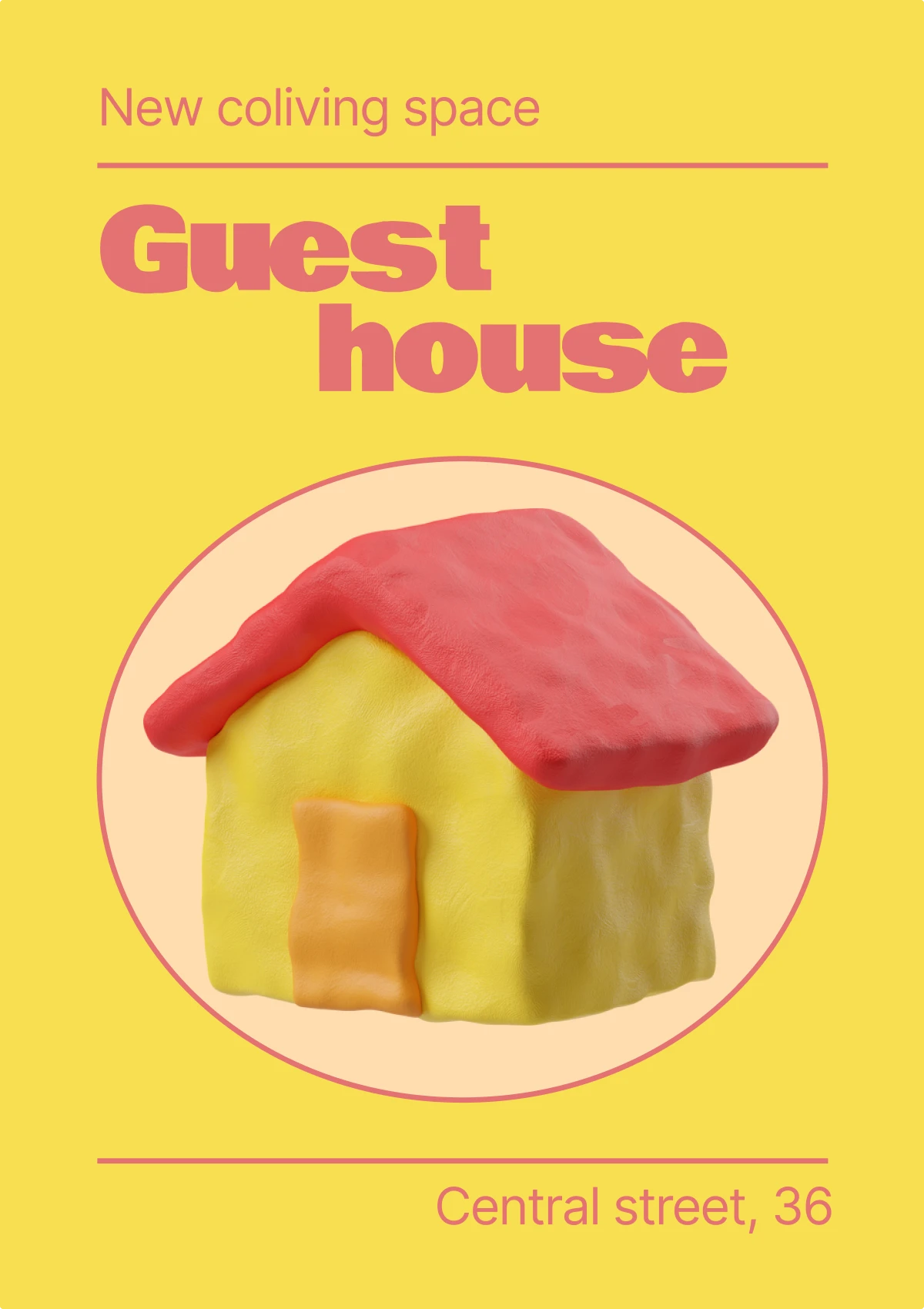
Icons help create more interesting layouts for prints. Use them outside of the grid to give your designs a contemporary look, or scale icons to a big size to emphasize details.
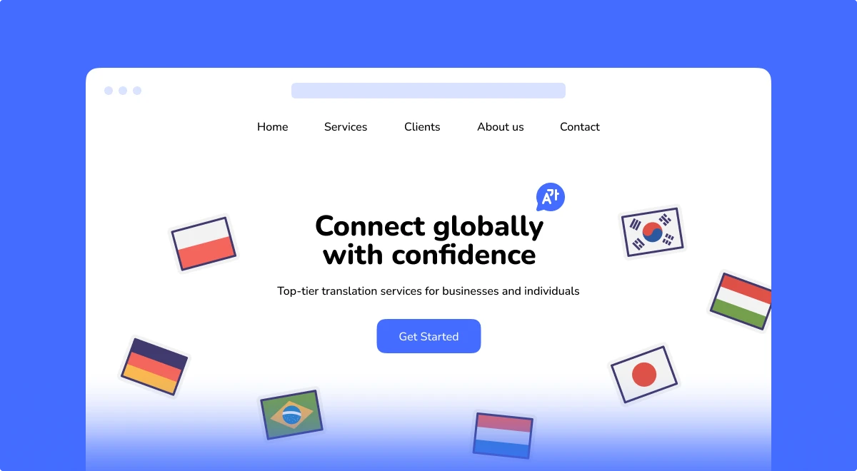
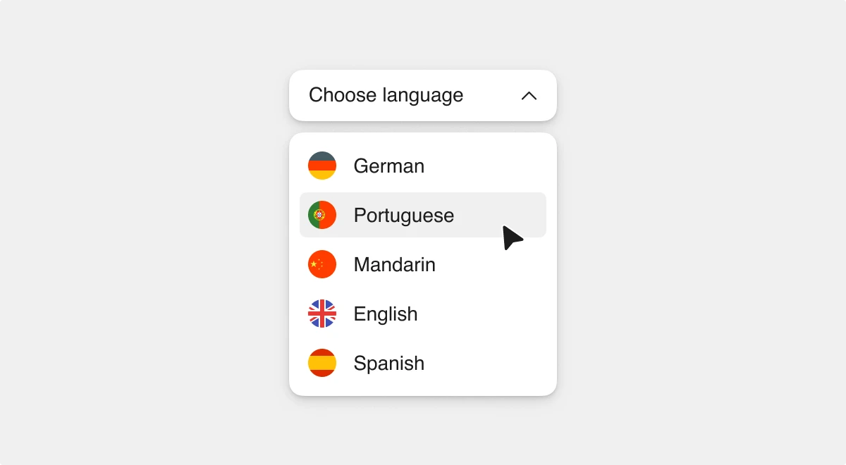
Flag icons in design
Flag icons point to the exact country without the need to actually add text with a country name. So, they save a lot of space, making your composition more neat and minimalistic. Grab these icon packs with flags to add them to your projects:
Get some inspiration from the design concepts below:
Bonus: travel illustrations
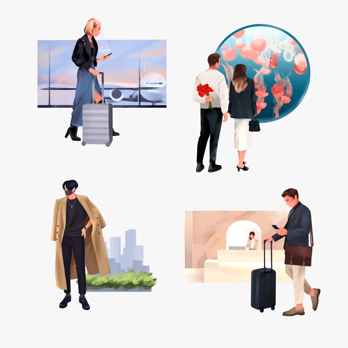
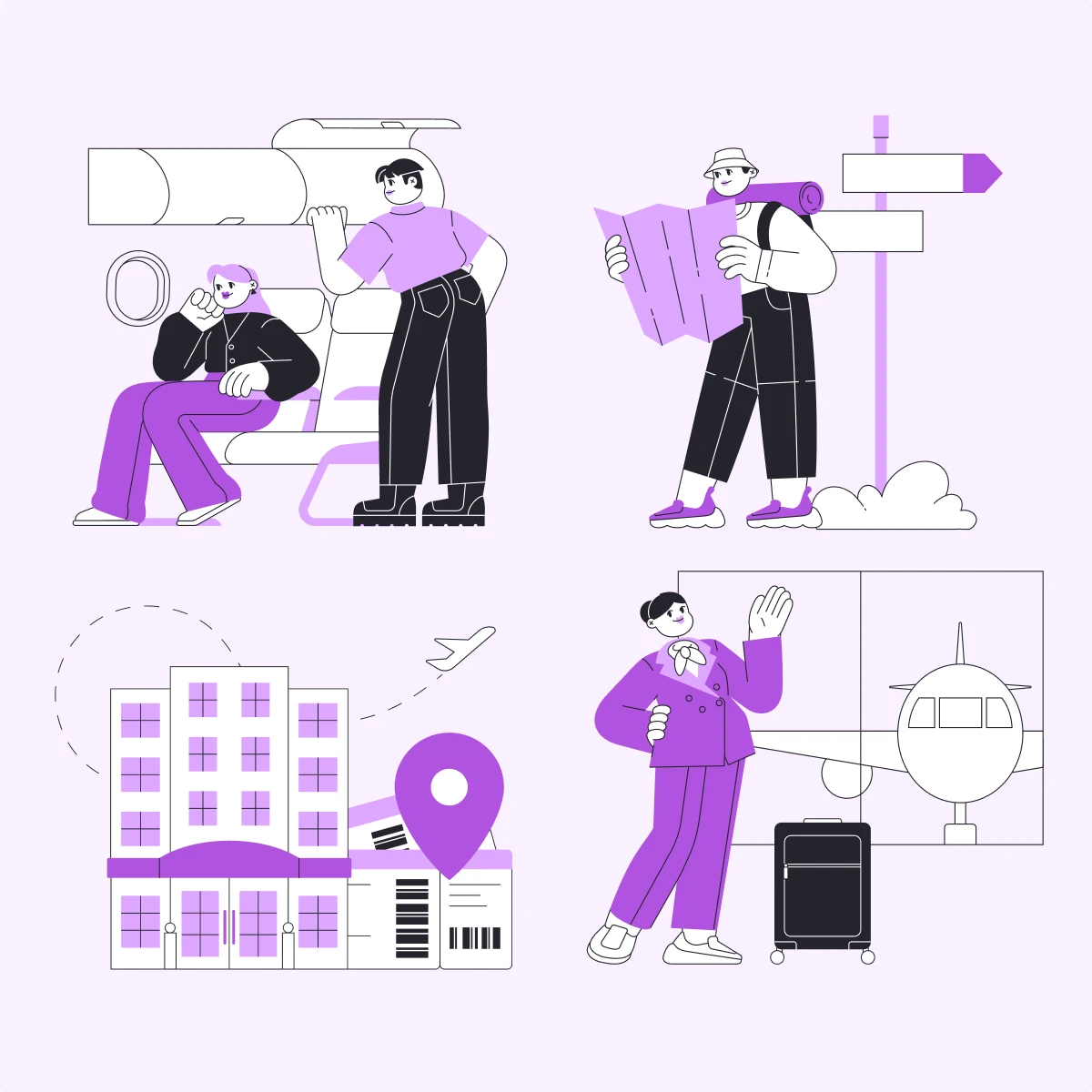
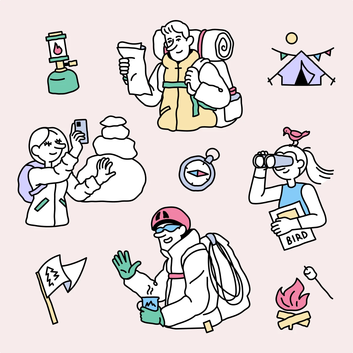
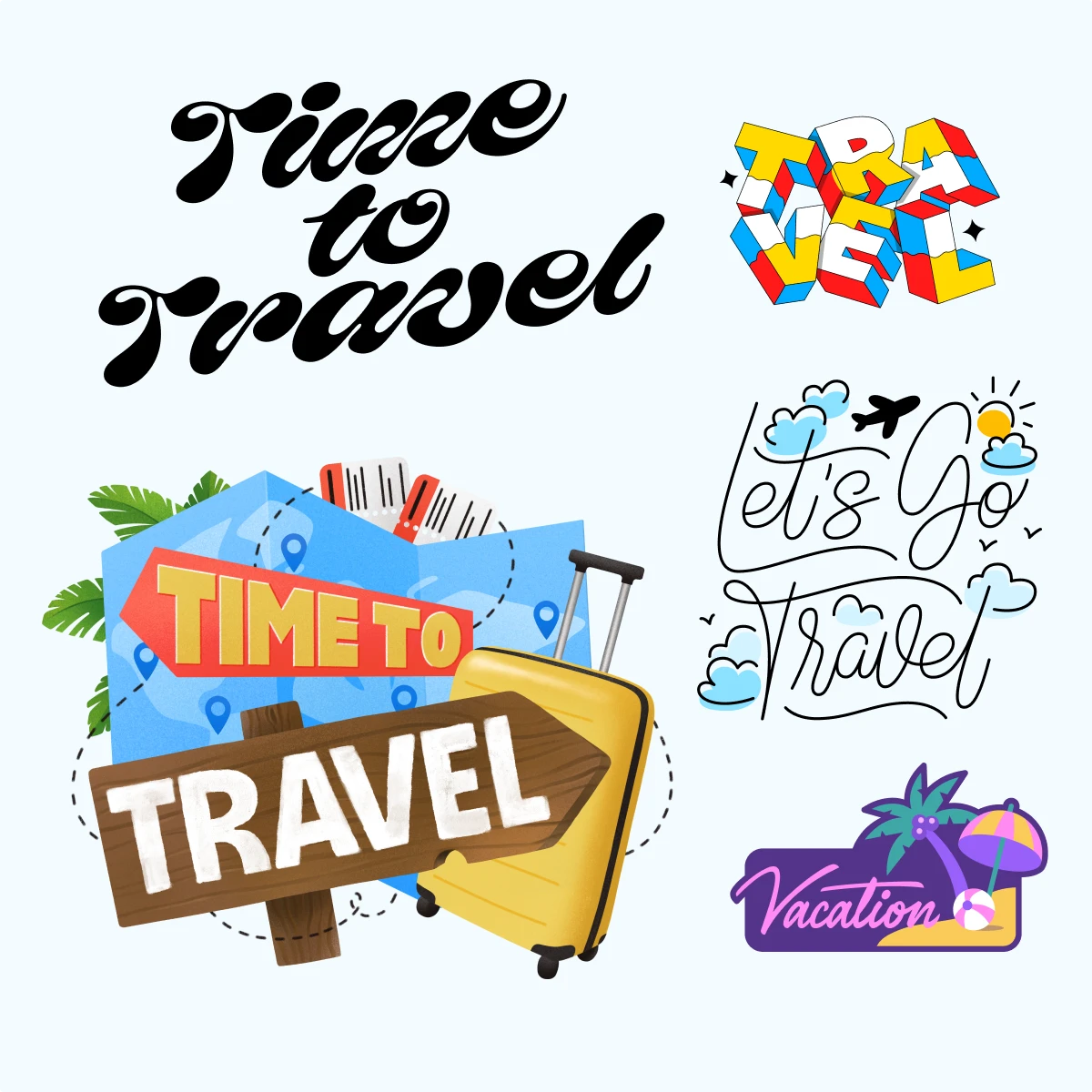
Aside from icons, you can also use illustrations in your travel-related designs. They usually have a higher level of detail than icons and look more interesting in the big size. Here are some illustration styles where you can find plenty of touristic scenes and travel items:
You can also add animated illustrations to the visuals to bring life to your design. The more complex the scene you choose, the higher the chances that the audience will watch the animation on the loop.
More use cases to catch inspiration for travel-related designs with illustrations:
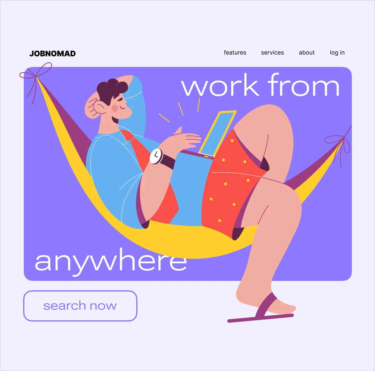

By the way, we used AI-generated illustration for this social media post. Want to create your own? Go to Illustration Generator.

Summary
Hope you found a lot of useful graphics for your travel-related designs.
Final tip:
If you don’t want to be limited to only the styles that we recommended here, go to the main icon library with the following search queries:
And you will get all the possible results in more than 50 styles. Surely you will find the exact icons you need. Have a nice designing!
