What is the first thing you think of when you think of UI design? Do you think of beauty, comfortability, and ease of use? I’ve learned a few things over the years about UI design. Beauty is part and parcel of a great UI design, but also the right language usage. Without the power and beauty of languages, even the greatest UI wouldn’t be considered multilingual.
So, as much as you think of the design elements for multilingual websites, you must also consider the impact language might have on UI. Today, I’ll tackle what I’ve learned about UI design from the perspective of language services experienced in these areas.
I’ve learned that a great multilingual UI design incorporates appropriate cultural markers and language options.
Designing a great user interface for optimal user experience is complicated for multilingual websites or mobile apps. You have to consider certain elements:
Global design template
Global design templates ensure consistency in user experience and account for changes in regional or language options. Of course, there’s nothing wrong with using a different template for each language or region, but it will be costly and time-consuming. Having to fix every little detail on each language page is hectic.
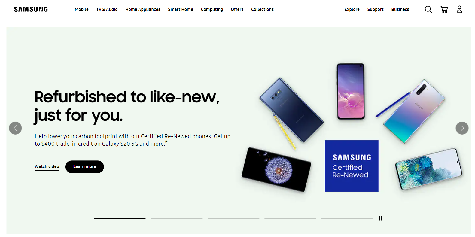
Samsung home page in the USA
You have more consistent branding for your language pages from a branding perspective, though they may differ in design touches. A consistent global design is less disruptive to the user experience. You’re better off making unique content or product offerings for each site than wholly changing the design template for each one.
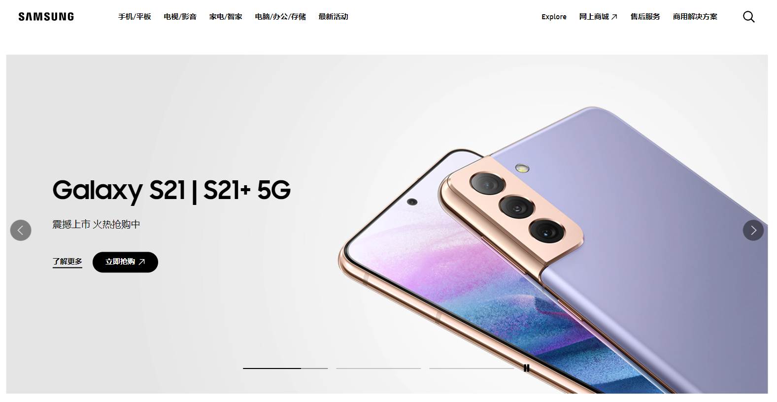
Samsung home page in China
I’ve learned that switching up the content, product offerings, and some design elements, rather than the overall design template of the multilingual website, will prove the most efficient and effective to use for the company on their side and user experience.
Proper drop-down language options
For a website or mobile app to be multilingual, of course, it would need to have language options. This can be done with a dropdown language menu. Think about where to place your language switcher dropdown.
You might want to refer to the languages in their native names rather than flags since flags represent countries rather than languages.
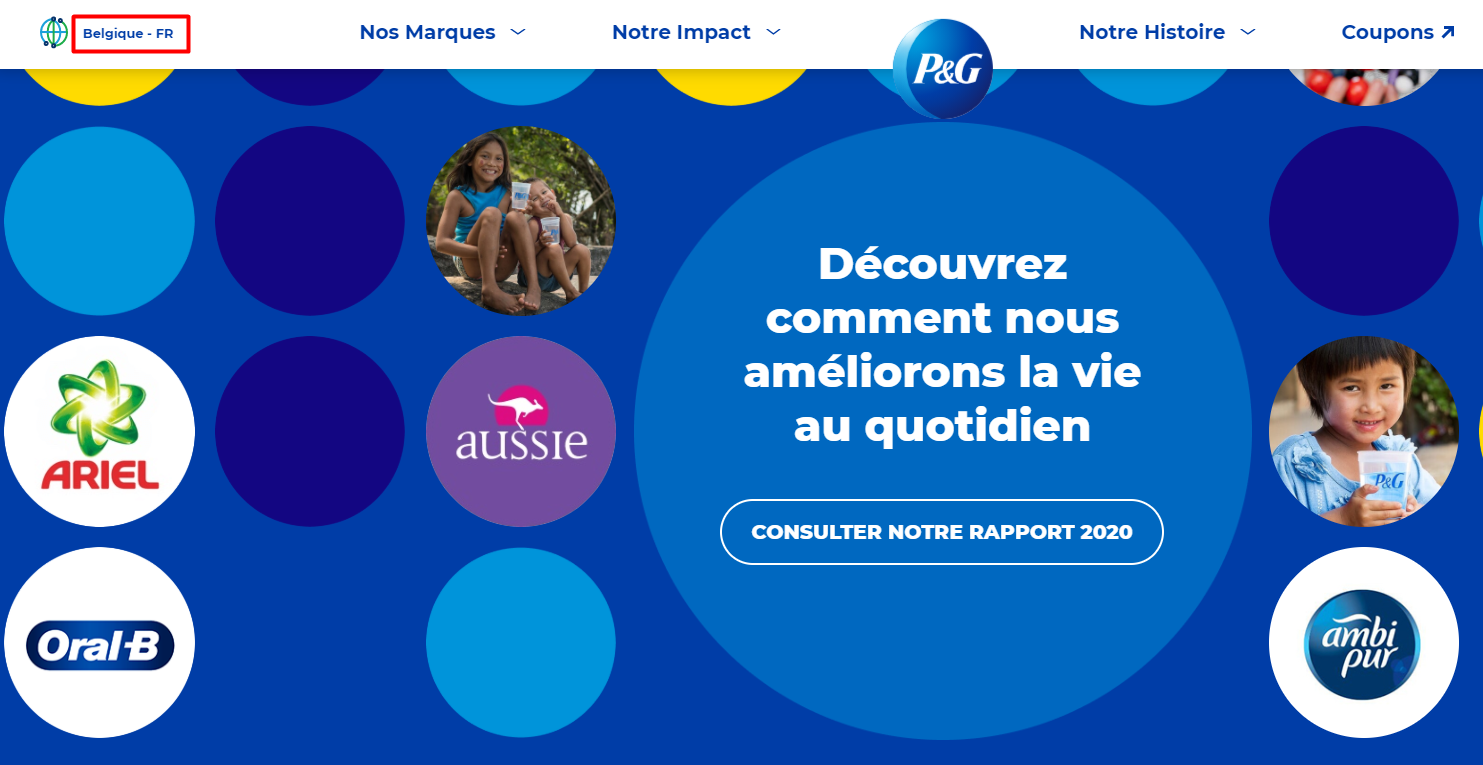
P&G home page in Belgium in French
For example, Ethiopia has 86 languages but only one flag.
You should determine what should be displayed on the screen for each language page, translate it to that native language, and then arrange the user interface elements on the screen. For example, buttons should be within reach of a thumb. Translate everything and remember to also translate the notifications for when they’ve clicked on your interactive buttons.
I’ve learned to think about why I’m making this language choice. I’ve learned to think from the user’s perspective — make them feel welcome in their native languages.
Icons
Your multilingual pages shouldn’t have the same content throughout but instead use appropriate images, text, and icons. For example, most Japanese websites are text-heavy with a modular design, while US websites are usually image-heavy.
The social media icons also differ within regions. For example, when it comes to Asian countries, Facebook is still prominent, while in Western countries, Instagram is preferred. You might want to change the layout of social media icons in your different multilingual pages.
Xiaomi product page in India
I’ve learned that even icons are most useful when tailored to a country — so do a little icon research.
Typography
Different languages will have different sizes, making room for text expansion, such as Hindi Devanagari script, which expands when written, and text contraction, such as abbreviations in English.
Languages require a specific understanding of the font as it pertains to the target language. Chinese fonts may need to be displayed in a font or two larger than Latin-based fonts like French. The text will also expand and contract based on font size, so watch out for these considerations in your designs.
Language directions will affect the design as well because you should mirror for left-and-right and for right-to-left. Here is a guide on bidirectionality for UI.
Here’s one tip I’ve learned: remember to leave enough space in your UI for longer texts and adjust for shorter texts.
Cultural specifications
Designs that may seem stylish to Westerners may be a no-no in other cultures. For example, pictures of hand gestures may be considered inappropriate in different cultures, like don’t do the thumbs up in the Middle East because it is considered an insult. Visuals often have the potential to be offensive. Use consumer research like this to avoid cultural offenses.
Sometimes, companies opt to use models for advertisements that are native to the country they are targeting: a Korean model for a Korean page, a Swiss model for a Switzerland page, etc. Using local models is good for localized purposes.

Easy to change models without changing the template in Mega Creator
For example, Coca-Cola increased sales when they gave leeway for their local operations to adjust to local preferences. Consider a hyperlocal marketing campaign.
Did you know that there are cultural differences when it comes to colors? Blue is considered globally accepted because it connotes trust and authenticity and calming to the eyes. Yet, red in some cultures can be offensive, associated with death and anger, such as in South Africa, where red is a color for mourning and violence or bloodshed. Meanwhile, red in China represents good luck and good fortune.
This consideration is a break-it or make-it deal for me: make sure to know the appropriate cultural messages for each country you’re dealing with.
Regional Differences
The littlest things count in life. So too in multilingual UI design. Dates, times, weight, and numbers are not standardized throughout the world and are different everywhere. English-speaking countries like the US and the UK use a 12-hour clock, but most European countries use a 24-hour clock, for example.
Another example is calendar date formats. Some countries use a month/day/year order, but in other countries like France, the day/month/year format is used. Some countries start with Sunday as the first day of the year, and others start with Monday. These are small details, but they will make a difference to UI design and the UX of your site.
I’ve learned even the littlest things like regional differences can make a huge impact.
I’ve learned that a great multilingual website should use consistent design with different offerings.
Language barriers often restrict websites to fewer languages than is optimal. Translations that are easy and quick will not do the job. Even machine translation will not do the job. A powerful combination of machine and machine post-editing can, though.
A multilingual website is a broad process managed by proper language experts and localizers who get the job done. That’s what companies like Tomedes do best by combining technical expertise with linguistic knowledge.
Let’s take a look at one example of good UI and elements of bad UI.
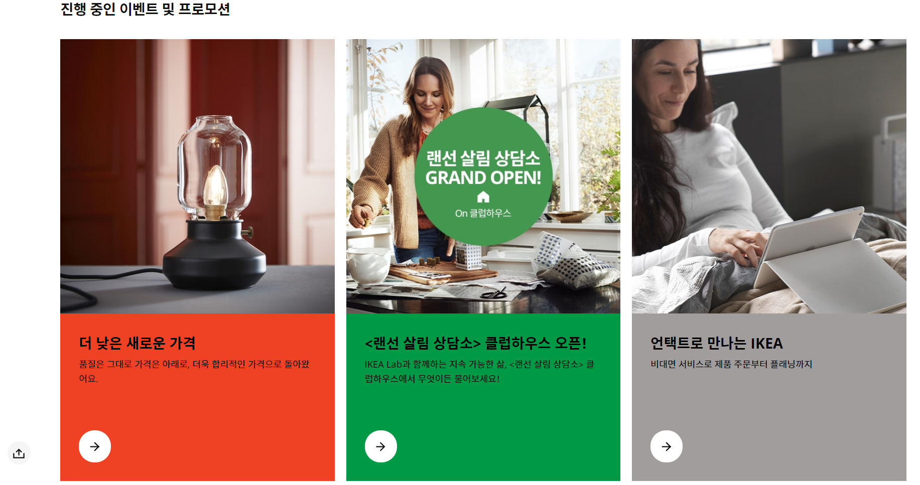
IKEA
In what is slowly becoming termed “the IKEA effect,” IKEA provides a great user experience for its consumers, creating a bond between its customers and its customers. So, how does it do this?
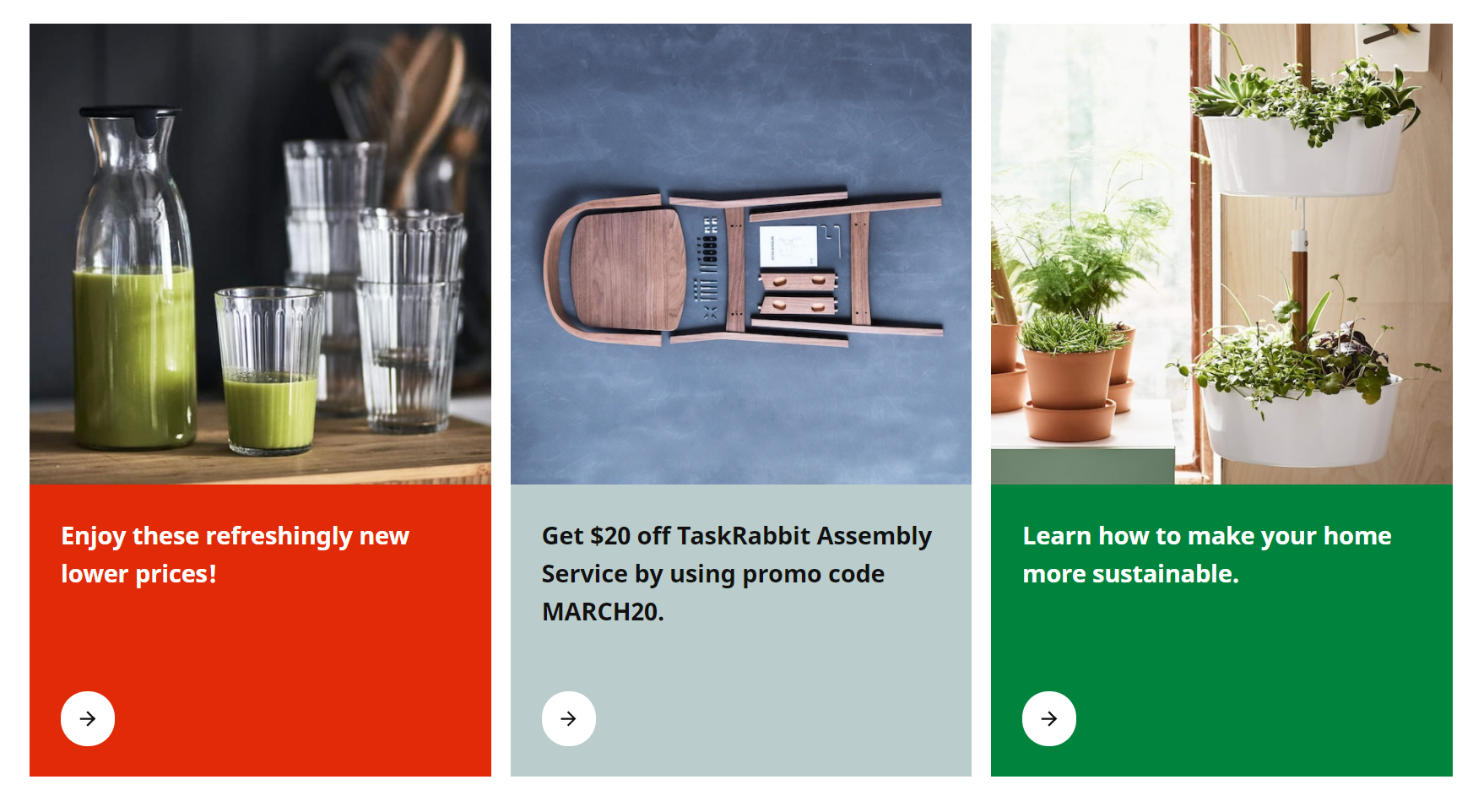
Their multilingual website uses a global template that allows for different design elements a simple modular design.
Their Korean page uses some culturally appropriate colors, like green and red, but for the most part, stick with the same color palette as their homepage for consistency. They also use more images than their USA one. Both pages highlight different products for each one.
All of their pages are aptly translated, too.
Here’s the Korean homepage to illustrate:
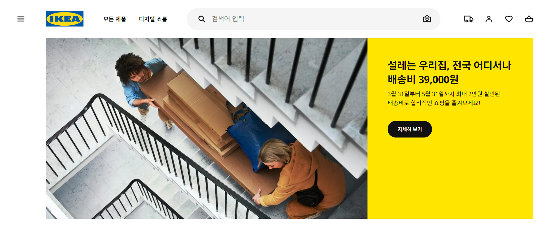
And here’s the US homepage for comparison:
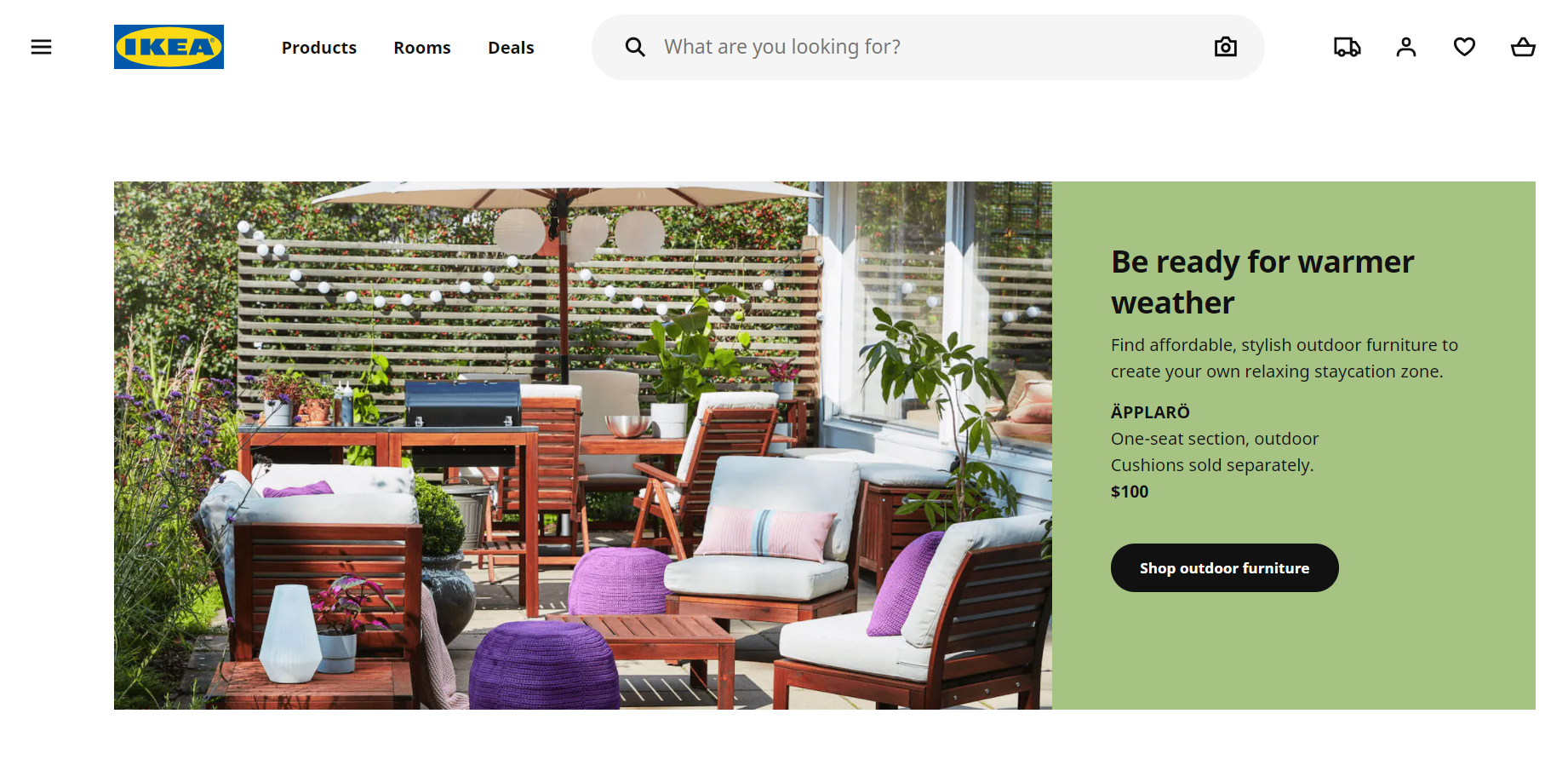
Here is where the US page:
And the Korean page differs:
Elements of Bad UI
This should go without saying, but good UI is:
- Error-free in translation
- Easy to use
- Easy to understand
- Effective for the service or product
A bad UI often has:
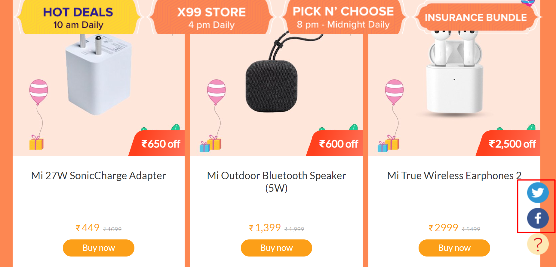
1. No contrast at all – I’ve said that multilingual websites should have consistency, but being too consistent without any contrasting elements like different icons or different directionality doesn’t make your page any different from your other language pages. A balance of contrast and consistency is good.
For example, this is one such example of where there’s no contrast at all in their UI:
2. Not responsive across all platforms – a good multilingual UI design will respond well across all platforms, be it mobile or tablet, be it a Japanese page or a UK page.
3. Not translated well – there’s a number of these online, but pages that are not translated well will not be responsive to the target market.
4. No cultural considerations – I’ve covered this previously, but stress this again. If the language has a right-to-left directionality, and you input it to a left-to-right design, you’re not doing well.
I’ve learned what a great UI looks like and what bad UI has done wrong.
Key considerations
I hope you’ve learned what I’ve learned in this article. So, to sum it up, here’s what I’ve learned:
- I’ve learned that the big things (language and culture) need to be appropriate for the global design and its modular elements.
- I’ve learned that the little things (icons, typography, and regional differences) can make a big difference.
- And I’ve learned that translating well can get you there — maybe through the use of services.
Good luck, and have fun designing your multilingual website!