


Are you team keyboard shortcut or team right mouse click? In UX, you have to be on both teams at once to make the interactions smooth and intuitive.
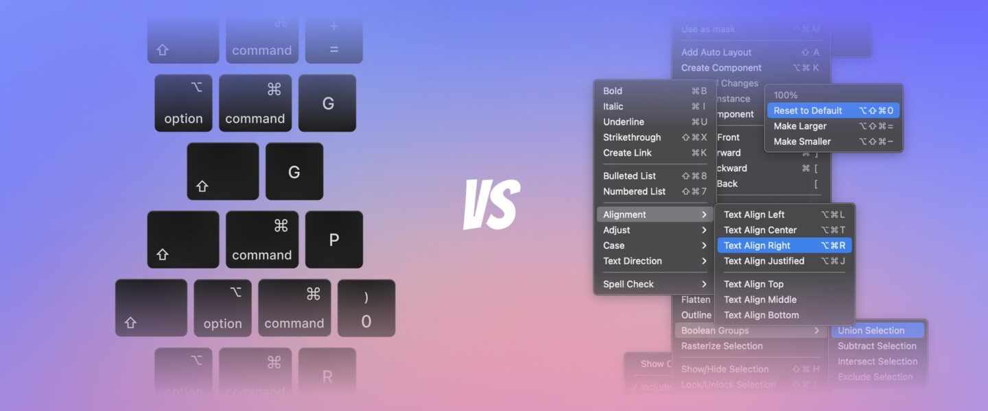
There’s a whole universe of button combos beyond Ctrl+C and Ctrl+V. How much do the users actually utilize them, though? And can context menus be more convenient? Both are good in their own way and both play a major role in UI/UX design. Putting an emphasis on one of these and overlooking the other is a dangerous path that can ruin user experience. Though users generally prefer to save time by hitting hotkeys, many of them stick to context menus because of their clarity.
Let’s take a closer look at both to see how to integrate context menus and hotkeys into UX design flawlessly.
Context menus in UX
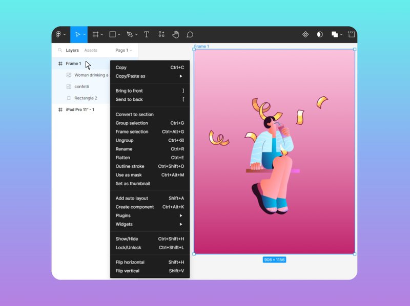
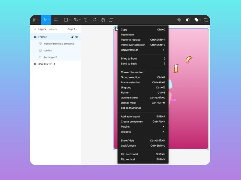
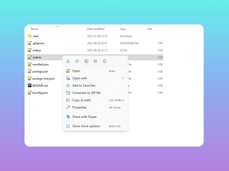
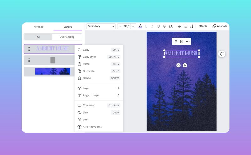
Also known as right-click menus and pop-up menus, these are a vital part of UX design. Though technically right-click menus turn into left-click menus with the left-handed mouse orientation activated, we are going to call them right-click or context menus to avoid confusion. It might seem like context menus take literal seconds to create because most of the time they contain the same actions in every app. There are the usual Open, Copy, Cut, Delete, Rename, and Share plus a few app- or object-specific actions. How hard can that be, right?
1. Respect the user flow
If you are creating a context menu for an item that has an icon and a name, a context menu should pop up no matter where the user clicks. Whether they choose to click on the icon or the object title, they need to see a context menu. Needless to say, the list of options should be the same in both cases because it’s the same file we are talking about.
The same logic applies to items presented in groups like rows, columns, and clusters. If they are supposed to be the same pieces of data, the list of actions for them should be the same in the context menu no matter where the user’s cursor lands. Imagine going through the items in the B column of your Google Spreadsheet and seeing that the actions in the context menu are different for each of them — infinite confusion.
2. Only leave the essentials
In most cases, a context menu shouldn’t have all the commands available for the target object — otherwise, it is going to be unimaginably messy and unusable. Instead, it should offer a list of the most common actions the users are most likely to perform. The rest should be available via dropdown menus in the navigation bar at the top of the screen.
For complex actions, you can add lines with arrows pointing to the right that open hover dropdown submenus with more commands. However, there shouldn’t be too many of them and they should be at the bottom of the list.
3. Visualize wisely
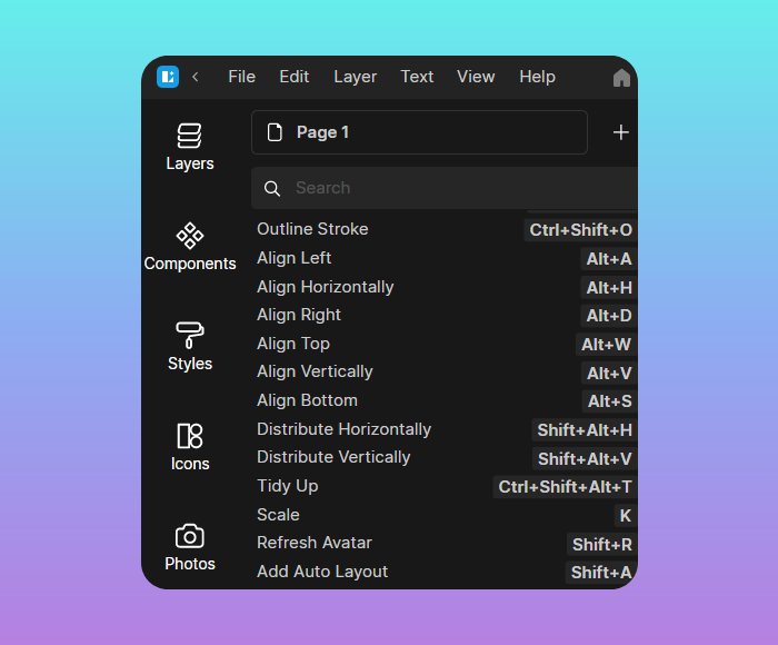
Adding icons next to actions on context menus can be a lifesaver when done well, but UI-wise it might be risky. Sometimes, even miniature icons can clutter the interface design, so if you choose to add some, make sure you don’t insert a detailed, colorful icon for every action there is. Stick to simpler, cleaner ones when designing menus. Also, if you decide to go for icons, consider replacing some of the text commands with them, just like Microsoft does in the Windows UI design. You have a scissor icon for ‘cut’, a trash can icon for ‘delete’, a text editor icon for ‘rename’, and some others.
Another good idea for better visualization is to insert a miniature indicator telling the user that a context menu is available. Those can be three dots or a triangle pointing down. Because sometimes it’s hard to tell whether there is any list of actions for an object, a subtle visual hint like this is extremely useful. When designing context menu indicators, avoid commonly used icons that are associated with something else. For instance, a gear symbol that is normally used for global app settings is not a great choice of an icon for context menus.
4. Keep it relevant
Another crucial thing to remember is that a context menu is targeted at a specific object unless the user right-clicks in the middle of a document. That said, having actions that apply to the entire document on the list of commands when a user clicks on a particular element is not a good idea. If you shove Close or Refresh in the context menu for, say, a layer inside a graphics editor, it’s going to be unclear to the user how these can apply to a layer.
5. Context menus don’t exist on their own
One of the worst crimes against users that UI/UX designers can ever commit is disorienting them with poorly designed UI. Context menus should never contain actions that are exclusive to said context menus and can’t be found in the navigation bar. A right-click menu can only include commands users can browse by opening the main menu at the top of the screen. If there’s something else you feel should be on it, make sure you add the action to the navigation menu first.
Shortcuts in UX
Though an average user only knows a few two-key combos that start with Ctrl, shortcuts are a fundamental part of UX design. They turn complex commands that would normally require a few clicks through the navigation bar into quick actions. An app that lacks shortcuts and has most of the commands only accessible via the top menu is not a user-oriented app. Assigning hotkeys to the right actions, however, requires a solid understanding of a user’s needs and behaviors.
1. Make a shortcut guide
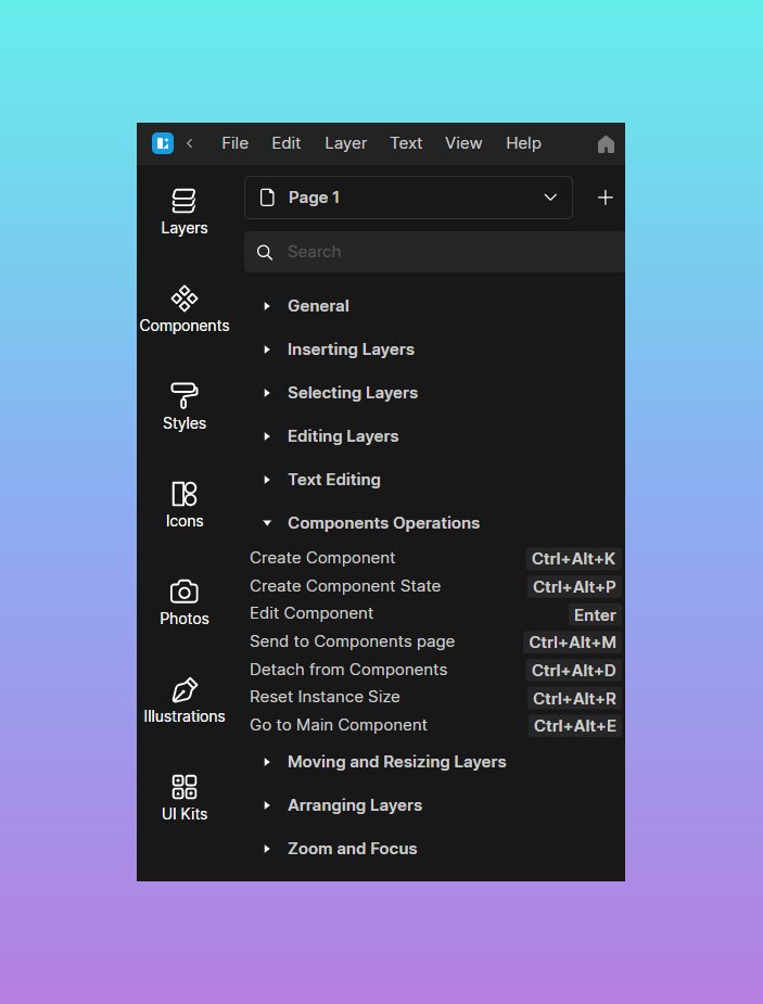
It’s good to have a shortcut reference guide with a list of all the shortcuts available to the user. You can insert it in the Help section at the top navigation bar and group the hotkeys within your guide to make the search more intuitive for the user. This is especially helpful if you have a long list of shortcuts available and many of them go far beyond the Ctrl+letter combo.
2. Use associations
Try to build associations between your shortcuts and the actions they refer to. Those might be literal if you use a single letter your action begins with to make a shortcut, or metaphorical.
Examples of literal associations between hotkeys and functions are endless: there’s O (Ctrl+O) for ‘open’, F (Ctrl+F) for ‘find’, S (Ctrl+S) for ‘save’, etc. Some of the best examples of metaphorical connections between hotkeys and actions are the Ctrl+Z and Ctrl+Y combos. Z is the last letter of the alphabet, and Ctrl+Z undos the last action you performed. Y is second to last, and Ctrl+Y takes you one step back by reversing the Ctrl+Z.
3. Avoid common key combinations
Trying to modify the existing universal hotkeys users across all operating systems have known for years is not a good idea. Because these key combinations work inside every other app, it’s going to be annoyingly painful for the users to relearn their function for a single different context. Maybe ‘export’ does make more sense for Ctrl+X, but this hotkey is already known as ‘cut’, and changing that would leave many users incredibly frustrated.
4. Add hints for shortcuts to your menus
Make sure your user can find the shortcuts outside the Help > All App Shortcuts section. They need to be visible in the main navigation menu and right-click menu next to the commands they correspond to. This will make it easier for the user to find and memorize helpful key combinations.
5. Main modifier keys first
Modifier keys include Ctrl, Alt, and Shift for Windows and Command, Shift, Option, and Control for macOS. Of all these, Ctrl and Command (or Cmd) are the main ones, and all the most important hotkeys start with them. When designing shortcuts, Ctrl and Cmd should be the primary modifier keys responsible for critical actions like save, undo, and duplicate.
In their Guidelines for Keyboard UI Design, the Microsoft team suggests that shortcuts starting with Ctrl are a better fit for actions that represent a large-scale effect. Smaller, less frequently used actions can start with an Alt, Shift, or a complex combo like Alt+Shift.
So which one is more important?
For those who use, say, graphics editors on a daily basis, only knowing about 10 simplest hotkeys is insanely inefficient. Spending extra time trying to find the right function in the context menu by using the right mouse button when working in Adobe Illustrator or Blender will turn any project into a never-ending nightmare. In cases like this, shortcuts are absolutely vital.
Neatly designed context menus are just as important: they make it easier for the user to get an idea of what actions are available in a particular context and memorize key combinations for their most used commands. Plus, there are tons of complex actions that don’t even have shortcuts assigned to them. In cases like these, right-click menus are irreplaceable.
At the end of the day, hotkeys or right clicks, it all comes down to how comfortable the users are when interacting with an app.