Why is every other logo blue and flat? What is the difference between a lettermark and a letterform? Our ultimate guide to logo design explains this and more.
The two most important components of a brand identity are its name and logo. They introduce your company to the world, much like your name and face help your new acquaintance make an impression of you as a person. The anatomy of a logo is both simple and complex. There are not too many elements to work with in logo design, but each aspect of those has to be perfectly calculated to be in tune with brand identity.
If you want to learn more about the psychological aspect of logo design, check out our article on how to create a brand sign that works for you. In this article, we are going to get technical and dive into the essentials of modern logo design.
Types of logos
1. Wordmarks
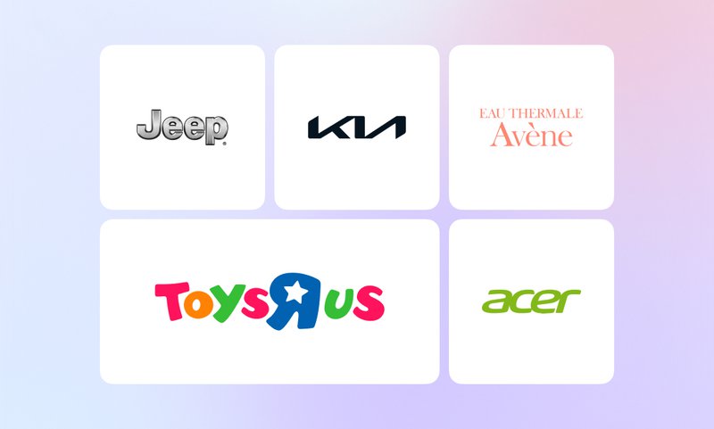
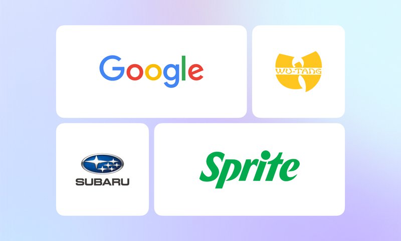
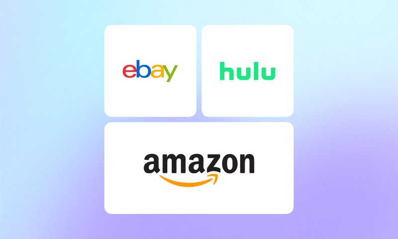
Wordmarks also known as logotypes are the most basic and the most universal logos. This type of logo design uses a company’s full name in its signature font and brand colors. As plain and subtle as wordmarks might seem at first, they are a go-to logo design choice for many companies across different industries. From automobiles to children’s toys, you’re familiar with hundreds of logotypes including Jeep, Acer, Barbie, Kia, and others.
A wordmark is concise, memorable, and straight to the point. It makes it way easier for a customer to memorize the name of the company than a complex logo that has a lot going on. With minimalist logo designs on the rise, many companies reduced their logos to wordmarks in the past years. These include Couchsurfing, Fendi, and Sprite.
2. Letterforms
Letterforms are logos that feature single letters, sometimes with additional symbols like exclamation marks and digits. In a letterform logo, the first letter of a company’s name becomes the central design element.
Letterforms are some of the most convenient logos: they can fit into virtually any environment without additional adjustments. No matter where you might need to include your logo, a single letter is perfectly scalable and always stays readable. Thanks to this, letterform logos are especially popular among companies that mostly exist in the digital world – plugins, software, mobile apps, and other types of e-goods. Take Figma, Gmail, or Opera – all these are basically useless outside your smartphone or PC.
3. Lettermarks a.k.a. monograms
Not to confuse with letterforms, monograms are built around brand name abbreviations. They always feature more than one letter – depending on how many words make up a brand’s name. While most of the time they are made up of nothing but letters, some of them have brand symbols and emblems, like LG with its red smiley face.
Lettermarks are a great option for businesses with long names that are hard to remember. Many of these end up looking so catchy, people don’t even know their full names. Some of the most prominent examples of iconic monogram logos include GQ (Gentlemen’s Quarterly), DKNY (Donna Karan New York), and FIAT (Fabbrica Italiana Automobili Torino).
4. Brand marks a.k.a. logo symbols
Also referred to as pictorial marks, these logos usually represent real-life objects. These might be symbols that are a literal visual representation of a company’s name or images that reflect a brand’s core values and ideas.
A good brand mark can build a strong association between the chosen symbol and your product. Eventually, this can make people think of your company anytime they see even a remotely similar image. Don’t you think of pizza as soon as you see the word ‘domino’?
When you look at a brand mark, you don’t need to guess what object it is supposed to represent. They don’t leave much room for artistic interpretation and are quite direct, unlike their close relatives, abstract logo marks.
5. Abstract logo marks
Though visually almost similar to the previous type of logos, abstract logo marks are pure geometry. An abstract logo mark is a clean, uncomplicated abstract geometric form that packs a brand’s concept into a symbolic image. They can have several meanings and possible explanations depending on how you look at them.
Simple, uncomplicated, crisp geometric abstract logo marks are particularly common among companies related to technology and finances. Société Générale, Electrolux, and Santander Bank use abstract logo marks.
Because of their simplicity, abstract logo marks are easy to remember and recognize. Just like letterforms, they can withstand resizing and reshaping with no damage to their look.
6. Mascots
This type of logo makes use of a brand’s signature character, making it the core design element. Mascots that have a striking appearance or a strong personality are an amazing choice for logo design. At this point, it seems like everyone knows the almost uncomfortably flirty Mr. Clean, the mildly psychotic multilingual owl named Duo, and the one and only Michelin man.
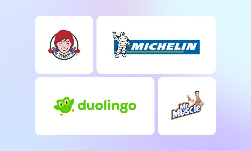
To make the mascot logo work, the brand’s character needs to have a backstory and play a significant part in the life of the company. A cute, adorable creature that does nothing but appear on brand logos and icons like a lifeless 2D sticker is neither memorable nor useful.
7. Emblems
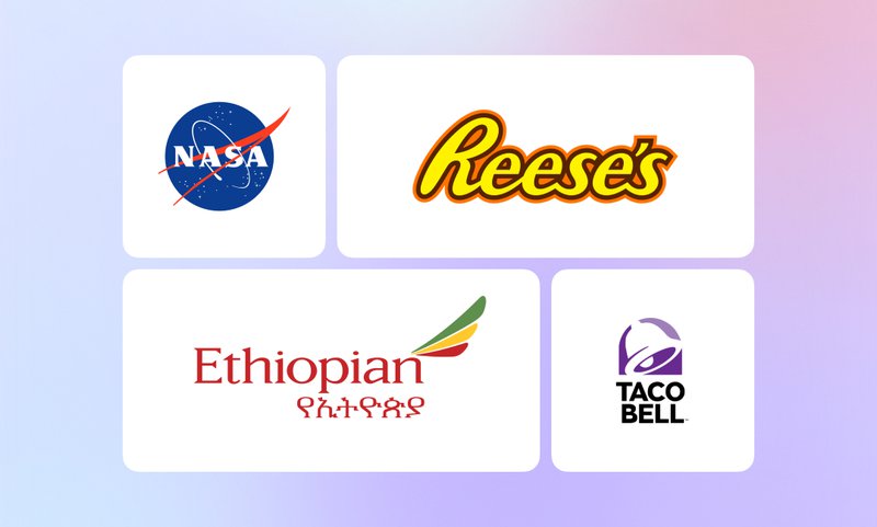
Often shaped like a coat of arms, an emblem features a brand’s symbolic imagery. Emblems are the logo of choice for family businesses and companies with a long history. Though especially popular in the field of education, you can find emblem logos in the automotive industry, entertainment, and other business spheres.
By using an emblem, businesses can emphasize that they value tradition and have been consistently delivering top-quality products to numerous generations of customers. Even if a company is relatively young, an emblem instantly makes it look like a trustworthy business with a long, rich history. Did you know Starbucks was just a little over 50 years old?
8. Combination marks
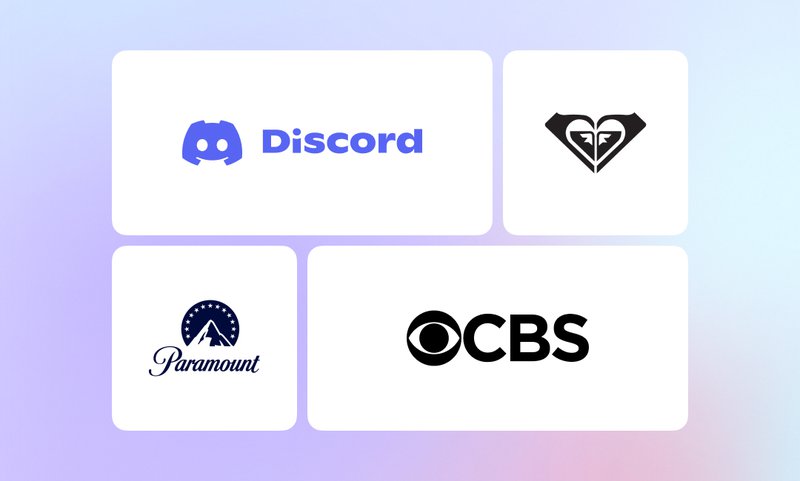
Just as the name suggests, combination marks are logos where a wordmark is combined with some other type of logo. It can be a blend of a letterform and a wordmark, a brandmark and a wordmark, etc. If you want to show both your brand’s name and personality, a combination mark is a perfect mix of the two.
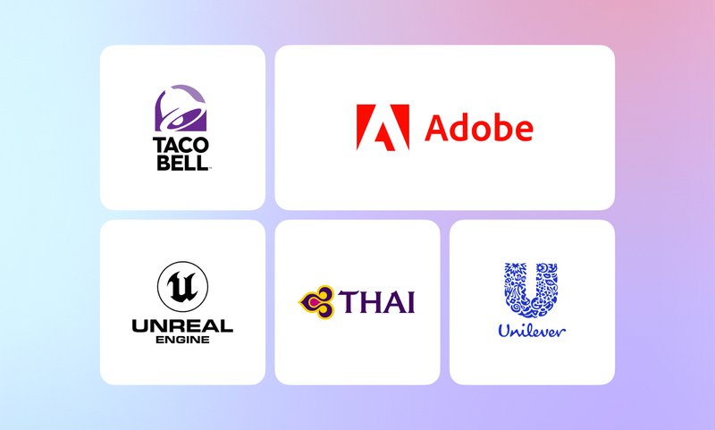
A combination mark is a universally convenient choice: whenever you need a smaller logo that would fit into a square, you can just drop the wordmark. While this type of logo is incredibly common across all industries, combination marks are a staple in aviation with every other airline using them: Air Canada, Lufthansa, Thai Airways, and more.
9. Dynamic marks
A dynamic mark is a flexible design that changes across the company’s subdivisions while preserving the defining element of a logo. A good example of a dynamic mark is NBC with all its subdivisions. The signature abstract logo mark with peacock feathers stays in each logo, while the colors and the wordmarks change.
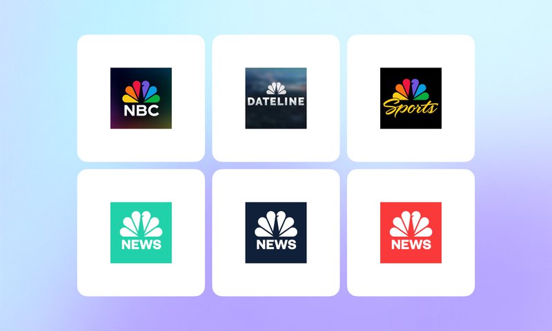
Dynamic marks are a convenient choice for companies with several subsidiaries or businesses that offer a wide variety of products. Because the main element of a logo stays the same, dynamic marks don’t harm brand recognition.
Psychology of color in logo design
Color is one of the key things to consider when designing a logo. It determines the vibe a logo gives off and hints at what the company values. Poor choice of a color palette might ruin the impression of the entire logo and make the message of the brand unclear.
The top 3 colors in modern logo design are blue, black, and red. Blue is the absolute leader with 40% of Fortune 500 companies using it in their logos. Black comes next: 25% of the world’s biggest enterprises have pitch-black logos. Around 16% of Fortune 500 businesses opt for red in their logo design.
Let’s take a closer look at the most common logo colors and their meaning.
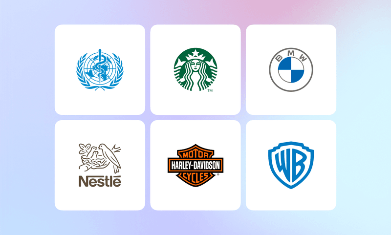
1. Blue
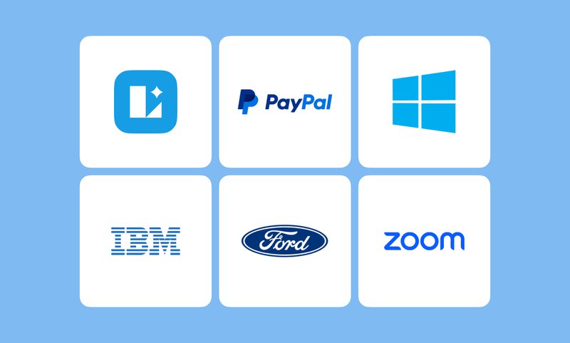
Everyone’s favorite logo color, blue is most often associated with intellect, reliability, and logic. This is why it dominates the color palette in tech and finances. Facebook, Twitter, Intel, HP, Samsung, Windows, and other tech giants all have blue logos. Of all shades of blue there can be, lighter hues like cyan and sky blue seem to be on the rise. These colors are synonymous with freshness, energy, and youth – the three characteristics many modern tech companies strive to embody.
Other interpretations of blue include tranquility and cleanliness, which is why you can often see blue logos in skincare, hygiene, and house cleaning products.
2. Black
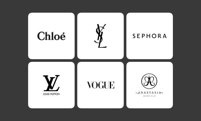
One of the most ambiguous colors, black is a popular option in modern logo design. Black symbolizes a dizzying variety of characteristics from dark and gloomy to expensive and sophisticated. Because pitch black looks elegant and chic, this shade is a favorite in the fashion and beauty industries. World-famous brands like Sephora, Chanel, Yves Saint Laurent, and Louis Vuitton use exquisitely minimalistic black logos.
Aside from beauty and fashion, black is also a foolproof logo design choice across the rest of the industries. Black is often associated with being professional, faultless, solid, and powerful. A black logo is always a bold statement that makes a brand stand out.
3. Red
Red is one of the most emotionally charged logo colors. It forces you to stop and pay attention much like a glowing red street light does. Vibrant red is associated with being youthful, passionate, bold, and energetic. It can also be interpreted as powerful, dominant, and aggressive which can be a not-so-subtle message for competitors.
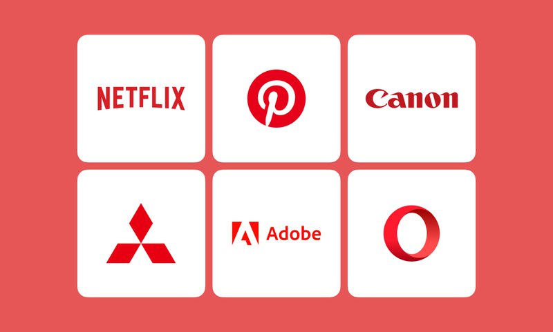
The brighter, more saturated shades of red like crimson, scarlet, and candy apple red are more common than deeper, darker hues like blood red or burgundy. Red is common among a wide variety of brands from different industries. Those include Adobe, Netflix, Coca-Cola, Mitsubishi, and other major companies.
4. Green
Green is traditionally connected with peace, health, nature, and being fresh and innovative. Though certain shades of green are considered a risky choice for logo design. Adobe recommends avoiding yellow-green shades because of their association with toxicity, sickness, and jealousy.
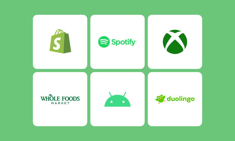
Some of the most popular hues of green include the friendly shamrock green, the calming emerald green, and the energetic lime green. Many world-famous brands use this vivid color in their logos: Spotify, Acer, Android, and Xbox to name a few.
5. Gray (silver)
Gray and silver are linked to being professional and intelligent, as well as elegant and expensive. Shades of gray are seen as calm and reserved, non-overwhelming, and balanced. These two colors are common among car company logos: Mercedes-Benz, Toyota, Lexus.
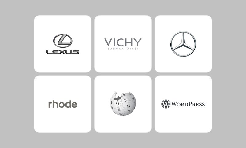
Other industries make use of different shades of gray in their logo designs, too: take Apple’s neutral gray brand mark or WordPress’ dark gray logo.
Because gray and silver can be tricky to optimize for various platforms, the main logo is often swapped for a 2D black or white version for better readability.
6. Yellow
The key words defining this luminous color are fun, optimistic, creative, and warm. Yellow is not your conventional bright shade for logo design, and using it makes a logo stand out immediately. When it comes to logo design, golden yellow and lemon yellow are the two shades that get the most love.
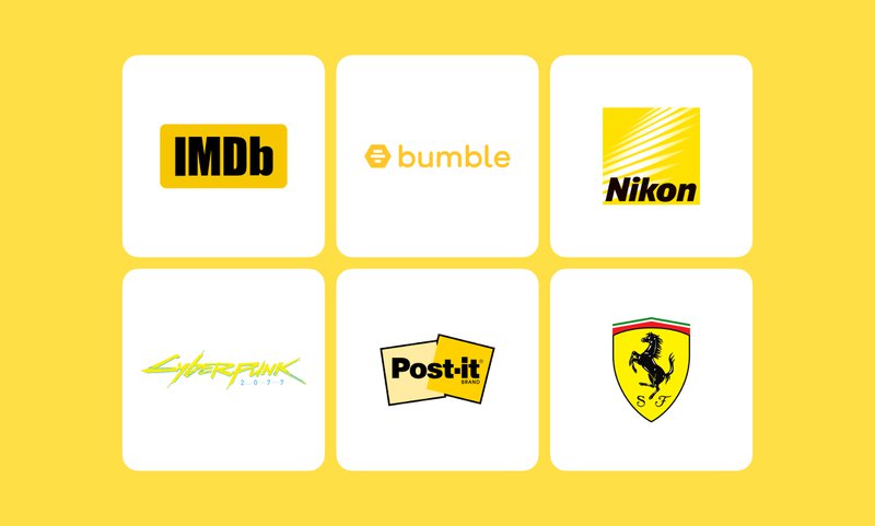
Despite being viewed as overall playful and bubbly, yellow is a go-to for a large number of companies, including banks, car manufacturers, and airlines. Raiffeisen Bank, Ferrari, and Spirit Airlines are known for their juicy lemon-yellow logos.
7. Orange
A mix of red and yellow, this color truly takes the best of both worlds. Like red, orange is adventurous, bold, and energetic. Similarly to yellow, this color is fun, creative, and optimistic. Orange is one of the most loved logo colors for digital products and services: Reddit, Houdini, Etsy, GitLab, and many others.
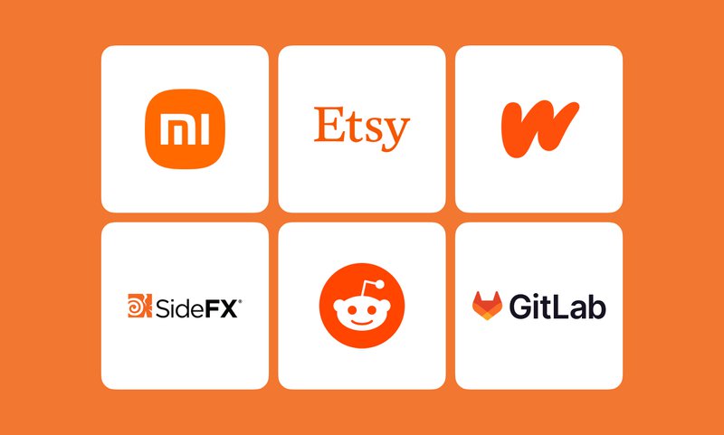
As many shades of orange as there are, the fiery red-orange and the eye-catching tiger orange are some of the most widely used variations of the color. Orange is just as daring and attention-grabbing as red, but way less common, making it a smart choice of logo color for companies that are going for a unique look.
Core principles of logo design
It’s no secret that logo design is not the same as other types of graphic design like illustration or typography. Though it uses the same elements – images and letters, it follows completely different rules. Composition in logo design is nothing like that of an illustration, a print, or a poster. A logo has to work quickly and efficiently to fulfill its main functions:
- Communicating the company’s message.
- Making sure the company stands out from the competition.
- Getting the customers to remember the brand.
Because of this, a logo needs to be simple, clear, and straight to the point. To achieve that, designers stick to the following principles when making logos.
Balance
Your logo might be symmetrical or asymmetrical but it always needs to be balanced. With symmetrical logos, it’s way easier to achieve: a composition where one half mirrors the other one feels impeccably balanced. If your logo is asymmetrical, you need to balance it out by experimenting with the size, color, and distribution of its elements.
Every element of a logo has a perceived visual weight depending on its shape, size, texture, and color fill. A fully opaque black rectangle is going to appear much heavier than a rectangle of the same size that only has a 3-px-thick black outline. Balancing a logo is all about assessing this visual weight and distributing the design elements in a way that would feel harmonious. Sometimes instead of resizing, recoloring, and repositioning the entire logo, adding a small detail would be enough to counterbalance the bulkier elements.
Simple layout
Because a logo has to be visually appealing, readable, and memorable, there is not much room for elaborate details. Complex backgrounds and additional elements that do not add much value to the message a logo is sending are a no-go in logo design. Ideally, a logo needs to have a sticker-like layout to make it universally convenient and usable across all channels and products a company has.
No more than 3 colors
The three-color rule is not unique to logo design. You’ve probably heard about the 3-color outfit rule which basically means that combining more than three shades in the same look is tacky. While this might sound too radical, the law of 3 colors is a must-know in cinematography, fashion, and graphic design for a reason. Using 4 shades or more can get too disorienting and confusing, making it unclear for the viewer where they need to focus their attention.
Filmmakers and interior designers even have an additional “60-30-10” color rule, according to which your primary color should take up 60% of the composition, 30% goes to the secondary color, and 10% is left for the accent hue. Some designers, however, suggest that the three-color rule should not include basic shades like black and white technically allowing for the fourth color in the palette.
Ultimately, the number of colors in a logo depends on the brand’s vision and identity and there are numerous exceptions to the 3-color rule.
Eye-catching and memorable
What’s the point of a logo that looks bland and unoriginal? A logo that is not an attention grabber will never help a brand stand out from the competition. The tricky part here is to remember that eye-catching doesn’t mean packed with elaborate details. A clean and simple logo can be both visually alluring and easy to remember.
Trends in modern logo design
Though the core principles of logo design have been there for decades, microtrends come and go. Take Lavazza’s logo, for instance. The famous Italian coffee brand has used simple, balanced, visually striking logos with fewer than 3 colors since 1895. But if you take a closer look, you’ll see how the font, the color palette, and the whole composition shifted towards minimalism over time.
Because modern logo design is often centered around optimization for websites and mobile apps, minimalism is the key trend. The rest of the microtrends are rooted in the minimalist approach to logo design. Here is what else you might notice when looking at the newest logos:
Sans serif font
Serifs are small strokes at the ends of the larger strokes making up a letter. The timeless, universally recognized Times New Roman is an example of a serif font. While serifs are great for print media because these micro strokes make it easier to follow lines of text, they are not great for logo design. Serif fonts tend to get messy and hardly readable when resized making cleaner fonts a better choice.
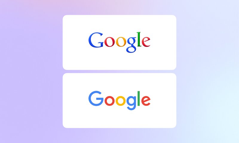
Sans serif fonts like Futura, Helvetica, Arial, and Montserrat are taking over modern logo design. Thanks to their plain, light strokes, they are more optimization-friendly than serif typefaces. Plus, neutral, minimalistic sans serif fonts are more universal – they fit into any logo organically and effortlessly. Whether it’s a car company logo or a language learning app logo, sans serif fonts work with pretty much any design. Many companies, including Google, switched from using serif fonts to sans serif typefaces in their logos.
If you want to know more about the art of choosing the right font for a logo, check out our tips on finding the perfect typeface for your brand.
Basic geometry
Elaborate shapes with lots of fine details are the ultimate recipe for disaster optimization-wise. Tiny elements only look good on full-size logos. In a smaller version of the logo, they get jammed and make the whole composition look sloppy and unreadable. The simpler the shapes are, the easier it is to scale them without losing clarity.
Negative space
The use of true negative space in logo design became possible thanks to the invention of the alpha channel and digital compositing. In simple terms, the alpha channel is what allows you to control the transparency and opacity of each element. Without the alpha channel, we wouldn’t have GIFs, PNGs, SVGs, and would still need to create a colored background for the logos only imitating negative space.
Now that we can leave parts of the image fully transparent thanks to the alpha channel, many companies take advantage of the negative space magic in their logo designs. Most of the time, it makes a logo look more flexible and flowy, leaving the impression that the product it represents is incredibly versatile. Sometimes, by using negative space, designers can create optical illusions that make the customers stop and focus on the logo, trying to fill in the missing parts of an image.
Either way, negative space is an effective attention grabber that doesn’t overburden the logo design.
Lowercase
Lowercase has been trending all across the web for the past few years. Instead of properly capitalizing every new sentence and every name, people often use lowercase letters for convenience and a more casual look. From messaging and captioning posts on social media to naming songs and designing company logos, lowercase is everywhere.
Stepping away from uppercase is a continuation of the shift toward minimalism in logo design. A wordmark that is typed entirely in lowercase letters looks friendly and modern compared to the usual capitalized version. On top of that, lowercase wordmarks are easier to align with the rest of the elements in a logo.
The perfect logo formula
Thankfully, it does not exist, and trying to check every box on the list of modern logo design principles won’t guarantee success.
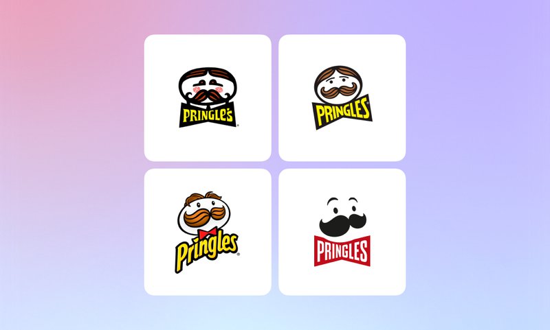
In fact, many companies that went from more elaborate designs to the hot new simplified logos left their customers disappointed. Take the polarizing Pringles rebranding case, for instance: the iconic portrait of Julius Pringles is barely recognizable now that it only has a mustache, two dots for the eyes, and two lines for the eyebrows.
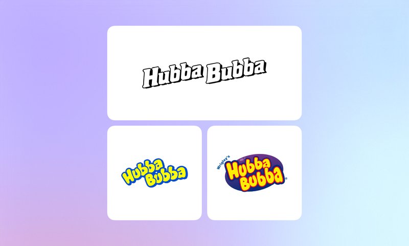
Conversely, there are companies that went from simpler logos to more complex, colorful, textured ones. Children’s favorite chewing gum Hubba Bubba started off with a duo-chrome wordmark and had been using it for decades before finally introducing its famous purple bubble logo in the 1990s.
There is really no best logo – there is what works for a brand’s identity, tone of voice, and target audience and what doesn’t. Knowing your logo design foundations is crucial but there is no point in blindly chasing every trend there is.