The only icon that brings a sense of joy and relief every single time you see it. Unless you’re a janitor.
The queen bee of icons
Which icon do you most frequently come across? At times, your eyes anxiously look for it in public spaces: shopping malls, airports, train stations, stadiums — you name it. If you guessed that this article is about a toilet icon, you’d be correct.
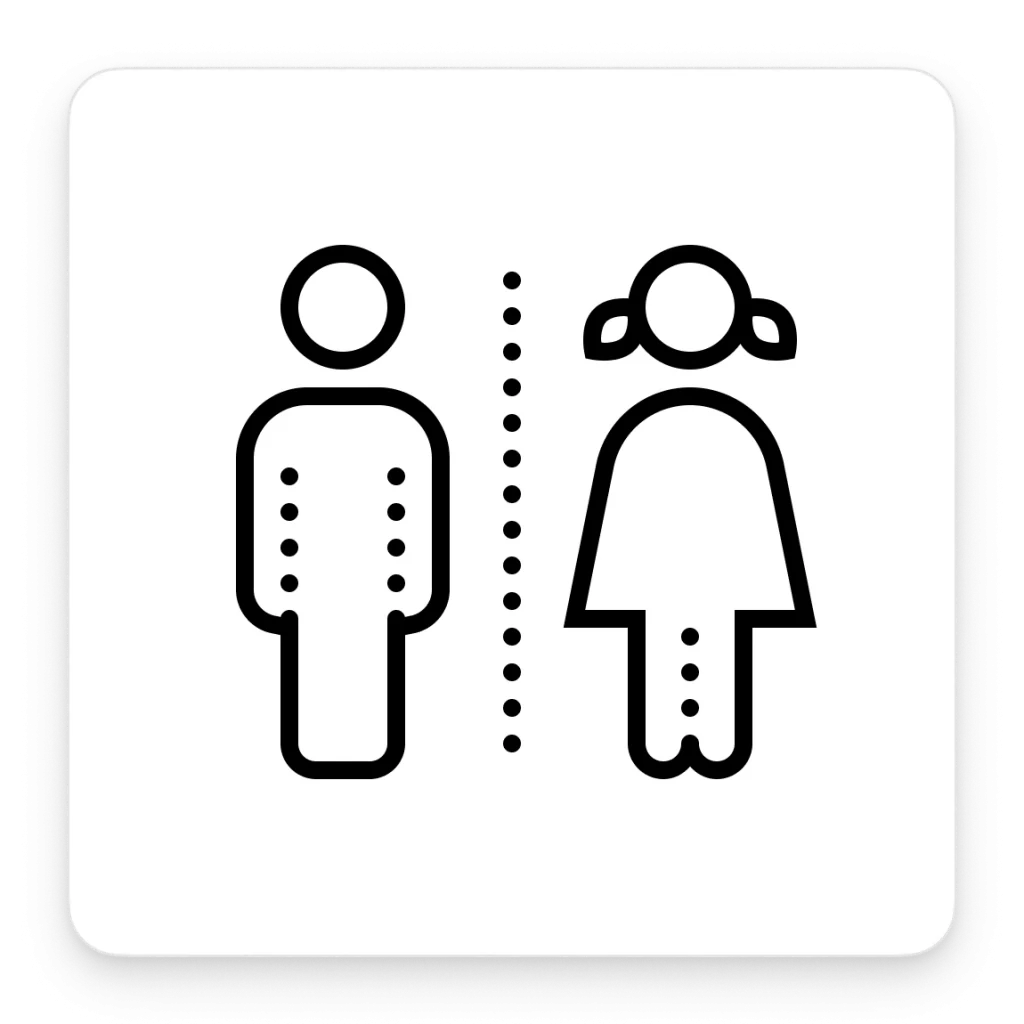
Traditional toilet sign
It’s hard to pinpoint the exact moment this bathroom classic was invented. The process of shifting toward a unified restroom signifier began in the 1960s. At that time, British Rail began a massive rebranding procedure to develop a new corporate identity. This involved a big-scale redesign project for every sign placed at the train stations. The new signs included clean, readable fonts and minimalist pictograms, one of which was the stick figure toilet sign.
In the 1970s, the US Department of Transportation started working on the same task. Their goal was to develop a set of universally recognizable pictograms for transport facilities to make it easier for travelers to navigate those areas. They also had to be neutral enough to fit any space without ruining its appearance. Together with the American Institute of Graphic Arts, they created a set of signs now known as the DOT pictograms. The classic black set of stick figures for bathrooms was among the newly designed signs.

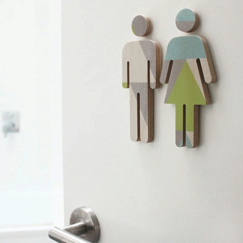
Since then, designers have been experimenting with the OG stick figures, reinterpreting the 20th-century classic and adding a bit of an artistic touch to them.
Here are some examples of the WC stick figures from the Icons8 library.
Timeless classic with a twist
To make stick-figure toilet signs a bit more playful for less formal public spaces, designers often spice them up by changing the posture or adding accessories. This way, they are less stiff, more human, and way more relatable.
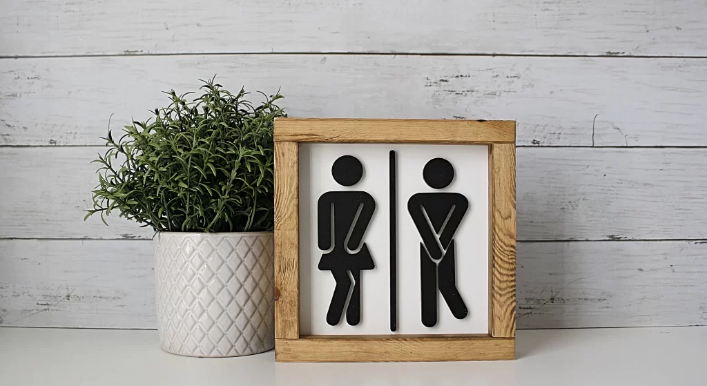

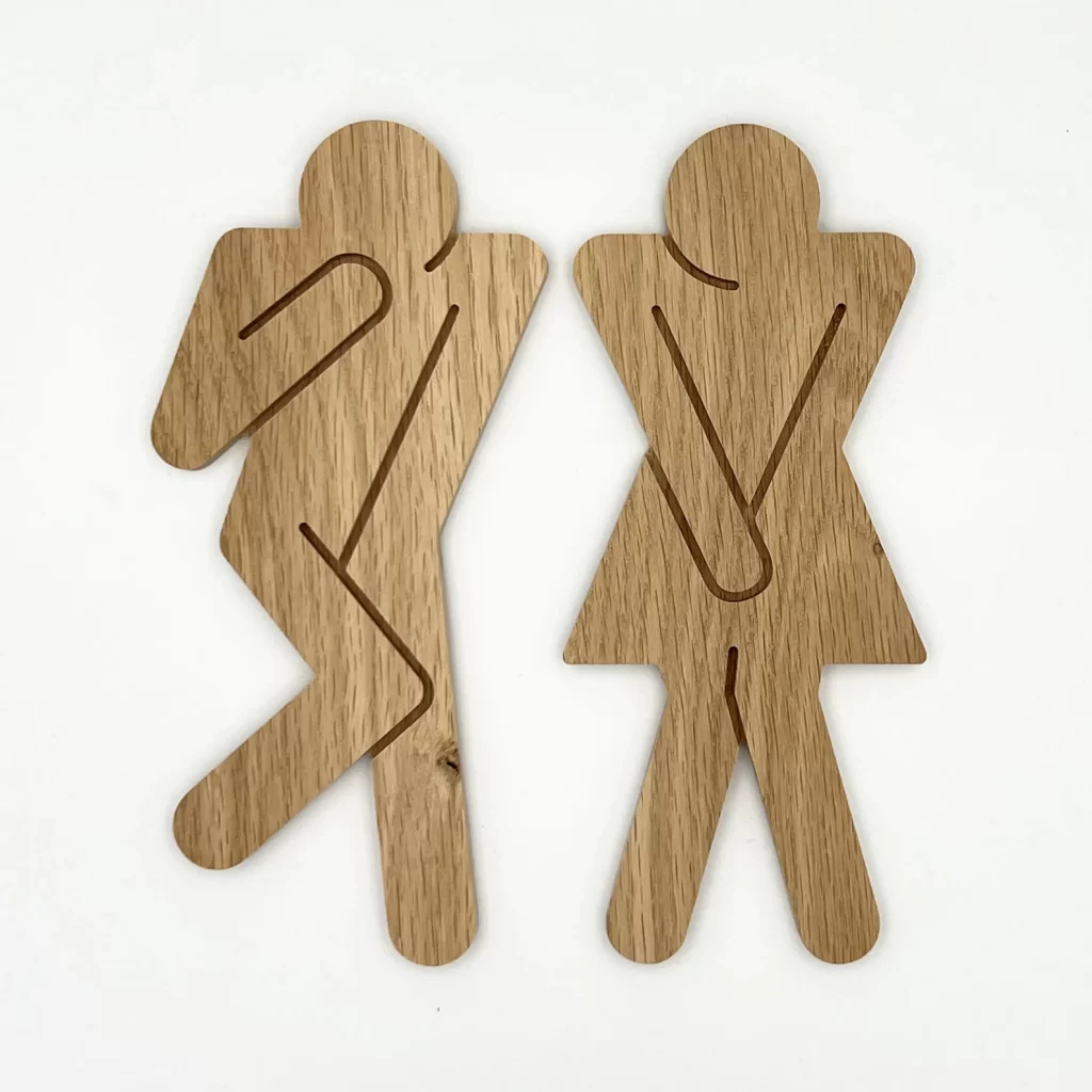
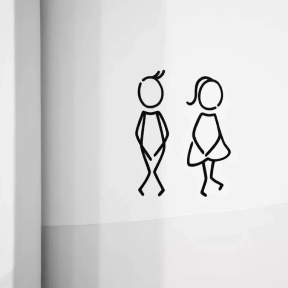
These are some icons to use:

Gender inclusivity in toilet signs
Recently, some countries have been adding more gender-neutral restrooms in public spaces. To account for these changes, designers are constantly developing new symbols for public bathrooms. Artists have been experimenting with both human and non-human signs for gender-neutral restrooms.
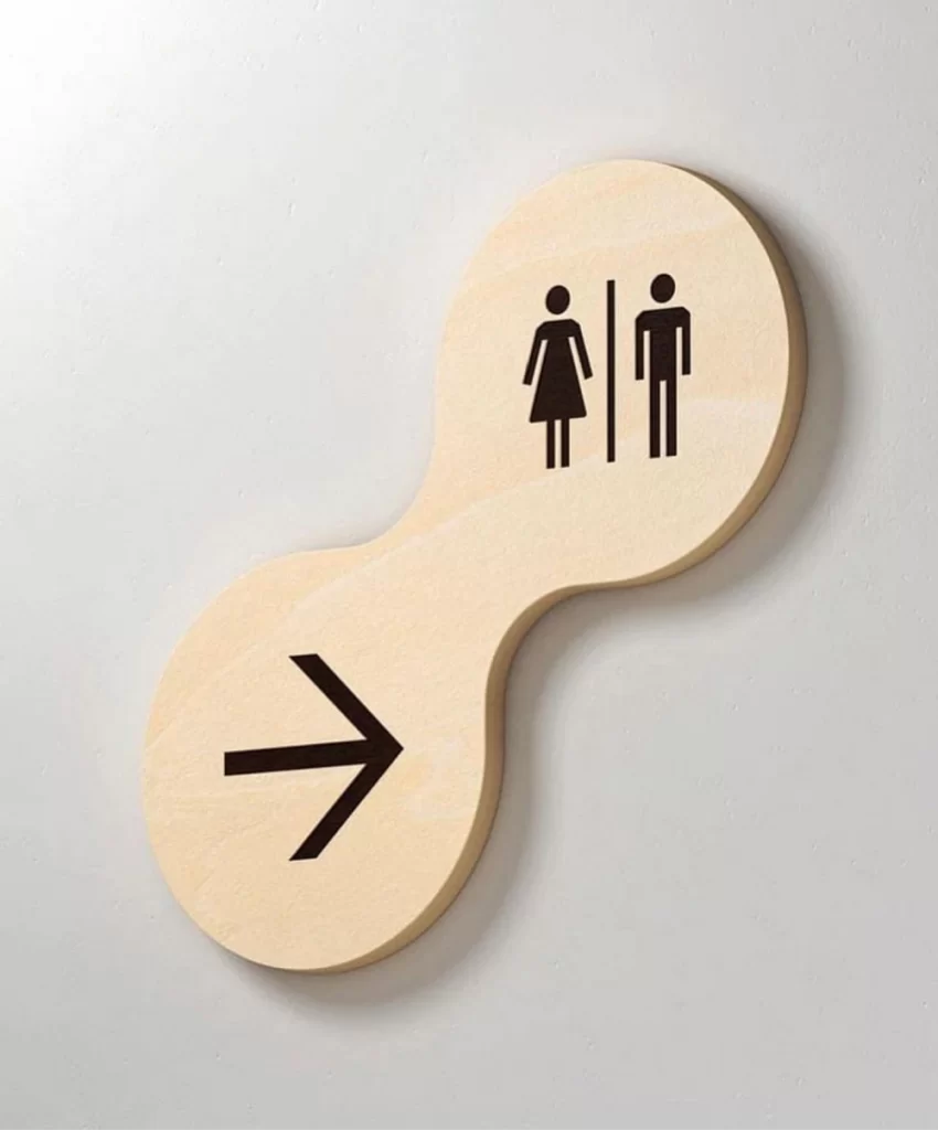
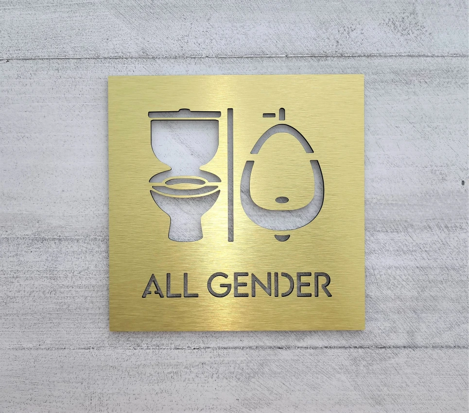
The male-female combo
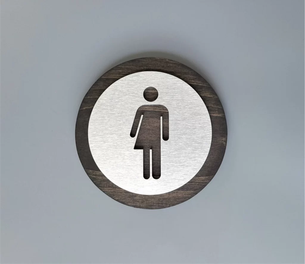
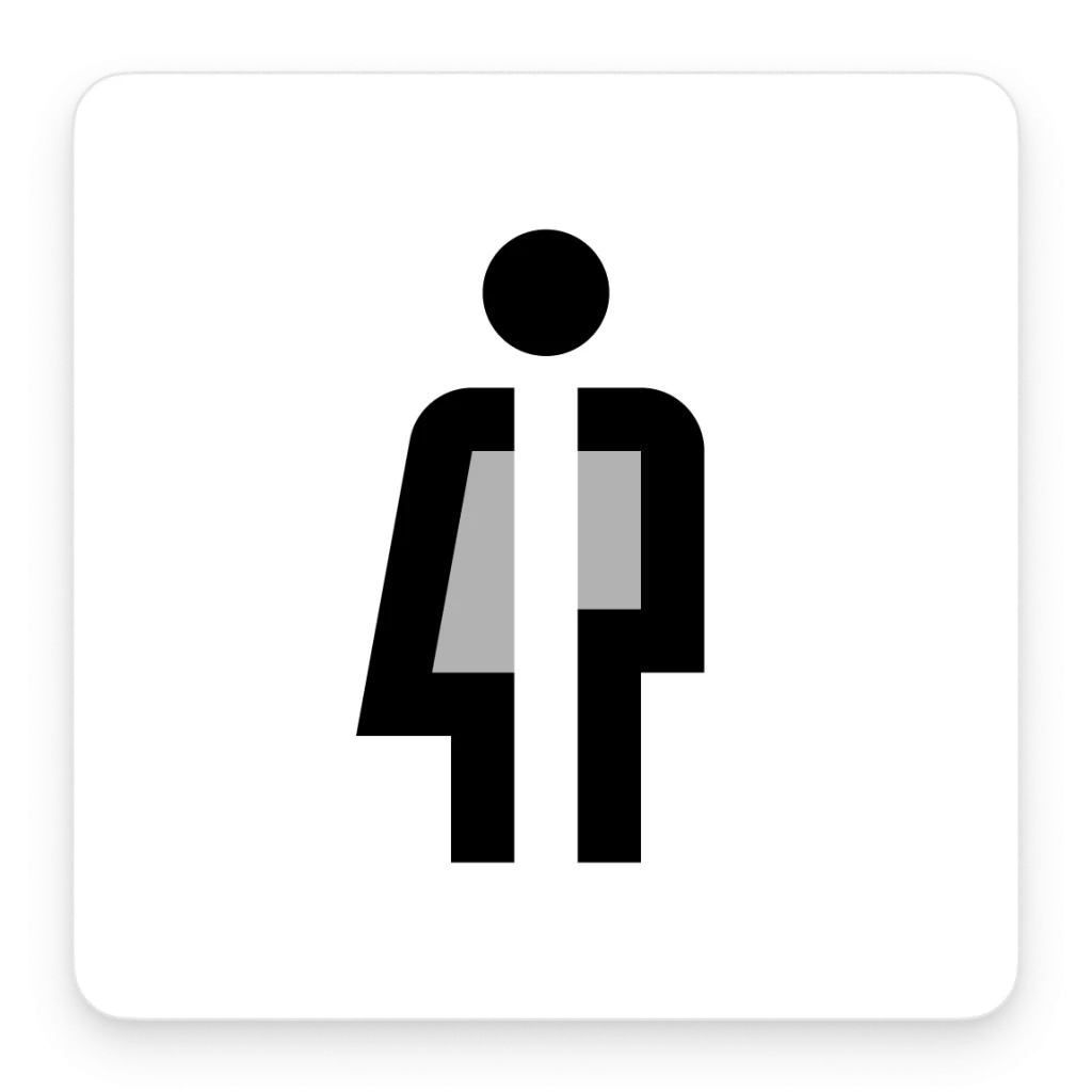
Probably one of the most popular all-gender toilet signs you can find is a hybrid of a male and a female pictogram. It is normally depicted as a stick figure with pants on one side and a skirt on the other side. It is clear, readable, and easy to integrate into any space.

Here are some gender-neutral icons for different styles of design:
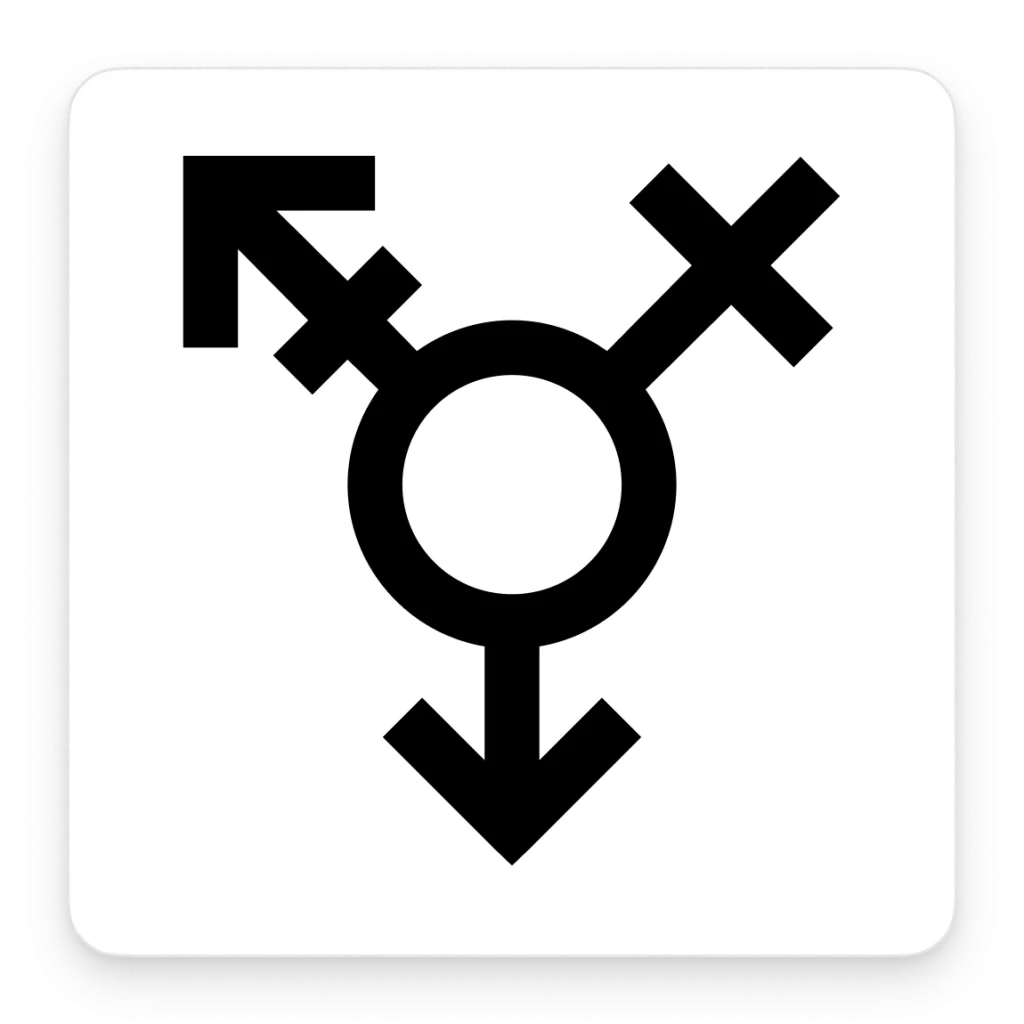
Gender symbols
Aside from the hybrid stick figure, some designers play around with gender symbols when creating gender-neutral bathroom signs.
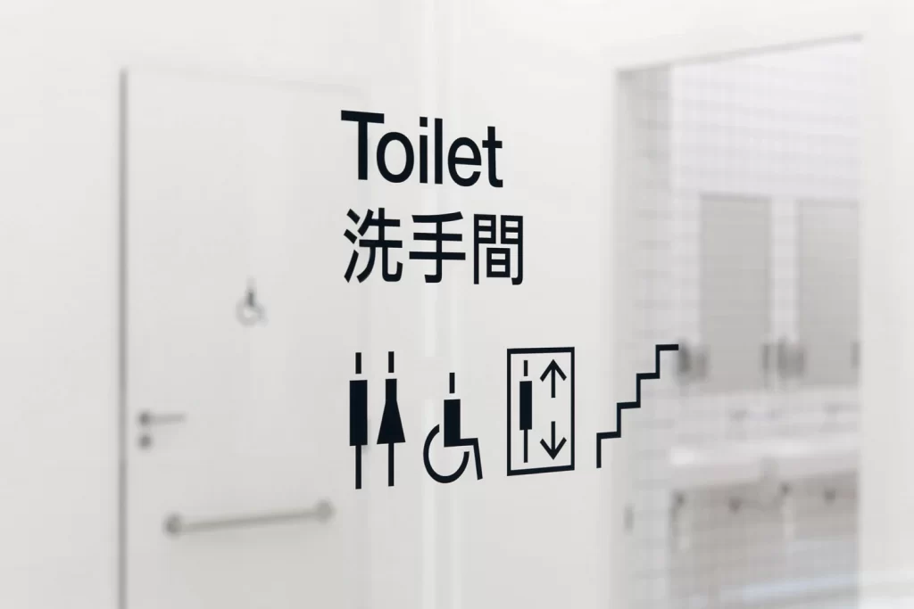
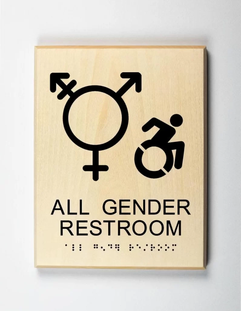
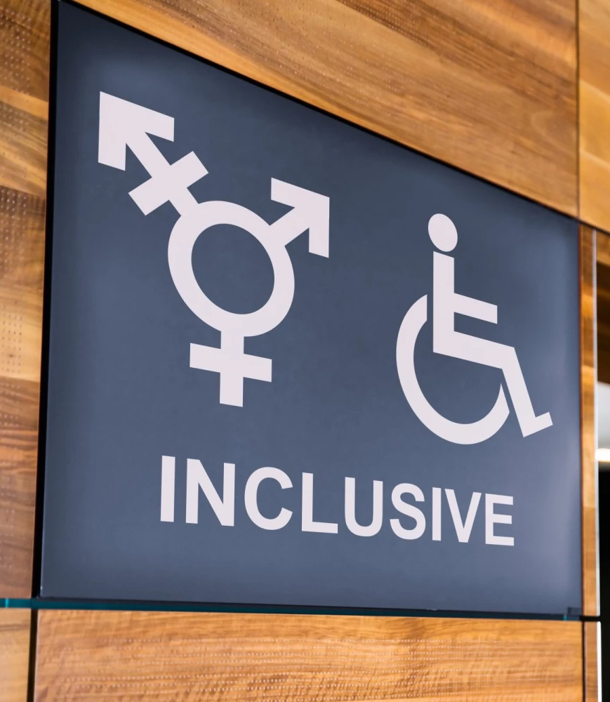
The transgender sign has become the universal symbol of gender neutrality and is frequently used in modern public restrooms. It is often paired with the international symbol of access to show that the toilet has stalls for everyone, including people with disabilities.
You can also use these icons in your projects:

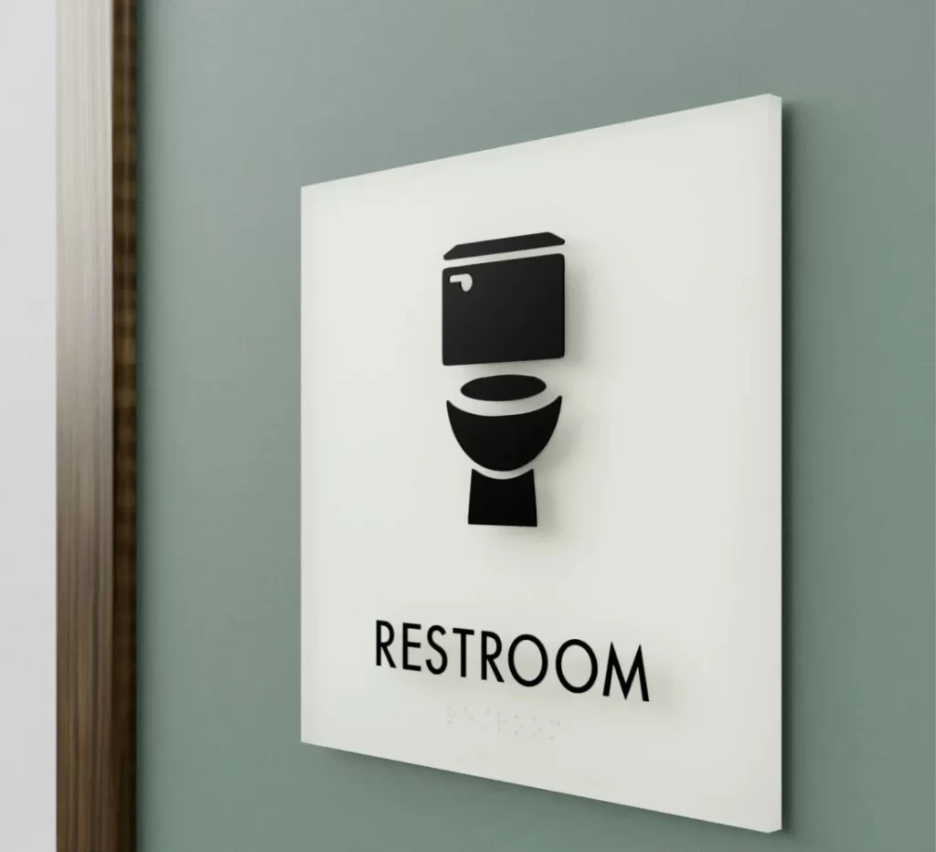
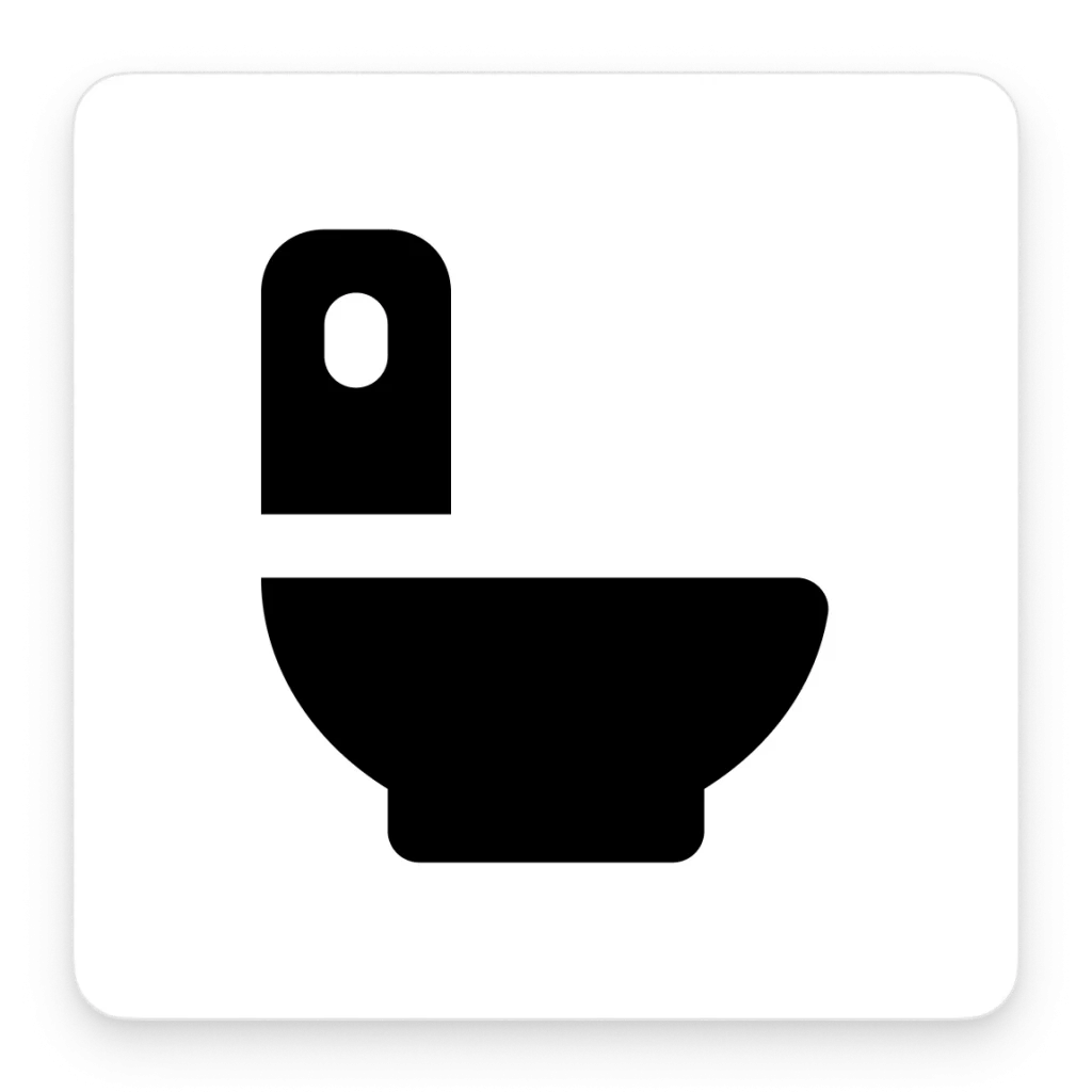
Toilet pictogram
Probably the easiest, least confusing way to signify an all-gender bathroom is the pictogram of a toilet. Just like the symbol of gender inclusivity, this sign commonly comes together with the international symbol of access, implying that there is a stall for everyone.
This pictogram is universally comprehensible and is guaranteed to cause minimal confusion. A toilet is readable, straightforward, and truly inclusive.
Get one of these toilet symbols from the Icons library.
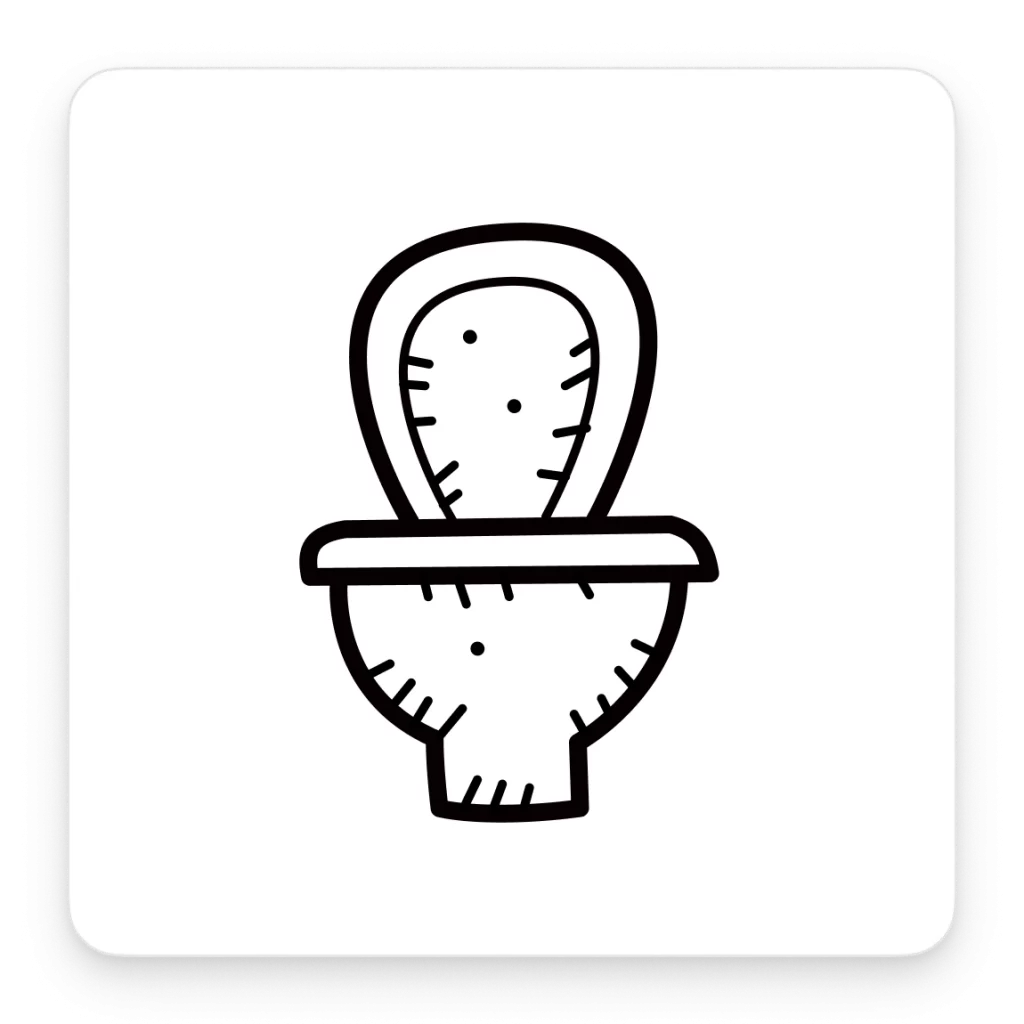
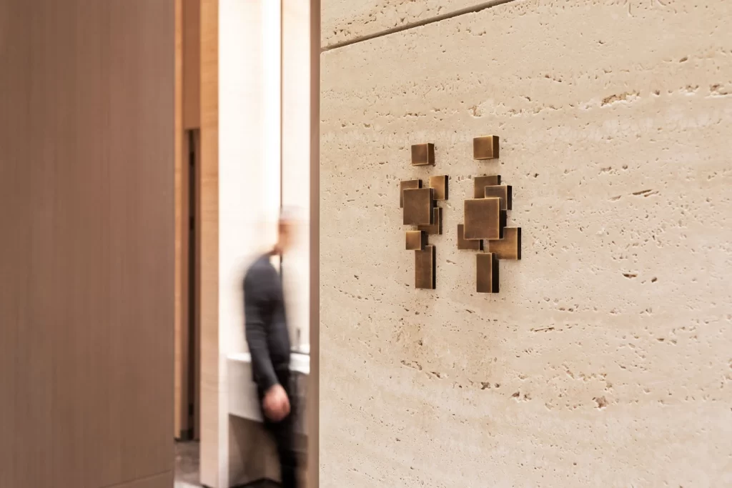
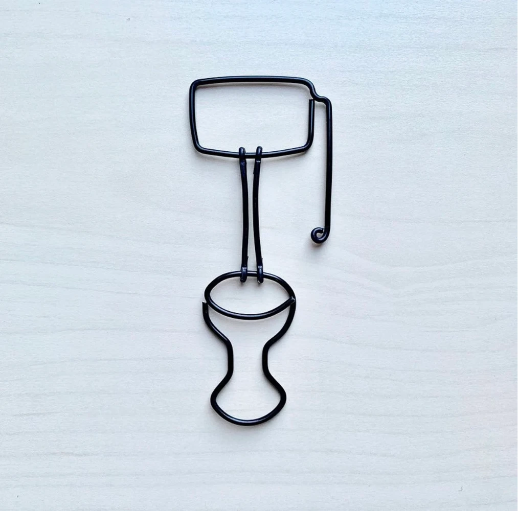
Unorthodox toilet signs
At times, designers push their imagination further and create unconventional versions of the restroom icon. As a result, sometimes true masterpieces emerge. Some of them use male-female imagery, and others are based on less obvious symbols.
However, these are not always worth the creative explorations because a sophisticated metaphor can fail to deliver the key message. When dealing with a utilitarian icon like this, recognizability and legibility should be the top priority.
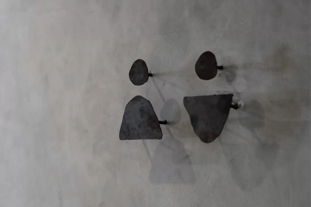
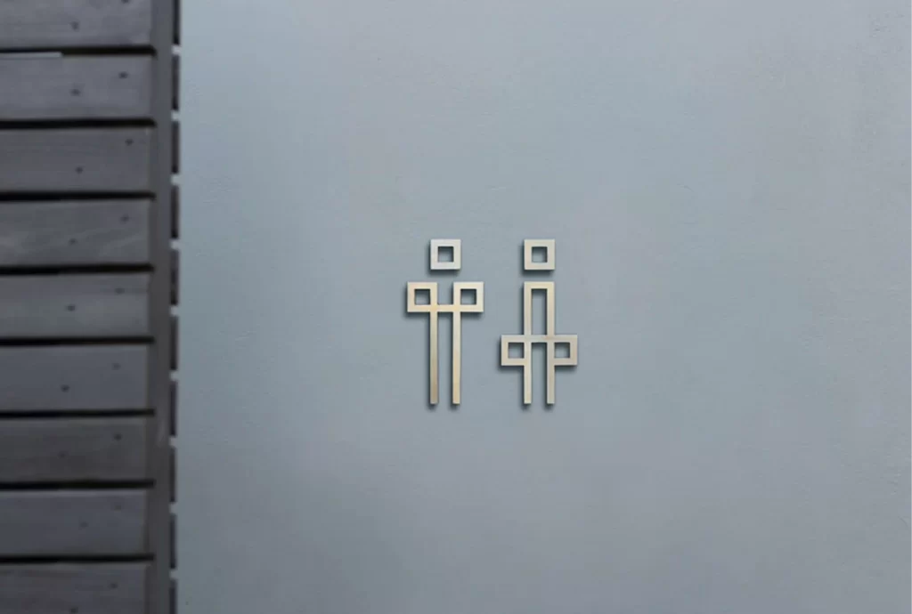

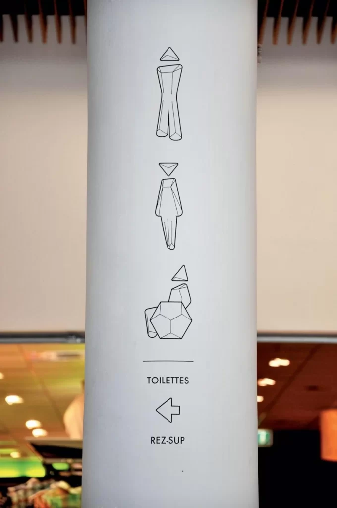
Here are some unconventional toilet signs from the Icons8 designers:

See how some of them take longer to decipher because of how vague and atypical the metaphor is? You can easily wet your pants while trying to make sense of an overly complex toilet icon.
This is why in most cases, the classic stick figure sign is still the go-to design choice.
Key takeaways
If you decide to craft your very own symbol for something as monumental as a public bathroom, remember that it needs to be:
- Clear. The end user of your icon might get into an extremely uncomfortable situation if you make it too hard to read. Save complex visual metaphors for a less crucial icon.
- Universally comprehensible. Ideally, a toilet icon should cause no confusion, no matter the cultural background of a person.
- Readable from afar. People rarely have the time or patience to go from door to door, reading one sign after another when looking for a restroom. A good toilet symbol is one that people can recognize from a distance to know exactly where to go without asking for help.
When it comes to designing toilet icons, practicality is way more important than artistry (even if you get commissioned to craft a bathroom sign for the Musée du Louvre).