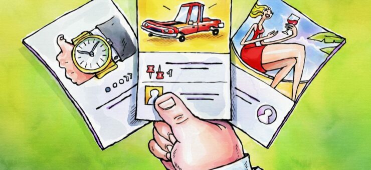
Dark UX patterns are tacky and users despise them. From confirmshaming to sneaking, let’s take a look into evil UX practices.
As a user, you encounter numerous UX patterns and cliches every time you interact with an interface. Some of them are well-thought and user-oriented, making your experience smooth and enjoyable. An example of a good UX pattern would be a plus/minus quantity controller in your online shopping cart. It allows you to remove or add items quickly and easily and proceed to checkout all within one page.
Other UX patterns might feel inconvenient and even annoying. They almost make it seem like the whole UX was designed to push you to do things you don’t want. Such patterns make it harder to navigate the interface, find what you need, and avoid things you don’t need. These are known as dark UX patterns, and in this article, we are going to go over some of the most common ones.
In this article
What is a dark UX pattern?
Ever fallen victim to sale countdowns on online shopping platforms? Grabbed unnecessary items in a rush because “only 6 left in stock”? These are some of the most basic examples of dark UX patterns. Dark patterns in UX are design tricks that businesses implement to push their users to perform certain actions. They disrupt the user journey and force the users to take a specific path even if they find it inconvenient. The goal here might be to make a user spend more money than they intended to, share more personal data than they thought was required, subscribe to services they never needed, and more.
Types of dark UX patterns
There are numerous types of deceptive UX patterns you might come across. Some of them are so common we almost stopped noticing them, others are pretty miche or relatively new. We are going to discuss 17 dark UX patterns you might encounter frequently.
Bait and switch
As you can guess from the name, this trick plays with your expectation from interacting with a certain element. You think pressing a particular button leads you to one action, and it takes you somewhere else instead. Each user knows quite a few connections between buttons and actions that follow them. Bait and switch uses this knowledge to lure us in to push a familiar button and redirect us elsewhere right away.
You can find plenty of bait-and-switch elements on online shopping platforms. Take Temu’s Lightning deals page, for example. When you click on an item on this page, instead of opening a product page, it takes you to the full list of their Lightning deals. This way, Temu forces you to spend more time on the website while trying to find the product you wanted. Plus, many users can’t help but add more stuff into their cart as they scroll through the page.
Comparison prevention
When you purchase something, you always want to make sure you get the best option. However, some websites and apps make it hard for you to compare different options, pushing the ones that are the most beneficial for the seller.
There are different types of comparison prevention. In some cases, the website forces you to read the details about each option separately. This makes the process of comparing the products exhausting and time-consuming. In others, you seem to get a feature overview for each option, but if you look closer, you notice the comparison is based on slightly different parameters. All this to make the most seller-oriented option stand out as the best one.
Confirmshaming
“No, thanks” is a button UX designers want users to press the least. “No, thanks” basically means the user is not that interested in what you have to offer. Whether it’s declining an email subscription, notifications, or something else, no website or app ever wants to hear a no from you.
This is why some UX designs are made to essentially shame you into not picking “No”. If you’ve ever encountered a button that says something like “No, thanks, I don’t want to save my money”, this is confirmshaming at its finest. While some of these can even be hilarious, confirmshaming can be quite hurtful depending on how harsh the statement is. We are pretty sure no one would want an online library membership if the subscription window features a “No, thanks, I want to stay dumb as hell” option.
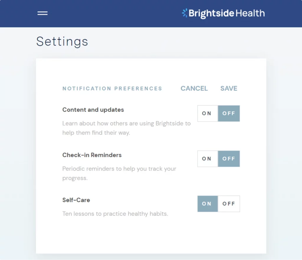
Here’s an example of confirmshaming from Brightside Health that asks you whether you want to turn off your self-care when unsubscribing from their emails.
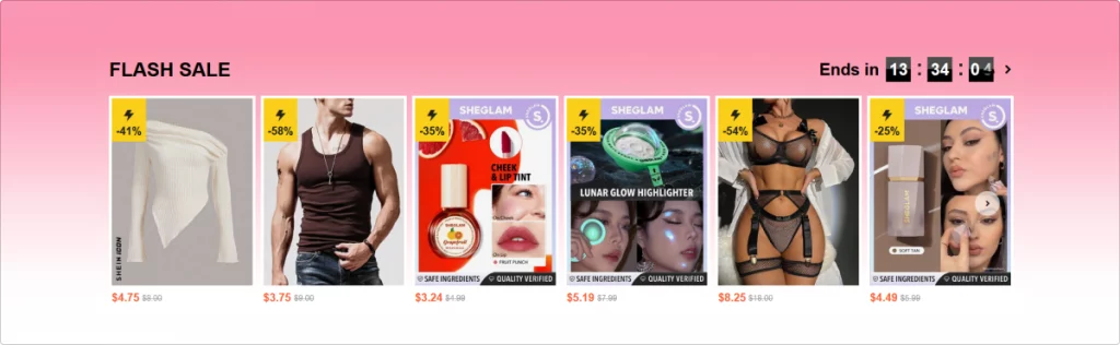
Fake scarcity
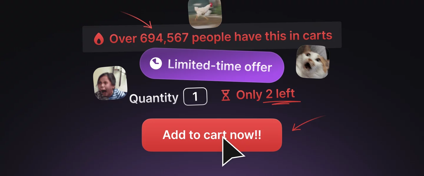
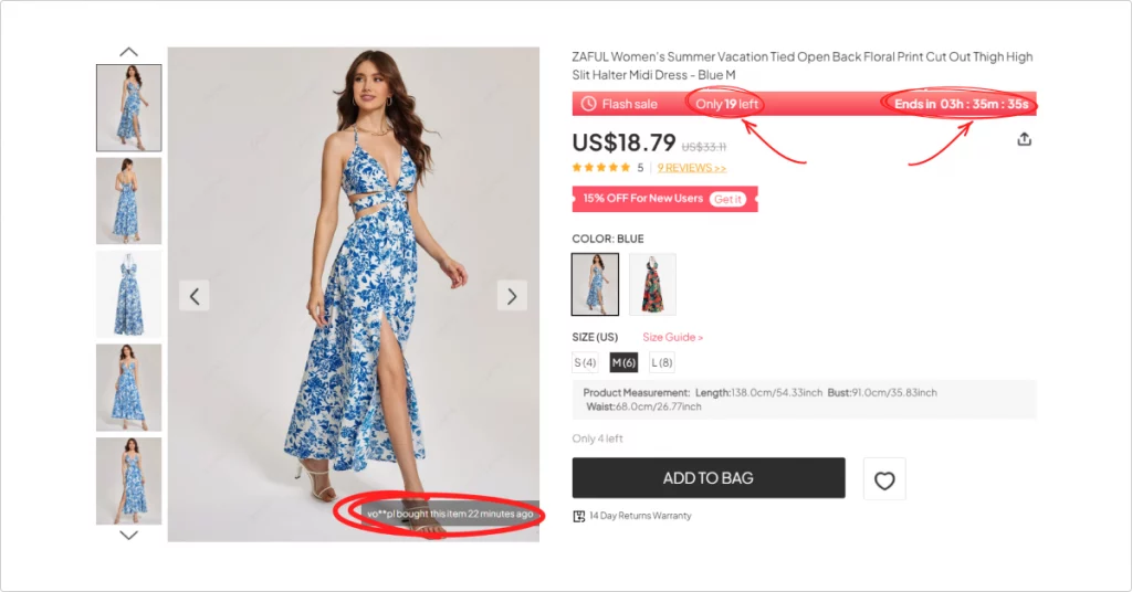
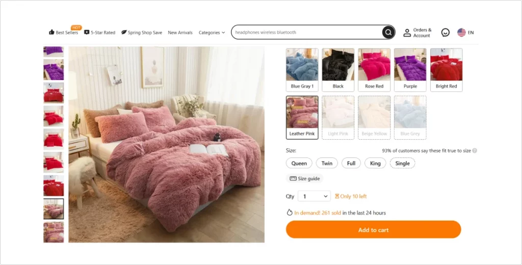
It’s natural for us to strive to grab all the best items, especially when they are claimed to be exclusive or limited-edition. Sometimes, however, this scarcity and exclusivity are fake or at least overly exaggerated. Websites frequently use fake live counters showing how many users purchased a certain item recently or how many are left. In fact, there are usually more items left in stock, or sellers restock them shortly after the sold-out.
Fake social proof
According to Brightlocal’s consumer survey, the number of buyers who read online reviews is decreasing. Despite that, sellers keep buying positive reviews in exchange for special discounts, post fabricated reviews from users who don’t exist, fake statistics on user satisfaction, and more. This way, they create fake social proof for their products, which is another example of a dark marketing strategy. Although it is not as effective anymore, it is still widely used to lure buyers in.
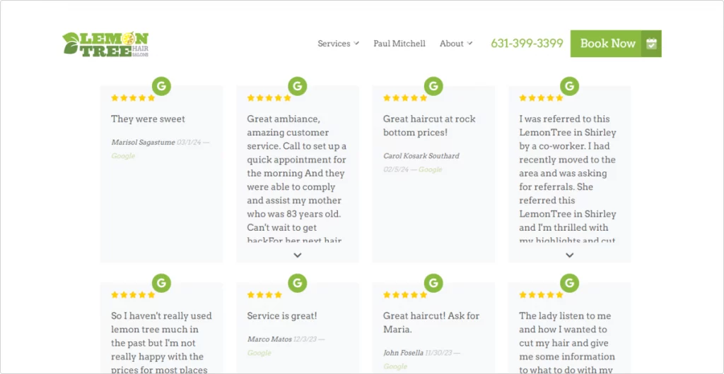
Lemon Tree Hair Salon only features 4- and 5-star ratings on its website, making it seem like all customer reviews are positive. In fact, depending on the location, about a quarter of company reviews on Google have a 3-star rating or below. A good example is Lemon Tree Hair Salon Shirley with an average ranking of 4.0 on Google.
Fake urgency
Similarly to fake scarcity, fake urgency taps into your FOMO. Just like fake scarcity tricks you into thinking there is a limited number of items, fake urgency makes you think you don’t have much time left to grab a good deal. Limited time-only product sales, discounts, and other special offers are designed to rush our purchase before the good deal expires. In reality, these offers often last way longer or get immediately replaced by new ones. Many websites that use this dark UX pattern pin massive countdown banners at the top of the window, making it impossible for you to resist.
Forced action
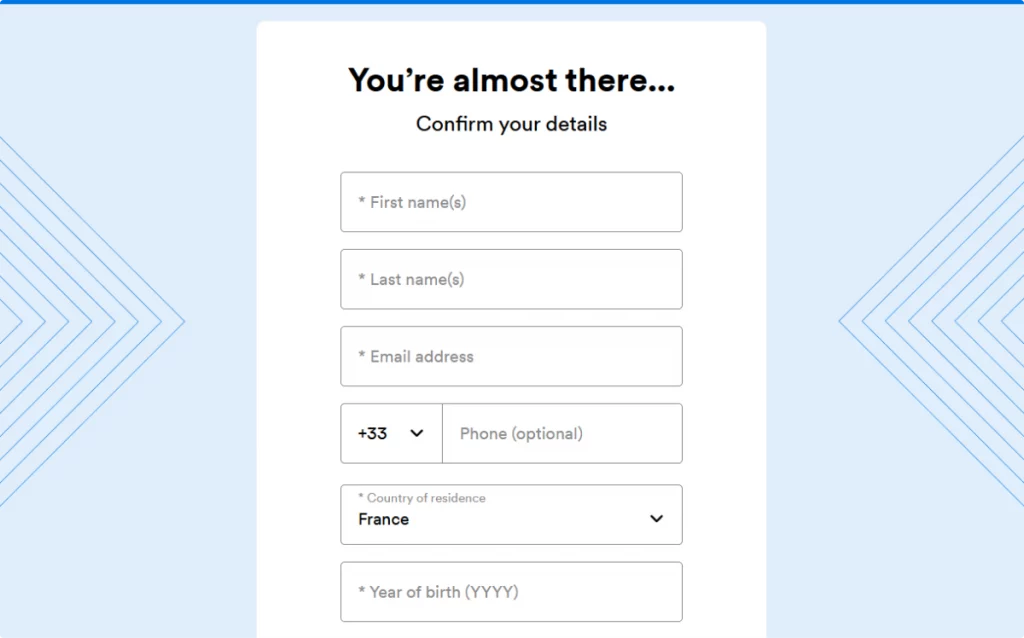
Trying to get users to do something through manipulation and deception is annoying enough, but forcing them to complete an action to continue browsing is even worse. Forced action prevents you from exploring a website or app unless you perform a certain action. This dark UX pattern comes in all shapes and sizes. It might be anything from a sign-in to a subscription form.
These forms usually pop up where you don’t expect them. One of the most popular use cases for forced action is a quick free diagnostic test that only shows you the results after you sign up.
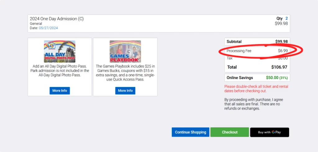
Hidden costs
This dark UX pattern tricks you into paying more than you intended. Whenever you see additional costs like service fees once you hit Checkout, these are hidden costs at their finest. Websites that offer temptingly low prices often hide the real cost of their products and services up until the last step of the shopping process. Some users click Pay without noticing those, others feel too exhausted to try and find the same products elsewhere — and this is exactly what hidden costs aim at. Because they suddenly surface at the end of the purchasing process, users are likely to let these slide and pay anyway.
Misdirection
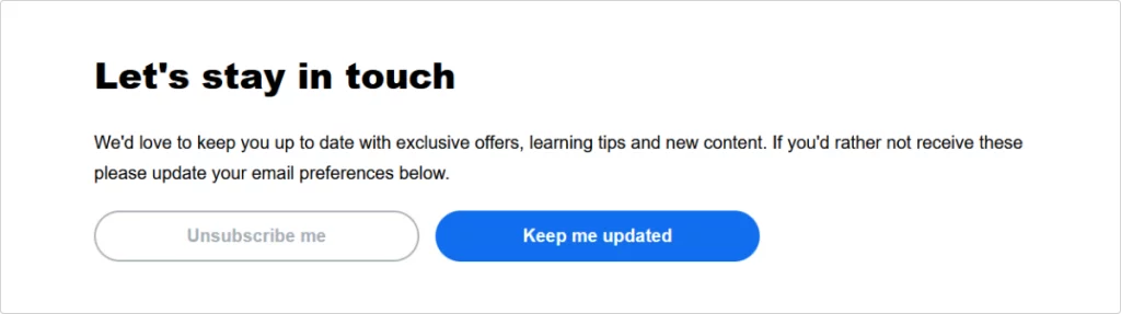
Misdirection is a UX trick that takes advantage of your familiarity with similar interfaces. Whenever you browse a website or an application, you are used to seeing certain regularities in every layout. You expect the navigation bar to be at the top, the Help, Contact, and About sections to be at the bottom, etc. This is also true for finer elements like buttons. The ‘No’ option is almost always on the left, while the ‘Yes’ one is on the right. Plus, the ‘Yes’ buttons normally have a color fill while the ‘No’ buttons are left with just the outline.
Websites that use misdirection mix these up hoping that you press the filled button in a rush without double-checking. Some of them go as far as highlighting the ‘No’ option with green and the ‘Yes’ one with red. You can see a similar example of misdirection when unsubscribing from Busuu‘s emails. Here, the highlighted button is actually the one that keeps your subscription active instead of the one that confirms its termination.
Nagging
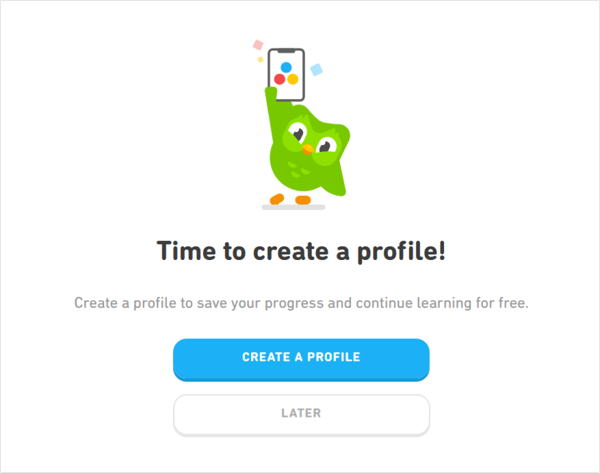
Nagging is a dark pattern that keeps bombarding the user with notifications and pop-up windows, reminding them to complete a certain action. While app notifications can be deactivated in a matter of seconds, in-app pop-ups are nearly impossible to stop. These might be all sorts of reminders, from “Create an account to save your progress” to “Upgrade to PRO to unlock all app features”.
The goal of nagging is to exhaust the user to the point where they agree to complete an action just for the sake of stopping the notifications.
Obstruction
You expect a smooth, pleasant, effortless experience whenever you browse an app or website. The last thing you anticipate is a sudden roadblock preventing you from reading an article, browsing a gallery, scrolling through the social media feed, etc. Obstruction does exactly that — it creates obstacles on your path, forcing you to do something or leave the site. Those can be any kind of visual interference from huge pop-up windows to tiny, unreadable elements.
Unlike nagging which you can keep ignoring forever, obstruction won’t allow you to continue using an interface. The only two options it gives you are completing the desired action or leaving.
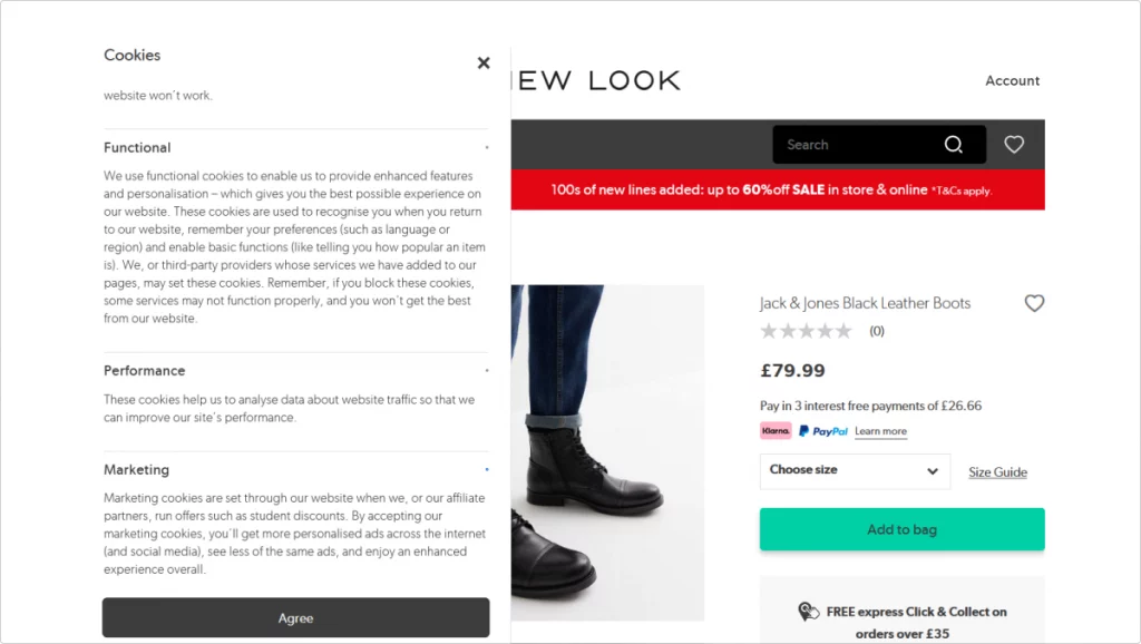
In this example from New Look, once you open cookie settings, you see a list of cookies you can consent to. Next to them are minuscule gray dots that happen to be clickable. These dots are checkboxes that you can click on to choose which cookies you agree to. However, they are so microscopic it’s almost impossible to notice them and interact with them. Even when you zoom in on the page, they stay tiny and unreadable.
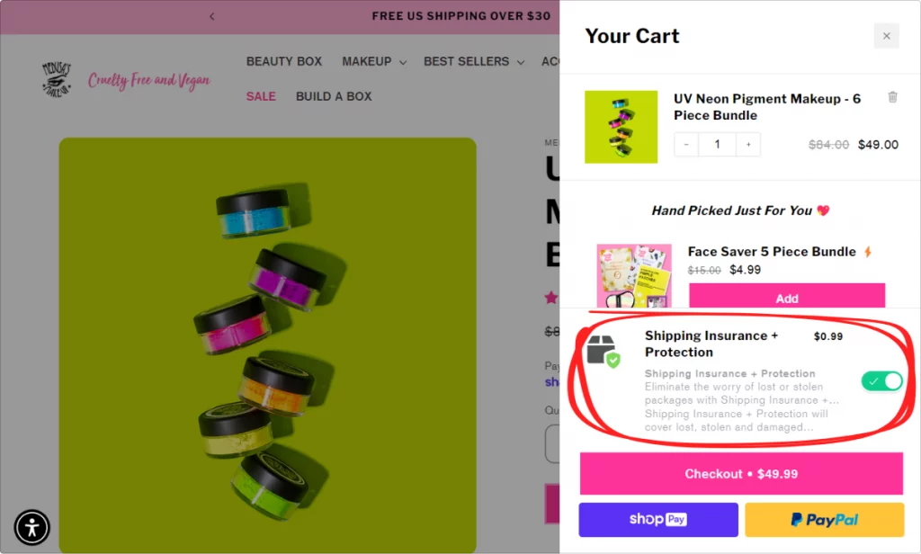
Preselection
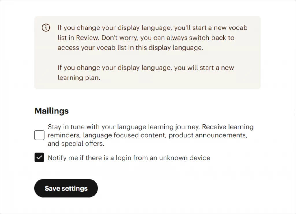
One more UX trick that takes advantage of the users’ inattentiveness is preselection. The most common subtype of this dark pattern is the pre-ticked box with optional goods, services, etc. These include, for instance, additional costs for shipping insurance when shopping online. Most of the time, you can easily uncheck these boxes to avoid agreeing to something you don’t even need.
However, sometimes you don’t even get a say with preselection. Some websites make you consent to a number of additional options by default when you agree to their T&Cs. One of the most common examples is the default subscription to a newsletter when creating a new account. It’s included in the terms of use and the only way to opt out of it is to not register in the first place or unsubscribe manually after signing in.
Privacy zuckering
As you can tell from the name, this dark UX pattern is named after Mark Zuckerberg, Meta CEO, who is known for mishandling user data. Essentially, privacy zuckering refers to all kinds of unethical practices regarding user data: collecting data without permission, selling data to third parties, etc.
Whenever you come across vague privacy T&Cs, it’s a sign there might be privacy zuckering in full action. Though it’s impossible to browse the web and have a squeaky-clean digital footprint, it’s important to avoid sharing personal data with questionable (and even reliable) websites and applications.
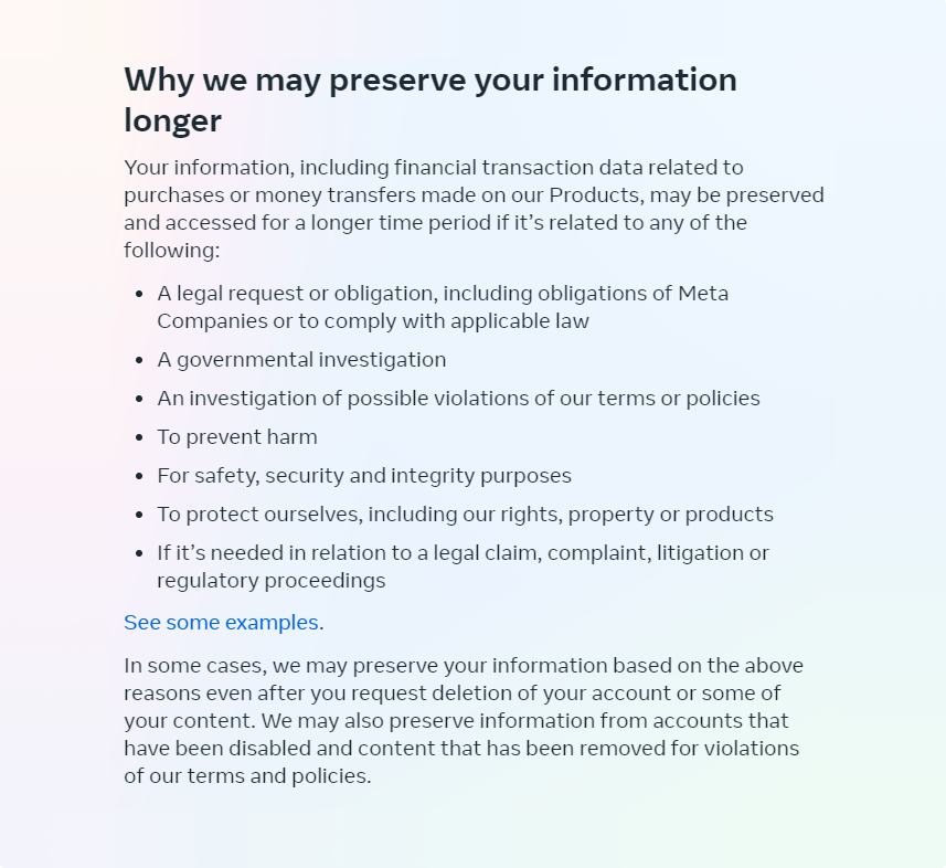
When you register on Facebook, you need to agree to a long list of T&Cs, some of which are vague and open to interpretation, making them hard to dispute.
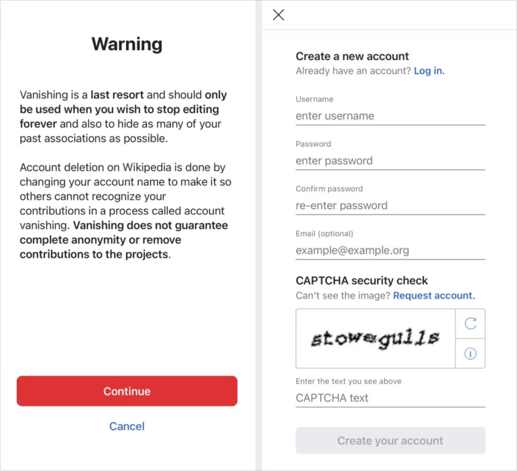
Roach motel a.k.a. hard to cancel
Just like roach traps that are easy for the insects to get in and impossible to crawl out of, roach motels are websites and apps that won’t allow you to cancel your subscription or delete your account. Once you are in, your data is there to stay. When it comes to subscriptions, roach motels often make it impossible to cancel them manually. You can only stop the recurring payments by contacting user support and requesting subscription termination.
Websites that don’t allow you to delete your account often only make it possible to freeze your profile but complete data removal is not an option. This is normally not stated in the T&Cs explicitly, making it hard to dispute personal data deletion. For instance, Wikipedia will not allow you to erase your account completely, and you can’t even find any link to their T&Cs on the sign-up page to find that out in advance.
Sneaking
Sneaking is mostly used by online shopping platforms and other sites and apps where you can purchase something. Once you add something to your cart, they will automatically drop another item in there. Sometimes, they are highlighted so you can notice them before checking out. A lot of the time, however, they just silently chill there among all the other things you picked waiting for the payment.
By sneaking these additional products into your order, the sellers trick you into spending more. These can be hard to argue because technically, you are not forced to buy these items. If you notice them in time, you can remove them from your cart.
Trick questions and trick wording
Imagine you see a question that goes ‘Would you like to never receive emails about our special offers, item restocks, and sales?’ Naturally, most of us would take a brief look at it and hit ‘No’ because it’s something about those annoying emails again. However, because of the deceptive wording used in this question, by clicking ‘No’, you would do the opposite and subscribe to the newsletter. Like many other dark UX patterns on this list, trick questions exploit the users’ inattentiveness and impulsiveness.
A perfect example of trick wording is the window you see when you click Unsubscribe in an email from Babbel. It redirects you to account settings where you need to find and change mailing preferences. However, the wording is extremely confusing, as it only vaguely mentions marketing emails at the very end of the sentence. Plus, it makes it feel like you are unsubscribing from crucial emails and notifications along with the newsletter.
Dealing with dark UX patterns
Businesses are getting creative, and this is not an exhaustive list of deceptive UX patterns. We mentioned some of the most common ones, but there are more types you can come across. There is a classification proposed by Dr. Harry Brignull, founder of the Deceptive Patterns Initiative. Along with his list of deceptive patterns, you can find more subtypes of shady UX patterns. Unfortunately, since these design traps are technically fine from a legal standpoint, you’ll only keep seeing more of them.
To minimize your chances of suffering the consequences of interacting with deceptive interfaces, keep the core safety principles in mind when browsing.
Double check what you’re agreeing to
This is especially true for subscriptions, online purchases, and any other actions that involve your money and personal data. Make sure you know what details you share and how the platform is going to use it further along.
Don’t click through an unfamiliar website or app in a rush
Take your time to make sense of what you’re seeing and what you’re clicking. Even one accidental click in the wrong place can have troublesome consequences.
Don’t trust everything you see
As you know now, chances are there is more than 6 items left in stock. And it’s very likely that 390 people didn’t buy this product in the past 24 hours. Keep your critical thinking on at all times and don’t surrender to impulse purchases.
If it looks shady, it might as well be
If a website or application looks a bit questionable, your intuition might be right. And if you’re only two pages in yet already see UX traps mentioned in this article, it’s time to leave. Businesses that live off user deceit are not the safest places online.