“Only 30% of passengers travel with a traditional ATB type boarding pass and the number is going down every month.” – Tony Capiau, Business Systems Solutions & Support Manager of Brussels Airlines.
But that’s just the end of this story. Let me briefly explain how it all started.
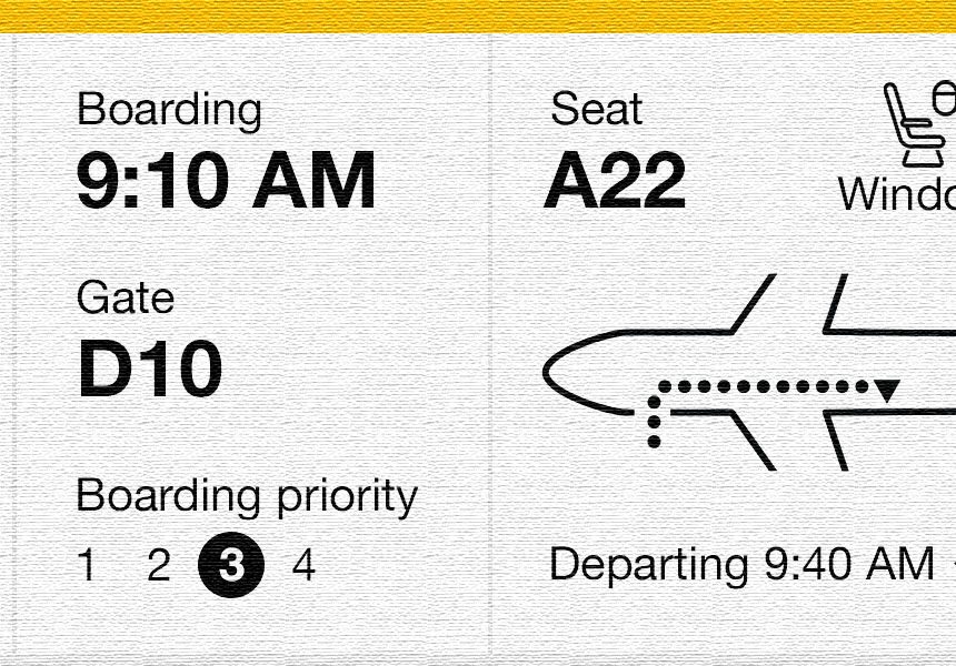
Here’s how a boarding pass should look:
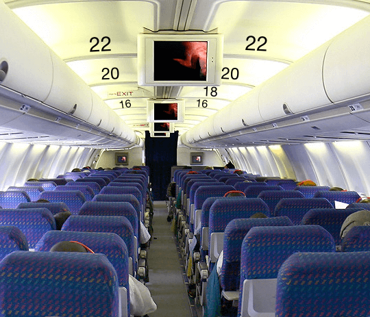
I’ve completed my quest: I’ve made it past check-in, survived security, and have had to wait so long that a new iPhone has come out since I arrived, now I’m finally boarding the plane. The other passengers and I are slowly making our way down the narrow aisle looking for our seats, when big guy in front suddenly expresses the well-known “facepalm” gesture. I already know what that means and sigh in frustration. He went too far, missed his aisle, and has to turn around and try and squeeze past everyone.
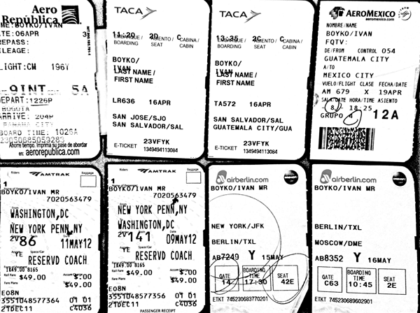
Finally, looking all sexy because I just lost several buttons of my shirt, I approach my seat. But something is wrong. Someone is already sitting there and I’m pretty sure I didn’t reserve a seat companion. I’m trying to explain that it’s my seat (and mine alone) using every European language and a bit of Swahili to no avail. The hottie next to him suggests I take a different seat which just happens to be next to the sweaty guy clipping his nails. Each of the characters in this story has one thing in common – a boarding pass. Like these:
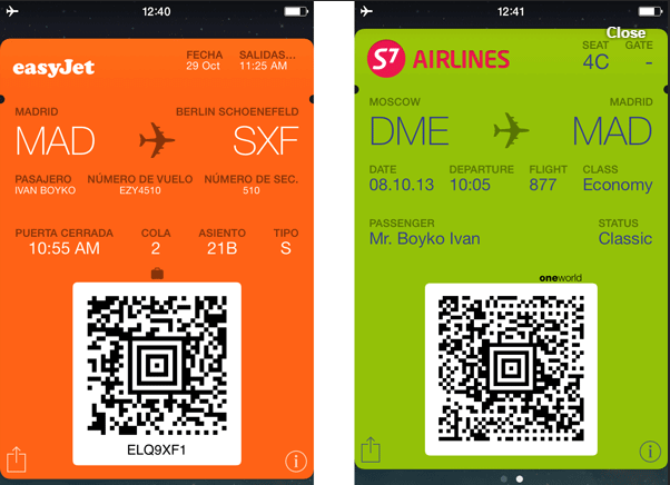
Or, perhaps its digital counterpart, which inherited the flaws of its paper ancestor:
This small thing could make the experience of air travel much better. Not just for boarding, but the overall airport experience. So why not make things even better?
Boarding Pass Redesign
This design is a follow-up to an article I wrote on boarding pass usability, which became quite popular. I got a huge amount of feedback since then and decided to redesign the boarding pass once again.
Here’s how this design differs from the one airlines use now:
-
- It contains only the required information. No booking code, something called SEQ NO, not even ETKT NO, and airport of origin. You either don’t care (most people can live without SEQ NO) or know it already (airport of origin)
- Information is grouped
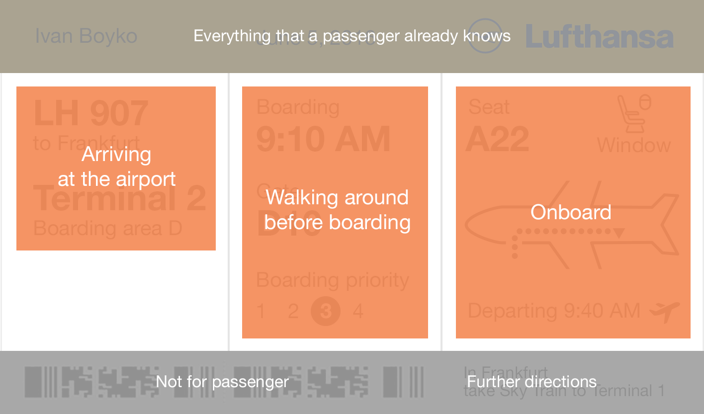
Your whole airport experience can be boiled down to 1-2-3, and your boarding pass guides you through.
-
- Find the way to your seat. Flight attendants don’t have to direct each of the 400 passengers to their proper aisle
- Large print for the visually impaired
Feedback for the last article was very diverse. Here are the most critical and controversial points of this design that I would like to address.
All We Need is Passbook? (Maybe)
Some people suggested that we no longer need paper boarding passes.
Pros: saving paper, saving printers, getting rid of an extra slip of paper that is easy to lose.
Cons: paper is faster to use. Glancing at a paper boarding pass takes 0.1 second while unlocking a phone takes two. Don’t forget, gadgets still have a tendency to run out of juice at just the right (or wrong) time.
As we’ll soon see, it’s not so much a question of digital vs. paper. Current digital versions inherit many of the flaws found in the physical version, such as an immunity to actually making things better.
The digital medium allows much more than a “keep it in your phone” solution. One can reconstruct the data easily enough and perhaps allow it to update over time. During boarding, information may fade and shrink, highlighting the gate and the seat depending on the current actionable step.
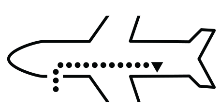
Remove the Arrow! (No)
Alexander York, founder of 12colours travel community:
“A new design helps with small irritating things, like fitting it into a passport or always having to ask an air hostess where your seat is. I like the arrow.”
Some people hated the arrow for a variety of reasons:
- It makes passengers think it’s for evacuation (sorry for the confusion; I mean it)
- It’s hard to print with thermal printers (probably)
- Some planes have entrances on the right (probably not true)
- Some planes are boarded from the back (very few)
- What if the type of aircraft is changed and passengers are re-assigned, so you have a different seat?
One can solve each of these problems easily, except… if the type of aircraft is switched, the whole boarding pass loses its meaning (not only the direction of the arrow). The question is – should we sacrifice the comfort of many people for the sake of a few exceptions? I’ll get back to that later.
What About Airport Staff? (They’re Cool)
People say airport staff needs more information and/or have different visual priorities than passengers.
One can easily add all the information airport staff needs, but…the bigger question is: instead of cluttering up the boarding pass, should we think about a proper interface for airport staff? It’s out of the scope of this article, but one can think about:
- Leaving a hidden mark such as a color spot with a specific color for each day. It won’t distract passengers much but will give clear information to the staff: let this guy in or make sure this guy’s luggage gets sent to Siberia
- Another option is printing all the information in a special area: on the back, on the side, you name it
Smaller Size to Fit Passports (Yes!)
This great idea is attributed to Peter Smart.
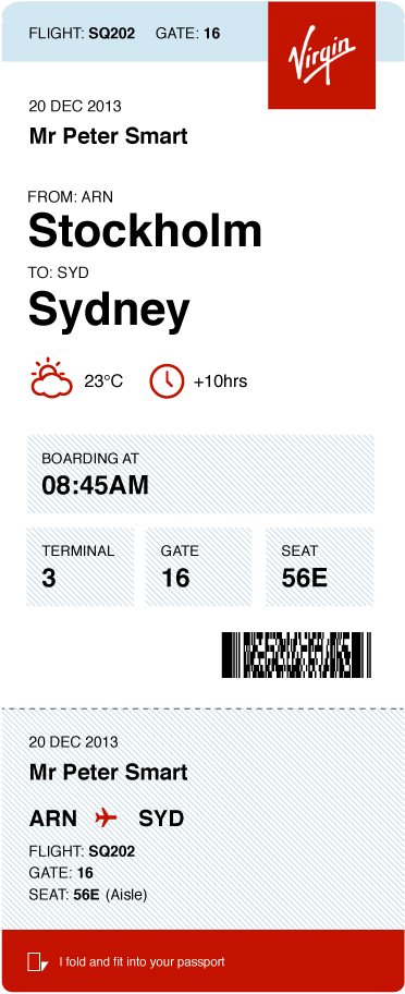
So I designed my boarding pass to fit into a passport without folding as well. Here’s the comment I got from Sharron Livingston, a Managing Editor at Travel Magazine:
“This is a user-friendly design which provides the passenger with all relevant information at a glance. It is particularly useful that it is passport size, and you can therefore easily keep your two “tickets” to fly, your boarding pass and your passport, neatly together. “
Including the Airport of Origin (No)
Readers argue there are stop-over flights where it’s essential information. I’d say it leads to extra cognitive load. What is easier?
- Choosing Miami from two options: Miami and Buenos Aires
- Choosing Miami – Buenos Aires from two options: Rome to Miami and Miami to Buenos Aires?
Tony Capiau, Business Systems Solutions & Support Manager of Brussels Airlines:
“Regarding the necessity of the departure airport: some passengers receive up to 4 boarding passes for 4 consecutive connecting flights during through-check-in. If we would remove the departure airport from the boarding pass, passengers would have a hard time to know which one to scan at the checkpoints at the next airport.”
Ok, take scissors, for example. Their form allows doing many things – cutting, screwing, threatening. Now ask the people who try to use scissors as a screwdriver how happy they are with their decision.
That happens when we try to develop a universal design for all possible scenarios. If you want to improve scissors to screw things better, eventually you’ll end up with a swiss army knife. And you won’t get through security. The same with the boarding pass – should we develop a universal solution that may benefit 1% of travelers but clutter the experience of the other 99%?
Or should we think about a customized solution for specific use cases?
What Travellers Think?
I sent a draft of this article to a few travel blogs and I’m very grateful for their feedback, which I added to relevant parts of this article.
Johnny Jet from JohnnyJet.com writes:
“I like how you simplified the pass. The best part is making sure passengers know it’s a window, aisle, or middle because often times they get on the plane and find out they’re in a seat they don’t want and it’s pretty much too late to change.”
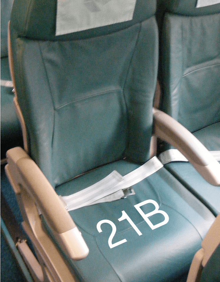
Of course, boarding pass won’t resolve every problem with finding a seat, and we can try adding a few things:
-
- Printing a big number right on the seat
-
- Make the row numbers visible from the side?
“I would also add which airline it’s operated by as often times it gets confusing.”
True that. Sometimes they can even switch terminals. I think I could use some space below a company name.
Alexander York, founder of 12color travel community:
“The common boarding pass design is more like a given reality. Improving design is a good thing in general, though I’m afraid airlines, in order to implement these changes will have to develop new standards. And that may affect ticket prices. In this case, it’s better to leave things as they are.”
The question of ticket costs leads us to wonder what airlines think about such a redesign.
What Airlines Think?
My team and I sent a draft of this article to 30+ airlines asking for commentary. While a few of them gently refused to comment, most simply ignored the request. I thought it was a lost cause, but in the darkest hour I got a beacon of hope.
I’m very thankful to Tony Capiau, Business Systems Solutions & Support Manager of Brussels Airlines:
“The difficulty of changing the physical format of the boarding pass is that it needs to be printed on different types of printers, such as IER400’s. The airline does not control which printers are being used at different airports.”
Anyway, paper boarding passes should be a thing of the past soon. We are issuing on average 12.500 mobile boarding passes per day. That is close to 50% of all transported passengers.
20% of passengers print their boarding passes at home on A4/Letter format or at the check-in kiosks at the airport. Only 30% of passengers travel with a traditional ATB type boarding pass and the number is going down every month.”
So while I was trying to redesign a paper boarding pass, the paper got old. But that doesn’t mean my cause is over. The tragedy I see is companies developing their boarding passes influenced by its paper predecessors: “picking a universal all-cases solution – mix all the information in one place and let people sort it out themselves.”
I don’t think that’s right. Simply transferring an old, faulty layout to your phone screen – is that an improvement? Digital lets us customize things infinitely, dynamically changing plane layouts, time zones, and providing useful hints along the way. And in a matter of few years “thermal printers” and “0,1% special cases” won’t be a justification to stick to the old ways.
It’s a good thing to recommend relevant articles in the “Latest” section. Well, we’re kind of out on relevant ones, but hey, maybe you’d like to know how Egyptian Hieroglyphs would show itself in AppStore?
If you’re still determined to know something more useful, take a look at How many people does it take to make text in your app look “pro”?
About the Author: Ivan Boyko is a founder of Icons8. He got his first job after drawing a banner with CTR of 43%. After years of creating icons, he specializes in rapid prototyping and backlog grooming.