Designing an effective pitch deck requires attention to detail. Learn these techniques from experienced designers to impress your potential investors.
Building a pitch deck is a huge challenge for any designer. It involves organizing a lot of data in a visually appealing and effective way while using various design techniques to convey the deck’s message.
In this article, I’ll share my insights from designing more than 100+ pitch decks for startups worldwide that have collectively raised more than $100M over the past four years.
Whether you realize it or not, a founder’s startup and fundraising efforts heavily rely on crafting a well-designed pitch deck and narrative. And that’s not easy at all. Most often, you only hear about the successful startups that end up raising millions of dollars, but the reality is that thousands of pitch decks fail daily to spark investor interest in a business idea.
So, it’s your responsibility as a designer to create a deck that really sells. My biggest realization of working on so many decks in the past is: “A good deck is about leaving as much information out as possible”.
Data shows that investors typically only spend two to three minutes reviewing a deck. In those three minutes, you need to ensure that you not only communicate the founder’s content clearly but also make a lasting impression with your design. Today, I am sharing my top 10 lessons on building hundreds of decks myself. Each lesson is closely tied to a design technique that you can apply to your next pitch deck makeover. So, let’s get started.
10 tips mentioned
- Keep it simple
- Set up a visual hierarchy
- Use a grid to align all elements
- Visualize the data
- Use icons to underline your message
- When in doubt, use more white space
- Choose easy-to-read typography
- Use high-quality images and mockups
- Stay visually consistent
- Use contrast
Keep it simple

The pitch deck serves as a brief overview of the entire business. Your main goal here is to get a foot in the door and open up the discussion with potential investors, so the content should be easy to understand within seconds.
Use clear and straightforward design language. Avoid clutter and unnecessary details. Focus on the main message and eliminate as much information as possible.
Set up a visual hierarchy
Visual hierarchy is important in any design. But in our case, it is literally essential. It can help you tell the right story and guide the investor’s attention on your slides and throughout the whole deck.
Here are three core elements to achieve this:
Pre-heading tag
This almost breadcrumb-style element helps investors quickly navigate what the slide is about and sets the stage. It’s especially important as most pitch decks follow a similar structure, and the investor is used to taking notes in the same structure. Out of these notes, he will later create an investment memo that will be presented to the investment firm, and thus, if we can make it easy for them to find the information they’re looking for, it’s a big plus.
Examples:
- Problem
- How it works
- Solution
Action title or heading
The second element is the slide title. As mentioned earlier, an investor rarely reads a whole deck. So, it’s your job to grab their attention through the core elements. The best pitch decks can even be understood just by reading the action titles.
Slide content
If the first two elements in the hierarchy spark interest, the investor will move on to the content, which is the most detailed element on the slide. Highlight the most critical information using visuals whenever possible. Visual aids help investors quickly digest complex data, while concise text keeps their focus on the main points. Remember, less is more, so keep text minimal to maintain their engagement.
Use a grid to align all elements

Imagine an investor looking at an artsy deck to understand how it is even structured. They will lose interest quite quickly and jump over to the next one. You need to make sure that this won’t happen. Use a clear structure to highlight the company’s strengths and convince the investor. A well-structured deck also gives the investor an idea of how good you are at clearly communicating what you are doing, and they will be more likely to invest as you will need the same skill in your sales and marketing.
For instance, I use a 4-row and 6-column grid to ensure each slide maintains a clean and professional look. Additionally, incorporating a solid margin around the main content allows the slides to have sufficient white space, enhancing readability and preventing clutter.
Visualize the data
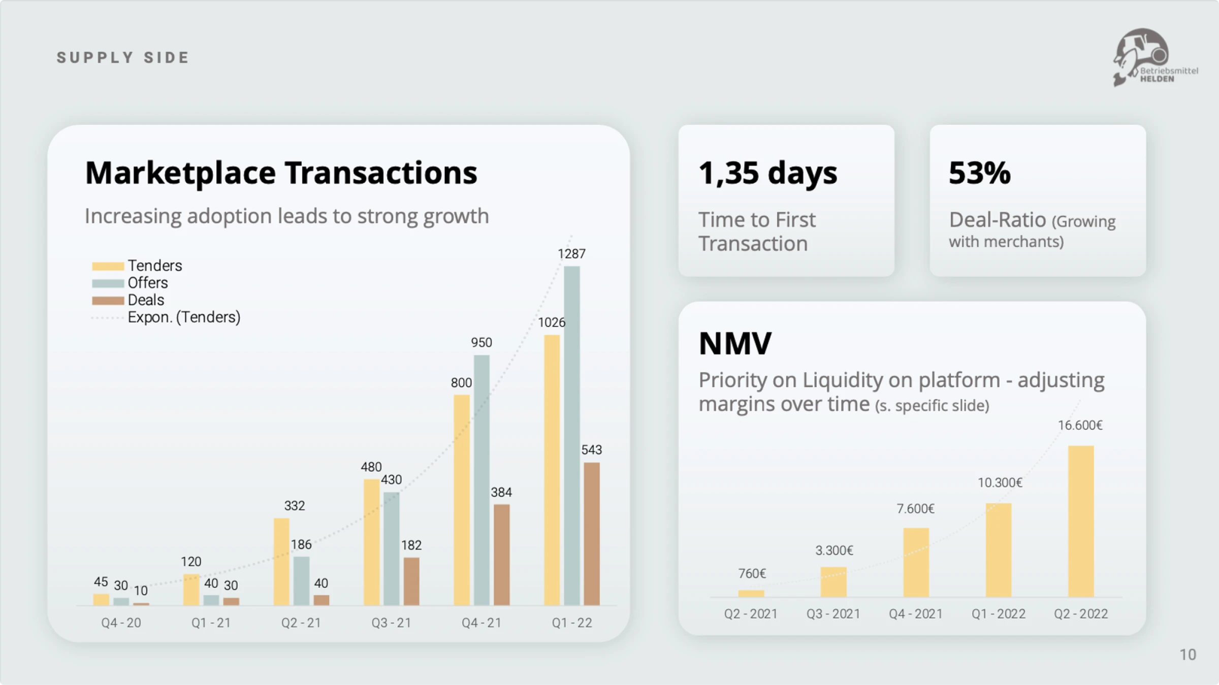
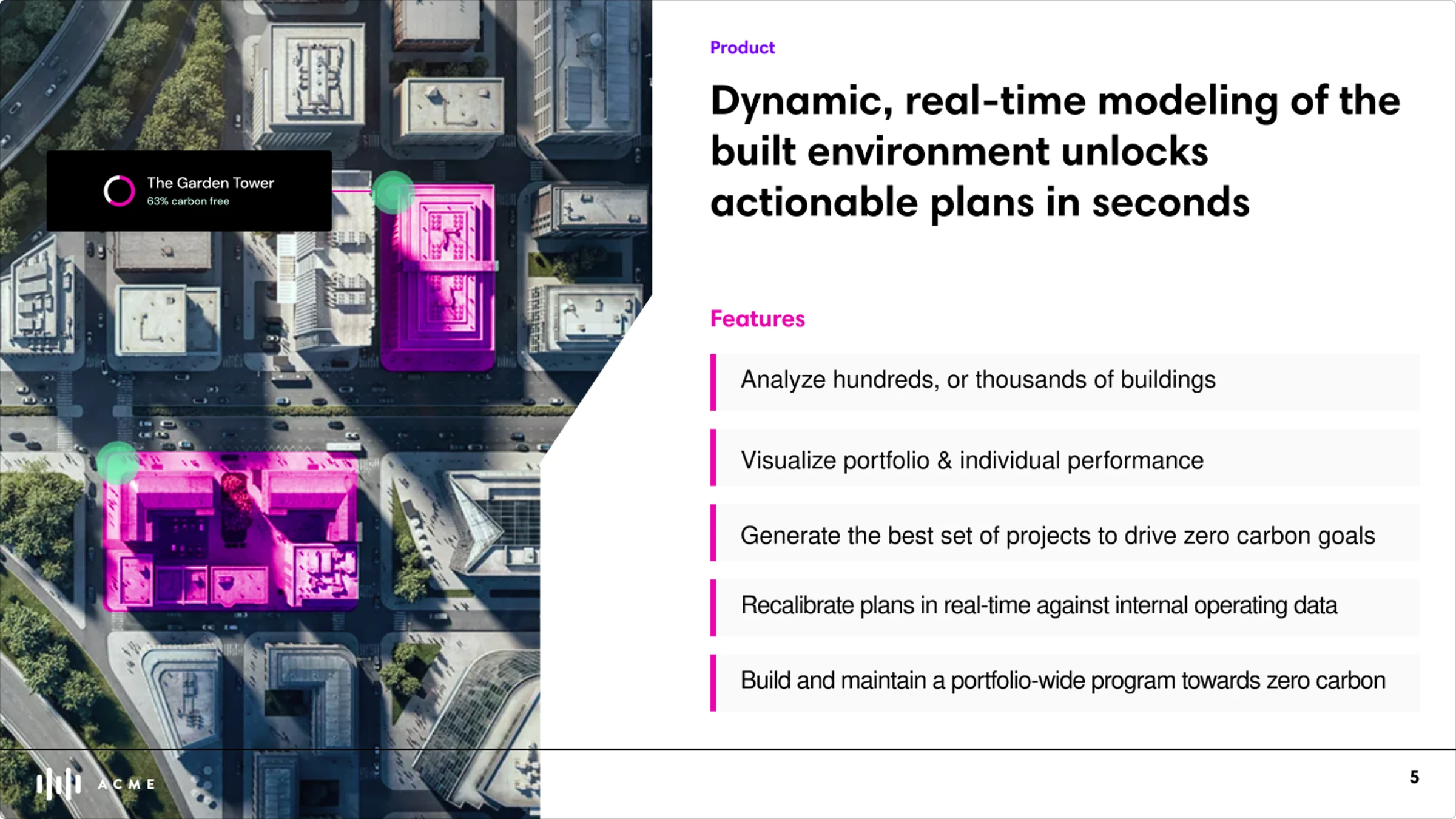
Most pitch decks are very information-heavy. It’s your job to use charts, graphs, and illustrations to present the data effectively. The best designers can break down complex information into easily digestible pieces while maintaining accuracy and relevance.
Use icons to underline your message
Icons can help highlight key points and make complex data more digestible, which is essential when trying to communicate the investment opportunity to investors. Use an appropriate set of icons throughout your design to convey information effectively and break up large blocks of text.
In my experience, having a wide array of icons is beneficial, so you always have enough options to choose the most relevant ones for your pitch deck. However, be careful not to overuse them and ensure they are relevant to the content.
When in doubt, use more white space

White space helps avoid a cluttered look and improves readability, which is crucial when presenting a startup to potential investors. In this context, I’d rather have too much than too little.
It gives the design a clean and modern feel, making it easier for investors to focus on the key points and understand the company’s potential. This approach ensures that your message is clear and impactful, increasing the chances of a successful pitch. In the end, any investor is here to earn money, and the clearer the path toward it they see, the more likely they are to invest.
Choose easy-to-read typography

Use appropriate fonts. While some fancy fonts may look good on a social media graphic, they might be the wrong choice for a pitch deck. Choose fonts that are easy to read, and use different font sizes and styles to create hierarchy and emphasis. Avoid using too many different fonts; most of the time, three types are more than enough.
Use high-quality images & mockups
Investors like to see how ideas and products look and feel. Whenever possible, enhance your slides with realistic mockups and high-resolution pictures to bring your project’s image closer to reality.
If high-quality images are unavailable, either create new ones from scratch or remove them entirely. High-resolution images and realistic mockups enhance visual appeal and convey professionalism, making a significant impact.
Stay visually consistent
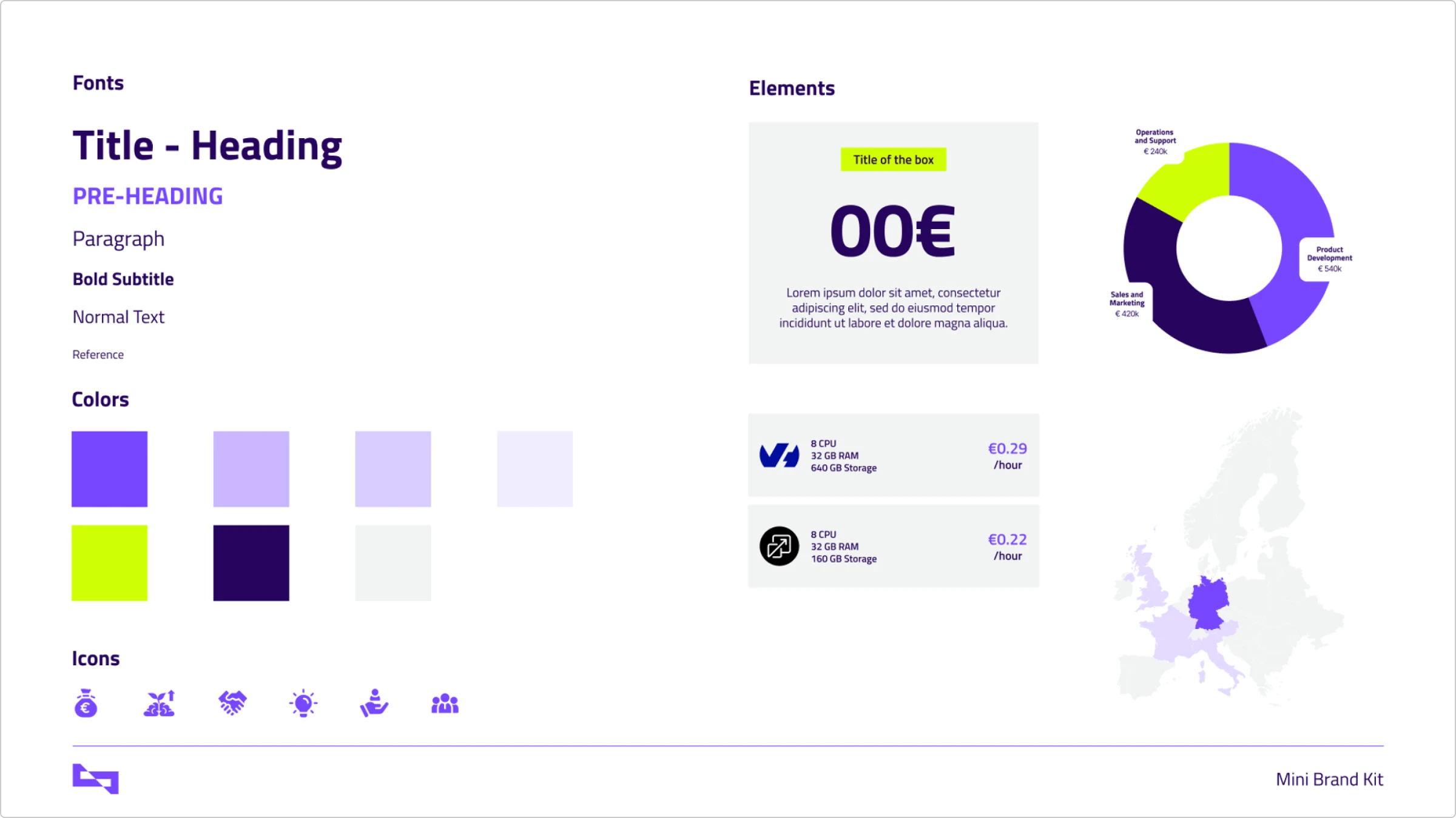
As with all brand materials, maintaining a consistent visual style across all assets is crucial. A well-designed pitch deck relies on the brand kit, using the same colors, fonts, layouts, and style to ensure a unified look.
I suggest setting up a mini-design system before starting the pitch deck design. This makes it easy to adjust and try out different elements.
Use contrast

Last but not least, you can use contrast to make important information stand out. In my example, I used two contrasting colors throughout the deck. First, the primary brand color is used, and then the secondary color is used to highlight key facts and value propositions of the company.
Alternatively, instead of using color contrast on a single slide, you can use two different slide designs throughout the deck — one in dark mode and one in light mode — to differentiate between the problem and the solution.
The proper use of contrast will make the content easy to read and help pinpoint the most important information on the slide.
Wrapping up
I hope you enjoyed these lessons on building the perfect pitch deck. As you have seen, a great pitch deck is all about using appropriate design techniques to support the content and make it easy for an investor to understand what the business is about.
By following these tips, you can greatly help founders in their fundraising efforts and make your work more impactful.
If you are looking for good resources for your deck, check out the icons, illustrations, and photos from Icons8.
FAQ
What is pitch deck design?
Pitch deck design involves creating a visually compelling presentation that communicates a business idea, its potential, and key details to potential investors or stakeholders. It combines visual elements like layout, typography, images, and charts with clear and concise content to make a strong case for investment.
Why is a pitch deck important?
A pitch deck is crucial for getting investments, partnerships, and gaining support for your business idea. It’s often the first impression potential investors get of your startup.
What should be included in a pitch deck?
A pitch deck should include key elements such as an overview, problem statement, solution, market size, business model, competitive analysis, marketing strategy, financial projections, and team introduction.
How long should a pitch deck be?
Ideally, a pitch deck should be concise, with around 10-15 slides. It should cover all essential points without overwhelming the audience.
What is the most important slide in a pitch deck?
While all slides are important, the problem and solution slides are certainly the most critical as they set the stage for the rest of the presentation.
What are common mistakes to avoid in a pitch deck?
Common mistakes include too much text, a lack of clear structure, poor-quality visuals, not addressing the competition, and failing to convey the business model clearly.
About the author
Maximilian Fleitmann is a serial entrepreneur, investor, and Co-Founder of magier. His pitch deck designs have helped raise over $100M. Now, he and his expert team of designers support startups with top-notch design. He’s all about giving founders designs that get results.
Read also: