Our website has a new design! See how we changed it to look even more modern and functional.
The last time we updated the Icons8’s main landing page was in 2020. Since then, we have gotten a lot of new tools and features to share, so we decided to present it all in a nice, appealing way. Let’s see what is new here.
Hero block
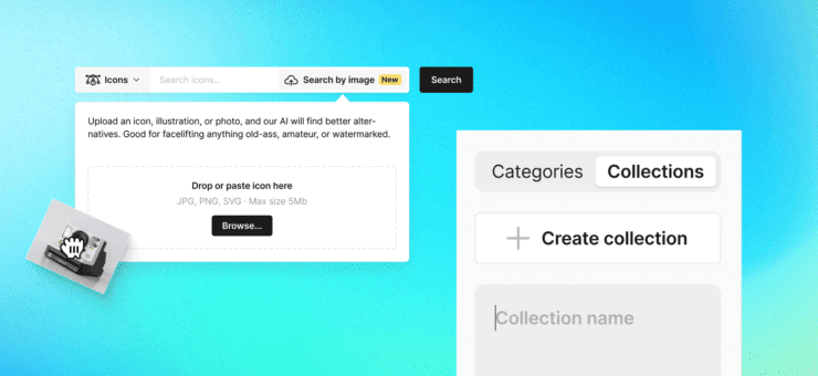
The search bar got an upgrade: now you can switch between different asset types quickly using the tabs above. Each tab has clean and clear UX icons that you can get here.
It also has a new fancy-looking gradient on the background. We played a lot around it to create this light and pleasing effect and not to overload the whole design. If you want to learn more about gradients, check our article, where we break through this topic step by step.
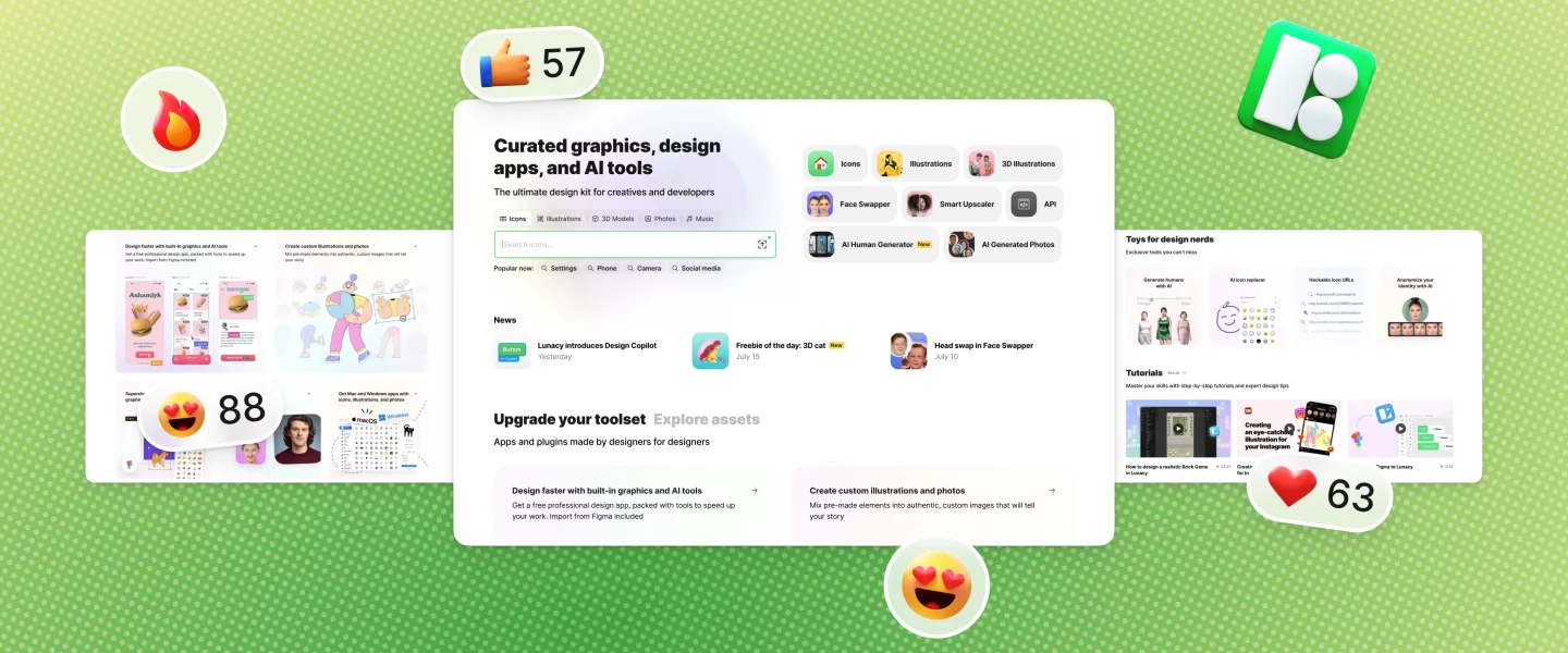
Top-used products and tools are at your fingertips right next to the search bar, so you don’t need to dig down the menu or scroll the page.
Tools and assets switching tabs
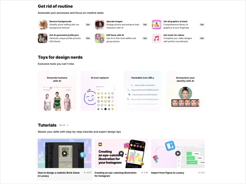
We sorted Icons8 apps and assets in a way that makes it easier to find the ones you need for your actual purpose. Whatever you need in your designer’s life, we have it! Each section has bright illustrations (for example, for the Mega Creator, we use these from our library.
And, of course, in general, we tweaked and fixed minor components and made the whole layout more diverse for you to go through the page.
Take a look at our new main page and dive into all the solutions that we have to offer to make your workflow smoother in any way.