Each year brings new tendencies for web design. Below, let’s see what solutions come as a “stream of fresh air” this year.
The following trends are a must for mastering for specialists who want to improve their competencies and provide broader services.
Top trends in web design for 2023
Behavioral design
This trend implies encouraging users to do particular actions. Thus, by combining info blocks correctly, an unobtrusive design reminds us of the necessity to do certain actions. For example, the use of task-completing bars, diagrams, or charts motivates users to continue. Such tools are perfect for all sorts of apps and websites for sports activities, such as jogging, meditation, painting, etc. Time bars are ideal for counting the time left for discounts. This technique combines features of physiology, design, and creativity.
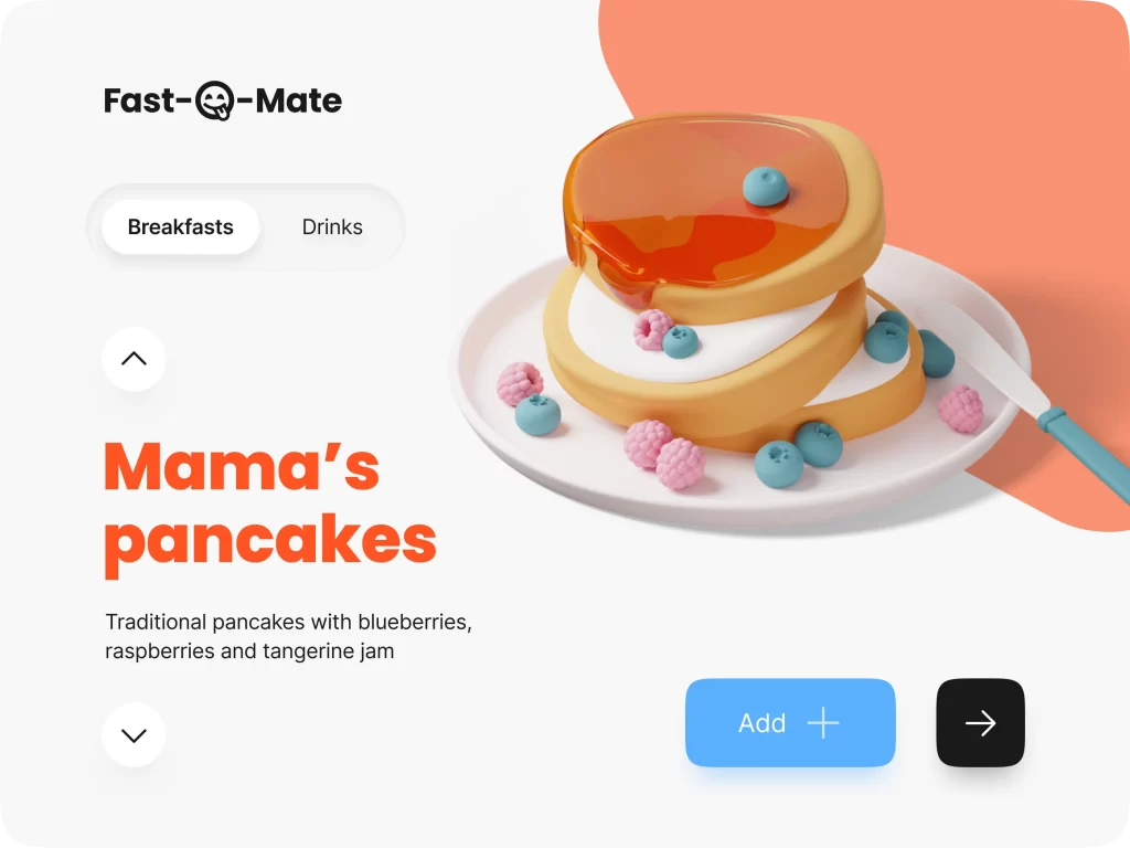
Claymorphism
This trend has come to replace neumorphism, which was popular in 2020-2021. Claymorphism is the use of 3D voluminous illustrations (humans, animals, part of the body, etc.). Such illustrations are created by blending four styles, namely, big rounded corners, vivid colors, outer shadow, and double inner shadow. Such illustrations are perfect for minimalistic designs.
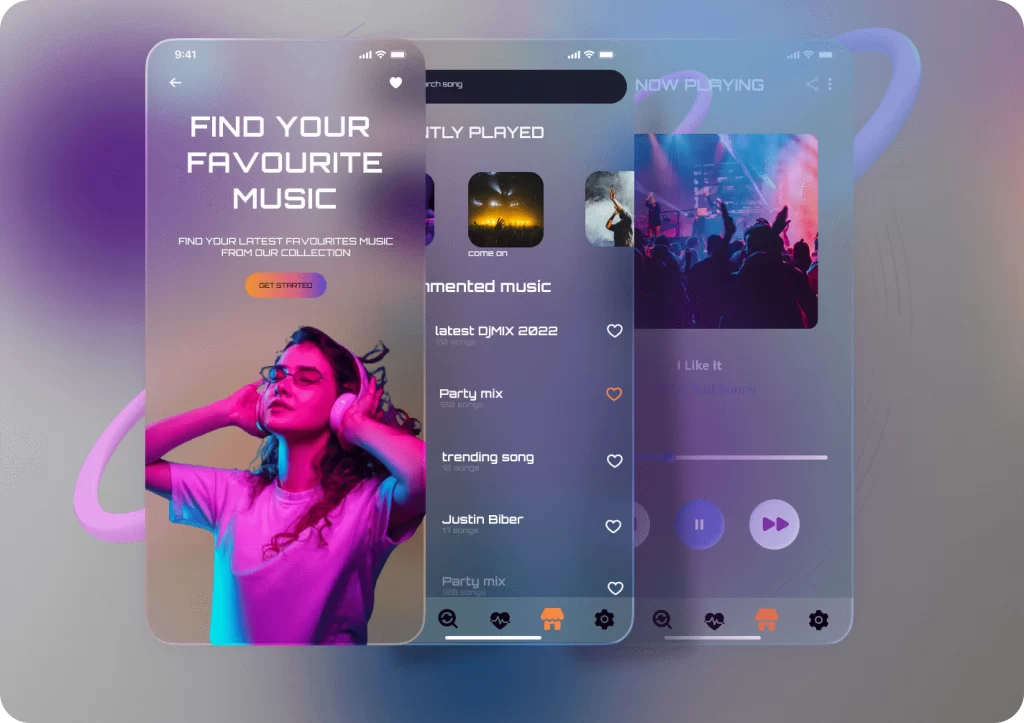
Glassmorphism
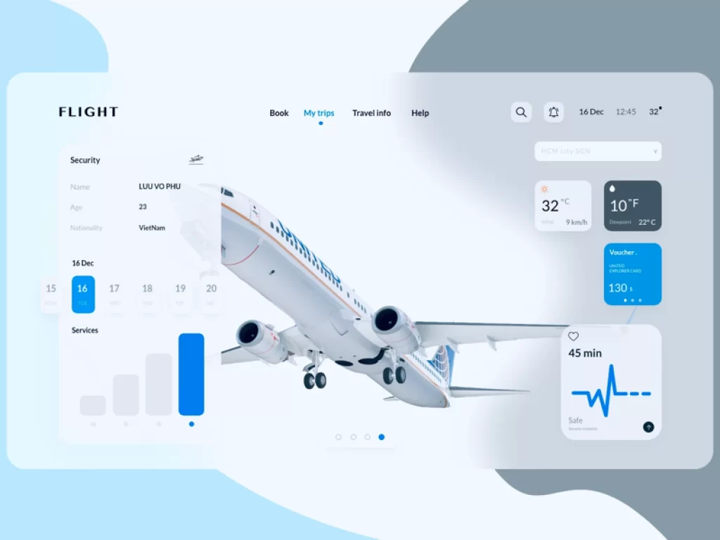
This trend implies the use of translucent and transparent elements. This technique helps make the UI deeper and richer by adding a visual hierarchy. Transparent elements may overlap or cross background, creating multi-layer designs.
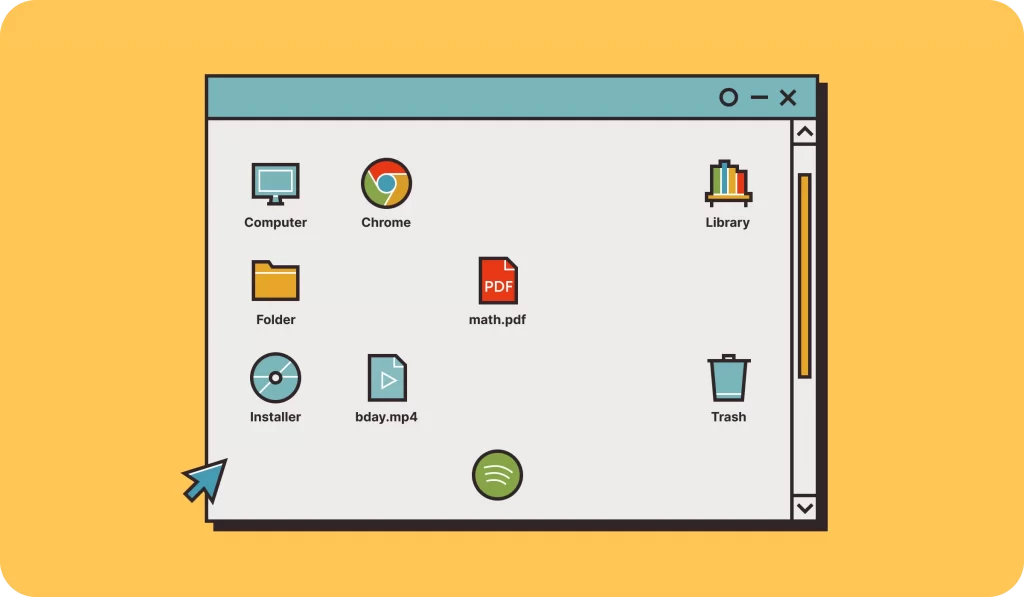
Retro design
This method brings the feeling of nostalgia to visitors’ minds. Thus, it works well in any case. Blending it with futuristic elements allows for creating out-of-the-box layouts and improving customer loyalty and engagement. Vintage and retro elements fit well corporate UIs, portfolios, or online shops.
A blend of graphics and typography
In this sense, designers do not use simple text since it looks too boring for modern users. Trying to make the text more vivid and attractive, they add graphical elements to the text. It is possible to use illustrations, clusters, or stickers. Mixing fonts is another popular technique, where one or several letters are written using another font.
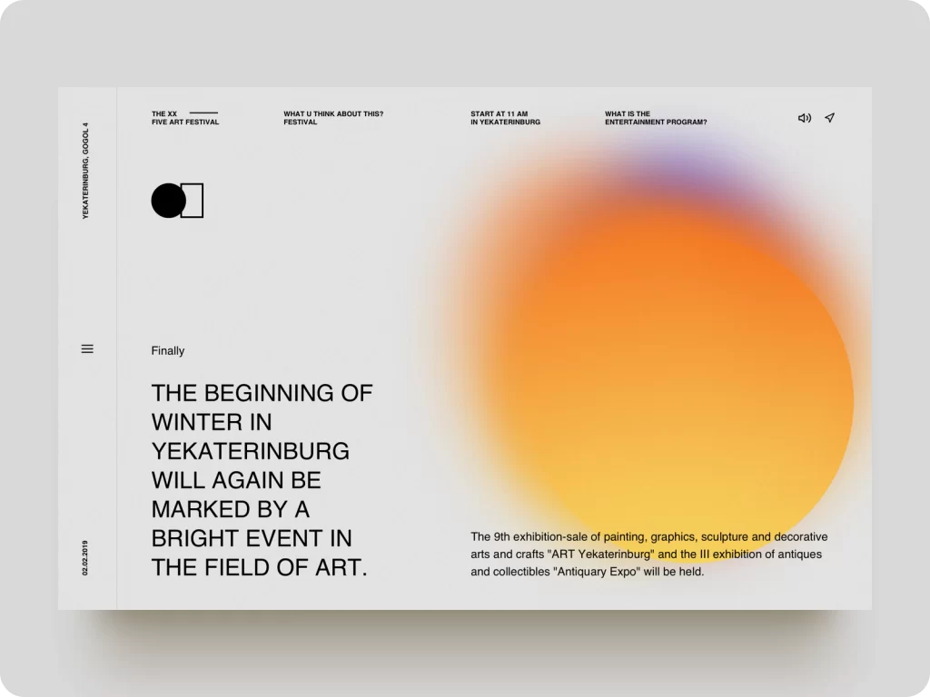
Complex gradient
Although gradient descent is not a novelty, it is still popular. Making it complex for perception brings a new breath to the trend. The use of gradients is popular since it makes layouts deep and resembles 3D effects. Thus, combining gradients with minimalistic UIs is an excellent solution to make web designs stylish and appealing.
Billets, stickers, and plates
Information is usually taken in blocks to make it clearer for perception. Nowadays, these blocks remind us of stickers or billets. They are placed on a website layout creatively to arrange storytelling. Text, illustrations, GIFs, and other symbols are placed on them.
Vertical storytelling
Generally, modern websites have already switched to vertical layouts with a consistent explanation of services or company concepts. Thus, making a website vertical is a common practice for modern UIs. Infographics, illustrations, and other visual tools are used to add vividness.
Engagements-focused interfaces
Engaging has been and continues to be one of the main concepts of web design since its task is to hold the visitor’s attention. Interactive designs capture Web surfers and add value to portals. Thus, the use of multiple interactive tools, such as videos, 3D graphics, and animation, adds vividness. Different moving techniques, like scrolling, dragging, and swiping, entertain users and make layouts vivid and attractive. So whether you run a multi vendor marketplace platform or want to create an app make sure to incorporate different moving techniques, like scrolling, dragging, and swiping to entertain users and make layouts vivid and attractive.
Minimalism
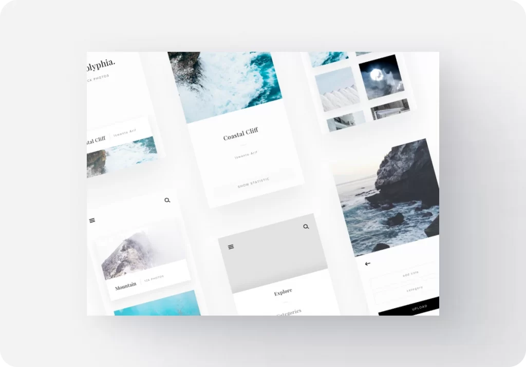
After all, web design directs minimalism. Overloaded or catchy websites do not attract visitors. Nowadays, discreet designs look more organic and responsive. They feature better visual perception. Moreover, minimalistic UIs are well-combined with the above-mentioned trends. Yet, note that minimalistic does not mean boring or monotonous. Due to the combination of minimalistic backgrounds with the listed techniques, it is possible to create stylish, attractive, out-of-the-box UIs.
Summary
Here are some tips on which directions I better look to create something fresh and functional. But keep in mind that it is a nice idea to combine several techniques to create the best solution.
About the author
This article is brought to you by specialists from the web design agency Crown. They are ready to offer modern turnkey design solutions based on their clients’ demands.