Learn about the top email design trends to boost engagement and conversions in your email marketing campaigns.
Email remains a marketing powerhouse when it comes to connecting with customers. In fact, 41% of email marketers say that email is their most effective marketing channel. Another 81% of small and medium businesses believe email marketing boosts customer retention and plays a key role in getting new customers.
But here’s the thing: What you say in your emails matters; how you present it can make all the difference. A well-designed email can grab attention, clarify your message, and encourage readers to act.
In this article, we’ll cover six of the best email design trends to inspire your email marketing campaigns and help you create emails that not only look great but also drive engagement and conversions.
Trends mentioned:
- Social proof
- Visual hierarchy
- Dark mode aesthetic
- Minimalist design
- Vibrant colors
- Bold typography and graphics
Social Proof
Our first design trend is social proof, which is all about showing potential customers that people love your product or service. When prospects see that others have had positive experiences with your offerings, they’re more likely to trust your brand. In fact, 66% of customers will buy a product because of its positive reviews.
You can leverage this strategy in your email campaigns by:
- Sharing quotes from satisfied customers to build trust and show the real benefits of your products.
- Using pictures of customers who gave testimonials to make the feedback more relatable.
- Displaying certifications and badges from recognized institutions enhances your credibility and reassures customers of your product’s quality.
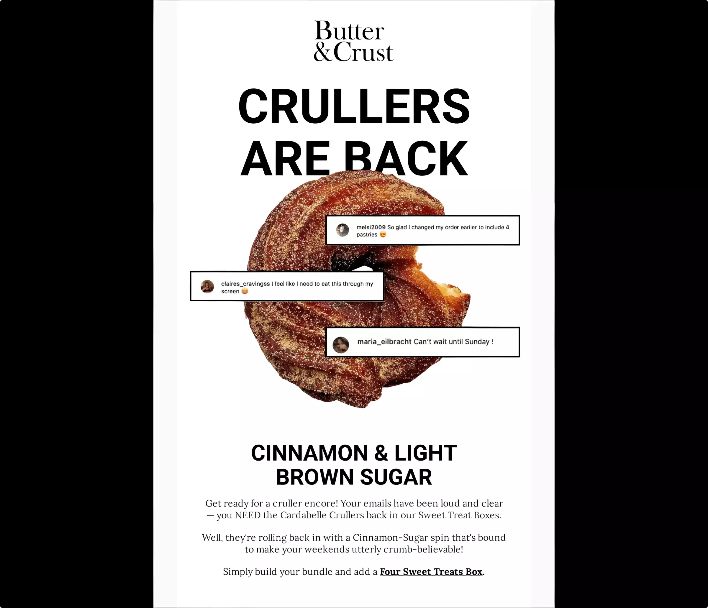
Here’s a good example from Butter & Crust, a pastries company:

The email showcases customer reviews directly on the cruller image. It’s one of the first things the recipient notices, immediately capturing their attention. The featured reviews also include usernames and profile pictures, adding authenticity and making the testimonials feel more personal and credible.
Visual Hierarchy
Visual hierarchy makes the most important information stand out and guides the reader’s eye through the content. This improves readability and ultimately increases engagement and click-through rates.
Here’s how to add a visual hierarchy to your emails:
- Use white space to separate different sections and elements so readers can focus on each part of your message.
- Use different colors to emphasize important elements like CTAs, headings, or special offers.
- Position images strategically to break up text and maintain the reader’s interest.
- Use bullet points to make it easier for readers to scan and absorb details quickly.
- Incorporate dynamic content and interactive elements to personalize customer experiences.
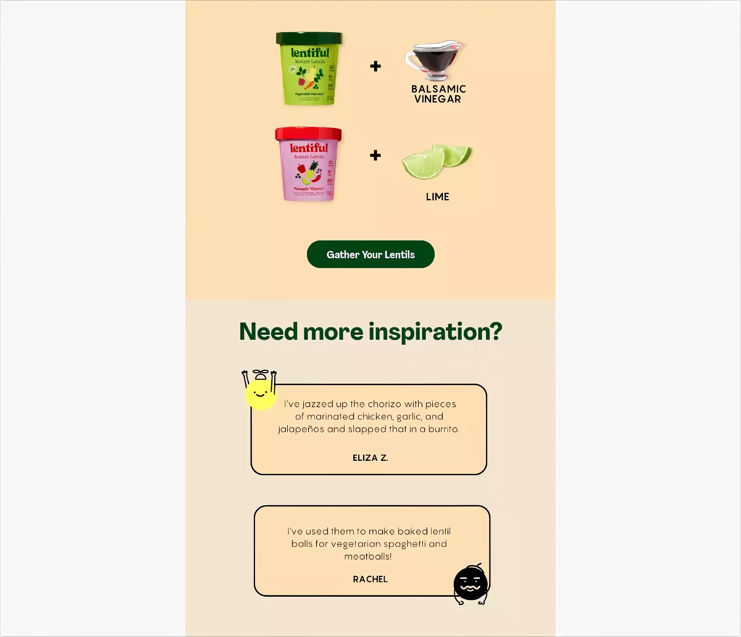
Let’s look at an example from Lentiful, a vegan food company:

The email uses an organized layout to showcase the products. Each Lentiful product is paired with a complementary ingredient, which creates a simple yet effective visual pattern that guides the reader’s eye from top to bottom.
In addition, the products have bright, eye-catching colors that stand out against the background. This draws attention to the items, making them the focal point of the email.
Dark mode aesthetic
Most people now prefer dark mode to a white background with black text. In fact, a whopping 81.9% of people with smartphones use dark mode in 2024.
Not only does it offer a sleek and modern look, but it also enhances readability in low-light environments, reduces eye strain, and conserves battery life on mobile devices.
So, how can you incorporate this trend in your email designs?
Use dark backgrounds to create the base for your dark mode design. Make sure your text color contrasts well with the background. Light colors like white, light gray, or pastel shades can be ideal.
You can also adjust the color of images, icons, and logos so they remain visible and visually appealing in dark mode. If necessary, create separate versions of your images — one for dark mode and the other for light mode.
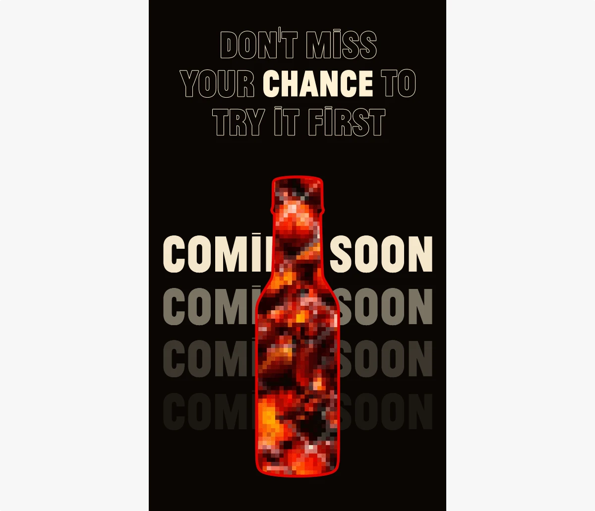
Fly by Jing, a food company, uses dark mode pretty well in its emails.

The email’s background is deep black, giving it a sleek, modern appearance. This choice of background color helps the other design elements (like the blurred sauce bottle) stand out and capture the reader’s attention immediately.
Minimalist design
In a world where the average person gets 100 to 120 emails daily, a clean and straightforward design can help your email stand out in a crowded inbox. A simple design cuts down on clutter, makes your message easy to read, and directs attention to the key points, like your call-to-action (CTA).
Cut out anything that doesn’t add value to your email and use headings, subheadings, and bullet points to make your email easy to scan.
In addition, only include images that support your message since having too many of them can clutter your email and distract from your main points. Remember to add descriptive alt text for your images so that readers understand what the photos are about even if they don’t load properly.
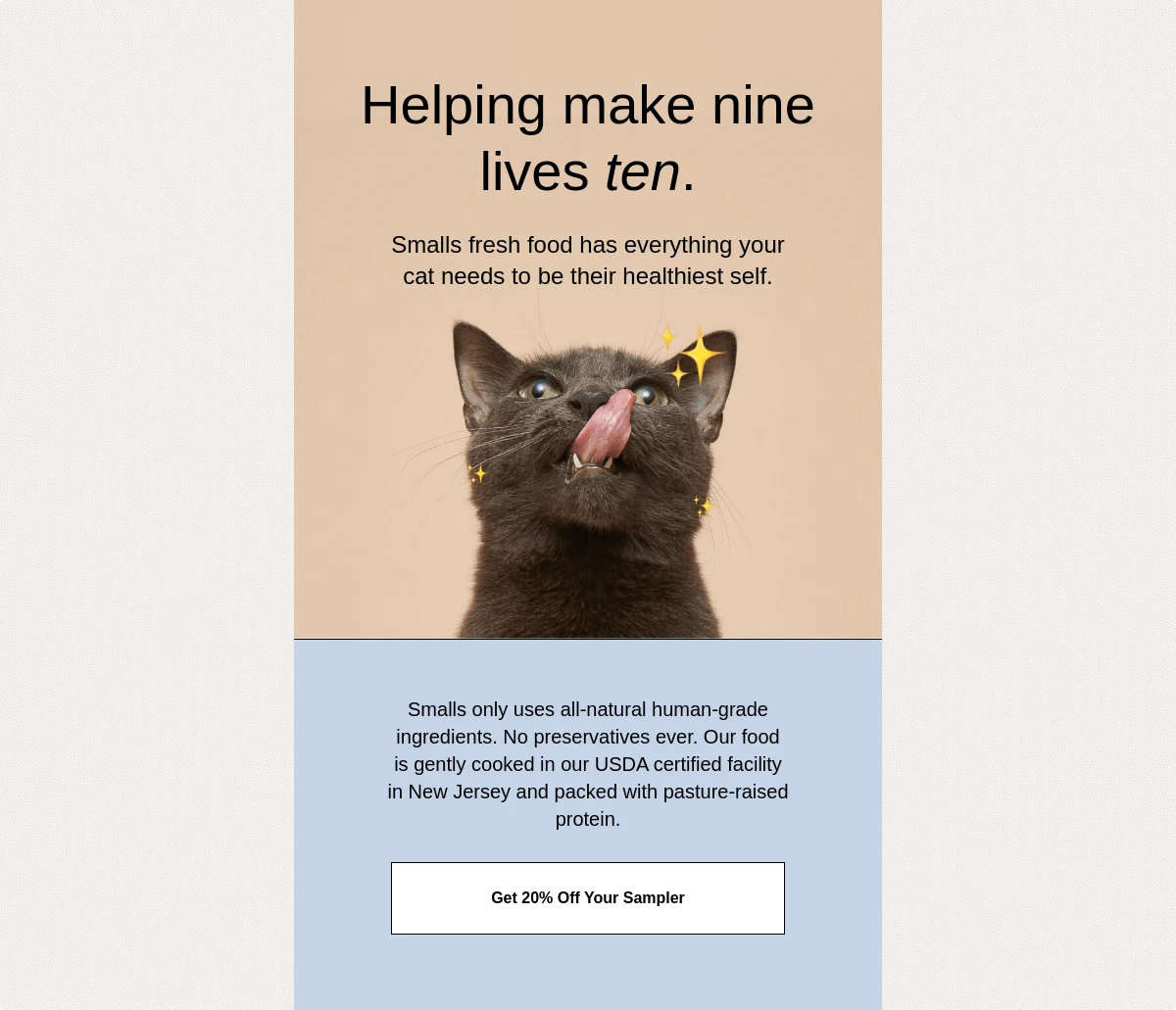
The email from Smalls, a cat food delivery service, is a prime example of a minimalist design done right.

The cat image captures attention immediately and creates an emotional connection with the reader. It’s relevant to the content, which reinforces the message about cat’s health and happiness. The picture is also well-placed and adds visual interest without clutter, drawing the reader’s eye naturally and complementing the text perfectly.
Vibrant colors
Vibrant colors can evoke emotions and reinforce your brand personality. So, select a color palette that aligns with your brand identity and evokes the emotion you want to convey.
For instance, if your brand represents relaxation, you might choose shades of blue and green. Blue can evoke feelings of calmness and trust, while green is often associated with nature and serenity. On the other hand, if your brand is vibrant and energetic, a palette featuring bold reds and oranges can communicate enthusiasm and excitement.
That said, stick to a few key colors to maintain a cohesive and professional look. Too many colors can overwhelm the reader and dilute the impact.
Here’s a good example from Magic Spoon, a cereals company:

The combination of a vivid blue top section and a hot pink bottom part creates a striking visual contrast that makes the email stand out. The colorful cereal boxes at the top also complement the background and create an appealing visual that attracts the reader.
Bold typography and graphics
Bold typography and graphics break the monotony of plain text and add excitement to your emails. This helps you capture the recipient’s attention, convey your brand’s personality, and make your message more memorable.
Here’s how to add interesting graphics to your emails:
- Use custom illustrations that match your brand’s style.
- Use fonts other than the standard options, like Arial and Times New Roman, to add a unique touch to your emails. Make sure they’re easy to read and align with the fonts on your website or landing pages.
- Incorporate bright colors to enhance the playful nature of your typography and graphics.
Let’s look at an example from Piecework, a company that sells puzzles:

The banner at the top of the email, which spells out “HAPPY RETIREMENT,” is attractive. Each letter has a different color and style, giving it a fun and festive feel.
The email also uses bold fonts for key messages such as “Shop the Retirees” and “Lazy Sundae.” These fonts are easy to read and add a playful message to the design, enhancing the overall visual appeal of the email.
Implement the right email designs in your campaigns
Email designers who use the right designs in their emails see a significant improvement in their marketing strategies. The good news is that you don’t need advanced coding skills to implement these designs. Many email clients, like Sender, provide the tools and email templates you need to make the process easier.
Experiment with the email designs we’ve discussed to find the best fit for your brand. That way, you’ll not only enhance the aesthetic appeal of your messages but also drive higher engagement and boost conversions.