I know what you are thinking. Just another guy trying to impose his personal opinion on a controversial, holy war-inducing topic. “UI vs UX: What’s the difference?”
You got that right.
My only difference from other articles is that I’ll show you practical examples from my personal experience as a usability specialist. I’m a guy who’s tested some real functioning projects on real people. It still goes without saying, however, that my opinion is subjective, so you are welcome to be more of a skeptic than Hugh Laurie in the first 10 minutes of every House episode.
You Can Break Down UI, But Not UX
To illustrate this point, I’ll use a feature from our website – Collections. It lets you create groups of icons.
I created a new collection and started dragging the icons I wanted there.
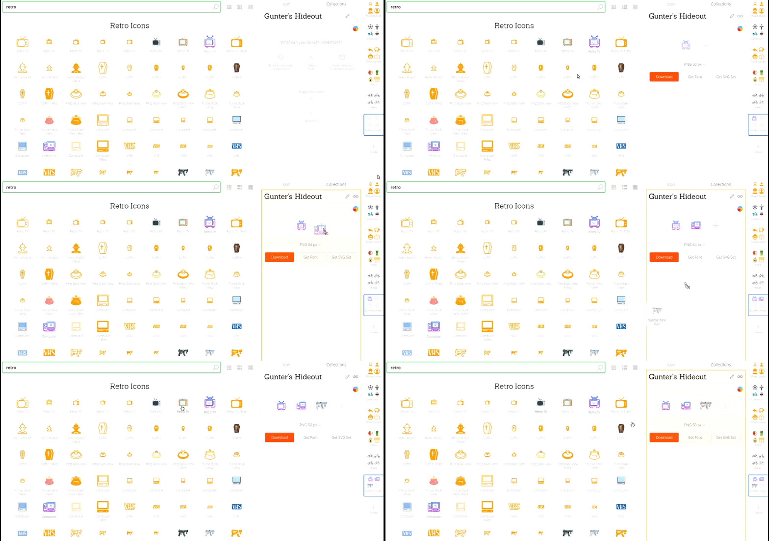
This is collection’s UI:
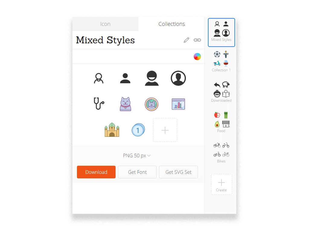
What’s UI? Everything you see above.
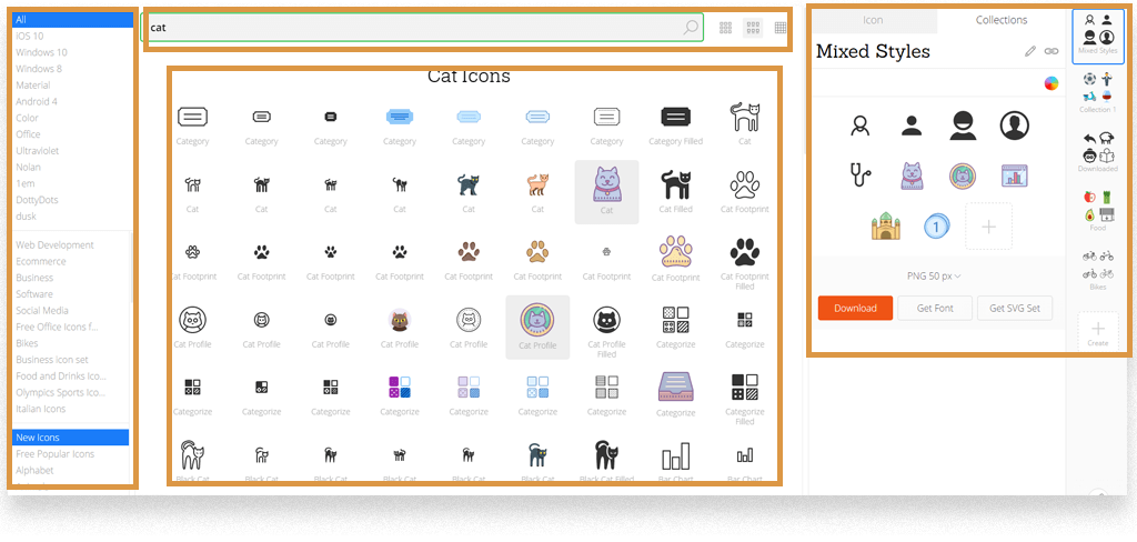
UI can be easily divided into parts. Below you can see the overall Icons8 UI, but it can be divided into different subsections like Categories UI, Collection UI, Search UI, etc.
What is UX then?
“User experience” encompasses all aspects of the end-user’s interaction with the company, its services, and its products.
– Don Norman.
In other words, “Collections” are a tiny part of the user’s overall experience on our website, because they are a tiny part of our product and the services associated with it.
Let’s look at a real world example:
John is an seasoned Icons8 user. His current experience with Collections is highly dependent on his previous experience with our website and any other icons websites, and cannot be considered in isolation.
Before using Collections he had used other features, such as Recoloring. So when it comes to Collections he expects the same features to be available.
Ok, the first takeaway:
UX cannot be divided into different parts. UI can be divided.
I am deliberately NOT saying “Collections UX”, because it undermines the whole definition given by Don Norman. Collections are a tiny part of the overall user experience.
You can’t just isolate Collections UX from overall UX because nobody uses these collections in a vacuum. Before they used collections, customers had probably searched for icons, read our newsletters or visited other icon websites (which is also a part of their experience).
Second takeaway:
UI is the same for everyone. UX is different for everyone.
I interviewed 3 website visitors: John, Alicia and Steve. There was no A/B testing of UI, so they all saw Collections UI equally. However, their overall experience (UX) was different.
John got an email promoting our new feature, “Collections”. Given the fact that he subscribed to our mailing list, obviously he had been on our website before. He’s an experienced user. Newly released Collections solved his old problem – downloading multiple icons at a time. He’s happy. He had a great UX.
Alicia found our website through a google search. She’s a first time visitor. She downloaded one icon and left. She never even saw the “Collections” tab. What was her experience? She had none. At least her experience never touched Collections. Neutral UX? No. She could have had the same problem as John (downloading multiple icons at once), but never found a solution. That’s a bad UX.
Steve uses Collections on a daily basis. But after trying to add the 500th icon to his collection he gets an error message “Nothing found”. Steve also points out that by using another website he was able to generate fonts from thousand of icons. Bad UX.
See? UX is different for everyone.
Remember me talking about the fact that….
UX cannot be divided into different parts. UI can be divided.
It goes even further.
The UX’s of different people cannot be isolated from one another either.
We have 2 different user experiences here. Should we treat them separately? No.
John had a great experience. However, we have to be sure we won’t make his UX worse while helping the other two customers, Alicia and Steve.
Alicia and Steve both represent our customers, each with their own problem and a bad UX. We need to improve their overall UX.
Let’s start with Alicia. Alicia represents a great number of people who simply don’t notice the “Collections” tab in the right corner. What we tried to do after this was to increase people’s awareness of Collections by adding this notification:
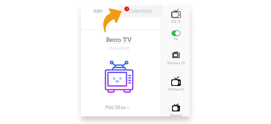
Now when people download any icons we automatically create a Collection named “Downloaded” for them and this red notification indicates the number of new icons added to the collection. Alicia’s UX was improved, yet It didn’t not make John’s (the happiest customer) life harder. And Steve…well let’s just say Steve has bigger problems to think about.
The problem Steve faces is far more technically demanding. The reason why we limited the max number of icons in any given collection to 500 is that only 0,001% of customers need collections that big. Expanding this limit would result in dramatic increase of server load, which leads to higher response time for all users. It may worsen overall experience of other customers (such as John and Alicia).
Put simply, we can’t improve Steve’s experience without worsening it for John and Alicia. However, we can soften things a bit. Remember the kind of message Steve got when adding 500th icon? The error message “Nothing found” was misleading. Let’s tweak it a bit:
“Our collections do not support more than 500 icons. Please, create another collection or contact our support”
Easy as that, we managed to increase Steve’s UX without hurting anyone else’s.
I want to really hammer this point home: UX’s of different people cannot be thought of in isolation.
You see, UX’s of different people are interconnected. You should never treat the experience of certain customers without thinking of the other customers. Yes, you treat every problem differently, but you always should think how the solution affects the UX of others.
Another Example of UI/UX Distinction
Once I was tasked with conducting a usability survey of our search. There’s a pretty awesome detective story I wrote about it, so this time I’ll be brief.
My goal was to test 3 different search modes:
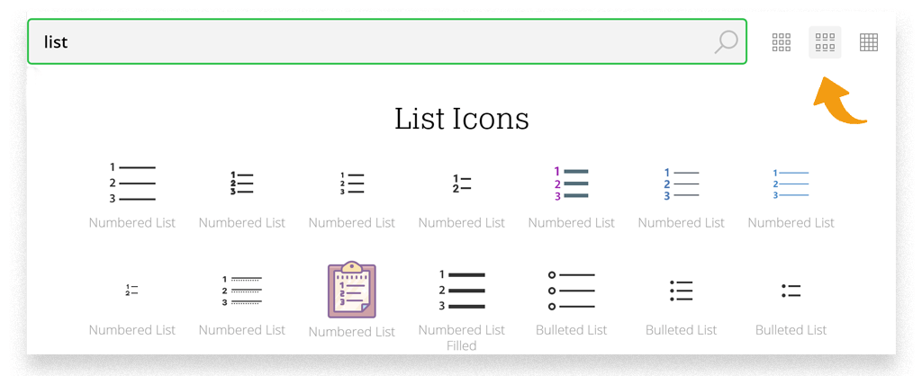
What’s a UI in this story? It’s 2 buttons switching between search modes and search results (icons).
So all I could test with my participants was whether those buttons were clickable and if people could find them. It took participants 2 minutes to do all that.
What’s UX?
With that exact question, my survey suddenly went from a 2-minute chat to a 30-minute full-scale interview.
The more I asked about people’s experience when they switched between search modes, the more it became apparent that:
- UX is different for everyone.
- UX cannot be divided into different parts.
Again, UX is different for anyone (if nothing else, please just remember this sentence I typed 100 times).
No matter how deliberately I followed my interview script, all 5 participants had completely different problems and ways of doing things.
For example, a designer found the “Only icons, no text labels” mode more convenient, while a manager found that text labels let her correct her own search parameters and find what she wanted more easily.
UX cannot be isolated into different parts.
I was asking people to search icons in different modes, and their experience heavily depended on what search mode was their first one.
For example, I asked people to search for a list icon.
And then I asked them to point out any irrelevant icons in the results. Well, the number of irrelevant icons was significantly higher if they first searched in “Icons & text labels” mode. With UX everything is interconnected.
Afterword
The internet is flooded with articles discussing the UI/UX difference. I didn’t want to spam you with one more. Instead of terms and self-conjured definitions, I tried to show you a few practical examples, so that you could feel for yourself what UI is and what UX is and how close, yet distant, they are in every case.
About the author: Andrew started at Icons8 as a usability specialist, conducting interviews and usability surveys. He desperately wanted to share his findings with our professional community and started writing insightful and funny (sometimes both) stories for our blog.