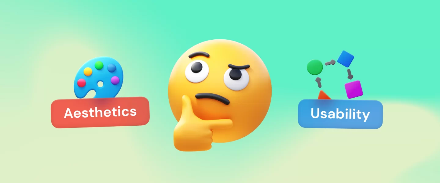
The article explores ways to find the balance between aesthetics & usability with examples of successful digital products.
Creating a successful digital product involves balancing appearance (aesthetics) and ease of use (usability). Deciding how much to focus on each aspect is tricky. Aesthetics deals with how the product looks and feels, while usability is about the ease of operation. It’s crucial to balance the two so that they complement each other rather than conflict. This article explores how to achieve this in design.
Aesthetics in design
Aesthetics lie at the core of design, defining its visual appeal to the users. It encompasses factors like balance, color, pattern, shape, and visual weight. Designers use aesthetics carefully to create attractive layouts, complement usability, and enhance functionality. Paul Rand, the renowned Art director, and Graphic designer who created iconic logos like IBM’s, aptly described design as the method of combining form and content.
If there is no harmony in aesthetics and usability, a design can confuse users. Let’s take a look at a few real-life examples of UI/UX designs that can be hard for users to make sense of.
Confusing UI of the call feature in Apple iPhone
Apple is generally good at making things look nice and work smoothly. But there are some features that can be improved. iPhone users experience a stressful situation when they receive a call while already on one. Multiple icons displayed on the screen leave users confused about what action to take next. As a result, handling such calls becomes a challenge, making it difficult for users to make a choice. This is an example of an unnecessarily cluttered UI that messes with usability.
Frustrating UX despite the good UI of Xiaomi phones
Redmi phones have an attractive user interface with visually appealing design elements. However, when it comes to the user experience, there is a notable drawback in their lock screen customization.
One significant problem with the lock screen is the inability to permanently disable the default lock screen, a marathon of ads and news, which is often a source of frustration for users. Of course, there are some ways to turn these annoying things off, but in general, this limitation, a monetization tactic, hinders the seamless user experience of Xiaomi smartphone users.

As evident from the examples above, a thoughtful design must balance both UI and UX to be successful. When there is a perfect mix of aesthetics and functionality, you can create outstanding user experiences that keep users engaged with the products.
Aesthetics and attractiveness bias
Attractiveness bias is an important factor to consider in user experience. It is a cognitive bias where people prefer products that look aesthetically pleasing. The aesthetic-usability effect shows that users are more forgiving of minor functionality issues if the design is visually captivating. This can be confusing for designers as it may lead them to focus solely on the look of a product. When users encounter similar products, they automatically pay more attention to those with better visuals. However, it is essential to remember that this attention is short-lived, as users ultimately value the usability of the product.
Read on to discover how to ensure your design is visually alluring and functional.
Finding a balance between aesthetics and functionality
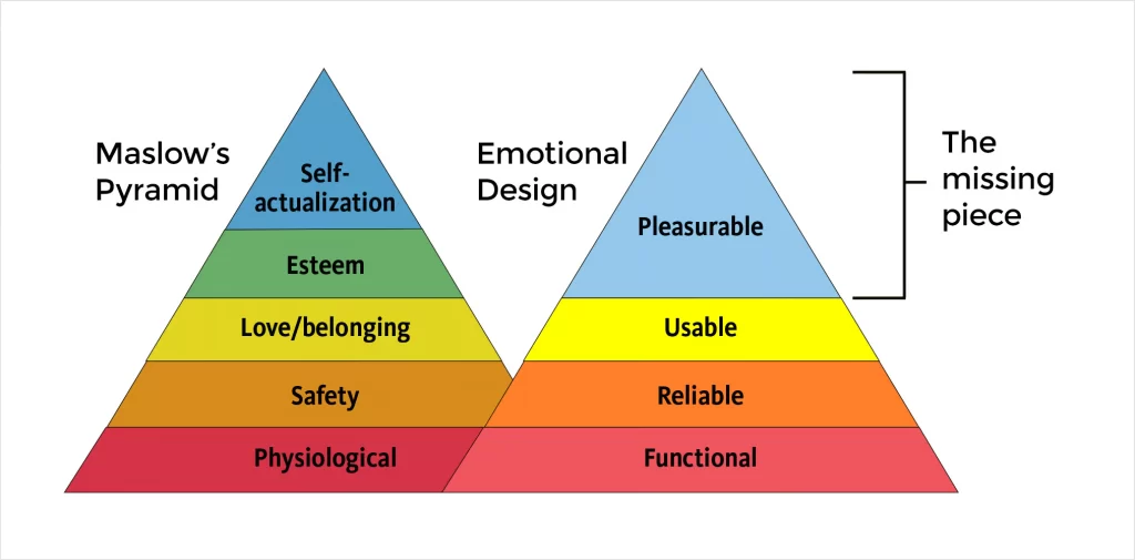
Address user goals and needs with emotional design
When designs evoke emotions, positive user experiences are born. Designers can connect with users on different cognitive levels—visceral, behavioral, and reflective—so that they associate positive feelings with products and brands.
As Don Norman, the Grand Old Man of User Experience, aptly put it, “Everything has a personality: everything sends an emotional signal. Even where this was not the intention of the designer, the people who view the website infer personalities and experience emotions.”
At the heart of emotional design is understanding the user’s needs and goals and using these insights to drive the design decisions. By ensuring that the design fulfills user needs and using aesthetics to further reinforce them, we can create meaningful emotional connections and provide enjoyable experiences to users.
Assess user scenarios and find solutions
Assessing user scenarios and finding solutions to users’ problems is key to creating a design that works. Before diving into sketching or prototyping, it is essential to clearly understand the users and their problems. This understanding allows you to focus on the core functions and features your design should provide to meet the preferences and expectations of your target audience. By utilizing tools like personas, user stories, scenarios, and user journeys, you can define the problem accurately and provide the right UI/UX design services for businesses.
Once you have a well-defined problem and a detailed user profile, you can begin generating various concepts and alternatives that address the issue and meet user needs. Techniques such as brainstorming, mind mapping, sketching, storyboarding, and mood boards can help you explore a wide range of ideas and possibilities. Drawing inspiration from existing designs, current trends, and best practices can enrich your creativity. The ultimate goal is to collect relevant concepts that you can later evaluate and refine to create an outstanding design.
Define the main design elements
Different projects may have varying focal points, so identifying the critical design elements becomes essential. Understanding what matters most to the users helps in determining which elements take precedence. For instance, functional aspects like intuitive navigation would be prioritized if usability is paramount. However, aesthetics should not be overlooked, as they significantly create a positive emotional connection with users.
By ensuring that the core functionality is solid and user-friendly, proceed to enhance the design with appealing aesthetics to create a compelling and satisfying user experience.
Leverage aesthetics to fix functional gaps
Leveraging aesthetics to address functional gaps in design is a key aspect of creating a successful user experience. Visual appeal can be both objective and subjective, as some aesthetic choices resonate universally, while others may be flawed in certain contexts. Factors like users’ culture, age, and educational level impact how they perceive design elements. This is where user research becomes vital to tailor the aesthetics effectively.
The principle of “letting form follow function” helps UI/UX designers align a product’s aesthetic with its intended purpose. Renowned designer Charles Eames emphasized that design should arrange elements to achieve a specific goal.
Harmoniously arranging page/screen elements by establishing a strong visual hierarchy helps guide the user’s attention to the features and functions they need. Moreover, keeping aesthetics consistent with users’ expectations enhances the overall user experience. By carefully considering the interplay between aesthetics and functionality, designers can bridge functional gaps and deliver designs that truly resonate with their users.
Follow design guidelines and principles
Following design guidelines and principles is essential to creating visually appealing and functional designs. By employing design principles like contrast, alignment, and balance, you can ensure that designs are both aesthetically pleasing and easy to navigate. These principles help to achieve a harmonious composition, making it easier for users to understand and interact with the design.
In addition to contemporary design principles, utilize timeless rules like the golden ratio, rule of thirds, and Gestalt principles. These principles optimize the choice and use of design elements, providing users with clear visual cues and reducing uncertainty. By implementing core gestalt, you can play around with contrast, spacing, and other design elements to create a UI/UX design that speaks to your user on a deeper level.

Test and iterate
The process of finding the perfect balance between aesthetics and functionality in design is not static but rather dynamic and iterative. You continuously refine the designs through testing and iteration based on valuable user feedback. This iterative approach allows designers to explore different design options and make improvements to achieve optimal balance.
For this, actively seek stakeholder, client, and user feedback through surveys, interviews, focus groups, and analytics. Such inputs help you understand what works well and needs improvement, guiding you toward making the necessary changes.
Learn from industry trends and best practices
Staying updated on the latest industry trends and best practices is critical if you want to create solid designs. By continuously learning from the ever-evolving domain of design, we can incorporate innovative techniques and proven methods into our work. Understanding current trends, usability principles, and design guidelines enables us to make informed decisions when crafting our designs.
For instance, in 2022, the number of people who consume video content reached 3.37 billion – video marketing is booming!
Online video is expected to account for 82.5% of all web traffic in 2023, making it the most popular type of content. 54% of businesses use video on their landing pages, and 81% of marketers say video has directly impacted sales.
So, it becomes imperative for designers to use videos in designs and learn the basics of video editing tools like Adobe Premiere Pro, iMovie, and Movavi Video Editor. It will help them create designs that align with the trend, generate brand awareness, and increase sales.

Form and function should be in tandem
To sum up, there are two main approaches to achieving the right balance between visually pleasing and functional products. The first approach involves starting with a focus on functionality, ensuring the product meets user needs and works effectively. Once this is in place, designers can then work on improving the aesthetics to enhance the user experience.
Alternatively, the second approach is to prioritize aesthetics, a.k.a. form initially, focusing on visually striking designs that capture user attention. However, this approach carries some risk, as it may require additional efforts to improve the functionality without compromising the design’s visual appeal.
Designers may sometimes need to make trade-offs between form and function. Adding more features to enhance functionality can lead to increased complexity, requiring careful consideration of user needs to determine which features are most significant.
To achieve the balance between form and function, designers must gather user feedback, conduct tests, and prioritize features based on both functionality and aesthetics. This would ensure that the final product meets user needs while delivering an engaging, visually pleasing experience.
Author bio
Aparna is a content creator with a strong passion for UX design, working with a leading UI UX agency. Her works are informed by her deep knowledge and understanding of the field. She blends creativity and her unique perspective of the field to create engaging and informative articles. Aparna seeks to inspire and educate readers by providing valuable insights into the world of UX design.