Dive into the art of notification design with Icons8. Transform alerts into engaging visuals and turn every ping into an opportunity to connect.
Notification graphics are unsung heroes in grabbing user attention. They’re small but mighty, guiding users back with a mere glance. This article zeroes in on the craft behind these visual nudges, showcasing Icons8’s rich array of icons and illustrations.
We’ll show you how to make your notifications not just seen, but impactful. Let’s dive into making those tiny alerts work hard for your user engagement.
How are push notifications designed?
Designing notifications that capture attention and engage users is both an art and a science. It begins with understanding push notifications, best practices, and user preferences. Then, it delves deeper into the anatomy of what makes a notification not just seen, but effective.
Step 1. Visual and design essentials
Effective notification design hinges on simplicity, recognizability, and relevance. Key visual elements include:
- Size. Ensuring visibility without being intrusive.
- Color. Utilizing colors to signify importance or status, drawing attention where needed.
- Symbolism. Employing familiar imagery to communicate quickly and intuitively.
These elements, combined with design principles focused on simplicity and consistency, ensure that notifications enhance rather than disrupt the user experience.
Step 2. The design process
Creating a push notification involves several crucial steps:
- Purpose identification. Define whether the notification informs, prompts action, or updates the user.
- Visual selection. Choose icons and colors that match the notification’s goal, leveraging familiar symbols and strategic colors for clarity and impact.
- Message crafting. Keep the text concise and straightforward, complementing the visual elements for clear communication.
- Clarity testing. Test across various devices and contexts to guarantee the notification’s effectiveness and readability.
Step 3. Ensuring consistency and brand identity
A consistent design across all notifications helps to create a seamless experience for the user, reinforcing brand recognition. Incorporating brand elements, like logos and color schemes, ensures notifications are not only effective but also serve as an extension of the brand’s identity.
Icons8’s extensive collection supports this process by offering a wide range of icons and styles, enabling designers to craft push notifications that are visually appealing, align with the brand, and effectively communicate their intended message. By focusing on these design strategies, push notifications can become powerful tools for engaging users and enhancing the overall user experience.
What are the 3 types of notifications?
Understanding the types of notifications is key to designing effective alerts that resonate with users. Notifications can generally be categorized into three types: informative, actionable, and user-requested. Each serves a distinct purpose and requires a tailored design approach to ensure it meets its objectives efficiently.
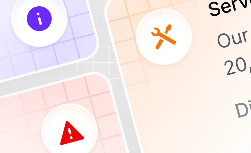
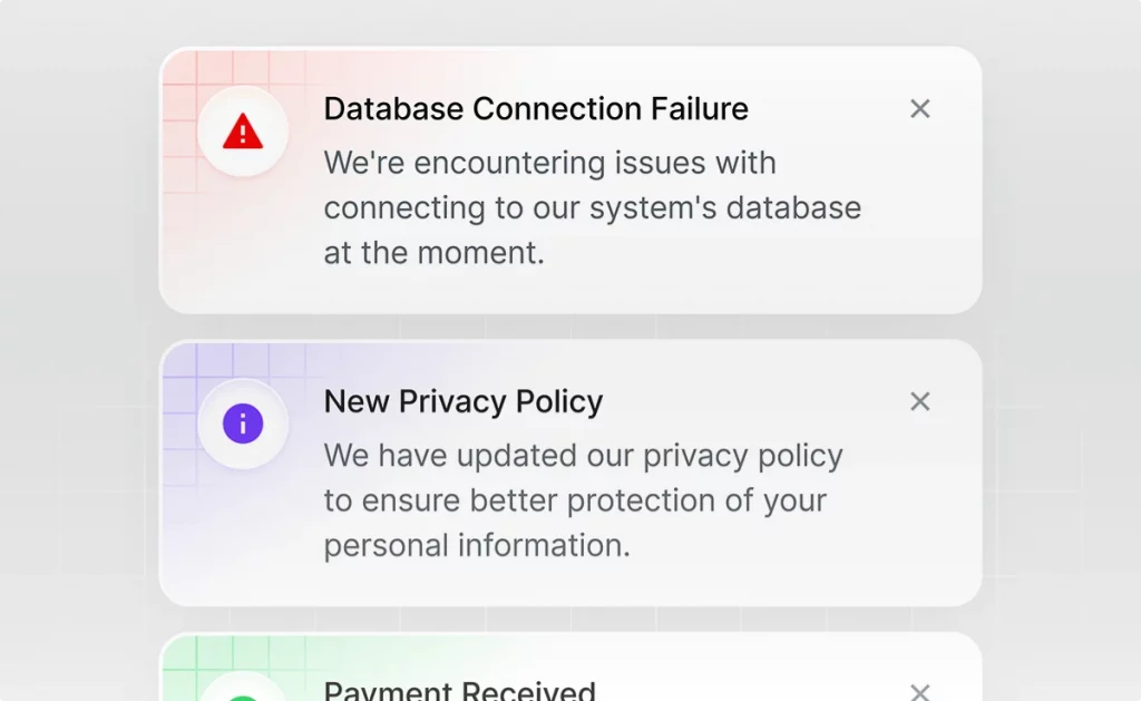
1. Informative notifications
Informative notifications are designed to provide users with valuable information or updates without requiring any immediate action. These could range from news alerts to weather updates or system statuses. The design focus for informative notifications is clarity and conciseness. Icons used here often include symbols like megaphones for announcements or cloud icons for weather updates.
Design tips
- Use clear, easily recognizable icons that relate directly to the message.
- Opt for colors that draw attention without alarming the users.


2. Actionable notifications
These notifications prompt users to take a specific action, such as replying to a message, approving a request, or completing a task. The design of actionable notifications is crucial, as it needs to not only inform but also motivate the user to interact. Icons might include arrows, question marks, or any symbol that suggests a call to action.
Design tips
- Choose dynamic icons that convey a sense of action or urgency.
- Employ bold colors like red or orange to highlight the need for user engagement.

3. User-requested notifications
User-requested notifications are sent in response to a direct request from the user, such as a reminder for an event or a notification when a specific task is completed. The user’s anticipation of these notifications means the design should focus on recognizability and relevance, ensuring the notification fulfills the user’s expectations.
Design tips
- Use specific, context-related icons that remind the user of their original request.
- Stick with comforting colors or those associated with the app’s branding to reinforce familiarity.


In designing notifications across these categories, the choice of icon and color plays a significant role in conveying the message effectively and prompting the desired response. By carefully considering the type of notification and employing the right design strategies, developers can create meaningful, engaging notifications that improve user experience and engagement.
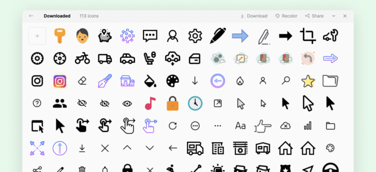
Icons8 notification graphics
Icons8’s vast collection of notification graphics is a treasure trove for designers aiming to elevate their notification design game. With an array of styles ranging from minimalist to intricate and themes that cover everything from the playful to the professional, Icons8 ensures your notifications not only stand out but also speak the right visual language to your audience.
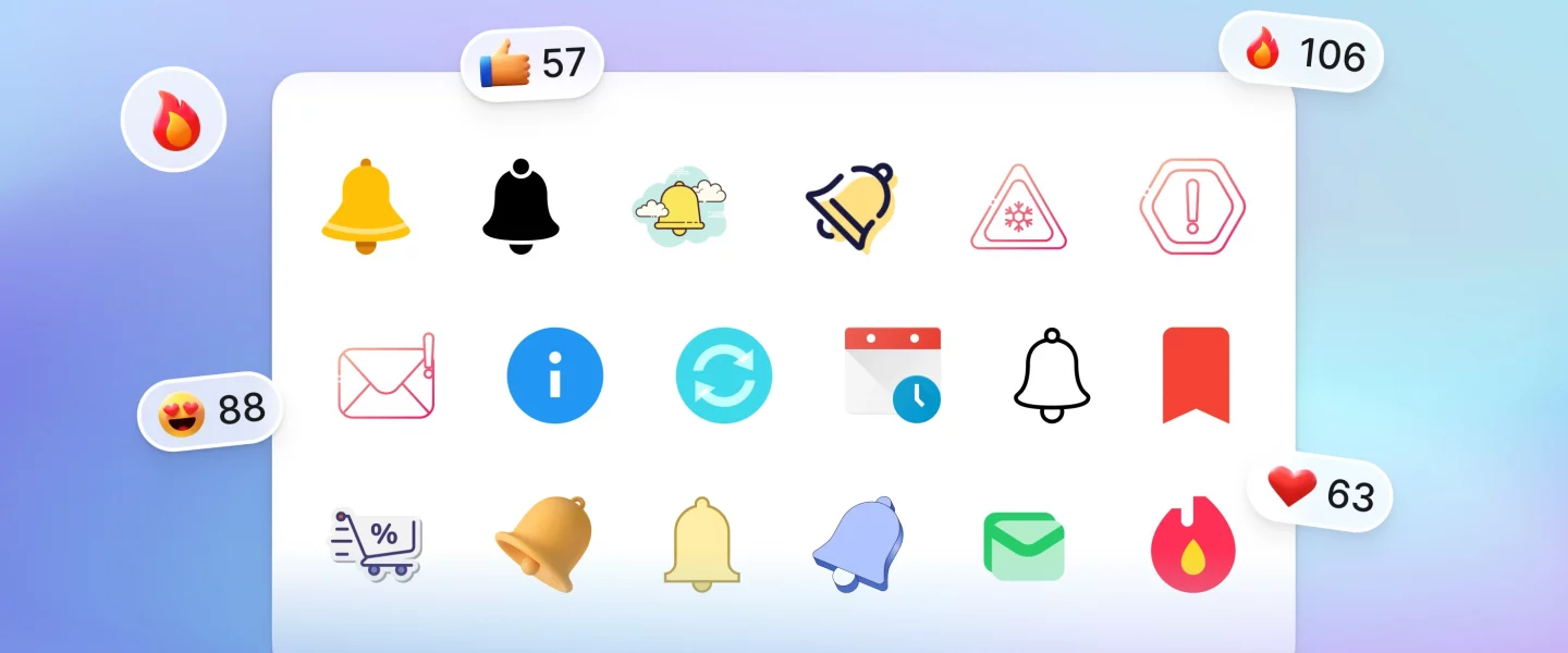
Notification bell icon
The notification bell icon stands as a universal symbol of alerts and updates. This small yet impactful graphic catches users’ attention, signaling new messages, activities, or reminders awaiting their engagement. Let’s explore how this iconic symbol functions across platforms and how it can be optimized for maximum visibility and interaction.


Notification bell illustrations add a creative twist to the classic alert symbol, blending artistry with the universal signal for attention. These illustrations offer a unique opportunity to showcase brand personality while maintaining the essential function of drawing user focus. Here, we delve into how these vibrant visuals can enhance user interfaces and marketing materials, making alerts not only noticeable but also memorable.


UI illustrations for ‘Notifications’ page
UI illustrations for the ‘Notifications’ page breathe life into the digital environment, transforming standard alerts into engaging visual stories. These illustrations can set the tone, convey emotions, and guide user interaction within the notification space. This section will explore the strategic integration of illustrations on notification pages, enhancing the user experience by merging functionality with visual delight.


Wrapping up
The right notification graphics turn everyday alerts into moments of engagement. Icons8 offers a toolkit that transforms simple notifications into captivating visuals. This dive into the art of notification design shows us the potential to not only inform but also delight our users. With Icons8, every notification becomes an opportunity to enhance user experience, proving that in the details lies the power to make the ordinary extraordinary.
Check out our articles about ‘Log in’ page and FAQ page graphics