A (nearly) scholarly article on dark mode that covers its benefits and drawbacks and explains how to design it wisely.
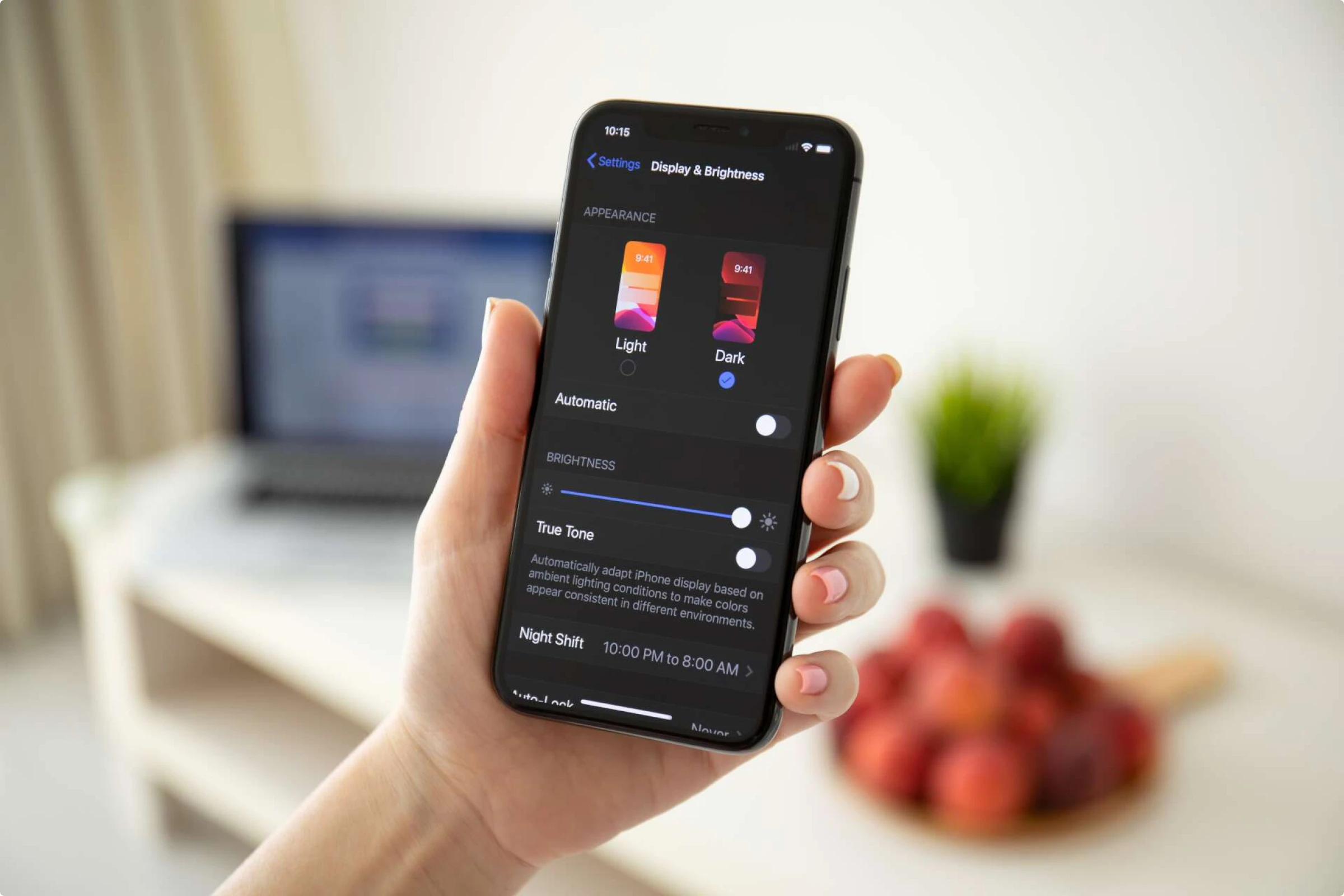
Dark mode, otherwise known as the dark theme or the night mode, is a light-on-dark interface. Dark mode has been growing in popularity since the late 2010s, and in some UIs, it has entirely replaced the traditional light mode.
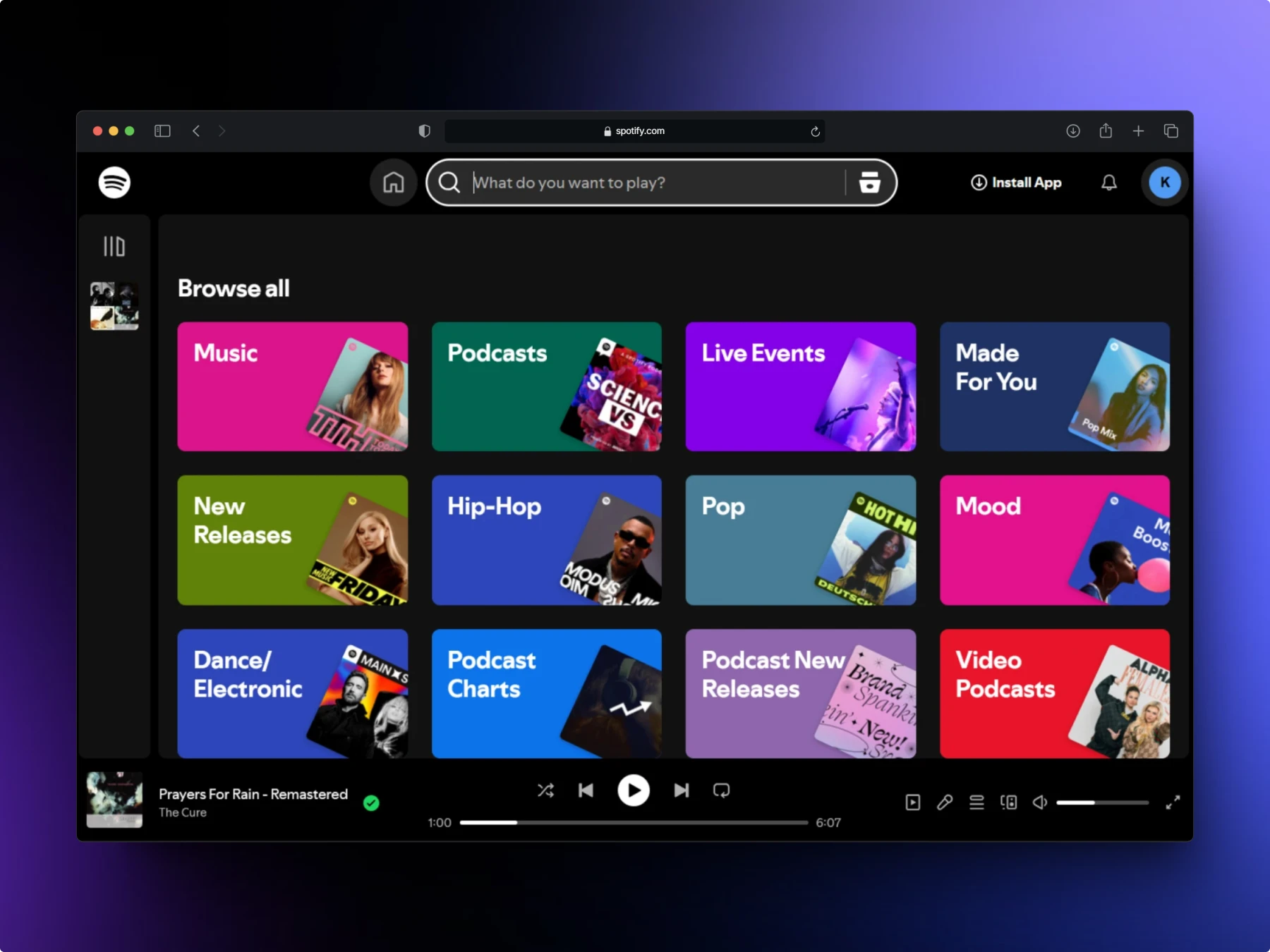
Spotify only has its signature dark theme and won’t let you switch it to the usual dark-on-light mode unless you tweak a few accessibility settings on your device. While some users prefer the dark mode purely for its aesthetic, others opt for it to reduce eye strain or prolong battery life.
Keep reading to learn more about the dark mode, how to use it in your UI, and its pros, cons, and limitations.
What’s inside?
- The ABCs of the dark mode
- Pros and cons of a dark-themed UI
- Tips on creating a dark theme
- Examples of dark interfaces
The ABCs of the dark mode
Dark mode is everywhere now, but its roots go much deeper than you might think. Before we dive into its modern revival, let’s take a quick look at where it all began.
History of the dark mode
Dark Although dark mode has gained popularity in recent years, its roots date back to the earliest days of computing. The first computer monitors were monochrome, displaying light text on dark backgrounds—typically black and green—due to the limitations of cathode ray tube (CRT) technology. CRTs produced images by firing electrons onto phosphor-coated screens, with phosphors like P1 (green), P3 (amber), and P4 (white) determining the text color.
It wasn’t until 1977, when color CRTs were introduced that light-on-dark interfaces gave way to color displays. The Apple II was among the first to feature non-monochromatic CRTs. By the 1980s and 1990s, LCD technology replaced CRTs, popularizing light-mode interfaces that mimicked the look of paper for a more user-friendly experience.

Light mode interfaces emerged in the 1980s as color displays replaced monochrome CRTs. These dark-on-light UIs aimed to make technology more approachable by mimicking familiar, paper-like visuals. White backgrounds and skeuomorphic design elements reinforced this connection, with Apple leading the charge by designing file icons to resemble paper documents and folders. This approach made digital environments feel intuitive and aligned with users’ real-world experiences.


Dark mode resurged in the 2010s, starting with Windows 10’s dark theme in 2016 and followed by macOS Mojave in 2018. By 2019, iOS 13 and Android 10 integrated dark themes, making them a standard feature in modern UI design.
Dark mode and accessibility
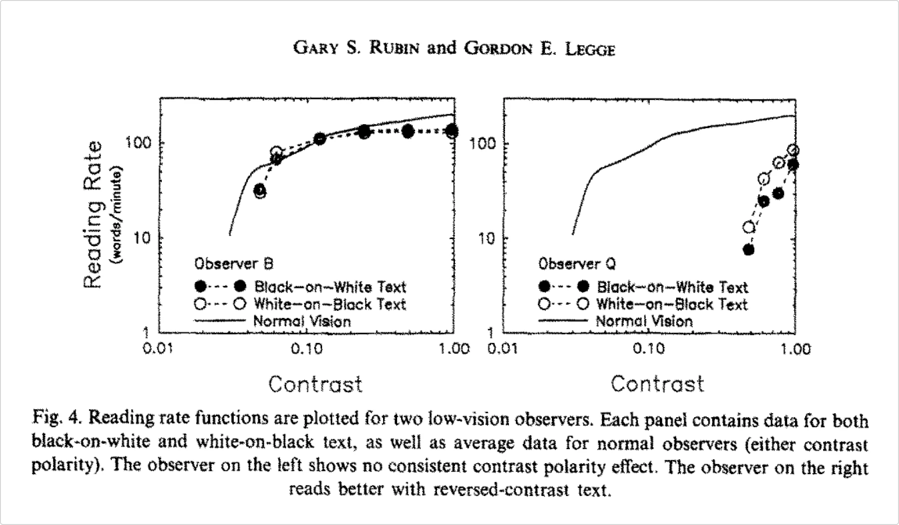
While some users report that dark mode makes everything more readable, it’s not true for everyone. Dark mode can, in fact, improve readability for some users, especially those with cataracts. In their 1989 study, Gary S. Rubin and Gordon E. Legge found that 5 out of 19 participants read white-on-black text faster than black-on-white at high and low contrasts.
However, dark mode can be a curse for another group of users with visual impairments. With astigmatism, bright objects appear to have a halo or light streaks around them. This halation effect makes light-on-dark texts appear blurry to users with astigmatism.
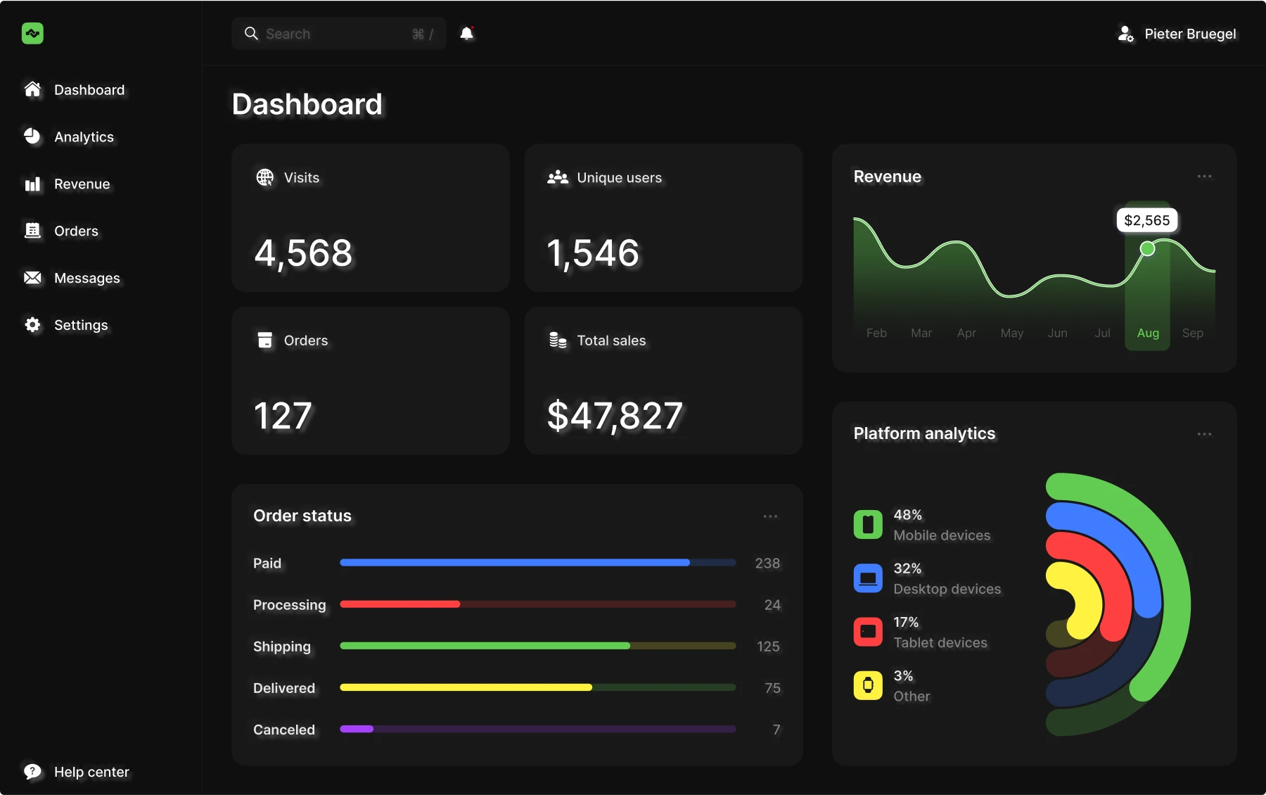
Other than that, dark mode can be no less accessible than the light mode. The only major factor to consider is the contrast level in the dark mode. Putting pure white text on a pure black background is not recommended since the contrast it creates is too strong.
This color combination can be uncomfortable to look at or even cause eye strain. For this reason, most dark-themed interfaces use dark gray instead of black and light gray instead of white. We’ll discuss more tips on designing dark interfaces.
Dark mode and battery life
Users who religiously use dark mode often say that dark mode is much better for all devices in terms of prolonging battery life. Since the screen emits more light in light mode than in dark mode, the battery exhausts faster. While it is true, the percentage of power savings is virtually unimportant below a certain level of luminosity.
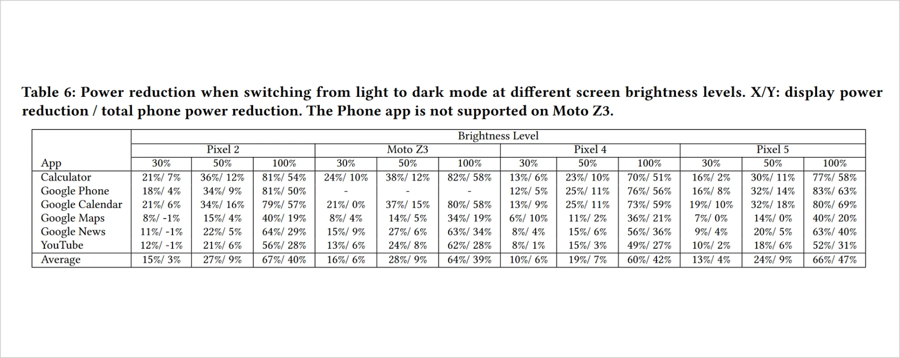
Pranab Dash and Charlie Hu discovered that at 100% screen brightness, dark mode helped save between 39% and 67% of battery power. However, at 30% screen brightness, it only helped save from 3% to 16% of battery power. This is an insignificant reduction in power consumption, though realistically, it’s hard to imagine anyone using a device at a brightness level as low as 30% non-stop.
At the same time, a high brightness level is linked to a faster onset of eye fatigue. Medium-level brightness is the amount of luminance most users seem comfortable with. This was confirmed by a study by Prerita Kalra and Vinod Karar. Pranab Dash and Charlie Hu’s research demonstrated that at 50%, dark mode helps save from 7% to 28% of power. That said, for an average user who sets their brightness to around 50%, dark mode can save roughly 30% of power.
However, it’s important to know that the battery-saving magic of dark themes is only true for OLED screens. In OLED displays, pure black pixels don’t consume power, letting the device rest on them.
This is different with LCDs since they emit a backlight that illuminates the whole screen. This means that regardless of whether a pixel is pitch black, it still consumes power.
Dark mode and health
Research on whether dark mode is better for eye health is still inconclusive. According to Healthline, dark mode might bring some relief for those who experience frequent dry eye and eye strain or pain. In their study on dark mode in VR head-mounted displays, A. Erickson, K. Kim, and G. Bruder discovered that users experienced significantly lower visual fatigue in the dark mode.
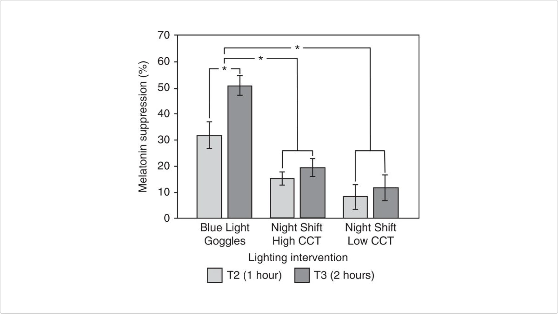
It is also unclear whether dark mode is better for healthier sleep. Some suggest that dark interfaces don’t interfere with melatonin production, thanks to the much lower emission of blue light. A study by Apple failed to prove this point.
In 2019, Apple conducted a study on the effect of Night Shift on iPad on melatonin production. There was no significant difference between users who turned on the Night Shift setting and those who didn’t.
Speaking of the influence of dark mode on cognitive functions, reading skills in particular, this is a point where light mode has an advantage over the dark mode. Tara Sethi and Mounia Ziat found that both younger and older adults experience a higher cognitive load when working with text in dark mode. They performed the search task significantly longer when presented with light text on a dark background.
Pros and cons of a dark-themed UI
Now that we’ve covered the nuances of the dark mode from a user’s perspective, it’s time to discuss it from a UX designer’s point of view.
Pros
Personalized user experience
Allowing the user to choose between the light and dark theme can immediately improve the user experience. This can increase engagement and user satisfaction. The more control a user has over the app, the more user-friendly it feels, which results in better user retention in the long run, as revealed by numerous studies on user behavior.
Visual appeal
Many users find dark-themed interfaces more aesthetically pleasing. A study by Liana Hakobyan and Rupam Saha showed that many Facebook users preferred the dark mode over the light mode and spent more time using the app with the dark mode on. Dark UIs look more sleek and elevated compared to light ones, so they are often perceived as more visually alluring.
Helps focus on the essentials
It’s much easier to create attention grabbers in a dark environment than in a light one. Pretty much any bright color can work as an accent hue on a dark background. It’s convenient to highlight important information and redirect the users’ attention to the most important sections of the page.
Cons
Extra work for designers
Adjustments are often necessary to make visual assets work with a dark theme. Images and videos designed for light backgrounds may not translate well to darker interfaces. If your brand logo contains dark colors, consider adding a light outline, applying a glow effect, or creating a color-inverted version to ensure it remains visible and aligns seamlessly with the dark mode design.


Unfit for bright environments
Dark mode performs best in dim or moderately lit environments, where its reduced light output is easier on the eyes. However, it struggles in bright settings. The lower luminance of dark mode can’t compete with the surrounding light, causing the screen to appear dim and text to become difficult to read.
Limited color palette
Light-on-dark interfaces tend to feel visually heavier than their light-on-dark counterparts, which makes adding extra colors trickier. Even a single additional hue can overwhelm the design. When creating color palettes for dark UIs, it’s essential to be selective, ensuring that every color serves a clear purpose and maintains visual balance. If you want to learn more about the art of making harmonious color palettes that work, check out our article.
Tips on creating a dark theme
Creating a dark theme isn’t just about switching colors; it’s about balancing aesthetics, usability, and accessibility. A well-executed dark mode enhances visual comfort while maintaining clarity and style. Here are some essential tips to help you design effective dark interfaces.
Add a mode switch button
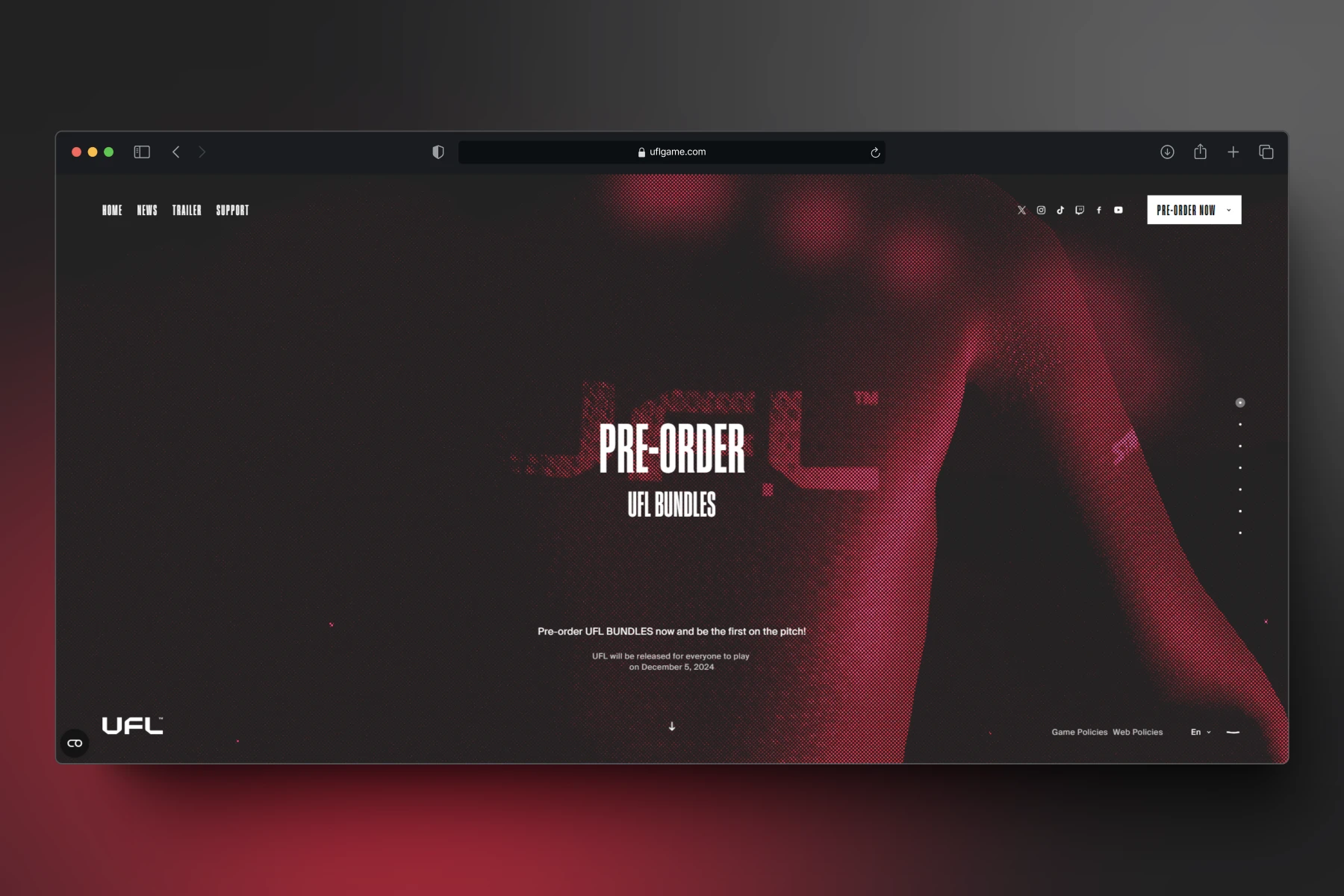
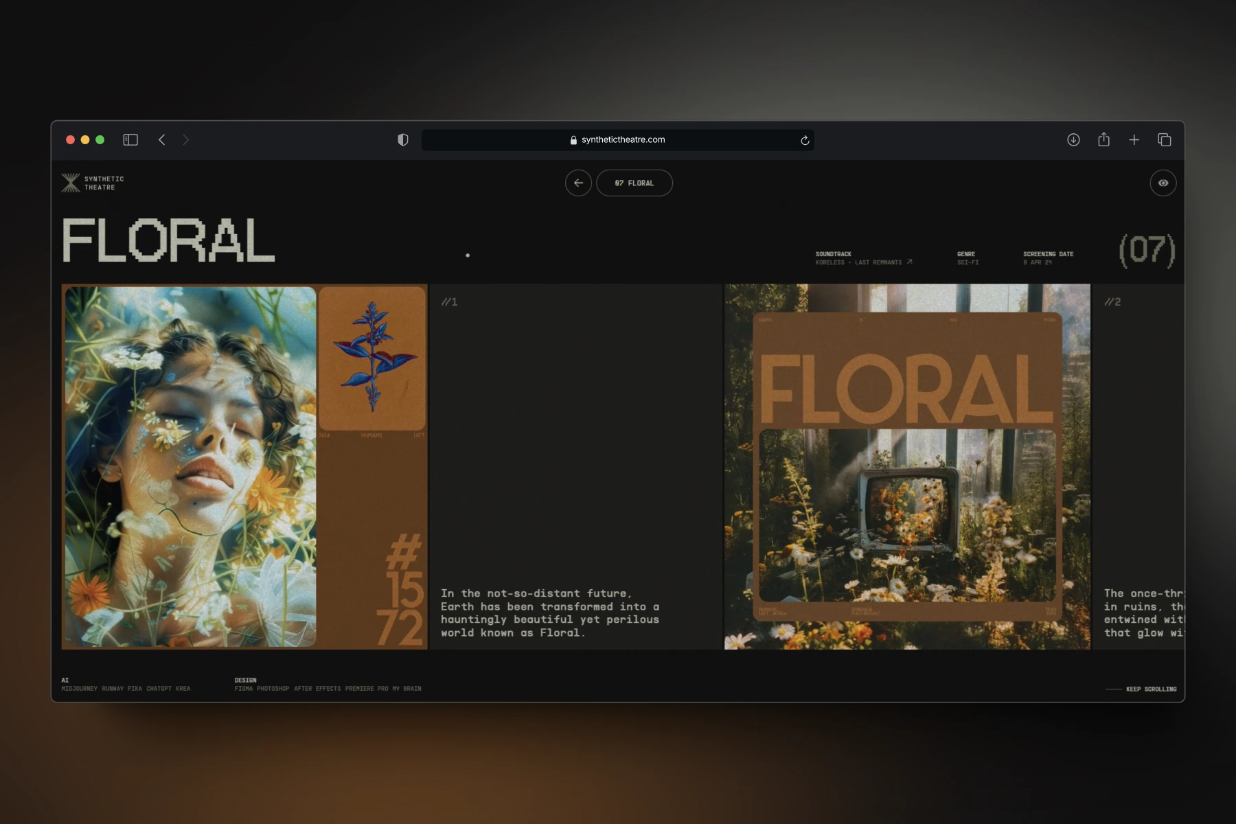
A dark-only interface works well for websites and apps that users interact with briefly, like portfolio sites for artists, musicians, or game designers, where the dark theme complements their aesthetic. However, offering a light theme is essential for utilitarian platforms such as online stores, wellness apps, or graphic editors.
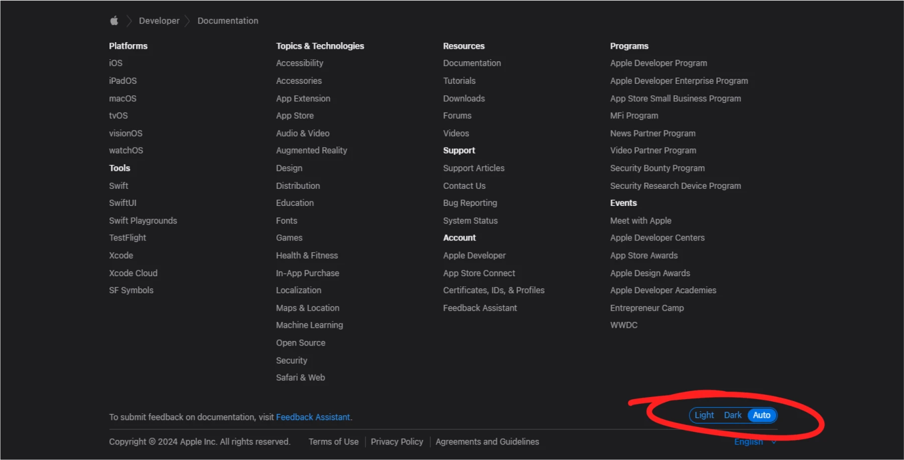
Not everyone’s eyes are suited for extended use of light-on-dark interfaces. Providing dark mode as an option, rather than the default or sole setting, ensures a more user-friendly and inclusive experience.
Avoid pure white on pure black
An #FFFFFF text on a #000000 background creates a contrast too strong to look at without feeling uncomfortable. Shades of dark gray are a better design choice when creating backgrounds for dark themes. Android developers recommend using #121212 as a background shade.

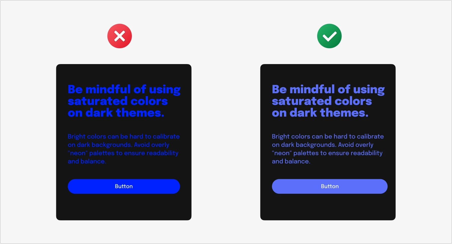
Use desaturated hues
Leave intense, vibrant colors for the light theme. In the dark mode, they cause all sorts of visual discomfort, from halation to shakiness. This happens because the contrast between the background and the hues becomes too strong. Desaturated colors don’t appear dull in dark themes—because dark backgrounds make them pop, they look as vibrant as their saturated neighbors do in light interfaces.
Check your contrast
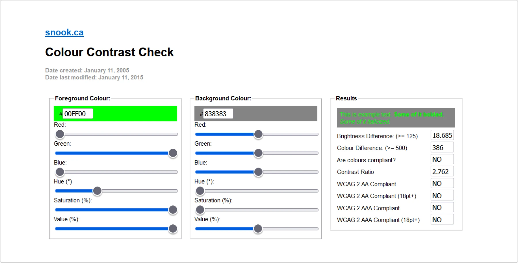
Getting contrast ratios right when designing dark interfaces can be tricky. Your lightest pair of a text field and body of text must pass WCAG’s accessibility standard of at least 4.5:1. In addition, your large-scale text and images of large-scale text must have a contrast ratio of at least 3:1.
Adapt your visual assets
Ensure your media files are tailored for dark mode. Dark gray icons may need to be brightened to remain visible, while vivid neon illustrations might require desaturation to avoid visual strain and maintain balance. Consistency is crucial—make sure all adjustments reflect your core visual style for a cohesive interface.
Don’t use shadows
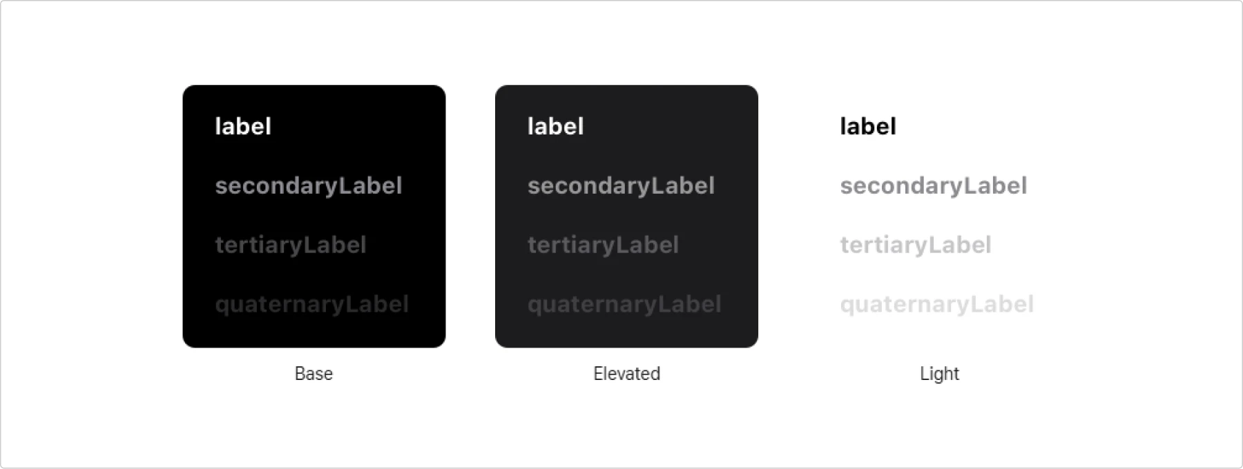
Shadows are far less effective in dark mode. Even with a light gray background and a pure black shadow, the contrast is too subtle to convey depth clearly. Instead, use backdrops with varying brightness levels. Lighter shades, often called “elevated” tones, help create the illusion of depth by indicating different interface layers. Apple developers note that elevated shades help UI elements appear to advance, hinting that a user is on a new level within an interface.
Examples of dark interfaces
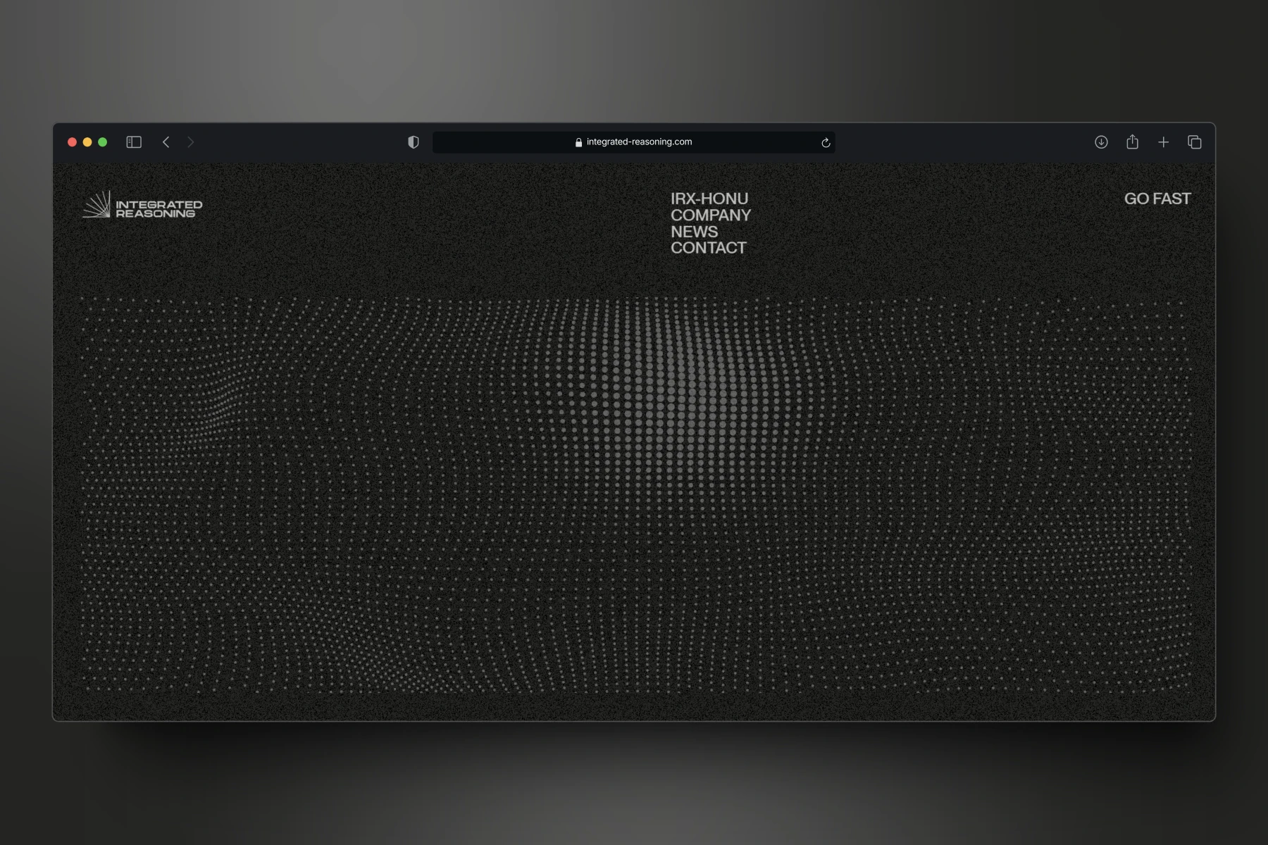
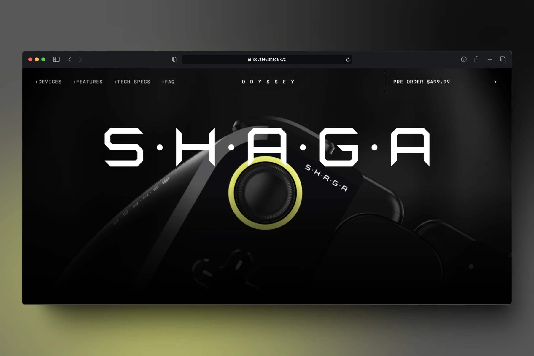
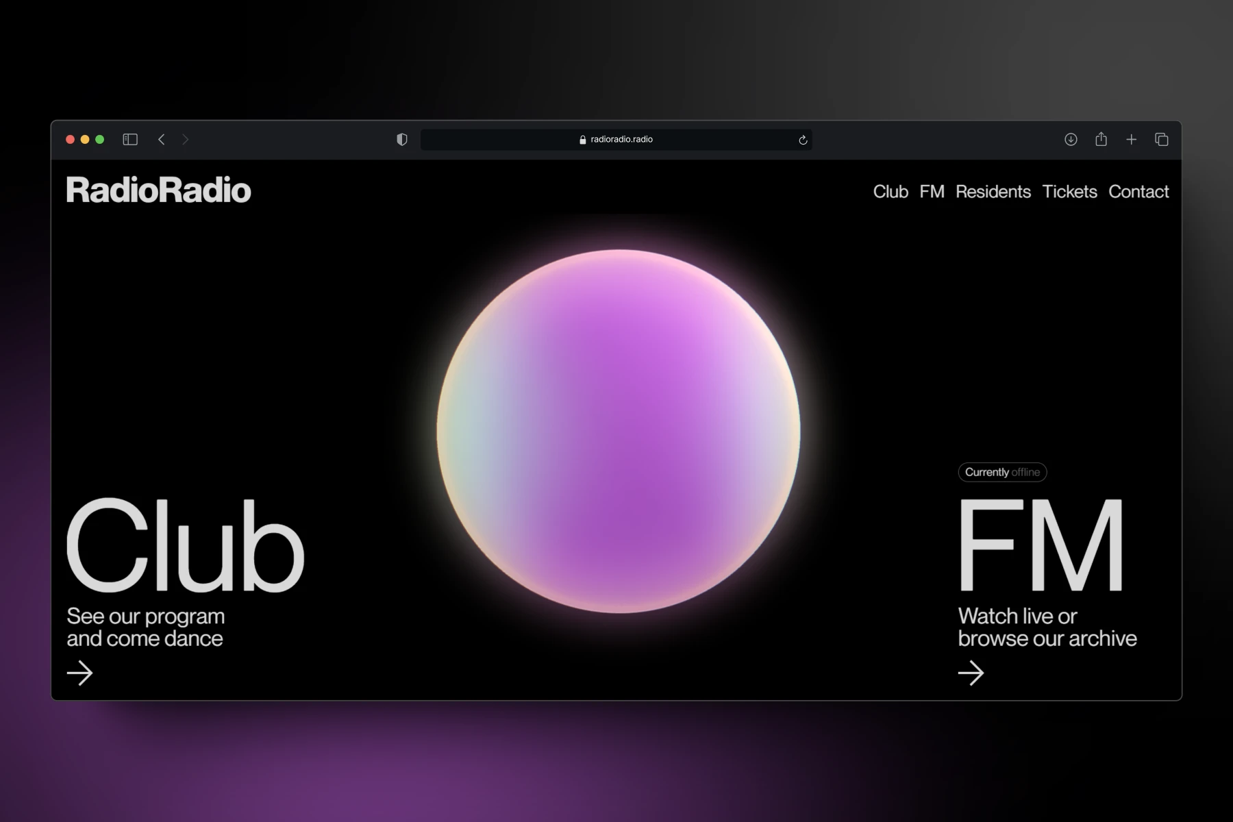
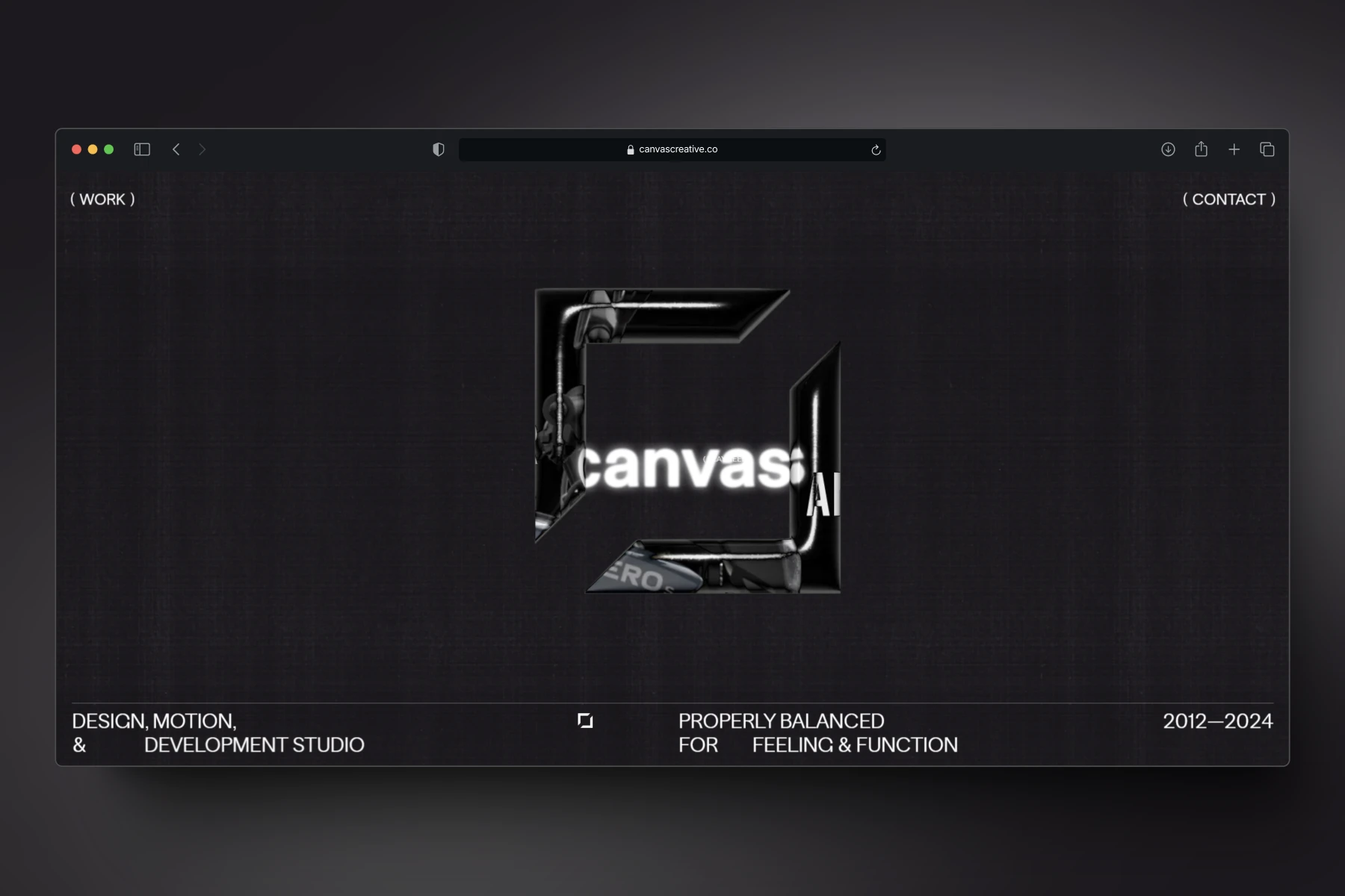
You’ll notice that dark gray is often the go-to background color when exploring websites with dark themes. However, some interfaces use rich shades of purple, blue, or other deep hues as their base. For dark gray backgrounds, popular secondary and accent colors include greens, purples, and blues, which provide a subtle yet effective contrast. Bold colors like orange, red, and yellow are less common in dark mode due to their intensity, but when used sparingly, they can create striking focal points without overwhelming the design.
To get inspired, you can also find examples of dark color palettes on websites like Coolors and Colorhunt. Plus, you can create your own dark theme with color palette generators like Codepen, Colorffy, and Colorchef.
Summary
Dark mode is undeniably popular, with many users preferring it over light mode for its sleek look and potential benefits. Adding a simple light/dark mode toggle enhances user experience and can boost satisfaction and retention.
While dark mode may not suit everyone from an accessibility perspective, it can improve readability for some users and help conserve battery life on OLED devices.
To create a comfortable dark theme, focus on desaturated hues, ensure your contrast ratios meet WCAG accessibility standards, and adjust your design assets to align seamlessly with the new color scheme.
Ready to elevate your design skills? Join the Icons8 Design Course and master creating stunning interfaces, including perfect dark themes.
