If you have a website out in cyberspace, you already know that users don’t equal customers. Having a ton of traffic is great, but that doesn’t mean you’re rolling in the dough. If your website traffic is just leaving without making a purchase or taking any steps in the customer journey, what’s the point?
Essentially, you need to know how to convert your visitors into customers. This is called conversion rate optimization, and it doesn’t have to be as complicated as the name implies. What is the typical website conversion rate? It’s a startling 2.35% on average, but the top 10% of companies can see this rise up to 5 times this rate with some smart thinking.
As you might expect, there’s a bit of science behind converting your users into customers, especially when those users are first-time visitors. Naturally, you want to convert as many visitors as possible, so try these easy ways to do just that. Read how to do it without overhauling your whole website.
What You Need to Know About Conversion Rate Optimization
First, we need to take a closer look at conversion rate optimization (CRO) and what that term means.
So what exactly is a conversion? It might not be making a sale. In fact, most new users won’t be in a position to make a purchase for a while. Luckily, all hope is not lost. You want that user to engage with your website in some way by taking some kind of action. Examples of conversion actions include:
- Completing a contact form
- Signing up for your website mailing list
- Downloading your app
- Visiting a specific website page
- Giving you a call or emailing you
- Following your page on social media
- Making a purchase
Before you begin with the strategy of turning a visitor into a customer, make sure you’ve identified exactly what step you want your users to do next. This might not be the same for every user or section of your website.
1. Use a Responsive Design
If your website isn’t designed for all types of users and their devices, you’re missing out on key customers. A considerable 60% of all internet access is done through a smartphone. Just look at the percentage of U.S. mobile retail commerce sales compared to all e-commerce sales from 2017 to what’s expected in 2021.
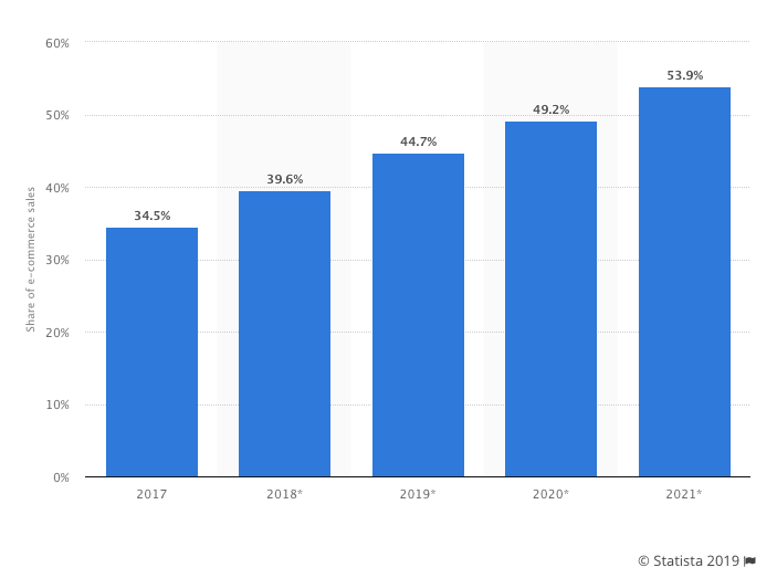
As you can see from this graph, more and more people are shopping on their smartphones. If your website doesn’t display properly on all screen sizes, your users will simply click away and go somewhere else.
You need a responsive, functional design that loads quickly and displays perfectly all of the time. Over 94% of people didn’t trust a website because of its design. When your website is outdated and not responsive, you look less trustworthy.
Another reason to pay attention to your mobile responsive design is for SEO or Search Engine Optimization. Responsive website rank is higher in Google. But don’t just take it from us, take it from Google’s 2018 mobile-first indexing.
Luckily, you don’t have to guess exactly what Google wants. Google developers gave a checklist of best practices for creating a responsive design:
- Keep your calls to action front and center
- Menus should be short and easy to read
- Have a visible search feature
- Don’t make users “pinch-to-zoom” to read your content
- Avoid opening links in new windows that are hard to navigate on mobile
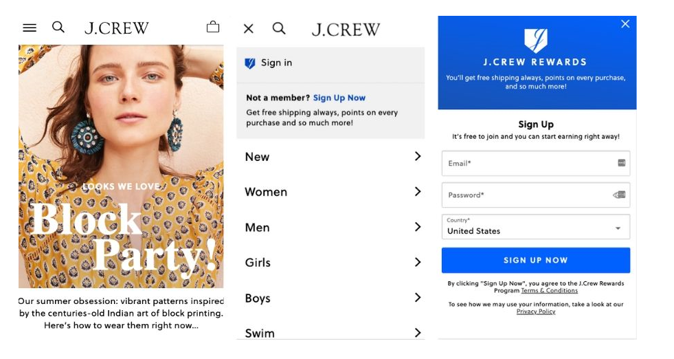
Now, let’s look at an example of a website with a functional, responsive website. The JCrew mobile website is easy to read, navigate, and search. They follow Google’s best practices, and it shows in their user experience.
Paying close attention to your own responsiveness will go a long way to helping users trust your website. Not only this, but you’ll make it much simpler for users on any device to convert into customers, email subscribers, or engaged readers.
2. Use Strategic Call to Action Buttons
How can you expect your users to know what to do next if you don’t tell them? Hoping they read your mind won’t get you very far. Brafton, an online marketing agency, discovered that by adding well-placed calls to action (CTAs) to articles increased one client’s revenue by 83% in one month.
There are two steps to using a call to action buttons strategically. First, you need only to have one call to action per page. You might use multiple buttons or links, but don’t ask users to complete more than one action. If you ask users to sign up for your email list and then make a purchase, they’re going to get confused.
ThinkWGroup is a great example of seeing single-action CTAs. On their insights pages, they have only one clear CTA, which is usually to sign up for their email list by downloading a freebie corresponding to their services. This helps users continue to engage with their content even after reading a single post or visiting one page.

Next, ensure you’re using what’s known as “value language” instead of cost language. That means you focus on the value this action will bring to them, not you. For instance, instead of just saying “Sign up for my newsletter!” your call to action should be “Sign up for the top industry trends in your inbox!” or something that demonstrates your value to your audience.
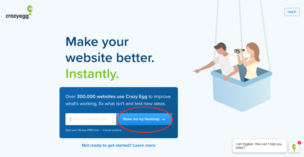
CrazyEgg’s heatmap software is the perfect example of a value-driven CTA. After explaining that this is a service that makes your website better “instantly,” they want users to click their CTA “Show me my heatmap.” Notice how this is in first-person, and it doesn’t dawdle around what’s in it for the user.
Just as with responsiveness, there are some best practices to consider with your CTAs:
- Clean and easy to read
- Distinct button text
- One converting action per page/post
- Value-driven language
- Personalized first-person (“Sign me up” vs. “Finish your sign up”)
- Visibility on mobile devices
Calls to action can be a bit like trial and error. It’s worth playing around with these on your website to see what works best for your audience. When you’re interacting with other websites, take a moment to think about what makes you respond. If it works for you, it’ll work for your audience.
3. Retarget Your Lost Users
As we mentioned before, most users aren’t willing to make a purchase the first time they come to your website. In marketing, this is called the Rule of 7. The Rule of 7 is the concept that a user needs to be exposed to your brand at least 7 times before they’re willing to make a purchase.
Frankly put, your users need some nurturing, and the best way to do this is through email or other types of retargeting. A staggering average of 69% of online carts is abandoned by users. People aren’t always ready to buy, but that doesn’t mean the sale is as good as lost.
You can create an automated email sequence to nurture those new leads, introduce them to your brand, and encourage them to come back and make a sale. Almost half (45%) of cart abandonment emails are opened.
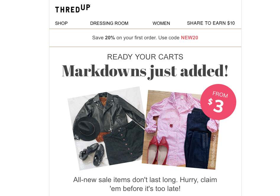
ThredUp, an online thrift store, encourages users to pick up where they left off with regular emails. After a user abandons a cart, they’ll receive reminders and updates about discounts and new sale items.
Another way to retarget is through social media. You’ve definitely noticed this yourself. After browsing on an online store, you might have switched to Facebook or Instagram only to see these ads displaying on your screen. This is retargeting, and it works. Because users are already exposed to your brand, the click-through rate of a retargeted ad is 10 times higher than a typical display ad.
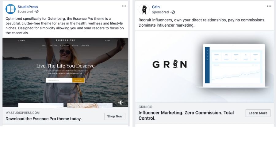
Below, see an example of two retargeted ads on Facebook. These businesses are attracting users who have already been exposed to their content in some form. They’re utilizing the Rule of 7, and they’re boosting their conversion rate.
Remember, slow and steady wins the race. Just because you didn’t convert a visitor the first time doesn’t mean you won’t do it in the future. It’s up to you to be patient with your users. It takes time to build trust and brand awareness, so don’t worry about rushing the process.
Final Thoughts
If you want your website to be a success, you need to make sure it’s working for you. There are no magic tricks or one-fits-all solutions. However, with some trial and error, you can design a website that converts the right users into customers. In the meantime, work on converting users into returning visitors. The more engaged people are with your website and your brand, the more likely they’ll make a purchase at some point in their customer journey.
About the author: this is a guest post by Ashley Lipman, a content marketing specialist, an award-winning writer who discovered her passion for providing creative solutions for building brands online.
Title image from Ouch, a library of free vectors and clip art images
Learn how to design effective billing forms, check the tips on product page design and explore the marketing strategies of big design companies