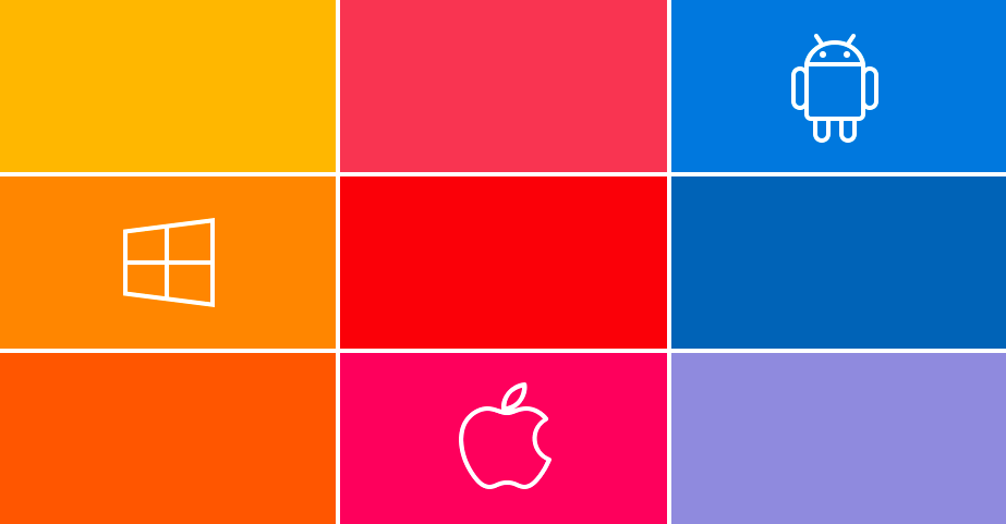
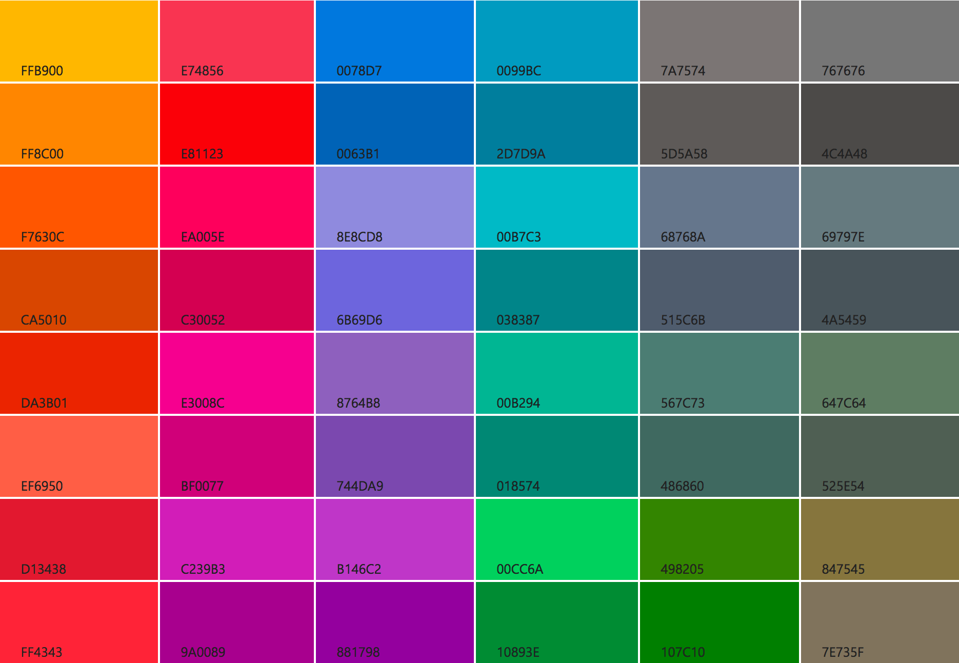
This is a quick reference for the standard colors for the major operating systems. Use a color picker to take the colors from these screenshots.
Windows 10
Do not use the accent color as a background, especially for text and icons. Because the accent color can change, if you must use it as a background, there’s some additional work you must do to ensure that foreground text is easy to read.
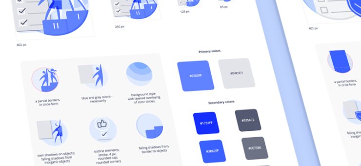
By the way, there’s nothing for Fluent Design System yet.
iOS 10
Also from the Apple’s official style guide
- Use complementary colors
- Try choosing a limited color palette that coordinates with your logo
- Consider having a key color that indicates interactivity throughout your app
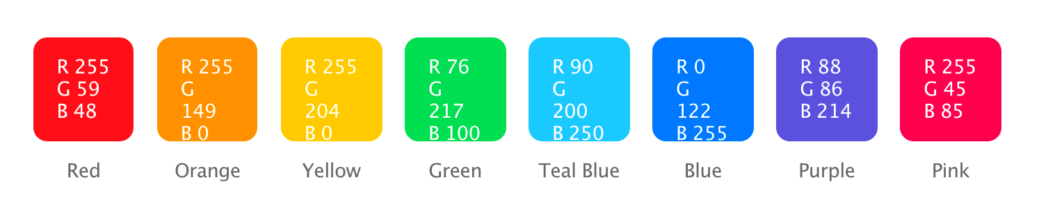
Android
Material Design specification is a whole different story. They basically permit any color; Google only made a vague attempt to balance the colors by saturation. They pretty much succeeded, with the exception of brown, that looks foreign.
Taken from the Material Design Specification
A Few Things to Remember
Some people find it difficult to distinguish green color from red (red–green color blindness affects up to 8% of males and 0.5% of females). There are also forms of blue-yellow and gray (either color cannot be distinguished from gray) colorblindness. If you use these colors in a combination never employ color as the only way of differentiating UI elements—play with geo forms of the buttons, different fonts or layouts.
Keep in mind that in different countries there are cultural differences in how color is perceived. While in Europe or USA red color usually communicates danger (road signs, stop light etc.) in China red symbolizes good fortune and joy.