So, you’ve heard about brand books but are still unsure where to begin creating yours? Or maybe you’re wondering whether it’s worth having one at all and whether it can truly bring value to your company?
We’ll cover all the essential components of a successful brand manual and discuss how to create and design your brand book, including features such as the color palette and logo and communicational and informational elements centered around the brand identity and voice.
To give you the best illustration of how these should be executed, we’ve incorporated the most notable examples from giant global companies and smaller-scale brands that have done their best.
Table of contents
- What is a brand book?
- Does your brand need a brand book?
- How to create your brand book?
- Handy tips on creating a brand book
- Using your brand book
- Brand book inspiration
What is a brand book?
Put simply, a brand book (or brand guide) outlines your brand’s mission, image, and core values. Above all else, it is the brand’s very identity, a DNA blueprint with layers upon layers of details, from the more general – such as brand purpose – to the more intricate nuances, such as specifics regarding the color scheme and fonts. Combined with all of these elements, a comprehensive brand manual is born, providing staff and customers with a clear vision of the company and its product. Every big-name brand has a brand book, from Apple to Google to Coca-Cola, but even smaller-scale brands benefit from having one.
As a rule of thumb, a successful brand book should have the following:
- Brand name
- Outline of the brand story, ethos, and purpose/mission
- Brand logo, its variations
- Icons
- Color scheme
- Fonts, sizes, and style variations
- Images that reflect the brand and give examples as to what images can be used in the marketing strategy of the brand
- Communication style (formal or informal, appealing to the audience’s emotions, or cool and withdrawn) and brand language
Does your brand need a brand book?
Absolutely! No matter how big or small your company is, a brand book will help keep things structured for colleagues and portray the most complete and personal image of the brand to the client.
The brand book keeps things clear for designers, whether they’ve just joined the company or have worked there for years, and allows them to refer to the nitty-gritty of the fonts, colors, and logos when designing the website or creating any extra style elements.
Furthermore, It helps the marketing team understand what language needs to be used, when, and how, as well as the story the brand needs to tell.
Finally, it connects with the customer, creating the most detailed and coherent image of the brand, reminding them that it is a living, dynamic, developing entity with its own personality and voice.
“If people believe they share values with a company, they will stay loyal to the brand”
Howard Schultz, the CEO of Starbucks
Your brand book is the best way to reach out to customers and show them that they do, in fact, hold the same values and principles. It is also a way to establish a common visual and verbal language for everyone who comes into contact with your brand.
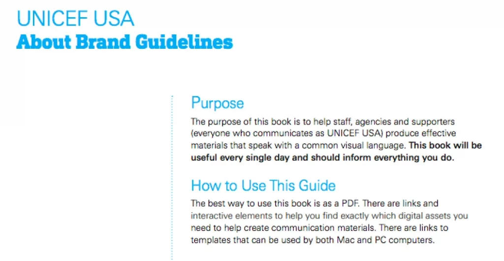
In their 2017 brand guidelines, Unicef highlights that their brand book is an essential tool, an inextricable component of all communication.
How to create your brand book
The brand guidelines can be divided into two basic branches: the style and design technicalities, which can also be understood as the visual and textual languages of the brand.
Designing your brand
The design aspects concern how the brand will visually communicate with its audience. Whatever you do, when working with visuals, always make sure you target your audience in each and every aspect of the design process, from colors to fonts to images that they’ll find appealing.
Color scheme
Your color palette is the shades and color combinations your company will use to shape the entire visual aspect of the brand. This color scheme will then govern all branches of the brand’s design, including the logo, icons, all of the visual marketing materials, and, of course, the company website.
When selecting your colors, the key to success is keeping it simple: choose up to 5 colors, although 3 are ideal – these should be a base, an accent, and a neutral.
The main color (base) will be the most predominant color of your brand, with the accent being a (complimentary) shade that is used with the base to create extra visual interest, and the neutral will be used for backgrounds. You can use the following 4 approaches when picking colors:
- Monochromatic shades: One color and some other slight variations in the shade of this same color.
- Complementary colors: Colors directly opposite each other in the color wheel create a vibrant effect through contrast, like red and green or yellow and purple.
- Triad: Colors that form a triangle in the color wheel also create contrast and visual interest.
- Analogous: Colors that are close to each other in the color wheel, such as yellow, orange, and red.
When deciding which colors you want your brand to be associated with, consider color theory and the psychological effects that certain colors have. Have a look at the following brands and the colors they’ve chosen to use:
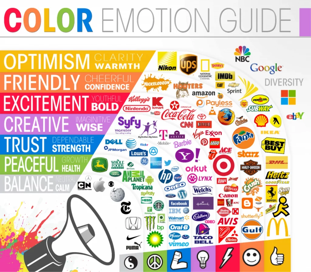
Once you’ve picked the colors, list their HEX, RGB, or Pantone codes in the brand manual so that designers know the exact shades of the colors selected and so that there are never any off-putting inconsistencies in the branding or design: Skype’s classic light blue is a recognizable color wherever it may be used, and any tinges that are even slightly off, such as a deeper blue, will simply seem unnatural.
Incorporate both primary and secondary colors in your color palettes. This is a key element in visual identity. The color scheme in your brand book should list color codes, ensuring consistency across digital applications and official documents.
Logo
Your logo, a crucial design element, should mirror the visual identity and company values. It’s essential in branding elements like your business card and official documents. The logo section should illustrate and explain how and where it should be used, detailing the color(s) and size requirements.
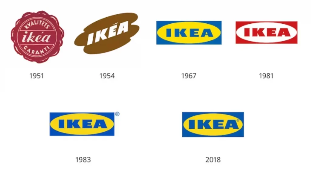
When designing the logo, as with the colors, keep things simple and to the point: make sure it reflects your brand and is not overly messy or confusing. One great example is the logo evolution of the furniture giant Ikea.
What started off as a very much nineties-like logo, with simply too much going on, with the pool water background and clashing text colors, has transformed into the clean, minimalistic, and recognizable logo we all know today. Just two colors have been implemented, together with an arrow that smiles at users, creating a subtle and subconscious positive effect.
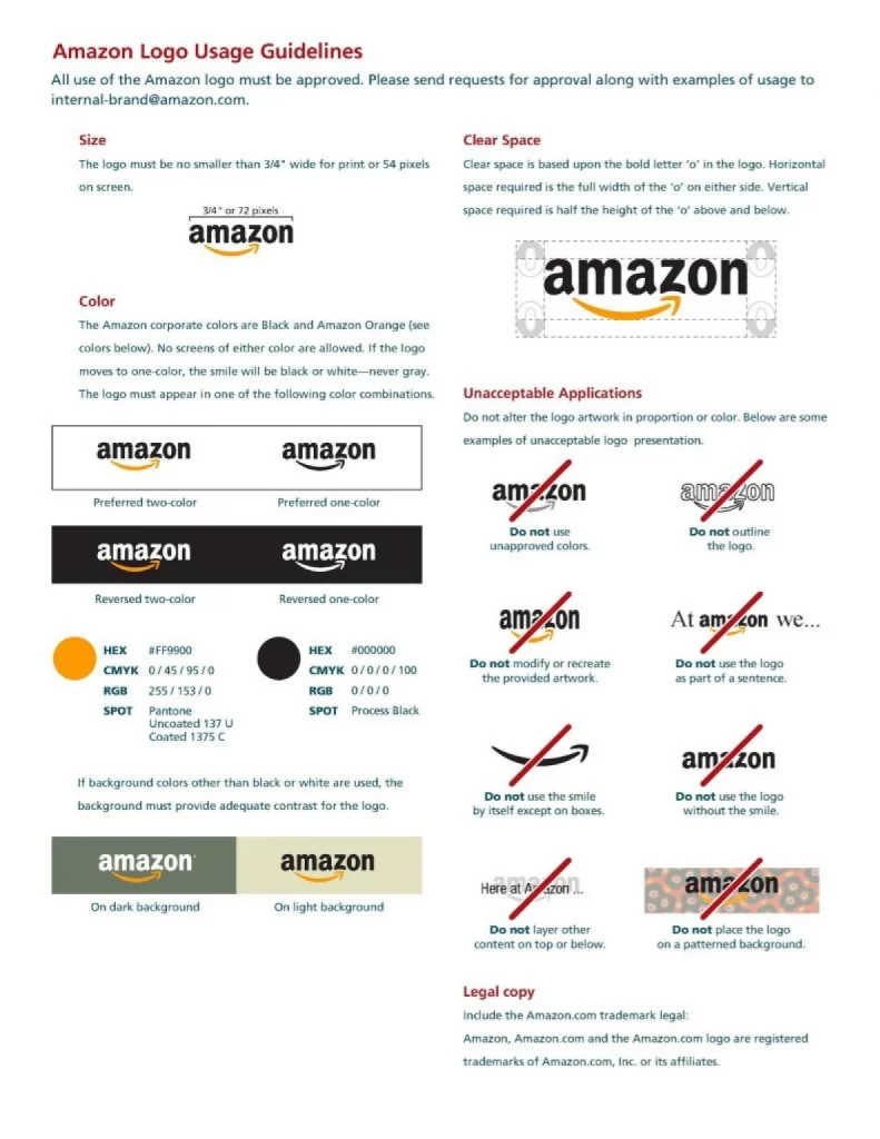
In their brand guidelines, Amazon has outlined each and every aspect of how the logo should be implemented, as well as how it categorically should NOT be used:
Font selection
Fonts are key design elements in your style guide. They align with the visual identity and tone of voice, ensuring your brand message is clear in all graphic elements.
As in the case of colors, each font will have its own unique effect on your audience. With the huge range of typefaces available—and plenty of insights from font trends— you’re sure to find something that accurately reflects your brand.
This section in your brand book should contain all the nitty-gritty regarding the font(s) you’d like used within your brand and where and how each font should be used (for example, in posters, on webpages, and even in ad campaigns).
You should identify at least two fonts: a primary typeface to be used for the body text and a secondary typeface for the headlines. As with other sections, this can be as complex and detailed as you need or as basic and to the point. Take a look at Yale’s typography guidelines:
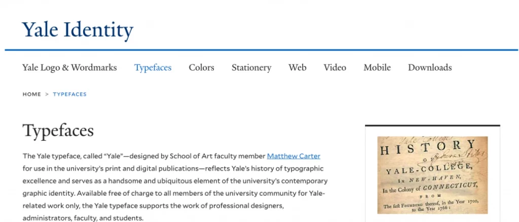
The section gives examples of how the font’s variations should look on the company website (shown below), in print, and on campus.
In this case, we can see that the font perfectly reflects the brand it represents, and Yale refers to how this is achieved throughout the guide. It has a classic feel to it and is by no means anywhere close to the likes of a lighthearted font such as Comic Sans. The Yale typeface reflects the institution’s history, and its seriousness is further emphasized by the font’s simplicity.
Icons
Icons, part of essential elements in visual content, should be consistent with your visual identity. Include these in your branding guidelines to ensure uniformity across platforms.
Those little symbols scattered all over your web pages are simple to overlook. But they’re majorly important, so make sure you get them right.
When designing your icons, keep a checklist of all the elements you need to consider nearby, as this will help you stay consistent and focused on keeping them relevant to your brand.
They may be small, but they add to the client’s overall experience when interacting with the company and create a cohesive (and, therefore, trustworthy) impression: nothing looks out of place when small details are considered.
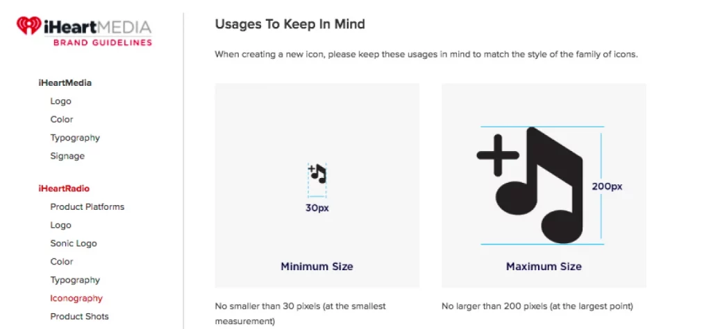
Include your entire iconography in the brand manual, as well as when, where, and how each icon should be used, and don’t forget about icons for any apps you have as well. Also, make sure to specify what parameters should be adhered to when creating new icons, as iHeartRadio has done:
Images
Choose images that align with your brand’s visual identity. These visual elements are powerful tools in your marketing support.
Dedicate a page (or a few!) to examples of imagery that reflects the company’s message, principles, and product. These should be pictures you’d like to see used in the brand’s design and marketing.
You may want to place a focus on black-and-white photos, or you may want pictures that reflect your target customer base. If your product allows it, try to include images of people reacting positively to it in a positive light.
Communicating your brand
A brand guide should convey the brand’s character, mission, and approach and detail ways the employees can reproduce this. A successful brand book will create a meaningful connection with customers.
Brand story
Your brand story and company values are central to your branding guidelines. They form the core elements of your brand identity, connecting emotionally with your audience.
Each brand has a story – and every company was once just an idea. You can keep this part short and sweet, but the more detail you go into, the more your clients can connect to the brand.
It’s like getting to know a person: everyone you’ve ever met seemed unfamiliar and distant at some point, but once you got an idea of their personal history and found some kind of connection with it, most likely, you couldn’t help but feel closer to the individual in question.
The same principle applies to your brand – it is also a kind of living, breathing entity in its own right. It represents a set of ideas that need to be expressed openly and with character in order to allow the world to bond with it.
Brand ethos and values
Your company’s values will emerge out of your story. What does your company stand for?

Jamie Oliver’s brand clearly outlines the key principles that the company strives towards. This creates an appeal for the client and reminds everyone working within the organization to stay true to these values in everything they do – from design to communication.
Brand voice and language
The tone of voice is a key element of your brand. It should be consistent and reflected in your communication guidelines, from blog content to official documents.
Whether you’re a serious establishment (such as Yale University) or a warm-hearted brand whose main purpose is to create meaningful connections, use language that reflects your intentions.
This adds further depth and character to your brand, bringing it to life and allowing it to speak to the world, simultaneously setting the tone in which you’d like the world to communicate with the brand.
Handy tips on creating a brand book
Make your book as detailed or as basic as you need. Place emphasis on things that matter most – perhaps fonts are not as important to you, but the color scheme is a crucial element of your brand. Of course, the more detailed the guidelines, the better, but it’s impossible to include everything! Go in-depth on the features that matter most. However…
- Include technical details of the design aspects to allow new and old designers to refer to them quickly whenever necessary. This is the one section that it would be wise to invest some time and effort into, as it’ll make employees’ work so much easier and allow you to remain perfectly consistent with all logos, icons, and colors. Consider utilizing no-code tools for creating and managing these design elements efficiently, especially if you want to simplify the process for everyone involved.
- Devote a section to the Do’s and Don’ts – this will prevent any unexpected surprises, ensure that your brand is communicated just how you like it, and prevent anyone from getting too creative with your logo, color scheme, or layouts.
- Lastly, remember to stay consistent throughout the brand book. Things that may at first glance seem unrelated – such as your color palette and the typography – should all come together like pieces of a puzzle to construct a cohesive, uniform picture of the brand.
Using your brand book
An effective brand book guides your creative team, encompassing everything from company colors to design tips. It’s a comprehensive style guide ensuring brand consistency. To get the most use out of your brand manual, ensure that you:
- Share the brand guidelines with all employees, especially those needing it the most, such as designers (old and new) and the marketing team.
- Go through the brand manual with your colleagues so they, too, can get a comprehensive image of the brand and what it stands for. Make sure that you get feedback and make changes if necessary.
- Make your brand book readily available for all clients, customers, and anyone who needs it.
Inspiration and examples from big-name brand books
Look at book examples for design tips and marketing tips. Notice how they use their style guide and branding guidelines to reinforce their brand identity.
Coca-Cola
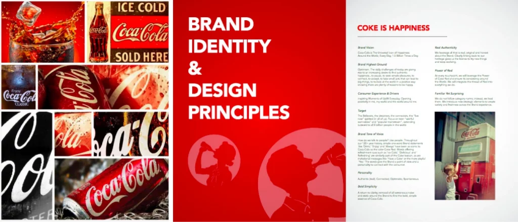
It’s not hard to guess which company this brand book belongs to, even if the tell-tale drink name were to be removed, which just goes to show how successful the brand’s marketing strategy (and, therefore, the brand manual) is. Coca-Cola’s classic red is all over their guidelines, immersing you into the brand environment.
Apple
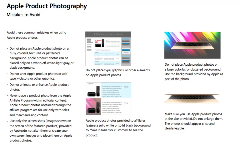
Apple’s brand and photography guidelines clearly express what to avoid in written form, accompanied by visual examples, ensuring minimal confusion.
General Electric

General Electric provides a thorough analysis of each and every key component of the brand, establishing a connection with the reader, consumer, and potential business partner.
Jaguar (Land Rover)

Jaguar Land Rover covers their products in the brand manual – each has its own personality and character, which is reflected in the language used to describe them, the photo, and the color choice.

This is a great example of a brand book that has stayed true to the company and each product by highlighting the difference between the Jaguar and the Land Rover, and what they stand for individually and as part of the brand.
Tesla
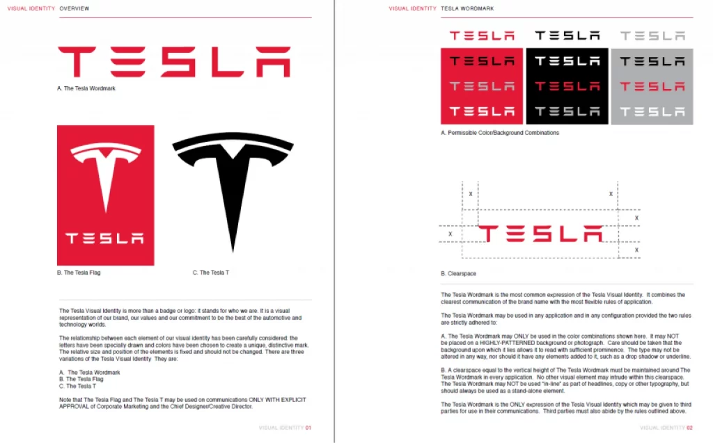
Tesla’s brand book is a great example of a detailed and thought-through guide for using logos, fonts, etc. You can check out the file here.
The North Face
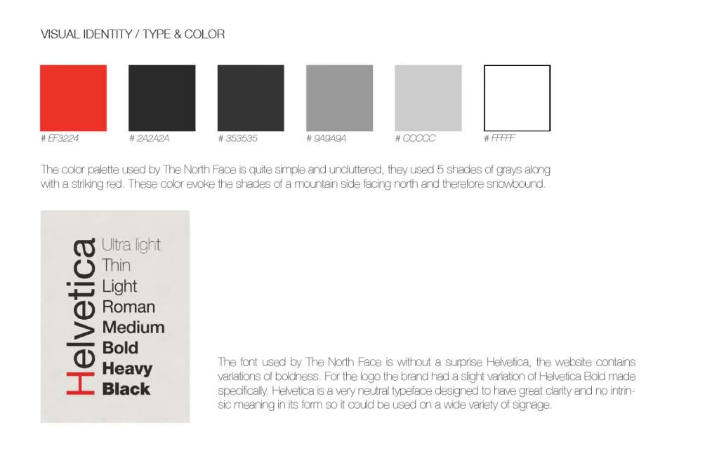
The North Face pays a lot of attention to brand identity and values.
Bolt
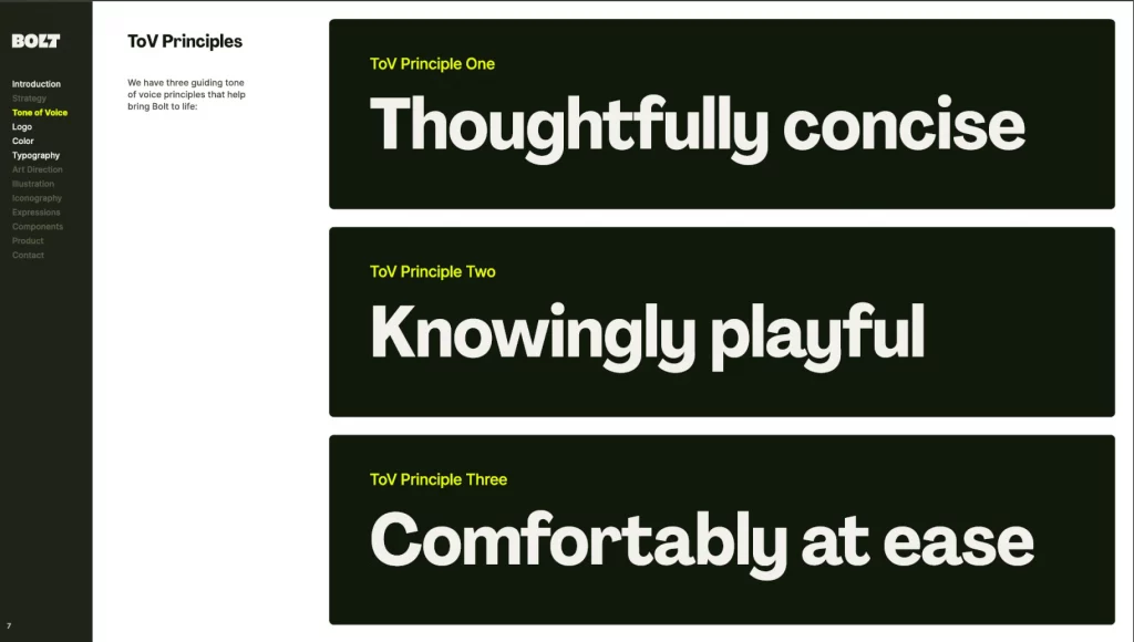
Bolt started with the tone of voice, which shows that they’re all about proper communication (find the full version here).
Coronation of King Charles III
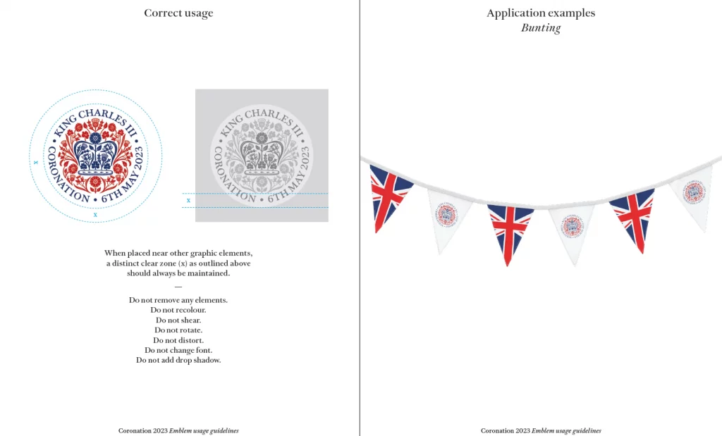
Ever heard of a brand book for the coronation? Well, here it is.
Dubai
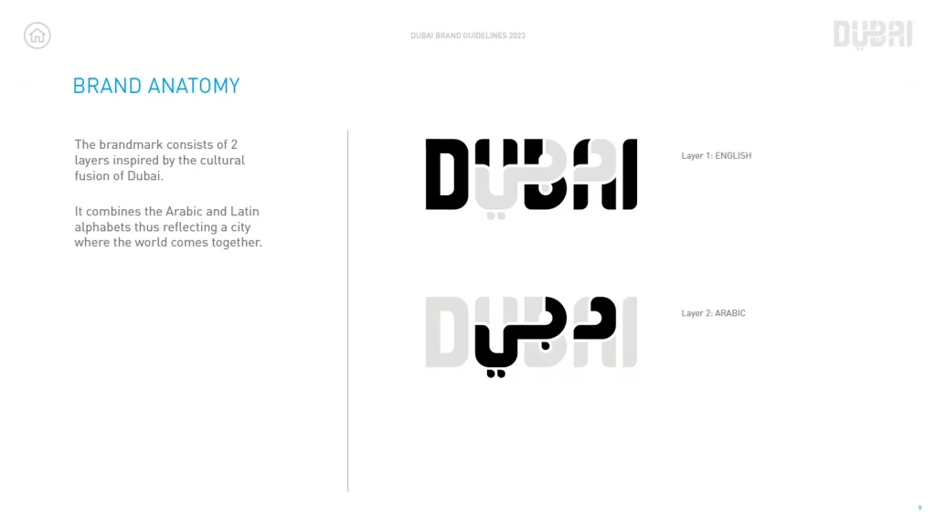
In 2023, even cities have their own brand books.
Asean Indonesia
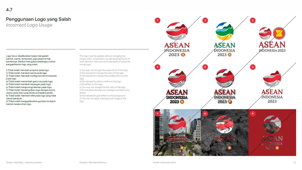
A great representation of Indonesia’s identity. The meaning of the logo, colors, and typography, everything is thought through (find the full version here).
Afterword
Your brand book is more than just branding elements; it’s the soul of your brand. Whether it’s a detailed manual or a basic style guide, it should create a cohesive and strong brand identity. Above all else, it is the soul of the company, the very core of its existence.
If you’re just starting out, it may feel overwhelming to even think about putting together a brand guide. But remember that it can be as complex and detailed as you require – or very basic, and include only the features you deem crucial.
When creating your brand identity guidelines, make sure to include both technical and communicational components. Remember to keep all of these consistent with one another, to ensure a coherent brand identity that your clients can connect with and, as a result, stay loyal to.
Keep in mind that you’re also creating these guidelines for yourself and for your team, too, as it’ll make design and marketing projects immeasurably easier – and more successful!
Read about typographic logo design practices, check the hot trends in logo design, and learn how to integrate identity into digital products.
About the author
Natalie Novice. Content marketing manager with a designer’s eye and a storyteller’s heart. Transforms dense UX concepts into binge-worthy blog posts, secretly rewrites all team communications for clarity, and maintains a “wall of shame” documenting terrible designs spotted in the wild.
