Here’s how the user experience of the product was optimized to eliminate unnecessary load on the generative model.
At its core, Human Generator has a powerful AI model that demands significant computational resources. The fewer requests a user sends to this model in one session, the less computing power it needs to generate an image. At the same time, we don’t want to limit the users, so balancing it is sometimes quite tricky.
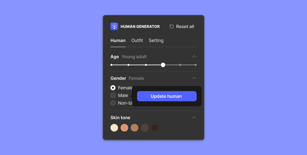
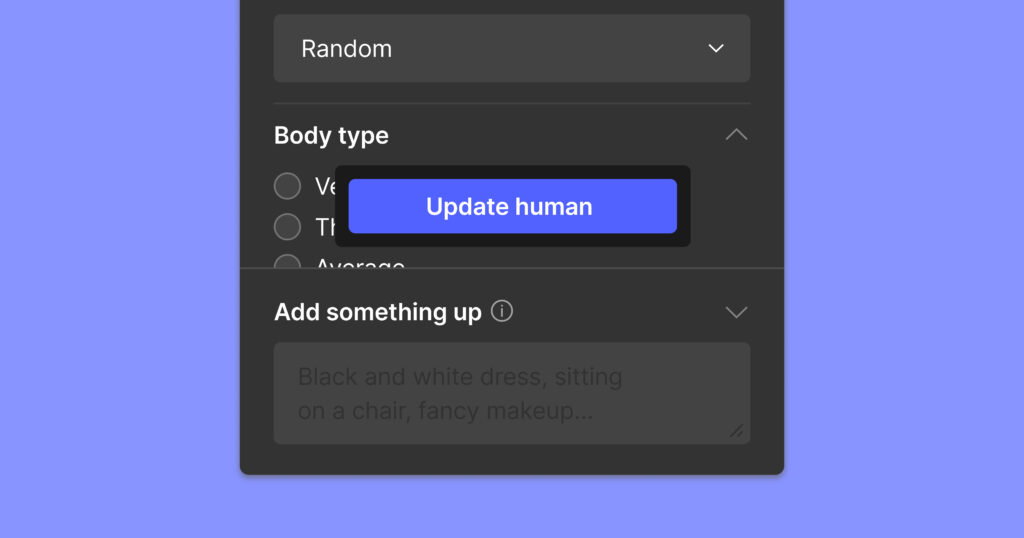
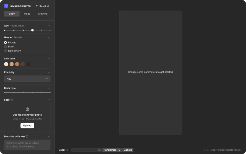
Among all the little things, a popover with the “Update human” button is a real time-saver for the user and a GPU-saver for Human Generator. It allows users to regenerate results only when they need to, rather than with every parameter adjustment, forcing updates to process altogether in a single request.
This approach is sometimes used for complex e-commerce filters but for a different reason. By design, the “Apply” button makes it possible to select the exact configuration of parameters you need before requesting the results. This flow is perfect for users who know precisely what they need.

The “Update human” button appears every time a parameter is changed. This way, it is always close to the cursor allowing quick access (which is key to great usability!). Here are two important aspects of its behavior:
- It is always next to the cursor. When the user interacts with a different part of the interface, there is no need to scroll down every time.
- The popover is almost always positioned to the right of the entire row of values (when the parameter has rows), so it does not cover any of the options.
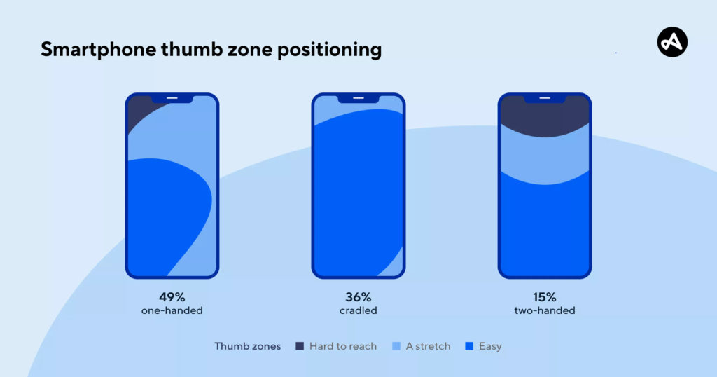
In the mobile version, though, the button does not follow the interactions. Instead, when the user makes changes to the parameters, the popover appears almost in the bottom-center part of the screen.
Mobile screen interactions are totally different from desktop ones. There are distinct “thumb zones” — easily accessible areas. The middle of the screen is the most accessible for all the most common ways to hold a device. Consequently, it is the best place for a primary element with a high frequency of usage, like an Update button.
Now back to the desktop. The only place where the “Update human” button does not appear after the interaction is the “Reset all” button. Initially, we did allow it to appear there, but during testing, we found that almost all clicks were immediately followed by other changes of parameters.
Instead, we implemented a state that encourages users to interact with the sidebar. This choice led to a significant reduction in server load.
Three weeks after release, we already reached more than 400,000 users, and the numbers keep growing. Thus it becomes more and more challenging to keep the balance between the system load and user experience. Now that version 2.0 is in the making, Human Generator will have even more features.
So, there is, for sure, always some room for UX optimization.