Check out arrow icons in different aesthetics and get some inspiration on how to implement them in your design.
In this article we collected arrow icons in various styles, from minimalistic and plain interface icons to creative and quirky ones, and examples of designs where we used this icon. Click any visual from the article to get the icons you liked.
Styles mentioned:
UI arrow icons
Arrow icons in interfaces play a big role: they point to the area where you need to drag the user’s attention and navigate through the screens (swipe icons, scroll icons, etc.). Depending on the system where your interface is built, the easiest way is just to use the icons designed by your system’s official guidelines. This way, icons will fit the design perfectly.
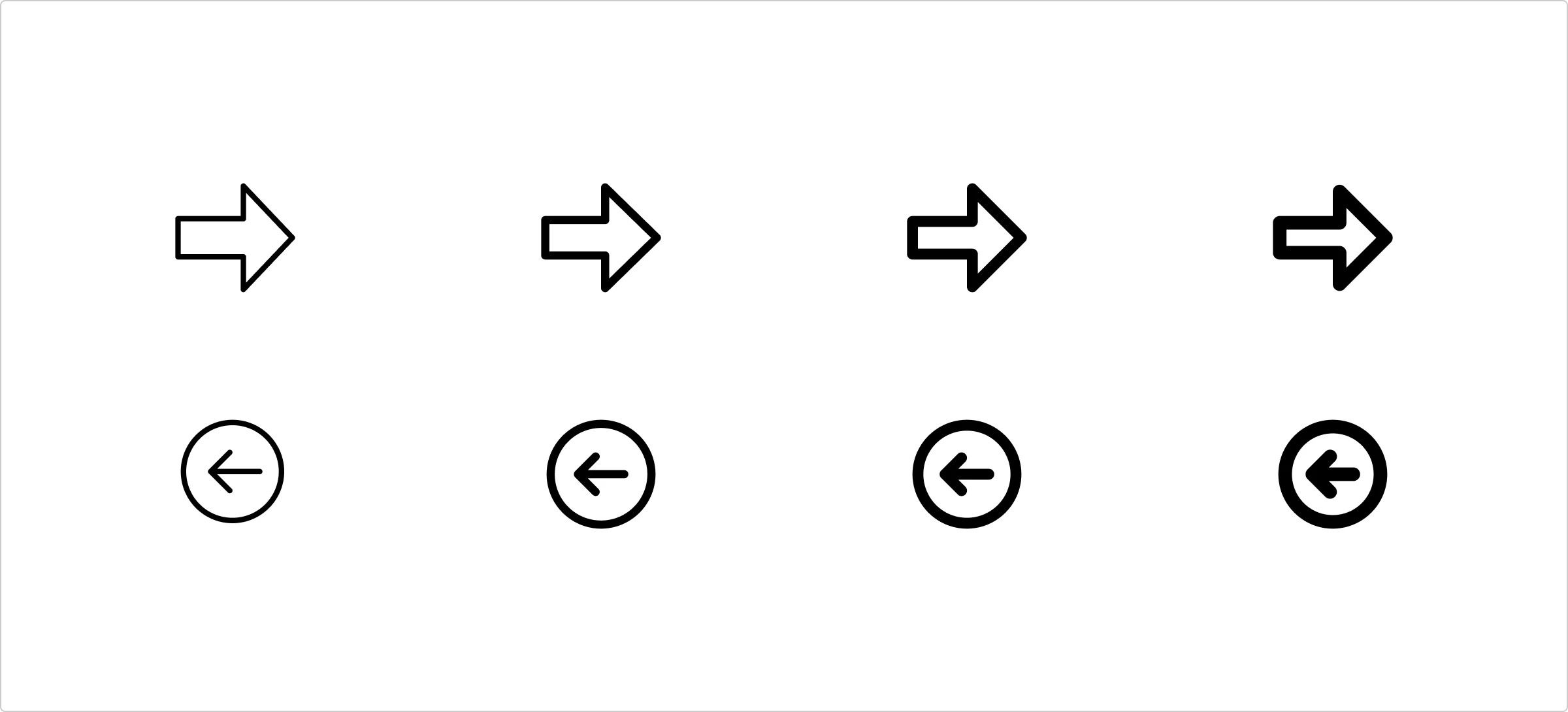
One icon style to rule it all
In UI design, line thickness is a must. For even the trickiest cases, there is a universal style group that has options from 1 to 2.5 px. Read more about this style here.
Design concepts
Here are usage examples to catch some inspiration:

Colored arrow icons
For accents in the interface, a brighter vibe, and emphasis on web design, try colored styles.
Colorful icons in design
The most common usage for colored icons is in infographics, presentations, and web design. This is where it gives this emphasis and delivers the message the best.

Creative arrow icons
We are moving to graphic design, where your creativity is unlimited. So why use plain icons when you can enrich your banners and social media posts with artsy and decorative ones? Here are some style options to choose from:
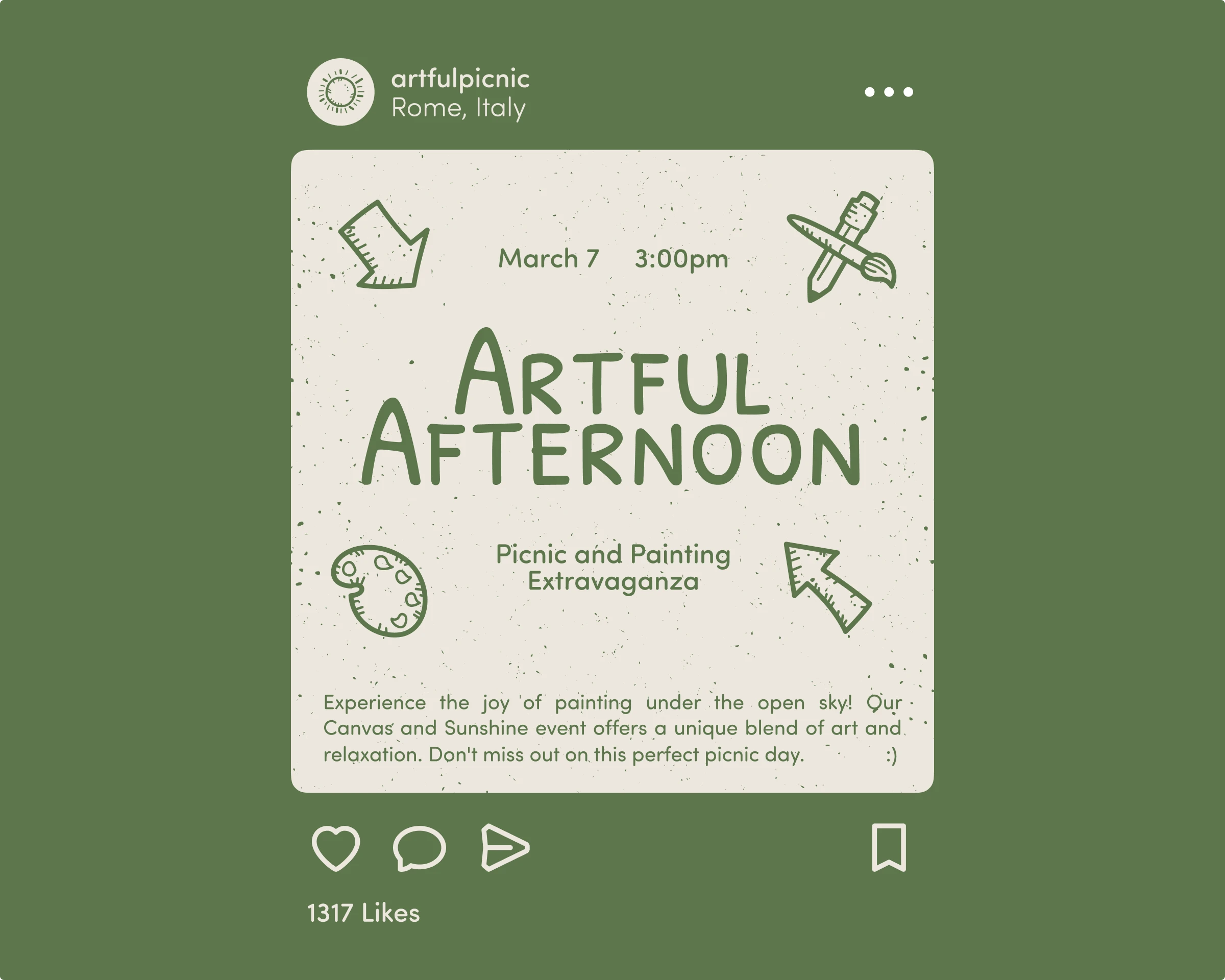
Use cases examples
Here are some inspo shots of decorative icons being a part of graphic design:

What is your favorite style of arrow icons? Share your thoughts on Twitter, and don’t forget to tag us @icons_8.
