Why Would We Compare Ancient Hieroglyphs With Modern Icons?
Both icons and hieroglyphs are images that communicate messages to people, i.e., pictorial languages. They are also both the product of hard work. Except those hieroglyphs were drawn on the walls of temples by Egyptian slaves while suffering and dying during their work. We draw icons as well, but we have time to write articles such as this one — oh yeah, and we get paid.
So, what’s the distinction? It’s in the purpose. Nowadays, we rarely use icons as a writing tool, and even infographics are usually accompanied by explanatory text. That was far from the case in Ancient Egypt.
It’s worth noting that 2000 years have passed since the last use of hieroglyphic writing. According to George Robins Gliddon, there were approximately 900 hieroglyphic forms used by Egyptians (and we have 20,000 icons by now, ho-ho. It’s just a pity nobody has decorated pyramids with them…yet). But these 900 forms were a part of a rich language. Today’s applications have an average of 10 or 15 icons in them, and it’s tough to make them look good all together. Now imagine an app with 900 icons, or even better, a whole language, based on these images — now you get the picture. With so much to say, Ancient Egyptians had to be very picky with their style guidelines.
Ancient icon styles
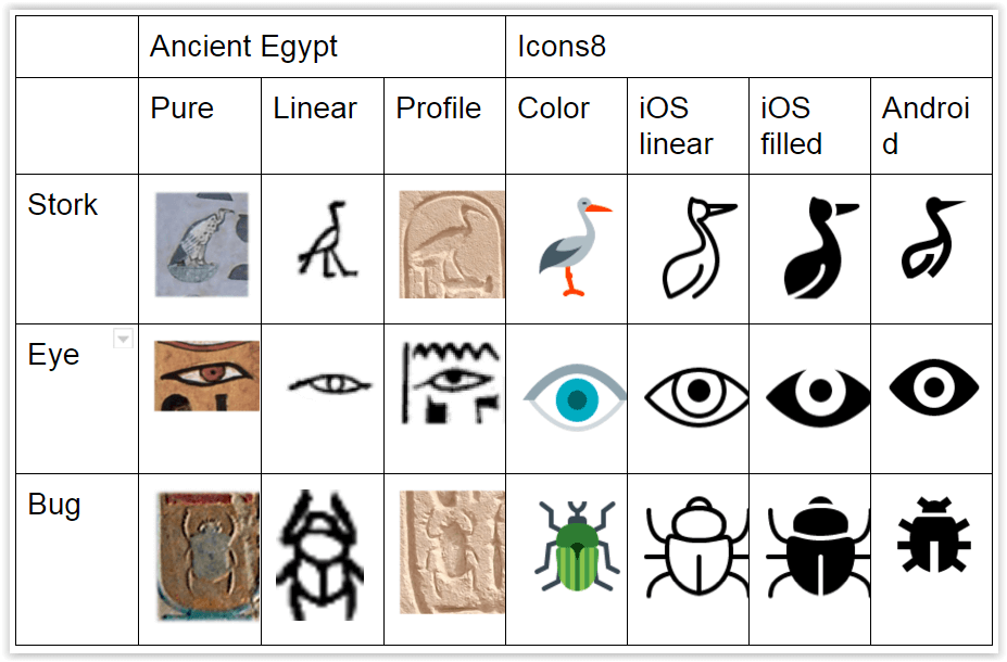
M. Champollion, a brilliant French researcher and the father of Egyptology, discovered three styles of hieroglyphs: pure, linear, and profile, each with their own characteristics.
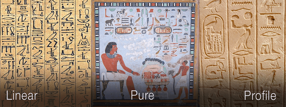
Linear was a simple draught, a sketch of an object. The strokes of linear hieroglyphs are fine and delicate. They can be mostly found in manuscripts and on mummy’s chests.
The pure style is characterized by fidelity and attention to the nature of details and bright colors. It was widely used on the walls of public buildings. This style also incorporated painting, though only decoratively — they didn’t lose their initial informative purpose.
The third style of hieroglyphs is profile, and it has a telling title. It is represented by the silhouette of an object. This style is similar to linear, but the space within the outline is filled. Profile hieroglyphs are found on most little monuments and in Rosetta. They look a bit simpler than the other styles, but that’s because they had to be carved into stone objects; otherwise, weather and time would have erased them from their oblivion.
Design comparison
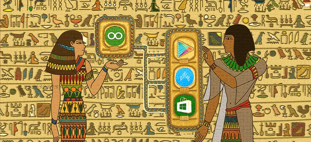
If we compare these styles and styles of a modern icon collection, say, Icons8 (unexpectedly), we can see that they are based on the same principles. Why, you ask? Well, we locked each of our would-be designers into a pyramid of their choice for a month (freedom of choice is important) with plenty of chocolate snacks, batteries, and a flashlight. Unfortunately, we learned the hard way that if they couldn’t eat or see, they would get pretty uncomfortable and wouldn’t be able to do much research.
No, actually, not. We drew our icons based on the guidelines and principles suggested for popular platforms (iOS, Android, and Windows). It’s interesting to note that ancient hieroglyphs may fit some of these guidelines. Perhaps some of the companies responsible for developing these guidelines did lock some designers in the pyramids for a while.
So, let’s imagine some dude blindly trying to copy ancient hieroglyphs and use them in his app. Would his design suit any modern guidelines?
Android icons
It’s all about simple, filled geometric forms, so the Egyptian style doesn’t quite fit.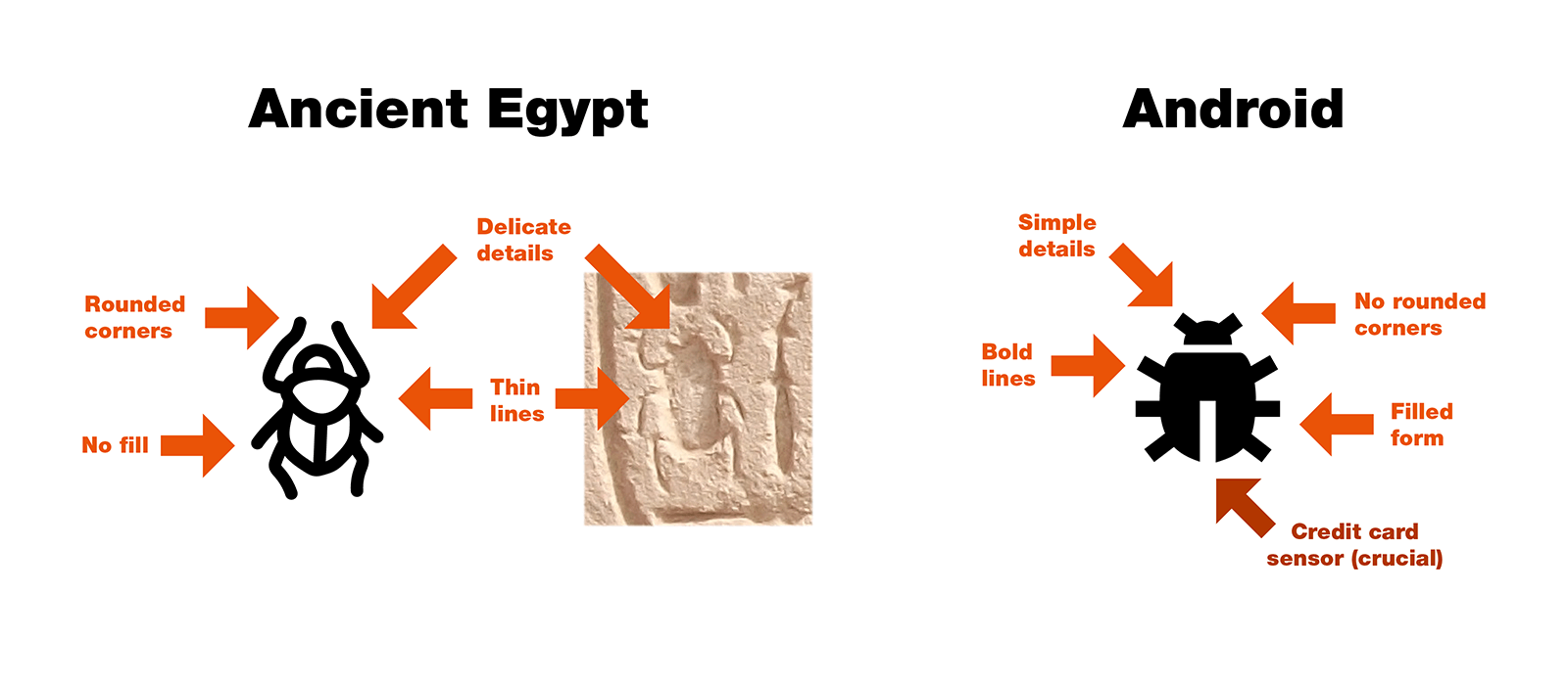
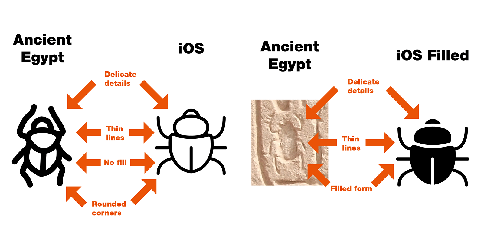
iOS icons
iOS is another story. Thin, detailed hieroglyphs would fit perfectly with iOS guidelines.
Windows icons
There are no official guidelines for Windows. However, you can take a look at our Unofficial Style Guide to Windows 10 Icons and see that hieroglyphs wouldn’t match.
Conclusion
Ancient Egyptians gave us an opportunity to see thousands of beautiful texts written with images. Their unified aesthetics made it possible for complex texts to become readable, not to mention pleasant to look at. It created harmony within all the hieroglyphs, no matter who the writer was.
That’s why we are trying to do the same with today’s platform guidelines. Following them helps customers understand and use interfaces better. Perhaps someday, our descendants might study today’s designs without knowing their purpose, category, or product ID.
The next civilization we dared to explore are Aztecs – take a look at How Did Ancient Aztecs Draw Icons? One Mystic Story
If you were inspired by this article and created icons – the next thing you want to know is how to sell them. Check out Best Places to Sell Icons.
About the Author
Andrew is a usability specialist at Icons8. He started his career as a phone support specialist, telling jokes while customers rebooted their computers. Then, he moved to usability testing and occasional writing.