You’re diving into the field of instructional design and developing an online course and want to impress your client and establish yourself as a competent instructional designer. You stare at the screen in front of you with a blank slide ready to be designed. You have ideas about how you want to create an online course and are excited about getting started!
But hold on for a second.
Many instructional designers have been in your shoes, and, luckily for you, they have made mistakes, so you don’t have to. Here are some common graphic design mistakes that instructional designers often make and ways you can avoid them.
Mistake 1: inconsistent color scheme
It’s okay to be creative when creating an online course, but being too creative with colors will leave your learners confused and distract them from the information you’re presenting. Make your course visually appealing and engaging, but don’t go overboard like the example below:
How to avoid creating an inconsistent color scheme
A good rule of thumb is to choose about 2 to 3 colors and use them throughout your course. Make sure the graphics you use complement the colors you chose – similar to the slide below:
Mistake 2: related objects look UNrelated
When learning our first language as babies, we connected the objects in our world to the words adults around us used to describe them. We knew that the bouncy thing we could throw and play with was a ball and that what fed us was called milk. We match the words “ball” and “milk” because they were spoken while close to the objects.
In online course development, the relationship between the objects you place on your slides and the words you relate to those objects is no different. Take a look at the picture below:

As you can see, the text looks unrelated to an image and can ultimately cause confusion and the misinterpretation of your message. The picture below is much better as the words are related to the words.
How to make related objects look like they are related
To avoid this mistake, make sure associated things are close to each other and aligned. You need to make it clear that certain words are related to specific images and vice versa. It is also important to make sure text color and image color match or complement each other if they are related.

Mistake 3: too much text
Take a look at this short paragraph:
The blue whale is much larger than other sea creatures. It is the largest known animal to have ever existed. To put this into perspective, the blue whale is over seven times the length of an Elephant.
Now, look at this picture:
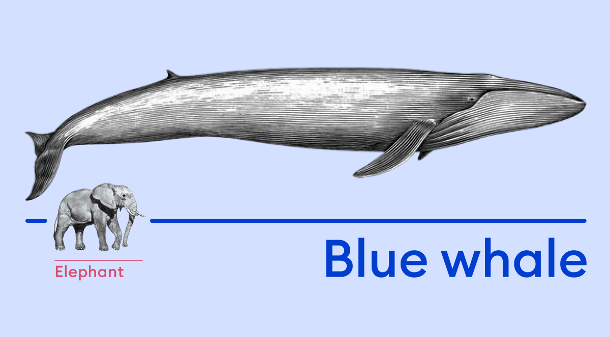
Think about how much effort it took you to interpret that picture. Now think about the effort involved in solving that paragraph. Was there more effort put into reading the words or looking at the picture?
Words and letters are like tiny images that our brain interprets. When reading, we don’t interpret each letter but each word. However, it’s so much effort too!
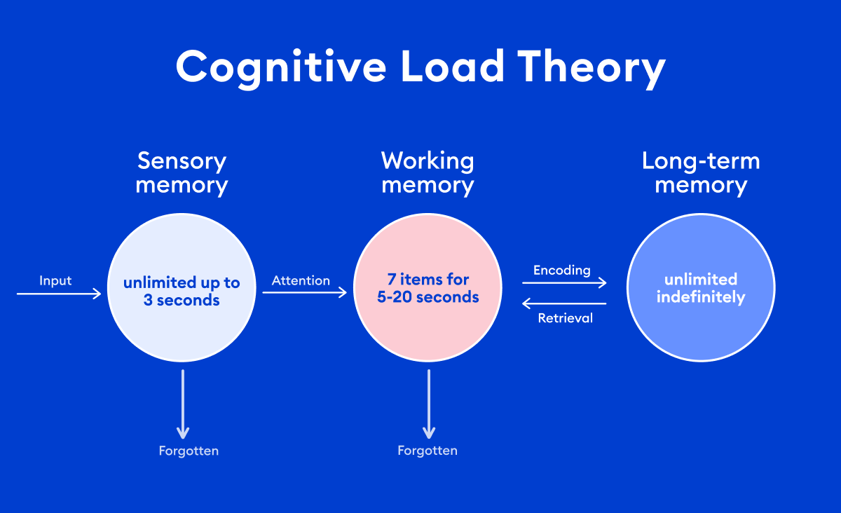
Cognitive load is a key concept to remember here. According to this theory, it is thought that people can hold from five to nine information items for no more than 20 minutes, and even fewer when the information items need to be combined, contrasted, or manipulated. This is why phone numbers are usually seven digits.
Words are also images. There are 36 words in the paragraph, so 36 different images. Contrast that with the one image below the section, and you’ll see how important it is to limit the amount of text you have on a slide, accompanying an image, or even text by itself.
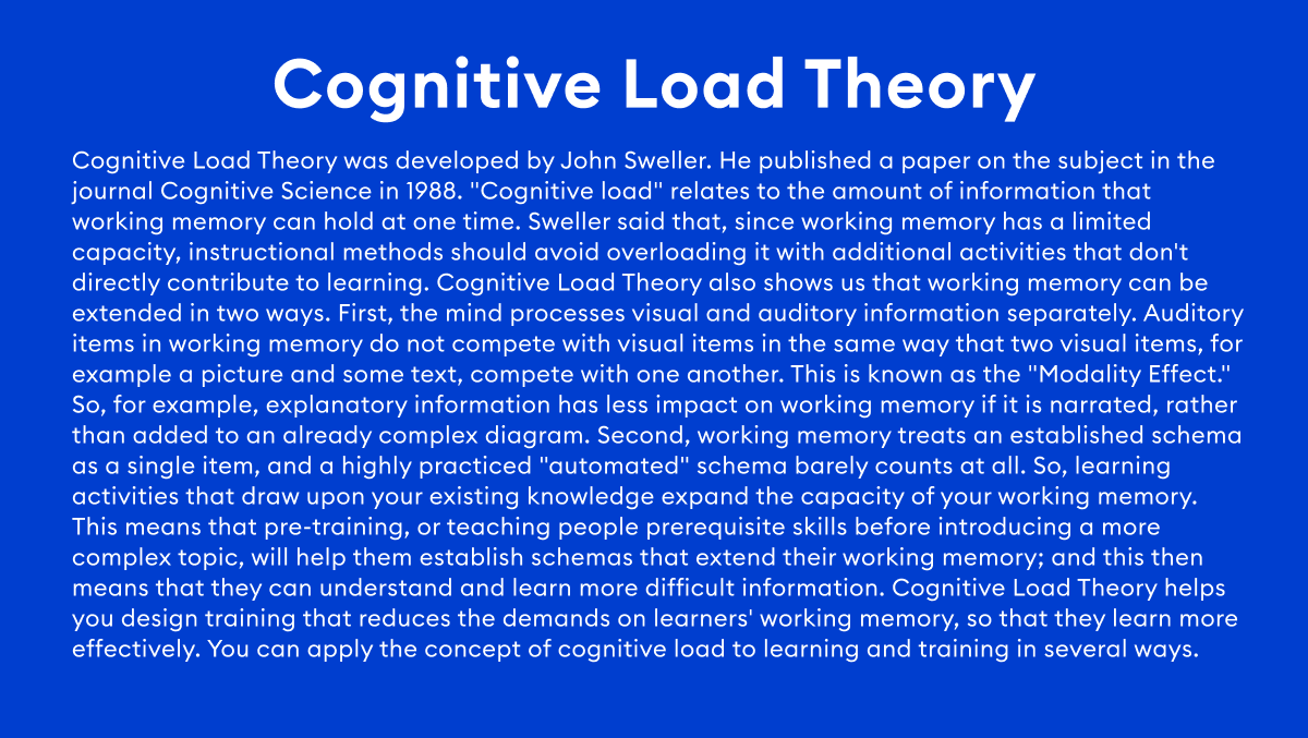
The more text we add to our online course, the more cognitive load you place on the learner. Like in this image:
How to avoid using too much text
To avoid this mistake, use captivating images that express the message you would like to convey.
If you need to use text, use as little as possible, just like in the Blue Whale image above. Stick to determining what the most important message is before creating each slide. Keeping it simple is crucial to avoid confusing or undermining your message as a competent instructional designer.
See how a slide looks after correcting the mistake.
Mistake 4: low-quality images
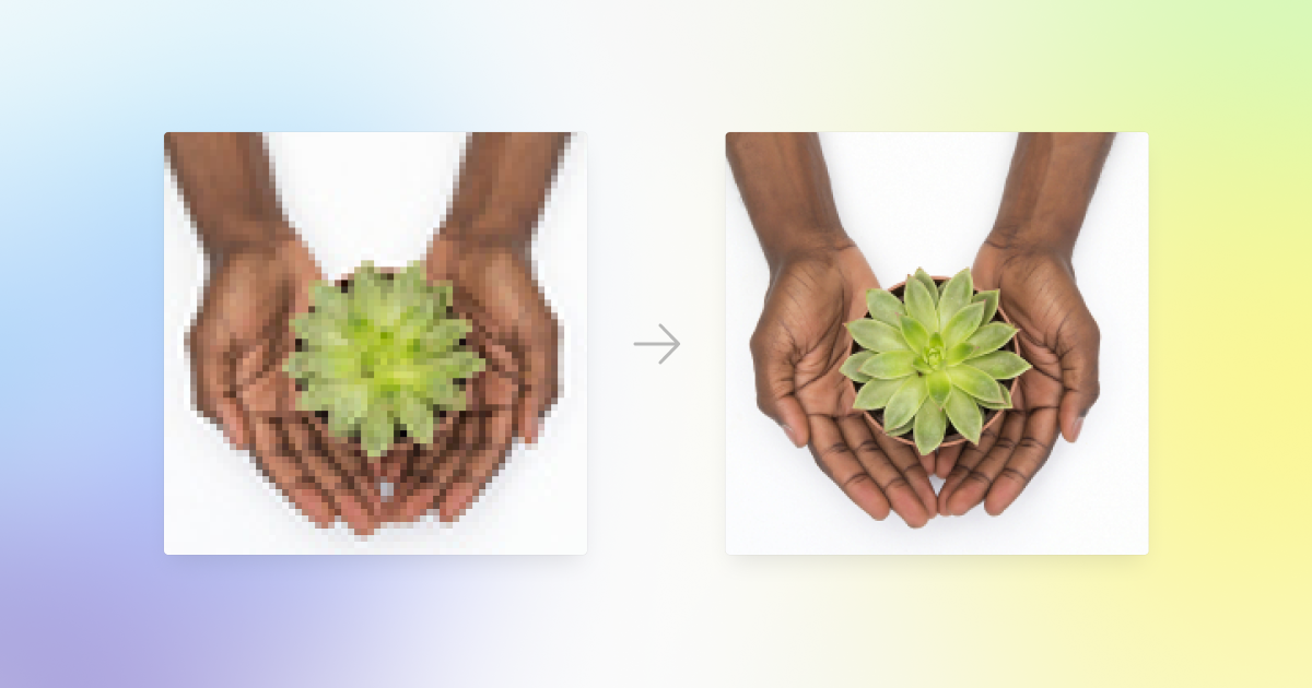
Yes, a picture is indeed worth 1,000 words, but a low-quality picture can distort and jumble those words – and you don’t want that. The quality of your images communicates the quality of your course to your learner. The pictures you also use unconsciously communicate how readers should trust the information you are presenting. Therefore, using low-quality images can hurt your course more than if you had only used text.
How to avoid using low-quality images
The causes of low-quality images are many, so let’s review a few of them here in detail.
Size of the original image
The image’s resolution is a major key to manipulating the image to use in your course. The more pixels in the photo, the more precise the image will be because there is more detail in the colors in the picture.
When you download pictures, it is good to download them in a large size (1024 x 768 pixels and up). If the photo or graphic you are downloading gives you the option to choose low-res or hi-res, choose hi-res.
Here are some sites where you can find high-resolution stock images for free: Moose, Unsplash, Pexels, Pixabay, and Canva.
Resizing
When resizing images in your online course, you should be careful to ensure that the pixels are not enlarged to the point where they blur the image.
To avoid this, you should use photo editing software to resize your image. Just in case, here are examples of free and quality photo editing software: Smart Upscaler by Icons8, Gimp, and Canva.
Vector images are also perfect for online course graphics because they don’t lose quality while resizing them.
Final Thoughts
Online course creation can be a lot of fun. However, you must make sure that your messages come across clearly and concisely. Learning from the above mistakes will get you well on your way to mastering online course creation. Happy developing!