Tech giants fail at basic icon design. Twitter, Instagram, and Threads use confusing symbols with zero context, making users guess what they do. This is a UX nightmare!
In the context of UX, icons can be considered as signifiers — additional indicators that amplify what a button should do.
However, the absence of labels can lead to ambiguity. What’s interesting is that a lot of top companies misuse icons, and you don’t need to conduct usability testing to know that. Such UX fails cost users time, create frustration, and may damage product experiences.
Sometimes icons are the only option when the space is limited, for example, on mobile screens. But what makes us wonder the most is that the choice is absolutely nonconventional, let alone the fact that the icons are not supplied with labels.
Let’s try to play a game. We show you a set of icons; you try to think what they are used for.
X/Twitter
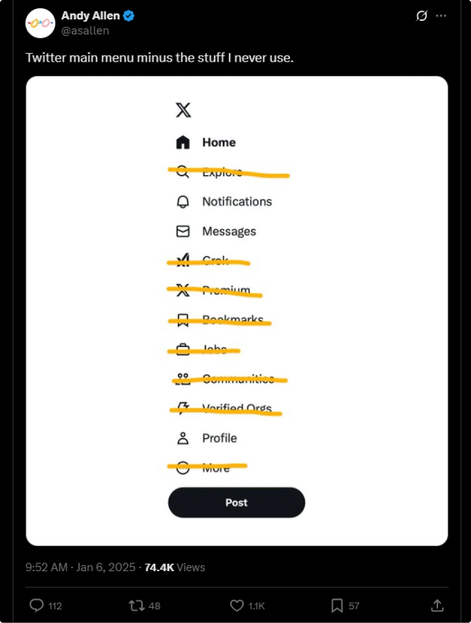
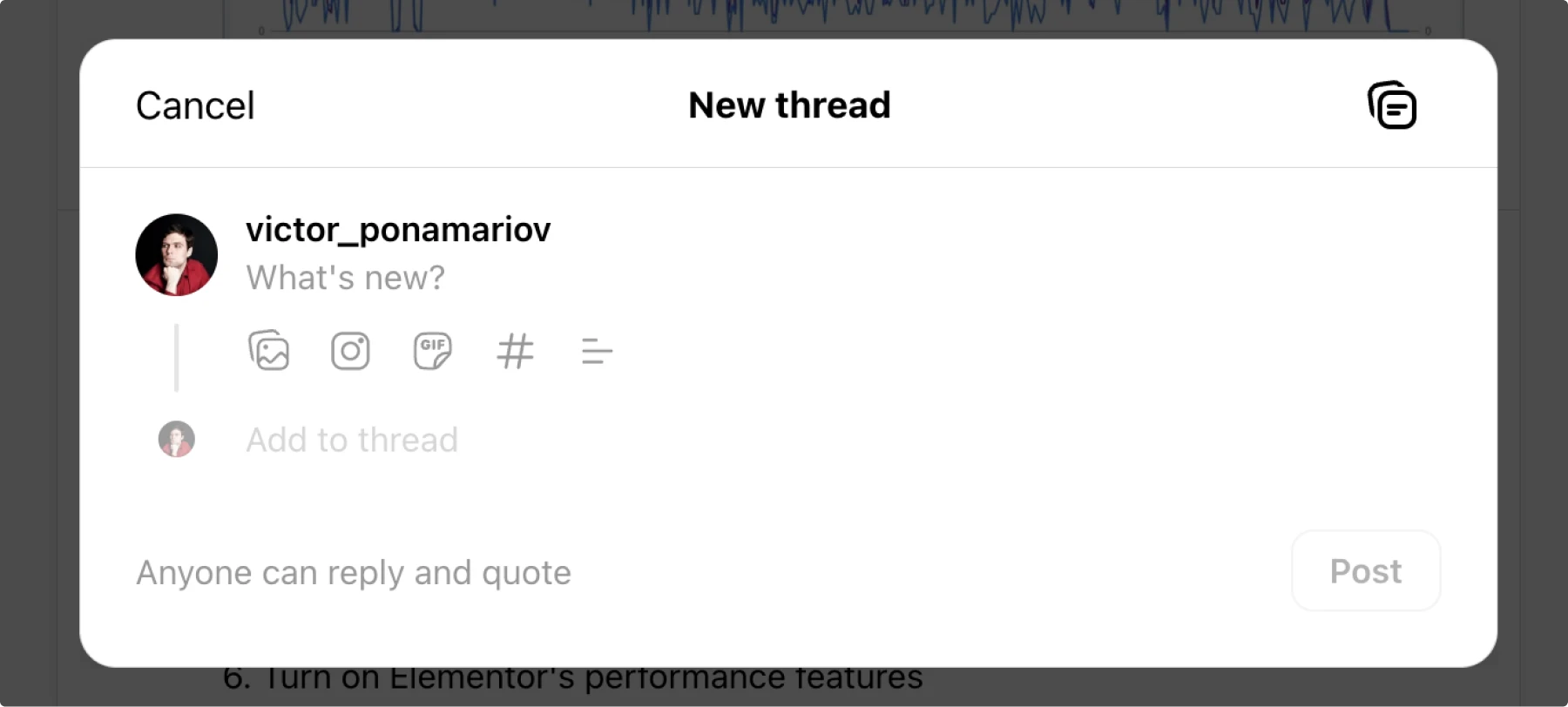
Here is an icon set. All icons are in the same navigation sidebar except the last one (which deserves attention as well).

Imagine you develop an app and need to make a menu with proper icons. So you came up with this.
Well, let’s try to guess what they mean.
Here is the answer.
What is wrong with them? The answer is: recognition and relevance.
Some of the icons are hard to recognize, especially in the context of the sidebar menu.
Mentioning Jakobs Law won’t hurt:
Users spend most of their time on other sites. This means that users prefer your site to work the same way as all the other sites they already know.
For example, the “Premium” item is in the middle of the sidebar, and it shows a modal with subscription plans.
However, very often you’ll find subscription options either in the profile settings, in the header, or in the footer of the side menu, but not in the middle of it, especially with such an icon.
A perfect illustration of redundant functions was made by Andy Allen.
In order to fix the navigation, it’d be better to start off with proper information architecture.
There is also an article comparing Bluesky and X, where a lot more details were explained.
Also, recently another unbelievable case appeared on X. Guess what the icon means? Let’s assume you are already aware that the icon represents “Grok,” an AI assistant.
The answer is…
Most of the time, AI assists in the creation, rephrasing, and generation of posts. Explaining a post that is difficult to understand is not necessarily a bad thing. But there are two things that don’t add up:
The Grok icon. It’s impossible to guess that it means “explain this post”. Absolutely.
Explaining posts is probably not a frequent action. Does it deserve a place here? Just to remind you, there is a “more” action under each post with at least 8 items, such as “not interested in the post”, “mute
The Grok icon. It’s impossible to guess that it means “explain this post”. Absolutely.
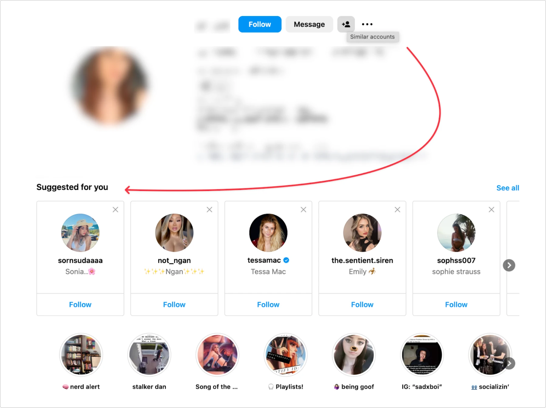
Here is an Instagram profile. There are three buttons:
- Follow
- Message
- …?
It seems like the icon means to add the person to something, maybe to some kind of list. But in reality, it opens an additional panel below (violating the proximity law) suggesting similar accounts to me. Impossible to guess.
Actually, if there wasn’t a hint on hover, I bet users would be afraid of clicking on it, because maybe it will send the user some kind of notification, and you don’t want to do this (e.g., friend request or something).
Threads
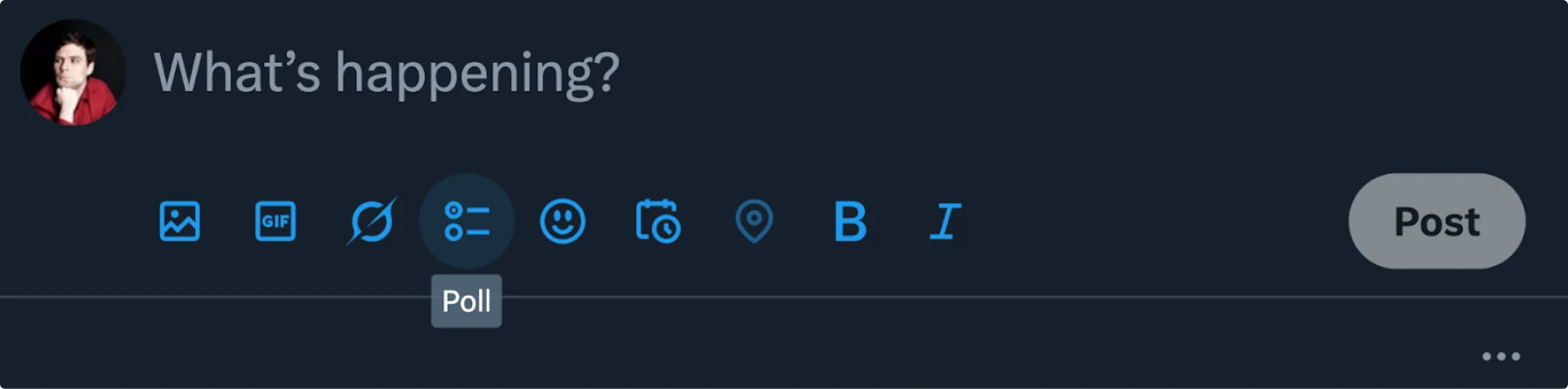
There is a very subtle and interesting case of using icons. Here’s an example of an icon in use on Threads.
If you don’t use Threads, try to guess what it means. Most users that I asked thought that the icon meant alignment because it resembles aligning text or elements to the left.
The paradox lies in the icon’s ability to serve multiple purposes, as its appearance can convey multiple meanings. However, it has become common practice to use a slightly different version of the icon for the purpose described below.
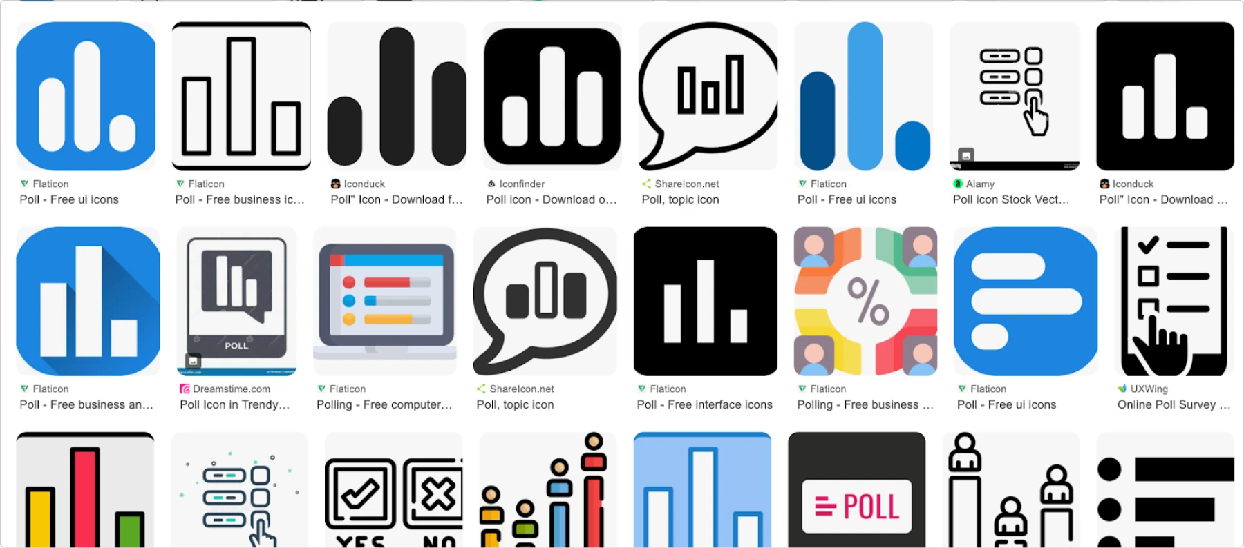
Here is the context. Maybe now it’s easier to guess that it means “Add a poll”.
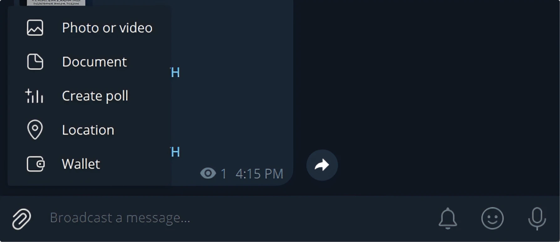
Let’s see what icon is usually used in such cases.
Note that in most cases the bars are vertical. Another pattern is horizontal bars with the same length and circles indicating options.
Telegram
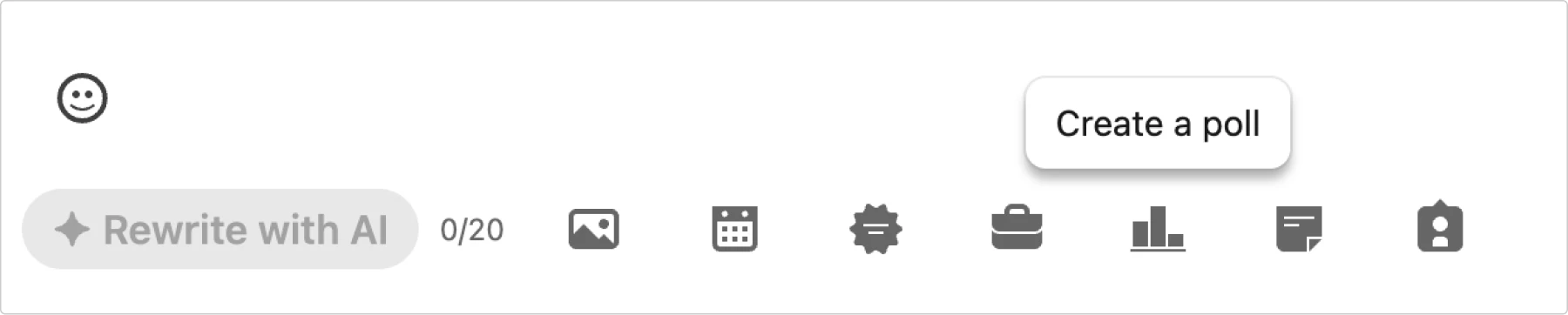
Google Pictures
Note that in most cases the bars are vertical. Another pattern is horizontal bars with the same length and circles indicating options.
Big guys can screw up, but you don’t have to
Even tech giants sometimes choose icons that are really confusing in common situations. But you don’t have to—you can learn from their experience. Here’s how you can help users avoid solving puzzles while using your designs:
- Search for common, well-known metaphors. Check out other app interfaces and icon libraries. Google actions and features to see what images appear, and decide which icon metaphor will work better for your users.
- Use icons and labels together when possible. This increases the clickable area and decreases cognitive load by removing ambiguity.
- Select appropriate icons and add hover hints if space is limited. But be smart about it—if your top navigation has a widely recognized profile icon, you don’t need a tooltip. Instead, include the user’s name, or on mobile screens, just leave the recognizable icon as is.
Strike a balance between an interface cluttered with unnecessary hints and one filled with mysterious icons. Remember: if users need to guess what your icon means, you’ve probably chosen the wrong one.
If you want to dive into icons, here’s your full guide on everything you need to know about icons and learn how to design icons for killer UI.
About the author
Victor Ponamariov, a web developer fell in love with user interfaces. He published a book with 100 practical UI/UX tips where he shares his experience.