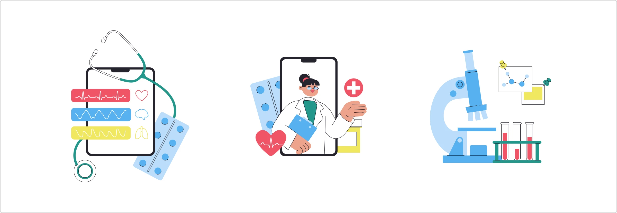
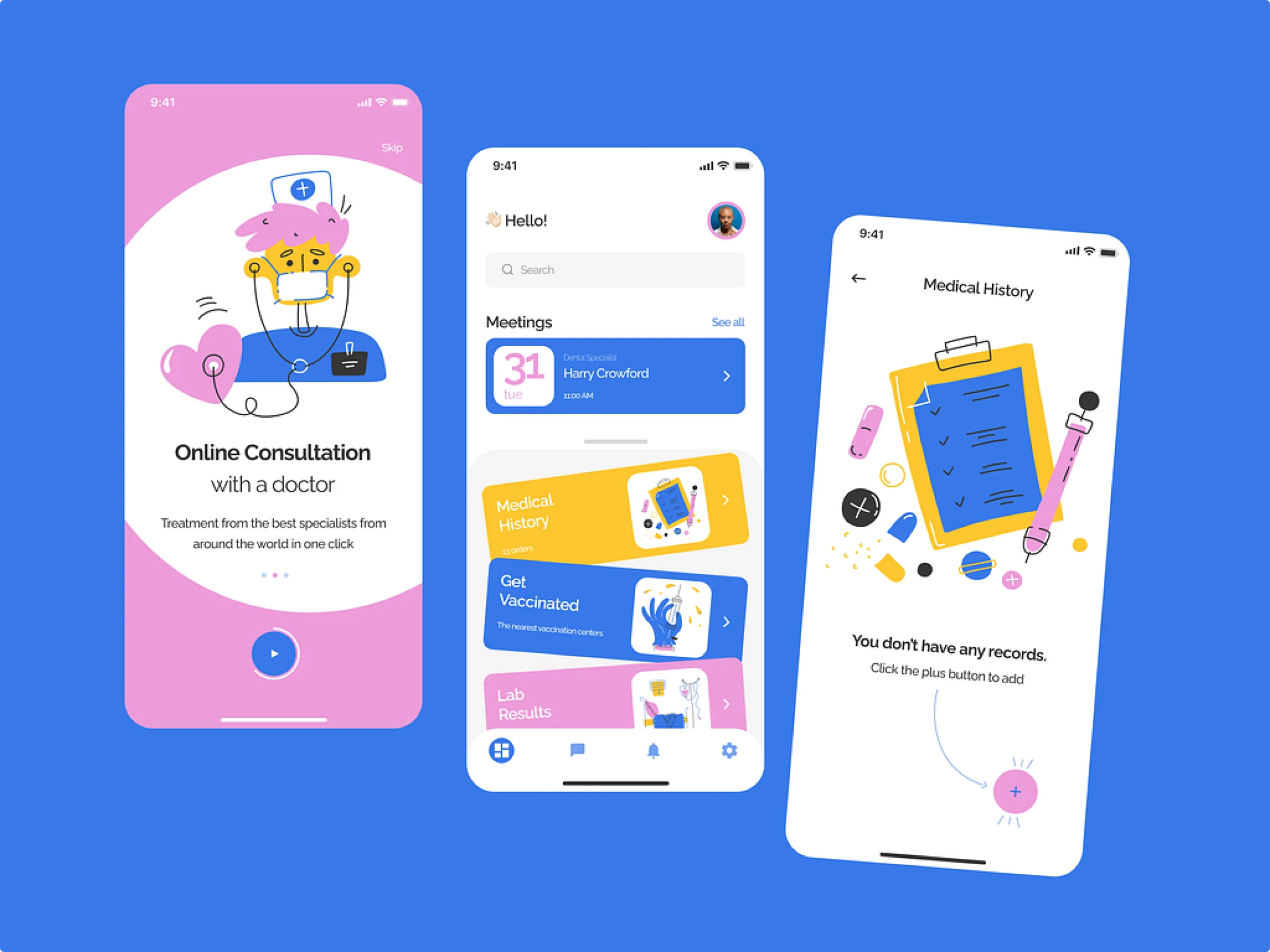
Custom graphics enhance healthcare apps, making navigation easier for all. Discover how icons and illustrations simplify info, ensuring accessibility for everyone.
Picture trying to navigate a medical app during a stressful moment, only to be met with confusing layouts and unclear visuals. For many users with disabilities, this isn’t just frustrating—it’s a daily challenge.
Custom graphics can change that. They make apps easier and ensure everyone can access crucial health information. This article dives into how graphics can transform medical apps. We’ll explore how icons and illustrations simplify complex information and make navigation a breeze, putting accessibility front and center in design.
Icons: enhancing navigation and understanding
Icons are small but mighty tools that make medical apps more intuitive. Here’s how they help:
Clear communication
Icons can convey a lot of information quickly and clearly. In a medical app, icons can represent essential functions like search, help, or settings, allowing users to find what they need without hassle. For example, a simple stethoscope icon can immediately indicate a section for medical consultations, making navigation a breeze.
Universal design
Good icons speak a universal language. This means users from different backgrounds can easily understand and navigate the app. For instance, a heart icon universally represents health and wellness, making it immediately recognizable to users worldwide.
Adaptive icons
Adaptability is crucial for accessibility. Icons8 icons are designed to be scalable and adaptable, ensuring they remain clear and functional at any size. Whether a user needs larger icons due to visual impairments or prefers smaller ones for a cleaner look, these icons maintain clarity and effectiveness.
Simplifying medical information
Illustrations are absolute lifesavers in making medical info easy to understand and engaging. Here’s why:
Visual simplicity
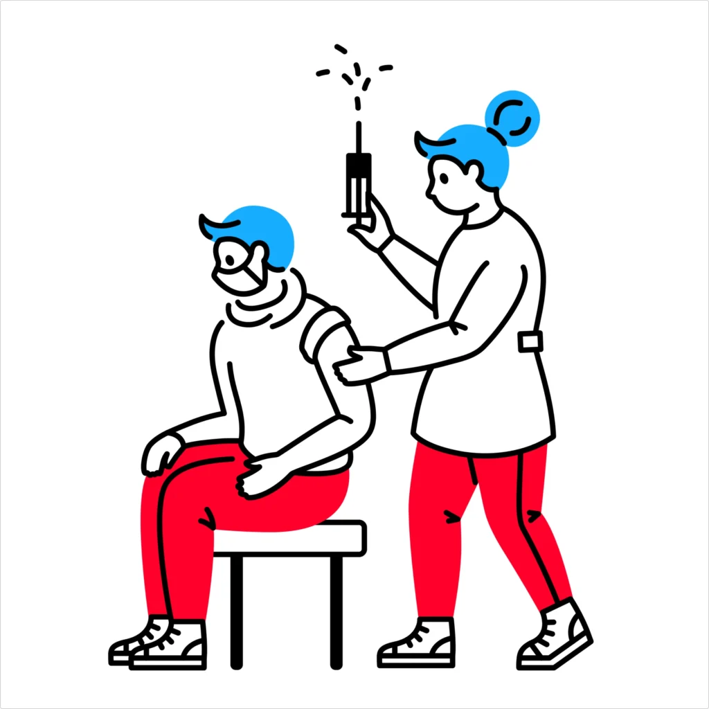
Medical jargon can be a real headache, but illustrations break it down beautifully. These visuals turn complex concepts into simple, easy-to-digest images. Imagine explaining a vaccination process with clear, step-by-step visuals—suddenly, it’s not so intimidating!
Consistency in design
Consistency is your best friend when creating a user-friendly app. Illustrations offer a cohesive look that helps users feel at home. This consistency means users can navigate the app without any confusion, knowing they’ll see the same friendly visual style throughout.
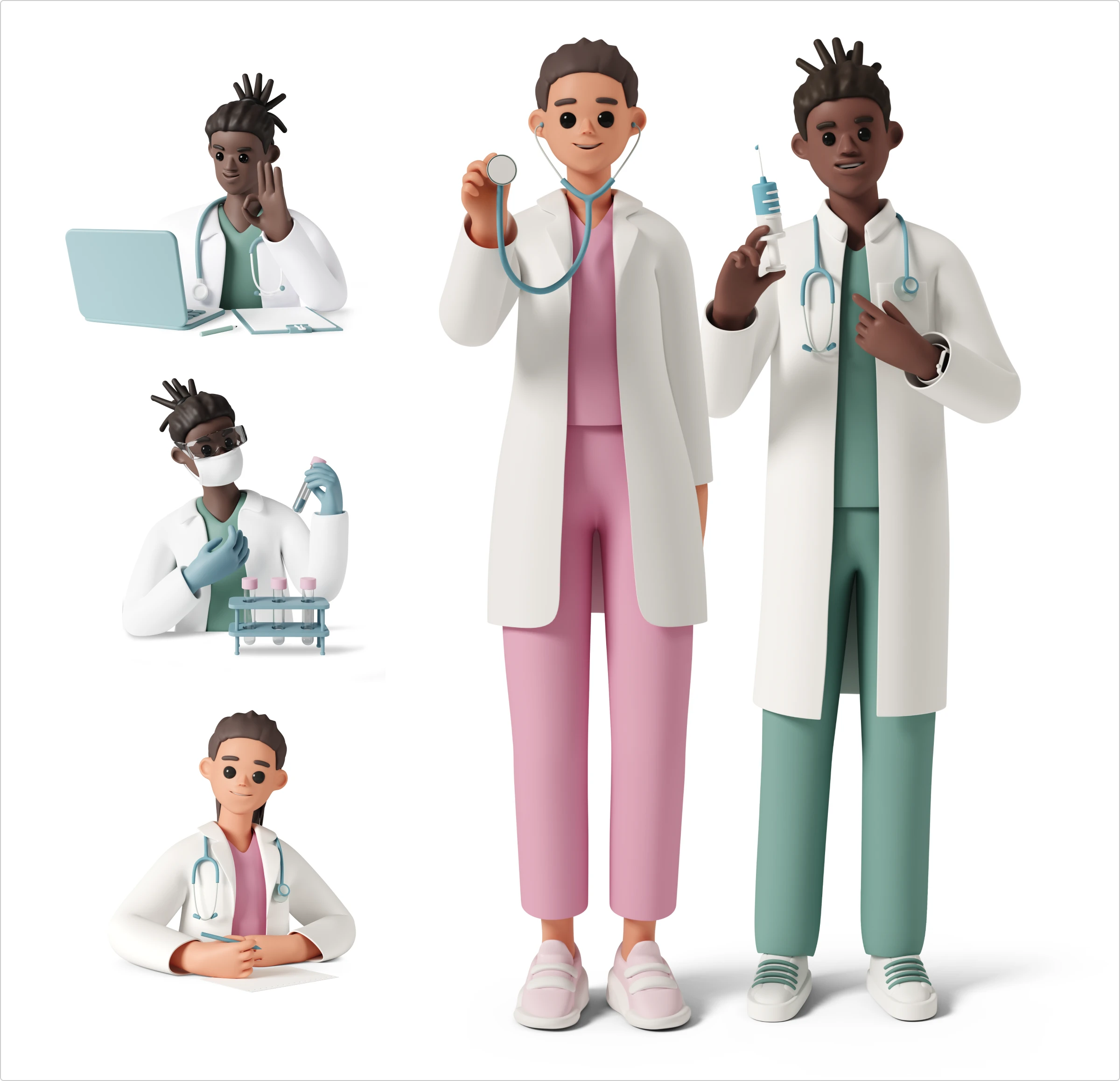
Introduce the specialists during onboarding and add UI illustrations in the same style.
Customizable illustrations
Every medical app is unique, and Ouch! illustrations can be tailored to fit your specific needs. These illustrations are flexible, whether you’re tweaking colors to match your branding or adjusting elements to better represent a medical condition. Download illustrations that fit your brand in SVG or PSD and tailor them to your needs.
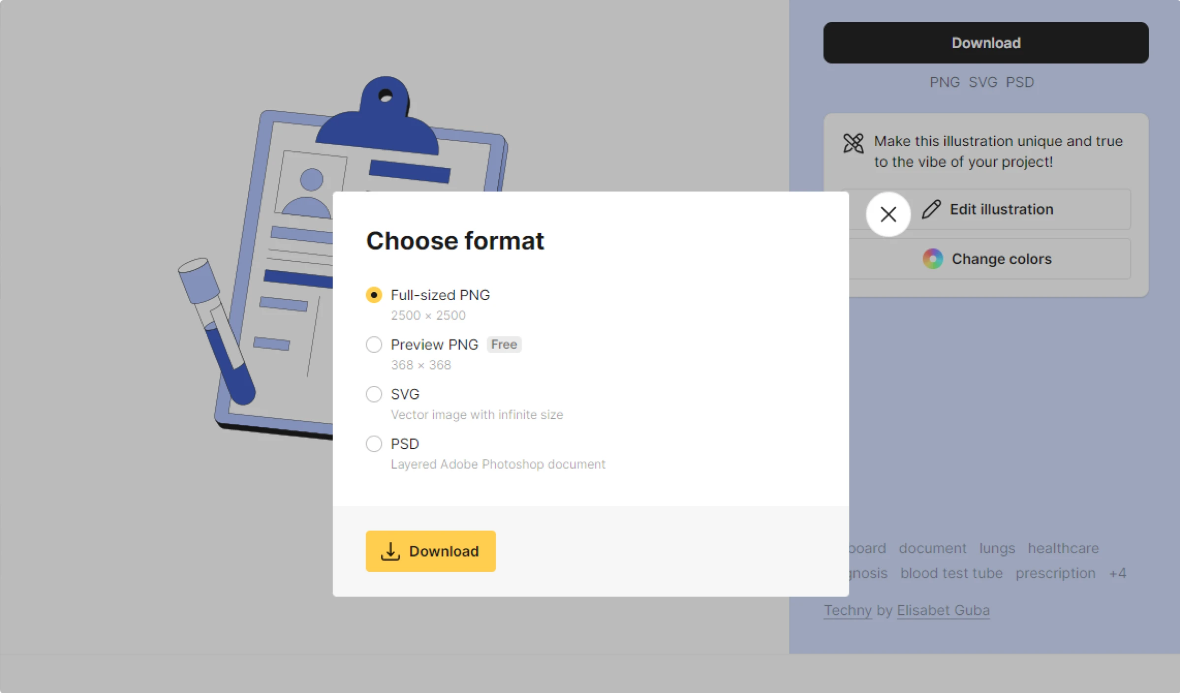
Tip: If your visuals have text on them, ensure that this text is in the same language as your users speak. If you want to use the same visuals for different language groups, translate the text on the image. It can be done manually or with the help of an automatic AI image translator.
Illustration Generator: create your own pack of consistent illustrations
The Illustration Generator is an incredible tool for crafting a cohesive set of custom graphics tailored to your medical app. Here’s why it’s so valuable:
Personalized visuals
Every medical app has unique requirements, and the Illustration Generator allows you to create perfectly fit visuals. Whether explaining a specific condition or detailing a medical procedure, you can generate images personalized to your app’s needs. Tailored visuals help users connect better with the information, making it clearer and more relatable.
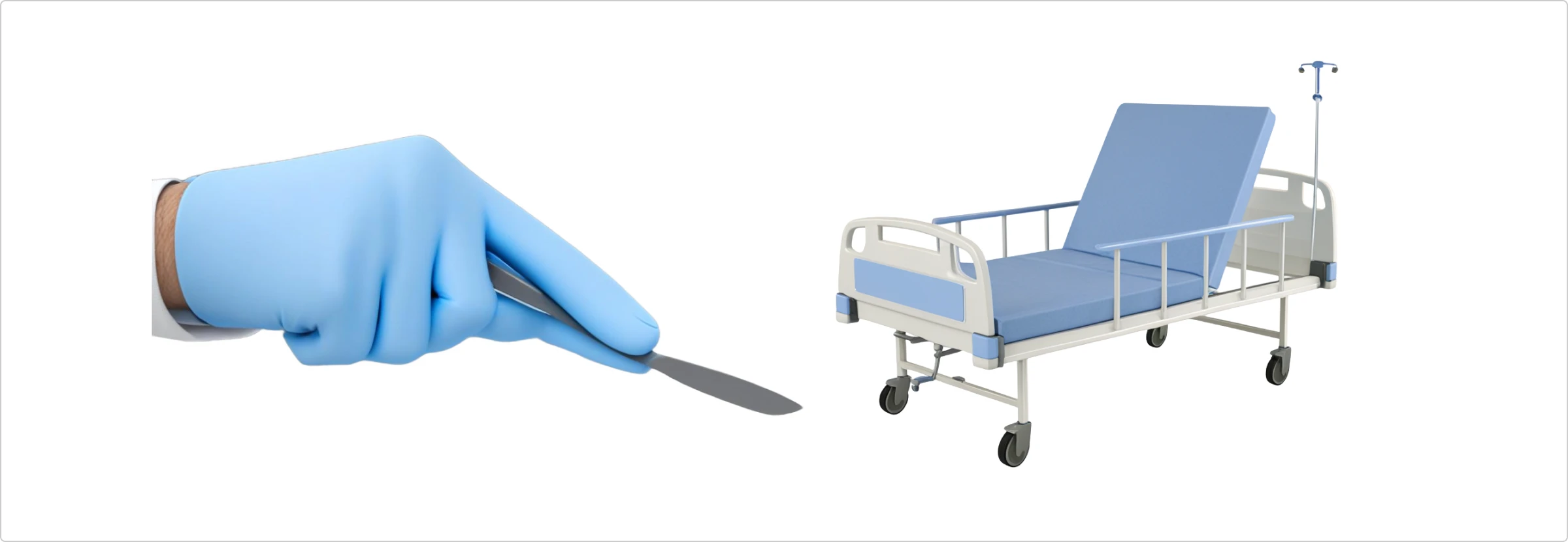
How to create an illustration with Illustration Generator?
You can create a pack of illustrations with a uniform style, ensuring a cohesive look throughout your app. This consistency helps users navigate your app more quickly as they become familiar with the visual language.
For example, you’ve chosen a particular illustration style for your app, but the pack doesn’t have a specific visual. You can quickly generate one, keeping your interface consistent. Here’s how you can do it:
Step 1. Start with a simple prompt. For example, “orange pill bottle. “

Step 2. The first draft looks promising. So we clicked “Make variations“.

Step 3. The third draft is a great fit. Click “Finalize“ and download, or just copy the illustration to your design.

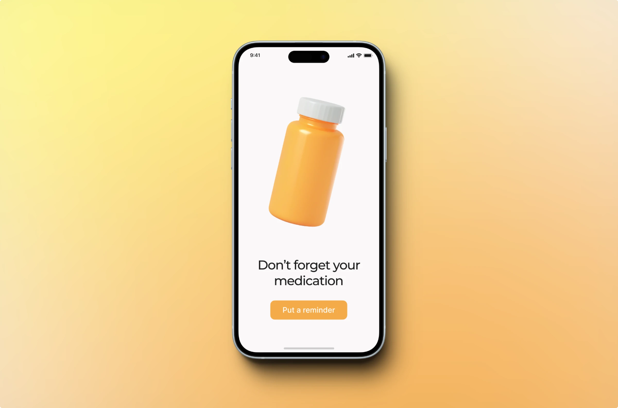
Here’s how we incorporate it into the interface.
Real-life concepts of medical app interfaces
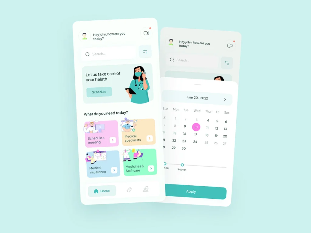
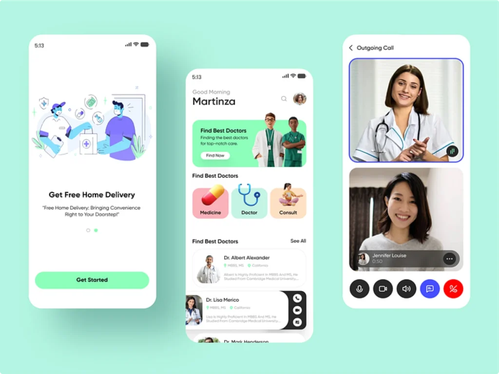
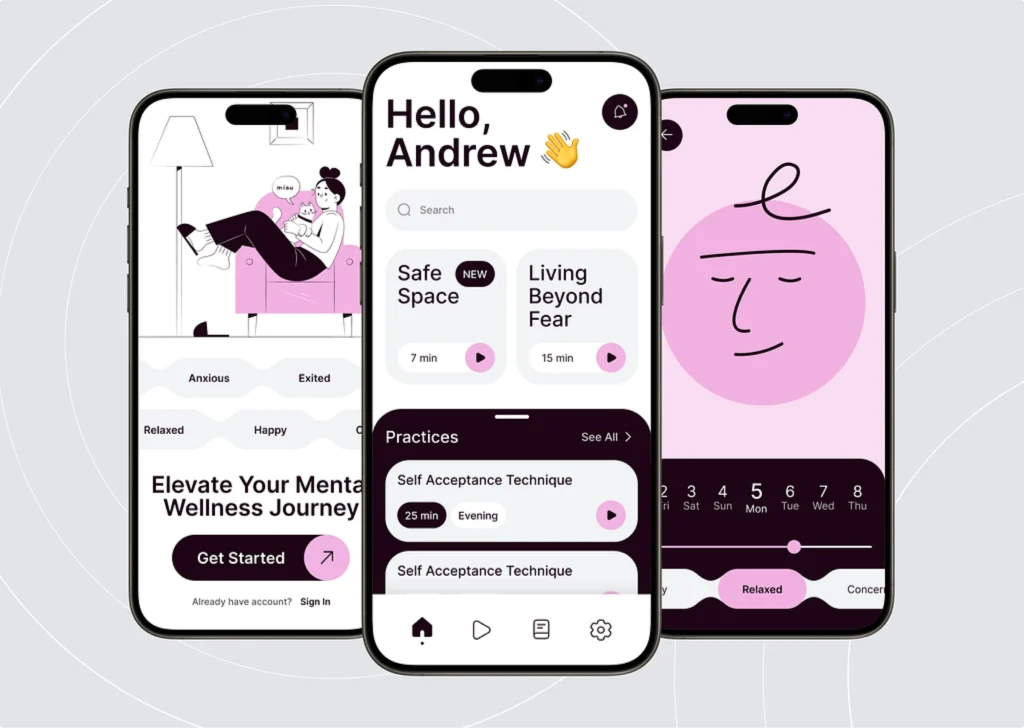
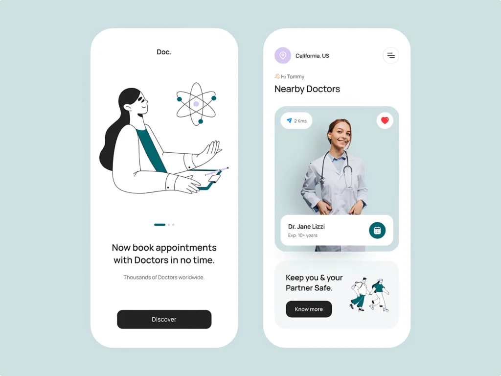
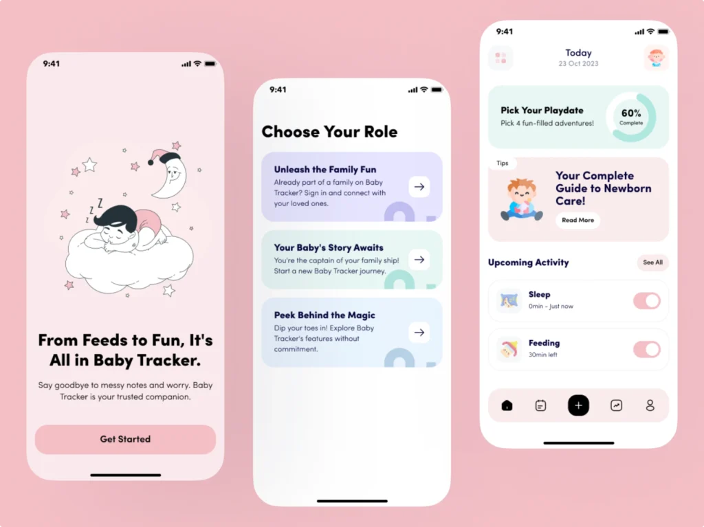
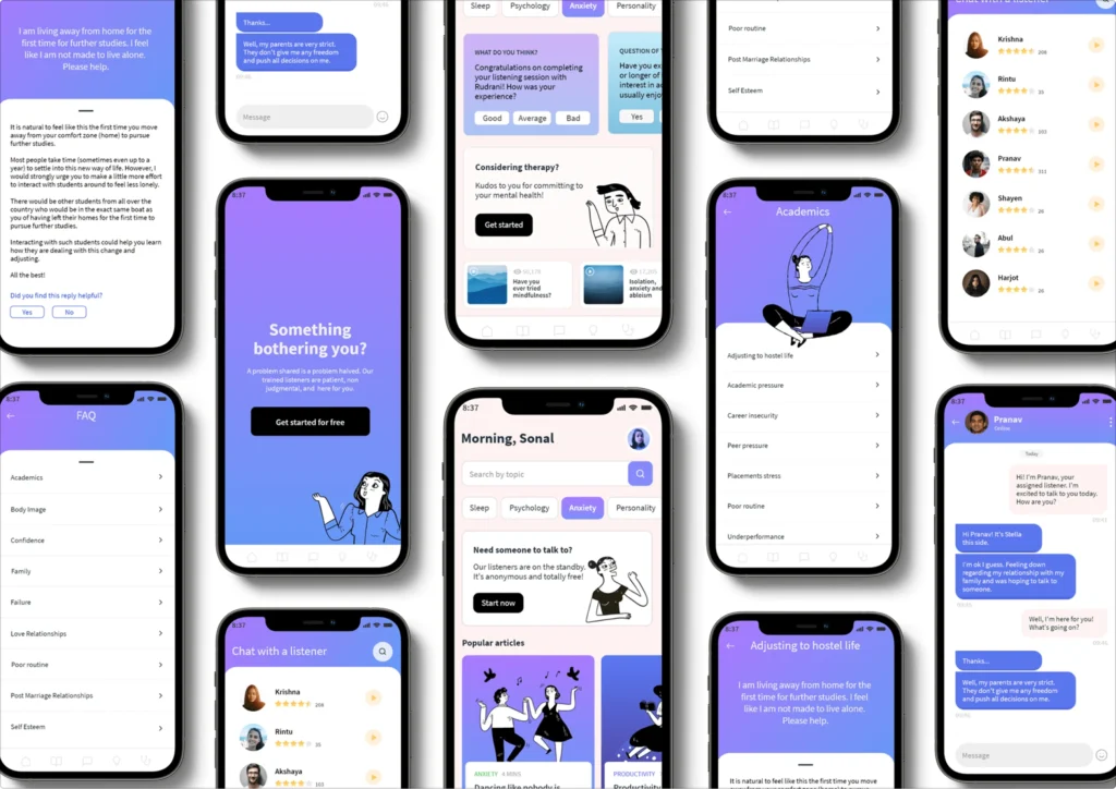
Here are some great examples showcasing how different medical app concepts utilize illustrations effectively.
Wrapping Up
Custom graphics are game-changers for medical apps. They turn complex medical information into clear, engaging visuals that everyone can easily understand and navigate. Whether you’re using Ouch! illustrations to simplify health tips, Icons8 icons to streamline navigation, or the Illustration Generator to create a cohesive set of custom graphics. These tools make a significant difference.
By prioritizing accessible and friendly design, you’re not just enhancing user experience—you’re making healthcare more inclusive and approachable for all. So, dive into these fantastic tools, get creative, and watch how your app transforms into a welcoming, user-friendly space that truly supports its users.
Also, learn how to design your mobile app in Lunacy.
About the author
Adeline Knight is a content writer at Icons8. She started as a professional photographer before falling for design. She enjoys experimenting with new tools and uncovering tips and tricks to simplify her life and boost her creativity.
